Search This Blog

April 28, 2010

April Palette Update

Here's a snapshot of my palette, where it currently sits. I'm really feeling great about having this structure back, although I'm frustrated with my colour testing rate. It's a sick form of punishment for me to only be able to torch once or twice a week. Whoever dreamed it up is mean and wrong, and I'm not sure what I've done to deserve it.
  • CiM Desert Pink 
  • CiM Sepia Unique #1
  • EFF Mud Slide
  • EFF Dark Grass Green
  • CiM Elphaba Unique #2
  • EFF Ink Blue
  • REI Mystic Grey Blue
  • CiM Poi
  • DHX TerraNova2.1 Light
  • DHX Clio
  • PRC Sasha's Silver
  • PRC Abe's Ivy
Desert Pink has replaced Silver Pink for a while... I didn't get to blog Silver Pink yet, so I'll be back.

Mud Slide has replaced Canyon de Chelly

Grasshopper replaced Commando but was retired in favour of Elphaba Unique #2

Blue-Violet (Hawaiian Purple) replaced Poi, but then I got a custom order and had to put the Poi back

Clio has replaced OK326

And I cheated a little... I wasn't out of TerraNova2, but I was dying to try the new light version of TerraNova2.1 that I got in the mail last weekend, so I kicked the TerraNova2 to the curb for a while. 

Anyone care to join me? If so, the staple colours that you are allowed to use with this palette are Black, White, Clear, Ivory, Dark Ivory, Adamantium, Opal Yellow and Copper Green. Dichro and metals are also allowed.

April 26, 2010

Test Results :: Poi

1 - Plain, 2 - Plain - reduced, 3 - w/ Silver Leaf, 4 - w/ Silver Leaf - reduced & encased, 5 - w/ Silver Glass Frit (Gaia, Kronos, Elektra, Black Nebula) - reduced, 6 - w/ TerraNova2 Frit, 7 - w/ Vetrofond Black, 8 - w/ Copper Green, 9 - w/ Opal Yellow, 10 - w/ Ivory, 11 - w/ Effetre White

If you've been following this blog, you will remember how much of a hate-on I have for Effetre Dark Violet, and you might recall why I have a bit of an aversion to opaque purple glass. This is a bit of a barrier for me with Poi as well, but Poi has a couple of redeeming features. First, it is really interestingly reactive, and second, the consistency of it makes it really nice to work with.

I'm constantly making excuses for my test beads, but when you look at these, be kind... I'm using my new press and my new beadroller and am still getting the hang of them. Using them to make test beads is the perfect way to practice :)

General Impressions
CiM Poi is super-soft.  It might even be softer and spreadier than Opal Yellow, which makes Poi the new #1 on my mental glass viscosity scale, and bumps Opal Yellow and White to #2.  It is similar to Effetre Dark Violet in colour, but it has just a little more pink in it, and the reactions are way more fun.

I had a couple of rods that were shockier than I'd like, but overall, working with Poi was a dream.  I really enjoyed what happened when I made a thick encased stringer of Poi with Ink Blue. The cage of Ink Blue kept the otherwise spready Poi from moving around too much and really made it sing on the bead.  A picture of that bead is included at the end of this post - it's the long, brightly-coloured focal bead.

Reduction
Reducing Poi doesn't have much effect when the Poi is all by itself.

I don't think I have a picture of this, but when I've reduced Poi with silver glass and silver leaf on it, I've had it fume a little and turn shiny and mauve.

Reactions

Silver fumes the surface of Poi a little, turning it a brownish colour, and when the silver is melted onto the bead, it practically disappears except for a few little patchy bits. Encasing the silver turns the silver to a white blanket under the clear, and the Poi lightens a little under encasement. I used silver leaf here.


Poi is just ok for me with the silver glass tests I did. The reducing silver glass frit shined up really nicely, but it's just sitting there, and after doing this with quite a few other colours, my expectations have been raised.  I find this colour as hopeless to strike silver glass on top of as I did Dark Violet.  I'm sure it's possible, but it just didn't want to happen for me. I do really like the light purple rings that appeared in the Poi around the striking silver glass frit though.


Now things start to get more interesting. This bead was made with the last of my Vetrofond Black.  On top of the Black, the Poi has developed a thin dark purple line in the middle, and has changed colour slightly, taking on a yellowish hue. Similarly, the dots and stringer lines of Black on top of the Poi have all developed a bit of a yellowish halo.


On top of Poi, Copper Green develops a subtle light outline. When you put Poi on top of Copper Green, the Copper Green sort of goes nuts.  It's a vibrant, sloppy mess underneath the Poi lines that have separated so that there is a dark purple line running down the centre.  This reaction makes me really happy.


Like Black, Opal Yellow seems to make Poi want to be a yellowish brown colour. Yellowish halos have developed around the Opal Yellow dots and stringer lines, and the Poi dots and lines have taken on a yellowish hue. The separation of the Poi on top of the Opal Yellow isn't as dramatic as it was on Black, but it's still evident. Conclusion? The colours that make great bases for silver glasses also are big influencers for Poi.

You can see that the Poi has spread on the Opal Yellow, and that Opal Yellow has sunken into the Poi.  This is why I say that Poi is a softer, spreadier glass than Opal Yellow.


The reactions that I observed between Poi and Ivory are pretty consistent with what I saw when I tested Ivory with Dark Violet. The Poi develops a thin dark line in the middle, but apart from that, there's not much else that's interesting going on here. 


Poi spreads and webs on White.  If it could hold itself together, I think there'd be a dark line going through the Poi, but it just can't because it's so much softer than the White.  The White stringer lines and dots have sunken into the Poi, resulting in their edges getting sort of frazzled.

And I've made some interesting beads with Poi.  Much nicer things are possible with Poi than was really evident from the test beads.


April 16, 2010

Test Results :: Mystic Grey Blue

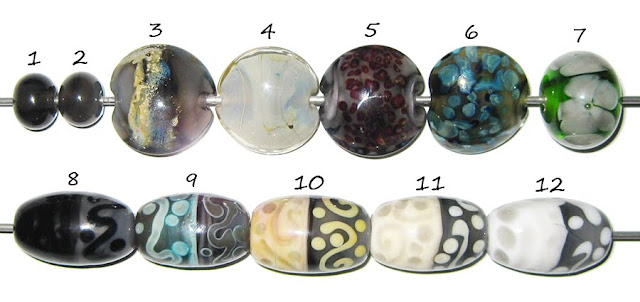
I set out to test Reichenbach Mystic Grey Blue (RL0803) certain that I didn't like it very much. It's weird, because I tried it months ago and thought I loved it, but all those warm fuzzy feelings must have worn off because when I made these beads, I'd been feeling like this colour was mocking me from its place on the table every time I sat down at the torch. I finally decided I'd  get the lead out and make these test beads just so that if I did, in fact, not like it, I could use the rest of it up coring lentils.

1 - Plain, 2 - Reduced, 3 - w/ Silver Leaf, 4 - w/ Silver Leaf, reduced & encased, 5 - w/ TerraNova2 Frit, 6 - w/ Silver Glass Frit (Kronos, Gaia, Elektra & Black Nebula), 7 - Over white in a floral, 8 - w/ Black (Vetrofond), 9 - w/ Copper Green, 10 - w/ Opal Yellow, 11 - w/ Ivory, 12 - w/ White

General Impressions
Part of the difficulty I was having in wanting to use Mystic Grey Blue had to do with the colour, and the other part of the difficulty had to do with the opacity. It's a strange but compelling colour, and sort of challenging to match up with other glass. As it turns out, I really like it. It just goes to show you that glass really needs to be exercised to shine...

This isn't really very good news for me, as one of the only things that has been saving me from completely overwhelming my tiny apartment with superfluous glass purchases is that there are colours I decided I didn't want to try because I didn't like what they looked like in the rod. Now, clearly, I really need them.

Opacity
Mystic Grey Blue varies between being completely opaque with shampoo glass-like streakiness and being completely transparent, depending on how much it is struck. I am having the same amount of luck controlling this 'striking' as I did with Mystic Beige, which is not even enough luck to keep a baby leprechaun alive.

Reduction
Reducing Mystic Grey Blue by itself strikes it a little and opacifies it, but striking it in a neutral flame accomplishes exactly the same goal most of the time, so I don't think reduction does anything special to it. (Bead #2)

Reactions

I like this colour with silver a lot. On top of Mystic Grey Blue, silver leaf turns blue in patches. Reduced and encased, the silver spreads out into a shiny, iridescent blanket. I love it when colours behave this way.


Unfortunately, I didn't have the same nice luck with silver glass. It is more difficult for me to strike TerraNova2 frit on this colour than usual, and while I got good shine out of the frit blend I reduced, it seems to have turned the Mystic Grey Blue a strange yellowish green colour. I'm going to try this with some different combinations, because after how it behaves with silver, I refuse to believe that this glass is a lost cause with silver glass.


There are no noticeable reactions between Mystic Grey Blue and Vetrofond Black, and you can't see the Mystic Grey Blue so well on top of the Black. It's that moody 'I cant decide if I'm transparent or opaque' thing.


With Copper Green, Mystic Grey Blue is pretty neat. The Copper Green, on top of Mystic Grey Blue, separates into two different colours in almost exactly the same way that it did with Lauscha Cocoa.  Come to think of it, the silver reactions are pretty similar to the ones I got with Cocoa, too.

Putting Mystic Grey Blue on top of Copper Green seems to make the Copper Green turn darker, except for the bits under the Mystic Grey Blue, which are a gorgeous turquoise-blue colour. You can't see it all that well in the picture, but the Mystic Grey Blue dots and lines all have a light outline surrounding them as well.


You can't see the Mystic Grey Blue all that well on top of Opal Yellow, but Opal Yellow looks really pretty on top of it.  There is no obvious reaction here apart from the Opal Yellow blushing to pink on the side where the Mystic Grey Blue is on top of it. It sometimes does this anyway, so I'm not certain whether or not the Mystic Grey Blue really had anything to do with it.


Mystic Grey Blue does not react at all with Ivory or White, and it's a little weird how dense Mystic Grey Blue looks by itself, yet how light it looks on top of other colours.

I've only made one fun bead worth showing with Mystic Grey Blue, and now that I've got these tests under my belt, I've got ideas for more.
 

April 10, 2010

Test Results :: Commando


1 - Plain, 2 - Plain - reduced, 3 - w/ Silver Leaf, 4 - w/ Silver Leaf - reduced & encased, 5 - w/ Sasha's Silver - reduced, 6 - w/ TerraNova2 frit, 7 - w/ Copper Green, 8 - w/ Vetrofond Black, 9 - w/ Ivory, 10 - w/ Opal Yellow, 11 - w/ White

General Impressions
CiM Commando is an interesting colour, because its behaviour is sort of halfway between what one would normally expect of a copper colour (i.e. Copper Green) and what one would normally expect of a sulfur colour (i.e. Ivory).  It is fairly reactive, the consistency is smooth and easy-flowing, and it is very streaky. I'm really fond of this colour, and if it weren't for the trouble I'm having encasing it, it would make my favourites list.

These test beads were made with 'New Commando' which is just a touch more blue-grey than 'Old Commando'. The behaviour of the two versions seems pretty similar, so whatever kind of Commando you have, these reactions should be pretty consistent with what you will see.

I'm having a bad bead week, so please ignore the deformities in the test beads. Every once in a while I seem to go through a phase where I can't put beads in the kiln without them touching and sticking together, and can't get nice shapes to save my life. Every other time this has happened to me it's been right before a "breakthrough" of some kind or another, so I have my fingers crossed that that's the case with me right now.

Reduction
Reducing Commando by itself darkens it quite a bit. (Bead #2)

Reactions

Silver doesn't do a heck of a lot on top of Commando until you encase it. You can see in Bead #4 that encasing reduced silver over Commando caused some really interesting blue and amber colours to appear. It also, however, seems to cause a cracking problem. I am using Reichenbach Crystal Clear at the moment.


This bead has a core of Commando, encased with Double Helix OK326 and then Reichenbach Crystal Clear, with a little Ivory and SiS between layers of Clear on top of the silver glass. This bead has little hairline cracks all through it. I haven't run enough tests to be positive, but it seems like it might not be a good idea to encase Commando. I've used the other glasses in question together without this kind of problem, so that Commando seems to be the culprit.


Commando and silver glass seem to get along just fine. The Sasha's Silver in Bead #5 has a slight dark outline, but it reduced nicely over the Commando. It seems to have made the Commando acquire a slightly yellowish hue around where the Sasha's Silver sits on top of it.

In Bead #6, you can see that TerraNova2 frit gets light halos around it when placed on top of Commando. I didn't strike this bead quite enough, but the TerraNova2 frit was developing colour quite nicely.


Copper Green, with Commando, acquires a dark, faintly reddish outline. The Copper Green seems to be raised a tiny bit off the surface of the Commando, and it looks that way both on the side where the Copper Green was put on top of the Commando and on the side where the Commando was put on top of the Copper Green.  This combination really appeals to me for some reason I'm having trouble putting my finger on.


There is a slight reaction with Vetrofond Black that might just be a little bit of bleeding. You can see in the Commando stringer line there is a greyish outline around it, and you can see some bleed in the middle where the Black and Commando halves of the bead meet.


With Ivory, Commando develops a black outline around the Ivory when the Ivory is placed on top of it, and around itself when it is placed on Ivory. This accentuates its streakiness, but the line isn't very crisp.


Commando seems to spread a little on Opal Yellow, which is a little odd because Opal Yellow is quite a bit softer. It also seems to encourage Opal Yellow to strike.


And with White, Commando develops a strange mottled look. I rather like this effect, even though I don't normally think much of White. The White, too, where it is placed over Commando, develops a strange spottiness. Very cool indeed.

Here are some fun beads with Commando. The second, greener lentil with the maroon and yellow on it is made with 'Old Commando', which is a little less grey-blue than 'New Commando'. I prefer the colour of 'New Commando', but they are both really nice glasses to work with.


April 3, 2010

Test Results :: Canyon de Chelly

I am really, really enjoying this colour. It reminds me of lions, and I've been a lion-lover since I was a baby.  I got my first stuffed lion when I was born as a gift from my Dad's mother. She died before I was a year old, so it's the only thing I ever really had that she gave me, and the only thing I have to remind me of her.

When I learned to talk, that lion's name was 'Zozo', since I couldn't yet properly pronounce 'Leo'. Over the years, I accumulated more and more stuffed lions, and I'm not sure if it was a lack of originality or just stubbornness, but ALL of them were (and still are) named Leo. Coincidentally (or maybe not), I am an August baby, and am a Zozo myself.
1 - Plain, 2 - Plain - reduced, 3 - w/ Silver Leaf, 4 - w/ Silver leaf - reduced & encased, 5 - w/ Sasha's Silver stringer - reduced, 6 - w/ TerraNova2 frit, 7 - as a flower, 8 - w/ Copper Green, 9 - w/ Black (Vetrofond), 10 - w/ Opal Yellow, 11 - w/ Ivory (Effetre), 12 - w/ White (Effetre)

The colour of CiM Canyon de Chelly, depending on how much you strike it and what you put it with ranges from a pale, tawny tan to a rich, variegated gold. It can also look a  little more dusky, and be struck to a more pinkish/purply hue. It is a fairly stable colour, and I would label it as 'moderately reactive', because while it can be influenced by other colours, it's pretty good at staying where you put it.


Encasing helps the striking process along, and you can see in the picture above that a little Canyon de Chelly sandwiched between two layers of Clear will strike darker in the centre than on the edges, and will sort of feather out on the edges instead of forming a crisp outline.

Canyon de Chelly is a pretty stiff opaque colour.  Copper Green, Ivory, Opal Yellow and White all spread on it, and I bet lots of other colours do too.

Striking / Reduction
When I reduced Canyon de Chelly, it turned a little more dull in colour, and darkened (Bead #2). However, it has also done this for me when I've just repeatedly struck it in a neutral flame, so I'm not convinced that reducing it had anything to do with the colour shift. Repeatedly striking it, however, definitely influences the colour.

Reactions

Worked in a neutral flame, silver brings out the gold in Canyon de Chelly, and blushes it a darker brown. (Bead #3) Reducing and encasing the silver (Bead #4) results in a sort of dirty, mottled brown and silver blanket. I like the non-reduced silver much better. I learned, also, that if you use a lot of silver and silver glass on Canyon de Chelly, the Canyon can get a shiny iridescence when you reduce the bead. Unfortunately, that iridescence is really hard to photograph, so I don't have a pic to show you.


Canyon de Chelly is a good base for silver glass, at least in organics. My Sasha's Silver lines and dots in Bead #4 have a faint shininess to them, and the Sasha's Silver has a cool, mottled blue effect to it. In Bead #5, my TerraNova2 experiment was sort of ruined by me not striking the glass properly, but when I retried it in my straight sided lentils (see the end of this post) I got gorgeous strike from the TerraNova2 on Canyon de Chelly.

You can see in the picture above that the TerraNova2 frit just started to strike before I messed it up, and the purple/red spreading over the Canyon de Chelly is a clue that more striking would have yielded better colour.


There is no strong, visible reaction between Canyon de Chelly and Vetrofond Black, but if you look closely at the Canyon stringer and dots on the left-hand side of Bead #9, there seems to be a faint edging. It's also really cool how the Canyon de Chelly, in a thin layer, looks sort of mottled.


In Bead #8, you can see a couple of different things going on between Copper Green and Canyon de Chelly. First, the Copper Green spreads on the Canyon, and the Canyon de Chelly sinks into the Copper Green. That's why the Copper Green stringer line looks so fat and the Canyon stringer line looks so skinny. Also, a dark line reaction forms between these two colours. The thing that makes this dark line reaction more interesting than other dark line reactions is that it is a reddish-purple colour instead of black or grey. Neat!


All three of these colours (Opal Yellow, Ivory, White) spread on the Canyon de Chelly because it is a relatively stiff colour, but apart from that, the reactions are actually pretty different.

In Bead #10, the Opal Yellow seems almost to raise itself off the bead where it is on the Canyon de Chelly and float a few micrometers above the surface. And the Canyon de Chelly on top of Opal Yellow sinks in a little, but also seems keen to become one with the Opal Yellow -- the edges of the dots and lines are a little blurry, like it's being assimilated.

In Bead #11, on top of Ivory, Canyon De Chelly has separated and developed a thick, strange yellowish outline.  I like this effect very much, and will be figuring out a way to use it.

In Bead #12, the Canyon is darker over White than it is over any of the other colours, but apart from that the reaction isn't really unique or interesting.

Here are some other beads that include Canyon de Chelly. What fun! I can't wait to make some more.  This colour is a perfect base for organics.


April 2, 2010

My Outdoor Studio

Today is Good Friday, and the first day of my week-long vacation.  It's raining, it's cooooold and it's windy and that is sort of sad for me because it means that Vacation Day #1 is a bit of a write-off in terms of being able to make any beads.  I can usually work through some rain, because I work underneath a deck and that keeps me pretty dry, but wind is a huge irritation, and no one likes being cold.

I live in a small apartment, so I can't torch inside.  My outdoor setup looks like this:


Most days, it works really well.  Even though I live in Canada, I've been able to do a fair bit of work outside this winter because the weather has been really mild.

Today, however, is a bit of a disappointment.  I really hope that this unfortunate weather doesn't continue all week long!