Search This Blog

June 30, 2021

First Look :: Scotch Broom

I am intrigued by this new, beautiful orange-yellow opal colour from Creation is Messy called Scotch Broom (CiM327). It's like nothing else I've ever tried, and everything I made with it so far is pretty ugly because I just don't have it figured out yet. The only thing a girl can do in this situation is buy a full pound of it and really buckle down to figure it out, so I just messaged Nortel to ask them to add a pound of Scotch Broom to my order.

OK, so why, if everything I've made with it so far is icky, have I just ordered a pound of Scotch Broom? Because I love the colour so much in the rod and in the plain spacers I made that I really need to figure it out. It's completely unique and crazy beautiful.


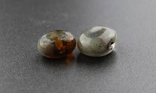
This is Scotch Broom in spacers. It seems like it is slow to strike back to opalescence, so these beads just look transparent. What a gorgeous, warm colour!


These little beads are Scotch Broom with silver leaf. The bead on the right is encased with Effetre 006 Clear.

The only surviving things I have made with this colour are truly ugly, and out of those, this is the least embarrassing one that made it past the water jar, so this is the one I'll put here:

This bead has Kniphofia in the core, encased with Scotch Broom. I made an incorrect assumption when I started using this colour that it would end up more opaque like the rod, and that was not the case. I got more opacification of it in this bead than in the little spacers, so it seems like working it longer can help with that if opacity is what you're after.

No one will ever know what possessed me to put blue and aqua flowers on top of this colour, and I did not expect the flower petal colours to let so much orange through. The flower effectively looks brown. 

I will repost about this colour when I've been able to give it a better workout. My results here definitely don't seem reflective of its potential.

June 26, 2021

First Look :: Kniphofia

Kniphofia from Creation is Messy (CiM225) is a medium orange transparent that is a bit slower to strike than other transparent oranges, but apart from that and the fact that it does not seem to opacify the way Clockwork does, it's very similar to Clockwork. It seems not so slow to strike as Goldfish was last year so it doesn't have quite as much range as that colour did. It is a gorgeous colour, though, and I appreciate both the flexibility of hue and how this colour seems to stay more transparent when fully struck.


It is very difficult to make two beads at the same time from a striking colour and have them come out the exact same colour. I made these two beads together and you can see how the one on the left struck a little deeper. In this case, I'm happy about it, because I think it might be fun to make a whole bunch of them to use in a necklace and it will be better if they aren't all identical anyway, but most of the time this is a frustrating problem. 

The only ways I've found around it are:

  • to hang around in the flame (and out of it, intermittently) until both beads look fully struck like they can't possibly strike further, 
  • to painstakingly restart the striking sequence in each bead after getting the initial gather on the mandrel but before starting to shape them and then being very careful to give both beads absolutely equal treatment.
But both ways take a long time, and even then I'm wrong half the time because things look so different when they're hot. When I want matching pairs with striking colours, I generally make 4 or 5 pairs and then pick out the best matches out of all the beads to be paired together.

Here are some beads made with Kniphofia:

I used Kniphofia in the stripes on the sides of these beads.


Here, Kniphofia is in the more orange of the orange stripes. The orange stripes that are a bit yellower in hue are CiM Scotch Broom.


And here, I've used Kniphofia under Clear and Double Helix Clio to make a beautiful, cloudy (because I over-reduced them) pink.


June 12, 2021

First Look :: Avalon Milky & Avalon Misty

CiM Avalon Milky (CiM4003) and Avalon Misty (CiM4002) are soft, minty, pale green, translucent colours. They melt beautifully, with no bubbles or scumming. These glasses are really only different as regards their opacity, so I feel like it is makes sense to post about them together. In general, I typically prefer the misty colours to the milky ones because I enjoy the brightness of them, and this was true for me with Avalon as well.


You can clearly see here the difference between the milky and misty versions of this colour. They are both beautifully translucent, but the misty beads show just a bit brighter and lighter because more light is passing through them.


Silver Foil under Avalon turns an odd lemon yellow colour.

I decided to try this just because the silver foil turned a bit yellow, but it turns out that lemon yellow is not quite yellow enough to do anything impressive with the frit. These streaky results are pretty, but they are also achievable by using regular colours rather than the expensive silver glass ones, so I'll never do this again.

Here are some fun beads that I made with these colours. I'm not really sure which is which now, but you can rest assured that whichever of these colours you choose to buy, you're getting something pretty neat. The butterfly murrini were created by the lovely and talented Jackie Gundelfinger.


June 8, 2021

First Look :: Pink Pansy

CiM Pink Pansy (CiM930) is a medium transparent pink colour. The colour is a little warmer than what I typically get from CiM Cranberry or Effetre Rubino Oro, and a bit lighter in saturation than Cranberry (Rubino Oro varies from batch to batch, so it's hard to say something really definitive about it here). This colour does not require any special handling in the flame to develop its rich, pink colour.


Other testers have posted about this colour having a butterscotch aspect to it, but for one reason or another, I didn't really see that in my test beads.


Silver leaf isn't very interesting with Pink Pansy, and so I almost didn't bother doing the next test. I'm glad my fixed habits sometimes win out over my lazier impulses or I'd never discover anything good :)


Silver foil under Pink Pansy is a rich coppery gold. This is a really beautiful result, but the most exciting thing about it is that colours that turn a rich gold like this make gorgeous silver glass frit stringer.


This is Pink Pansy pulled into frit stringer using my random blend of TAG and Double Helix reduction colours. I've put it over a core of pink pansy in most of the beads, which is why you can see a lot of pink poking through. The beads on the very ends give you an idea what the stringer would look like without the pink core. 

And here is a fun pair I made. The base of these is Effetre Skyberry, and I've also used some CiM Mediterranean in here. The windows are made with aqua dicroic.