Search This Blog

Showing posts with label Light Turquoise. Show all posts

April 10, 2020

Product Review :: New CiM Cloudy Transparents

I am crazy about so many of these new CiM colours and I will be coming back to blog about some of them in greater detail over the next few months. Because the volume of colours this time is so big, I wanted to make sure that I at least posted some initial impressions and photos of them all but will do my detailed colour explorations only for those colours that I decide to incorporate into my palette more permanently. I made this decision after I had already dived in and done a bit of testing, so you will see some more detailed posts for a few colours right away, beginning next week.

I haven't used all the colours yet, and this post will be focused on what I've been making with some of the new Cloudy Transparent colours. I really like this new rod format with the pigment filaments suspended in Clear, and I am hoping for a whole range of colours in the future. I think that a dark blue, a dark teal, and some bright oranges, pinks, and yellows would be particularly fun.

In general, I have found the Cloudy Transparent colours to be a bit shocky. For for the most part, this was quite manageable and well worth the effort, at least for the colours I've tried so far. Heather is the one that I've had the most trouble with out of this group. Another thing common to all of these colours (so far) is that they can be easy to boil, so you really have to watch your heat. This is true not only with fine stringer, but also when applying the glass from the rod to your bead. Work higher up in the flame and a bit cooler to avoid this problem. I have not specifically tested any of these for colour reactions yet. When I do, I might find out something interesting, but so far they do not seem very reactive with other colours.

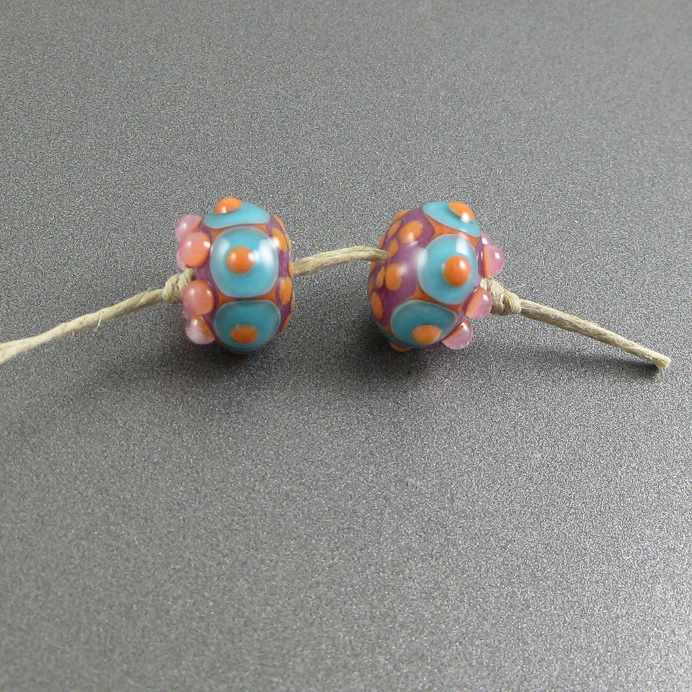
These beads all contain Heather (CiM922) or Luzern (CiM924). The only real difference between these glasses for me was that my rods of Luzern had more colour density. Heather and Luzern are a magenta/lilac-coloured streaky transparent where the pigment filaments are suspended in clear glass. Both of these colours are stunning, and I am hoping to get some more of at least one of them.


Colours: CiM Heather/Luzern, CiM Sunset, Effetre Opal Yellow, 
Effetre Light Turquoise, CiM Loch Ness, CiM Serenity, CiM Circus Tent, 
Effetre Super Clear, and various colours of enamel.

Fruit Punch (CiM730) is described as a reddish brown cloudy transparent but I found that it lightened substantially while I worked it and came out looking more like a cloudy pinkish peach colour.


Colours: CiM Fruit Punch, CiM Sunset, Reichenbach Pink Lady, CiM Serenity, 
Effetre Light Turquoise, CiM Adamantium, Effetre Opal Yellow, and various colours of enamel.

Chocolate (CiM731) is a gorgeous, deep, dark brown transparent colour. Out of all the new cloudy transparents, this one might be the one I am most excited about. Because it is a very dark colour, when used in thick layers this colour is a very opaque deep brown, but you can lighten it as much as you want by applying it in thinner layers on top of other colours. This offers quite a lot of flexibility when you're designing with it.


Colours: CiM Chocolate, CiM Light Turquoise, Effetre Opal Yellow, Effetre Light Red, 
CiM Sunset, CiM Loch Ness, CiM Serenity, and various colours of enamel.

CiM Watermelon (CiM219) is a bright coral cloudy transparent that darkened a little as I worked it. I really liked it. I am wondering if it could have been made even more beautiful by suspending the coral filiments in a very pale pink instead of clear.


Colours: CiM Watermelon, CiM Chocolate, Effetre Opal Yellow, 
CiM Sunset, Reichenbach Pink Lady, and CiM Loch Ness.

And finally, this last bead is made with a colour that I don't think will be for sale (at least not this time around), doesn't have a name, and is a bright, royal blue cloudy transparent. In these beads, you can see both how the bright blue base looks almost opaque, and how the same colour in a thin layer in the bead's raised dot decoration looks streaky and wispy and almost transparent.


What a lot of fun! I can't wait to see where CiM takes this product line in the future.

June 12, 2012

Test Results :: Light Turquoise

1 - Plain, 2 - Plain (reduced), 3 - w/ Silver Leaf, 4 - w/ Silver Leaf (reduced & encased), 5 - w/ Silver Glass Frit (reduced), 6 - w/ TerraNova2 Frit, 7 & 8 - w/ Tuxedo, Copper Green, Opal Yellow, Ivory and Peace

Effetre Light Turquoise is a medium turquoise opaque colour. It is very sensitive to flame chemistry, and is very reactive with Ivory and other sulfur colours.

Because I mainly make organic beads, this kind of opaque colour doesn't really do much for me. It's not neutral enough to use as a base colour in my organics, and it doesn't do enough fun streaky spready things to really be fun for me. My favourite things to do with Light Turquoise, at the moment, are to bury it as the core of my vine cane or in the middle of a big bead overlaid with a dark transparent. Both Effetre Light Turquoise and Dark Turquoise are especially annoying to me because of the grey film that develops on their surface. They are nice underneath other colours, and if you layer them under something else, they don't film up.


Here I have made two Light Turquoise spacers. The one on the left was made in a more or less neutral flame  (I'm on a Minor, with a 5lpm oxycon), and you can see how a greyish film has developed on most of the surface. This film can be removed in a number of ways - you will read in online forums about how it can be removed by soaking the beads in Coca Cola, by soaking them in CLR or Lime Away or any number of other household chemicals. I like CLR - an hour or so of soaking in that and the film is gone, but haven't had much luck with the Coca Cola method.

The bead on the right was reduced, and in addition to the greyish film, it has also developed a pinkish coating. This pinkish 'reduction' coating can't be removed by soaking in anything because it is the copper crystals in the turquoise rising to the surface. Once you've done this to your Light Turquoise, unless you get it nice and hot in an oxygenated flame and can burn the reduction film off, you're stuck with it.

If you are a frequent reader of this blog, you know that I always test with Copper Green, and that Copper Green also has this unfortunate habit of filming up, but that when it is used with some colours, that film doesn't appear. The same is likely true of Light Turquoise, although I didn't really do a lot to test that theory. If you are reading some of my other tests and come across a colour that seems to have kept Copper Green free of the blechy grey film, it is worth a try to combine that colour with Light Turquoise to see what happens. Copper Green has redeeming qualities that Light Turquoise does not, in spite of this unfortunate tendency. I will tell you all about them in a future blog post!


With silver, Light Turquoise is not very attractive. Both on the surface of the bead and under clear after reducing, the silver looks sort of a greyish greenish yellow colour. Where the silver was left on the surface, it does seem to have done some interesting things - you can see one area of the bead where there has been some darkening and veining of the Light Turquoise - however while it is a little odd and worth notice, I'm not sure I'd do it on purpose.

One of the nicer things that happens when you encase Light Turquoise is that the greyish film doesn't accumulate on its surface.


Silver glass is just 'ok' on Light Turquoise. Light Turquoise neither seems to do anything to help the colour along nor hurt it, but the colour of the Light Turquoise doesn't do anything for me when combined with either the reduction frit blend or the TerraNova2.


In terms of reactions, the most pronounced one in this set of results is the dark line that Light Turquoise develops when used with Ivory. Everyone already knows about this reaction, so I haven't exactly broken new ground here.

On top of Light Turquoise, Peace and Opal Yellow both separate slightly and the dots and stringer lines have a pronounced three-dimensional effect. This reaction is more evident with Opal Yellow than with Peace.

The only other thing worth pointing out is that Light Turquoise on top of Tuxedo and Light Turquoise on top of Peace look like two completely different colours. I'm not sure why this is the case, but when I look at the bead on the left, above, it is difficult for me to process the idea that I was using the same colour on both ends of the bead. I don't know if this is because of a reaction or if it's just what happens when you use Light Turquoise on top of a very light colour vs. a very dark colour.  You can decide.

I used Light Turquoise as the base colour in this bead, underneath a layer of CiM Midnight.

And this little set is Light Turquoise with Ivory and Tangerine Sparkle, a touch of SiS, and a smidgen of Light Teal.