Search This Blog

Showing posts with label Multichromatics. Show all posts

April 13, 2020

Test Results :: Circus Tent


CiM Circus Tent (CiM220) is a very interesting 'threaded transparent' colour where multiple long filiments of various colours are drawn thin inside a clear rod. The clear that CiM  used for Circus Tent is much smoother, more buttery, and less prone to boiling than my previous experiences with CiM Clear would have led me to expect and I found it really nice to use.

I am not sure I love the colour combination inside this particular colour, but I am very excited about possible future colours built using this technique, maybe inside clear, maybe inside misty opal colours with more appealing colour combinations. For instance, I would love something like this with more than one layer of oranges and yellows inside it to use as stamen cane, and I'd also really appreciate a pale aqua that contained filiments of various blues and teals.


Reducing Circus Tent doesn't change its colour.


Silver is the same on top of Circus Tent as it is on top of Clear. Nothing very interesting happens, but the silver has nice visibility on the surface of it (leftmost bead).


Reducing silver glass frit develops nicely on top of Circus Tent, making me want more of the clear glass that Circus Tent is made from.


Circus Tent is not a reactive colour. The main thing I find interesting in these test beads is the way Ciircus Tent pulls into a very slightly streaky stringer.

Here are some beads made with Circus Tent:


November 13, 2017

Test Results :: Multicolor


Reichenbach Multicolor (RL6209) has changed a little since the first time I used it, indicating to me that it might not be all that consistent from batch to batch. This most recent supply that I got is much easier to strike and a little darker than the last batch of this colour that I tried.

This colour is less saturated hue-wise than Multicolor Dark, more reactive with other colours (the reactions are similar, just more intesnse), and I found it a bit slower to strike.

Multicolor is fairly stiff, making it nice to work with sculpturally, although its striking nature means that you need to be careful to keep even heat or you end up with a sort of blotchy result.


Making a simple spacer from multicolor, I got very pretty, variegated greens and blues. When I reduced a Multicolor bead, I got a shiny gunmetal purple.


When silver leaf is melted into the surface of Multicolor, it looks a uniform light teal colour, except for where there are gaps in the silver layer. When the silver is reduced and encased, it looks more yellowish, and the multicolor peeking through the gaps, instead of looking blue, looks a reddish purple colour.


Multicolor is very reactive with other colours.  It separates Copper Green, Opal Yellow, and Peace, and forms a serious dark line reaction with Ivory.

Here are some other beads made with Reichenbach Multicolor:


Here in the goddess bead, you can see that in the places where I reheated the surface with some concentrated heat (nipple and belly button areas), I got a very strong strike to purple.


May 22, 2017

Test Results :: Multicolor Dark


Reichenbach Multicolor Dark (RL6206) is a reactive striking colour. It is relatively easy to strike. The rods are a reddish purple colour, they go transparent when heated, and then turn green as they cool, then striking to blue, purple, and sometimes even a reddish colour.


You can see here that reducing the Multi Dark doesn't make it shiny and doesn't cloud it up the way Raku behaves when reduced. Here, it just advanced the colour of the glass into the purple hues.

I have noticed that in order to strike this colour, you need to let it get fairly cool and then give it a thorough, deliberate reheating. I was not able to screw it up -- no matter how I did it, I still got great colour, so that's a huge point in its favour.


I've now had two different versions of Multi Dark - or at least they seem different based on the appearance of the unmelted rods.

Both of the goddesses below are solid Multi Dark.  The top one was made with the darker rods and the bottom one was made with the older, paler-rodded variety. Maybe the newer, darker-rodded batch gives more deep blues, but it's also possible that these two beads received a different amount of heat, were cooled a different number of times, etc. This is a seriously beautiful colour, and no matter what batch of it you have, it's great glass.


On top of Multi Dark, silver disperses such that it's not really apparent on the surface. In so doing, it seems to inhibit the natural colours of the glass, or maybe just cover them up. When the silver is reduced and encased, it forms a solid layer through which you cannot see much of the base bead.


Copper Green, Opal Yellow, and Peace all separate on top of Multi Dark, and Multi Dark does not inhibit the sheen that develops on top of Copper Green.

Ivory forms a dark line reaction and turns a dark greyish brown around the edges of the dots and stringer lines when used on top of Multi Dark, and it also seems to separate. When Multi Dark is used on top of Ivory, it gets a dark outline and fumes the base ivory a brownish colour.

Here are some other beads made with Multicolor Dark.


August 13, 2015

Test Results :: Iris Orange (Raku)

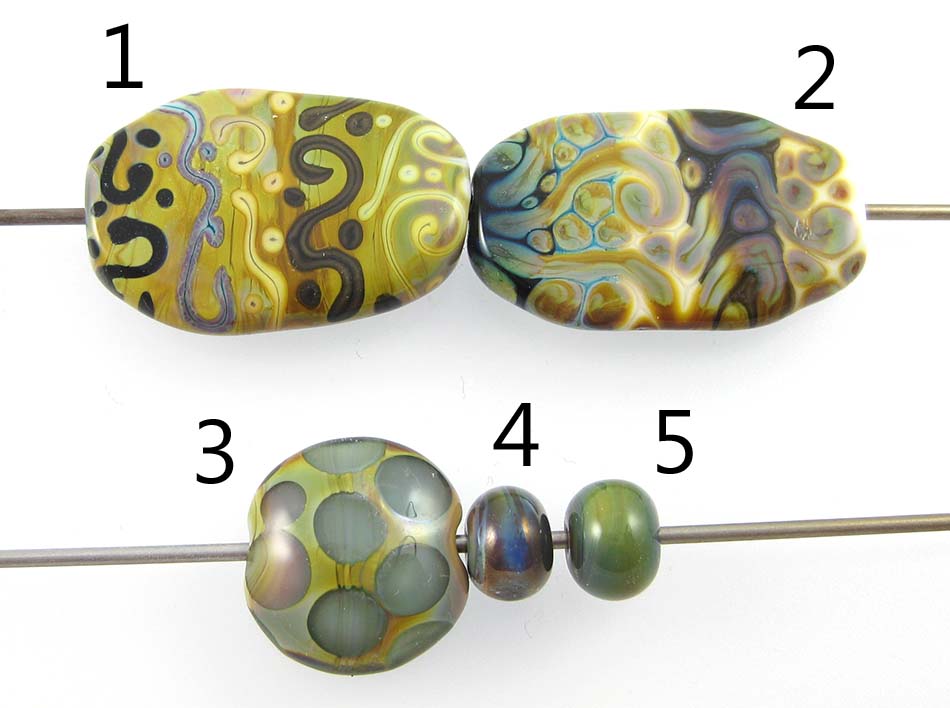
1 & 2 - w/ Tuxedo, Copper Green, Opal Yellow, Ivory, and Peace, 3 - w/ Clear dots, 4 - Plain (reduced), 5 - Plain

No one calls this colour "Iris Orange", to the best of my knowledge, in spite of that being the actual colour name that Reichenbach gave RL6208 when it was born. Instead, we all call it Raku, which is shorter and more meaningful since there's nothing particularly orange about this colour and the colours we get from it remind us of raku pottery. I think that you have to be either pretty loved or despised (or both at the same time!) as a colour to get a nickname like 'Raku' or 'Evil Devitrifying Purple', and I know that there are probably as many people who loathe this colour as there are those who love it.

That's for good reason. I find Raku sort of hard to work with when I am struggling with it to get those brilliant colours. I am consistently unsuccessful at striking it and never get the beautiful pinks, purples, and blues to stick in it that I see some of the people who are really handy with it getting. However, even if you can't yet get the brilliant colours out of Raku, I still think it's pretty lovable for its reactions and for the more subtle colour changes you can achieve without a lot of effort.


In the bead on the right, you can see what I usually get from Raku when I try to strike it in small beads. Some blues, maybe some greens.  If I reduce the Raku (the leftmost bead), I can get some brighter blues and some shiny pinkish brown. Neither of these are what I really want when I start the bead, but they are both sort of awesome in their own right.


Something else that is sort of awesome about Raku is that you can trap its colours under an encasement layer, and even if you mismanage it the way I did here, you can still get some nice pastels in dots or flower petals under Clear.


Tuxedo does not do much on top of Raku, but if you look on the bead on the right you can see that Raku struck more readily on top of some colours than others.  On top of Tuxedo, I got gentler blues and greens and the brownness of the Raku migrated into the centre of my stringerwork dots and lines.

On top of Raku, Copper Green separated and dark turquoise coalesced in the centre of my dots and stringer lines, and a  crusty pinkish effect took over its edges.  When I used Raku on top of Copper Green, it spread out quite a bit, and got a mottled, 3-dimensional look. It also made the Copper Green quite dark and rich-looking in between the spready Raku bits.

On top of Opal Yellow, I got a gentle strike from the Raku, but a strange, lingering brownish effect that almost looks like a shadow underlaying that colour change.  You can also see that the Opal Yellow has risen up around the Raku in halos, for an extra border around the Raku stringerwork. Opal Yellow on top of Raku separates and intensifies in colour quite dramatically.

Both when used over and under Raku, Ivory turns brown, almost black. It also curdles and separates in a dark and murky way. The interesting thing for me here is that after Ivory has finished being all moody because the Raku is spreading around on top of it, it seems to facilitate a really nice colour change in the Raku. On top of Ivory, I got a wider range of colour than I got over any other of the base colours I tried.

The reaction between Raku and Peace is very similar in appearance to what happens with Opal Yellow. Behaviour specific to Peace is that it appears to change from white to look greenish yellow on top of Raku and yellowish when used underneath it, probably from the silver in the Raku fuming it.

My favourite way to use Raku is as a border for my mushroom beads. I love how dark I can get the brown to stay in its pre-striking stage, and then how some traces of rainbow show up in it no matter what I do.  Here are some examples of that.


And here are some Raku goddesses. These are 100% Raku, and I have overstruck it, but I like the organic streakiness and the earthy pastels I got from it a lot.


October 23, 2012

Test Results :: Ivoryish


1 - Plain, 2 - Plain (reduced), 3 - w/ Silver Leaf, 4 - w/ Silver Leaf (reduced & encased), 5 - w/ Silver Glass Frit (reduced), 6 - w/ TeraNova2 Frit, 7 & 8 - w/ Tuxedo, Copper Green, Opal Yellow, Ivory and Peace

Effetre Ivoryish is a little like the Fossil family of cool colours from Effetre, except that Ivoryish is a warm colour where Fossil tends to be greyer and cooler. On the whole, I vastly prefer Ivoryish. I've never had much of an attraction to Fossil.

Like the Fossils (Dark, Medium, Light), Ivoryish is a streaky colour. Warm ivory tones, warm beige notes and darker greys and browns all run through the variegated rods. The consistency of Ivoryish is quite a bit like the consistency of Effetre Dark Ivory, and its reactions are also quite similar. Like Dark Ivory, Ivoryish curdles when it is super-heated, and turns browner when fumed with silver.


This is what Ivoryish looks like made up into plain spacers. You can clearly see all of the colour striations, ranging from ivory tones to darker beige and even darker grey.


Putting silver leaf on the surface of Ivoryish, burnishing it on and then burning it off results in a sort of 'petrified' appearance to the Ivoryish. The colour of it goes darker, browner and cloudier, with curdling striations wandering through it. When the silver is reduced and encased, some of the magic is lost  -- the blanket of silver looks sort of dirty and the fumed colour dissipates.


Silver glass likes Ivoryish a lot. In the bead on the left, I got great colour from my reducing silver glass frit on top of this colour. The dark lines that pop up around the frit make it even more interesting. And in the bead on the right, I got pretty decent colour out of the TerraNova frit in places, and in other places it just looks dark and drab. But, there is potential here for Ivoryish as a base for either reducing silver glass or striking silver glass.


In terms of reactions with other colours, Ivoryish is pretty much identical to Dark Ivory. It forms dark line reactions with Copper Green and Opal Yellow.

All of these beads contain Ivoryish to some degree.What an awesome colour.


April 29, 2012

Test Results :: Earth

1 - Plain, 2 - Plain (reduced), 3 - w/ Silver Leaf, 4 - w/ Silver Leaf (reduced & encased), 5 - w/ Silver Glass Frit (reduced), 6 - w/ TerraNova2 Frit, 7 & 8 - w/ Tuxedo, Copper Green, Opal Yellow, Ivory, Peace

Effetre Earth is one of the 'Cool Colours', and was new in 2011.  It is a rich, vibrant and streaky colour that  is veined with a saturated dark blue transparent. While using it, it developed mottled patches of turquoise that are especially pronounced when it is used with silver.

Some glass colours were meant to be used only in combination with or under other colours. In my opinion, Earth is a colour that really shines on its own -- its streakiness is really beautiful -- and is sort of difficult to like when used with other colours. And you'll see at the end of this post what can happen when you encase it. It is going to take some creativity to figure out how to use this colour to its full advantage.

Earth turns a dark brick red when it is reduced.


Silver really brings out the turquoise in Earth -- you can see it surrounding all of the silver in the bead above, on the left. The Silver Leaf has balled up and veined, attaching itself to the dark blue transparent streaks running through the Earth. When the Silver Leaf was reduced and encased, it turned an otherworldly mustard colour.


Reducing silver glass on top of Earth has more or less the same effect on the surface colour as melting Silver Leaf into it. I don't really like putting shiny blue things on top of other blue things, but other people might. I got a nice, dramatic strike in the purple ranges from my TerraNova2 Frit on top of Earth.


When you do stringer lines with Earth, it is streaky and veined with a dark blue transparent webbing. This is a pretty neat effect on its own, without even taking into account any reactions with other colours.

Copper Green separates on top of Earth, going darker in the centres of lines and dots. When Earth is used over Copper Green, the Copper Green is a vivid turquoise colour.

The edges of Earth, when its used over Opal Yellow, thin out slightly with a bit of a bleed. Opal Yellow on top of Earth develops a strange, veiny separated look to it.

Earth develops a mottled, medium brown line reaction with Ivory. You can see this both on the bead where Ivory was used on top of Earth as well as the bead with Earth over Ivory.

On top of Earth, the edges of Peace take on a turquoisey blueishness and translucency. The Peace stringer lines and dots look more solid in their centres than where they meet the Earth. There doesn't seem to be any strong reaction when you use Earth on top of Peace, except for a little blurring of edges.

Here are some fun beads with Earth:
 
In these beads, if you enlarge them, you can see that the dark blue lines that Earth has, which are what make it streaky, are transparent. When you Encase Earth, underneath the encasement layer it looks all billowy and organic - this is because the solid, opaque portion of Earth is criss-crossed with those dark transparent veins. It looks almost like blue clouds. This effect is more pronounced in the bead above than it is in the Mushroom bead.
  

October 8, 2011

Test Results :: Candy Corn

1 - Plain, 2 - Plain (reduced), 3 - w/ Silver Leaf, 4 - w/ Silver Leaf (reduced & encased), 6 - w/ Silver Glass Frit (reduced), 6 - w/ TerraNova2 Frit, 7 - w/ Tuxedo, 8 - w/ Copper Green, 9 - w/ Opal Yellow, 10 -w/ Ivory, 11 - w/ Peace

Rods of Candy Corn are orange on the outside and have what seems to be a core of White running through them. What this translates to in a bead is a streaky orange that ranges from a pretty light orange to a dark, tomato colour.

Candy Corn, like the other Vetrofond veiled odd lots, can be a little annoying to work with. It's not as bad as Honey Crunch or Avocado Marble, but some of my rods did have that problem with cracking off every few inches while I was working.


On top of Candy Corn, silver leaf gets a yellowish, crusty look to it, and causes a bit of a dark line reaction between it and the Candy Corn, otherwise pretty much staying put. When the silver is subsequently reduced and encased, it turned back to silver except for some patches that either stay yellowish or develop a blueish tint.


My reducing silver glass looks bluer on top of Candy Corn than it has on top of other colours, but I have been using the same blend for most of this year. The silver glass on both beads has a very distinct black border around all of it's little fritty bits. The TerraNova2 frit in the bead on the right didn't really get off the ground in terms of striking.


No reactions to see here, really, but it is interesting how on the Tuxedo side of the bead the Candy Corn stringer lines have a light outline. I think this is from the streakiness of the glass, and I like how that streakiness translates into a textured look in the stringerwork.


Candy Corn and Copper Green develop a mutual dark line reaction. Again, the Candy Corn stringer lines have a beautiful streakiness that makes them look almost three dimensional, or like they've been intentionally shaded.


On top of Ivory and Peace (much more so on top of Peace), Candy Corn spreads a little and because of its streakiness, has some interesting things going on. Peace separates and develops a thin, translucent line down the middle on top of Candy Corn.

I've taken some short cuts here, but Candy Corn just isn't a very reactive colour. The streakiness is fun though, and I can't wait to work with the other Vetrofond odds that are languishing in my glass box.

Here's a fun bead with Candy Corn.