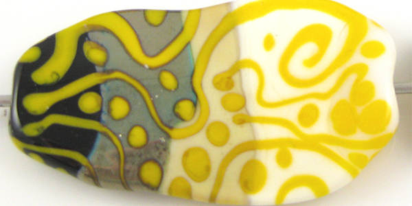
Effetre Butter Yellow (418) is a bright, sunshiny yellow that seems to have more than the usual amount of batch-to-batch variation. All of my Butter Yellow was from the same batch, but I've seen some new stuff that looks way more orange than what you see here.
Butter Yellow is very similar to Ivory in terms of its consistency and its reactions with other colours, although it is a bit stiffer than Ivory.

In this picture, you can see Butter Yellow's awesome sunflowery yellowness. It doesn't change much when you reduce it, but this colour does seem to strike a little in the flame to become a deeper, warmer colour, and you can see that a little in the reduced, smaller spacer on the right.

Silver turns Butter Yellow a yucky brownish colour, and crusts on top of it similarly to how it behaves with Ivory. When the silver is reduced and encased, it looks more or less the same except that the interesting bobbliness of the reaction is magnified under the clear layer.

Silver Glass on top of Butter Yellow is a bit of a wash. I don't think I got great colour results from the reducing silver glass frit on the left because there's so much reaction, and while I got some nice colour in the TerraNova2 frit, the colours I got don't exactly complement the bright yellow. At least, not for me - you can make up your own mind.

Butter Yellow separates very slightly when used on top of Tuxedo.
Copper Green and Butter Yellow develop a reciprocal dark line reaction. Copper Green goes a bit pinkish but doesn't develop the strong gunmetaly surface patina that it does when used by itself or with some other colours.
On top of Opal Yellow, Butter Yellow goes a bit dark at the edges, but when Opal Yellow is used on top of Butter Yellow, the dark line reaction is pinkish and much more pronounced.
On top of Ivory, Butter Yellow looks a bit darker but doesn't really do anything unexpected. However, when Ivory is used on top of Butter Yellow, it seems very translucent and I got some really interesting brightish yellow borders on my Ivory dots and stringer lines. The Ivory also spreads considerably on top of Butter Yellow.
Butter Yellow looks its most green when used on top of Peace (and probably White, too). On top of Butter Yellow, Peace separated in a really interesting way and developed a cool yellow border. That's probably worth doing again.
Here are some beads made with Butter Yellow.