Search This Blog

Showing posts with label Bleeds w/EFF White. Show all posts

March 5, 2011

Test Results :: Steel Blue

1 - Plain, 2 - Plain (reduced), 3 - w/ Silver Leaf, 4 - w/ Silver Leaf (reduced & encased), 5 - w/ TerraNova2 Frit, 6 - w/ Silver Glass Frit (reduced), 7 - w/ Tuxedo, 8 - w/ Copper Green, 9 - w/ Opal Yellow, 10 - w/ Ivory, 11 - w/ White

Lauscha Steel Blue has to be one of the most interesting opaque colours I've tried. I love Lauscha Cocoa and Lauscha Olive as well, but the hue of Steel Blue does something to me. All three of these are interesting to work with -- stiff while you are melting them, but spreading wildly on top of other glasses, translucence on top of some colours, and fun with silver glass.


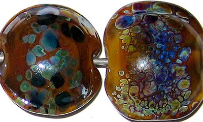
The addition of silver is a transformative experience for Steel Blue, making it look completely unlike itself.  Here, in the bead on the left you can see that the silver has turned gold, and wisps and webs its way over the surface of the bead.  You can also see, in that same bead, how the Steel Blue itself has gone super-dark, except in a couple of areas where the silver has blown a royal blue blush through it.  In the bead on the right, the silver leaf was reduced and encased, and all of the visible Steel Blue looks more of a royal blue colour than Steel Blue's typical, deeper hue.  Also in that bead, the silver has taken on a dull greyish-lavender colour.
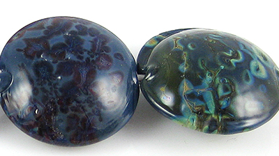

Steel Blue makes a very interesting base colour for silver glass. My TerraNova2 frit did all kinds of pretty blue and purple things on top of Steel Blue, and the reducing silver glass frit just went sort of crazy, and turned the visible surface of the Steel Blue base a kind of oily teal colour.  Nifty.  I particularly like the way the reducing silver glass frit has bloomed on top of the Steel Blue.


There is no noticeable reaction between Steel Blue and Tuxedo.


I love colours that make Copper Green do this.  A lighter, turquoise line springs up around Copper Green wherever it touches Steel Blue.  Also, the Steel Blue stringer lines and dots spread a bit on top of Copper Green and have more translucency than you'd expect. Some magical ingredient in th Steel Blue prevents Copper Green from getting that shiny, metallic patina on it, too. Other colours that spring to mind that are this much fun with Copper Green include Lauscha Cocoa, Lauscha Faded Rose, CiM Charcoal, CiM Ming (in it's own wacky way), REI Mystic Grey-Blue, Lauscha Olive and CiM Slytherin, although that's hardly a definitive list.  What do all of these colours have in common?  Good question.  Apart from how much they love Copper Green, I have no idea.


Opal Yellow is seriously yellow with Steel Blue.  And curdly when used underneath it.


On top of Steel Blue, Ivory gets a fine translucent line in the middle of stringer lines and translucent pinpricks in the centre of dots.  On top of Ivory, Steel Blue spreads out, a lot, and feathers its colour out into the Ivory base.  This is almost identical to the reactions I got with Lauscha Olive and Lauscha Cocoa when I used them with Ivory.

Nothing interesting to report with regard to White reactions except that when you use White on top of Steel Blue, be prepared for the White to look more blue than white, because the Steel Blue will bleed up through it and change its colour.

Here is a fun bead made with Steel Blue.  I've been using Steel Blue a lot in twisties and other organics, and I think I have a few other pictures I can include once I get the rest of my beads photographed.

September 26, 2010

Test Results :: Olive (Lauscha)

1 - Plain, 2 - Plain (reduced), 3 - w/ Silver Leaf, 4 - w/ Silver Leaf (reduced & encased), 5 - w/ TerraNova2 Frit, 6 - w/ Silver Glass Frit Blend (reduced), 7 - w/ Tuxedo, 8 - w/ Copper Green, 9 - w/ Opal Yellow, 10 - w/ Ivory, 11 - w/ White

General Impressions
Lauscha Olive looks almost black when it's hot. It is also a very stiff, very dense colour. It is a pleasure to use in stringer form because of its stiffness.

This colour is also very reactive, and does crazy things with other colours. I have not done my tests yet for CiM Olive (This is a thankless, endless job I've set myself! Someday I'll get to it) but I don't think the two colours, apart from both being a similar olive-y shade of green, have much in common. I don't expect CiM Olive to do the same kinds of weird, spready reactive things that this Lauscha Olive does, but I'm sure that it has compelling secrets of its own for me to discover.

My Lauscha Olive rods are pretty thick - possibly around 9mm in diameter. The glass is surprisingly not-shocky for its girth, which was also my experience with Lauscha Cocoa. After you've melted some of the rod and you reintroduce it to the flame you're likely to lose the tip of it, but apart from that it's smooth sailing with this colour.

Reactions

One of the things I'm discovering is that a lot of the colours that are full of endless organic fun do this blue thing with silver that you see in the bead on the right. On top of Olive, silver leaf melted in sort of disappears and forms some blue-ish blotches. Once the silver is reduced and encased, it forms a shiny armour-like patina over the Olive with a fumed blue haze around it.  Awesome.

The reactions with silver are NOT one of the ways Lasucha Olive and Lauscha Cocoa are similar. Olive is WAY nicer with silver and striking silver glass than Cocoa is.


I got better colour out of my TerraNova2 frit on top of Olive than I have with almost any other colour. Lauscha Olive is much nicer with the striking silver glass frit here than with the reduction frit blend.


Lauscha Olive is odd with Tuxedo only in that almost every other green that I have tried with Tuxedo has stirred Tuxedo into a crazy, webbing frenzy. With Olive, Tuxedo is simply a nice, crisp Black. The only strange thing I see in this bead is that where the Tuxedo and Olive portions of the bead met in the middle, the Olive is a bit lighter.

Whoah. I thought that Lauscha Cocoa was cool with Copper Green, but as cool as that reaction was, this one blows it away. On top of Olive, Copper Green develops a light outline, and then a silvery inner outline with a concentration of a darker teal colour in the centre.  Three rings for the price of one :)

On top of Copper Green, Lauscha Olive seems to spread a little and take on a faint translucency, and a light turquoise watercolour outline surrounds the Olive dots and lines.


On top of Opal Yellow, Lauscha Olive loses its vibrancy, and it does weird things to the Opal Yellow underneath it. The Opal Yellow on the right side of this bead almost seems to have a crack in it, but that's just a transparent crease formed by this reaction.

On the left side of this bead, the Opal Yellow dots and lines have developed a light yellow outline and the inside of them has blushed a pinkish orange colour. Another really cool reaction here.


On top of Lauscha Olive, Ivory develops a fine, translucent line in the middle of its dots and lines. On top of Ivory, Lauscha Olive loses its cohesion a little and bleeds. This reaction is pretty similar to what happened with Lauscha Cocoa and Ivory, although Cocoa is a little better at it than Olive is.


And finally, White separates a little on top of Lauscha Olive (but not as much as Ivory does) and Olive spreads on top of White (but not as much as on top of Ivory).

Fun beads with Olive:


August 3, 2010

Test Results :: Silver Brown

I'm sure this little problem is only going to get worse as time passes and more and more glass colours get created, but isn't it irritating how there is that tiny bit of overlap between manufacturers with regard to naming? The glass I'll be talking about in this post is Kugler Silver Brown (B-181) which used to be called Silver Cinnamon when it was distributed through Arrow Springs and was an ASK (Arrow Springs + Kugler) colour.  It should not be confused with Reichenbach Silver Brown or Dark Silver Brown, because those colours are completely different.
1 - Plain, 2 - Plain (reduced), 3 - w/ Silver Leaf, 4 - w/ Silver Leaf (reduced & encased), 5 - w/ Silver Glass Frit Blend (reduced), 6 - w/ Terranova2 Frit, 7 - w/ Copper Green, 8 - w/ Tuxedo, 9 - w/ Opal Yellow, 10 - w/ Ivory, 11 - w/ White

General Impressions
When it is hot, Kugler Silver Brown is transparent, but it cools to a yummy chocolate brown opaque. This colour is very reactive, and it is also quite soft.

My results with Kugler Silver Brown are not very reminiscent of pictures of other people's beads that I've seen using ASK Silver Cinnamon, but I guess batch-to-batch variability could be to blame for that, as well as my relative inexperience with the colour.  These are my first beads with Silver Brown, and there won't be many more since I've only got two short rods of it left.

Reduction
The effect does not photograph well, but in Beads #2 and #5, reducing the Silver Brown did result in a slight mirroring of the brown colour and a slight milkiness to its finish.  In Bead #4, where I reduced and encased the silver leaf, I feel sure that the blue colour is the result of the reduced and encased Silver Brown, but it's hard to be positive without more in-depth testing.

Reactions


In the bead on the left, the silver pretty much just balled up and didn't do much. However, in the bead on the right, reducing and encasing the silver on top of the Silver Brown resulted in something a little more noteworthy.  Th Silver Brown portions of the bead have turned blue, and the silver has stayed silver. Usually when I get blue in this particular test bead, it is the silver itself turning blue. I need to do some more work with this someday, but it seems like it might be the Silver Brown that turns blue here.


The colours and shine on the reduced silver glass frit in the bead on the left developed well too, but I don't much like that bead.  The bead on the right (in spite of its deformities) has something cool going on. Silver Brown is a GORGEOUS base for striking silver glass.  I got amazing colour out of my TerraNova2 frit on this colour.


Copper Green makes Silver Brown bleed. On the left side of the bead, dark brown halos surround the Silver Brown where it is on top of Copper Green, and brown smears mar the surface.  On the right-hand side of the bead, the Silver Brown infiltrates the Copper Green lines and dots, giving an aged effect to the scrollwork. This reaction probably has its uses, but I don't think I'm a big fan.  (To get a better look at the bead, click on it to see it enlarged)


On the left side of the bead, you can see how Opal Yellow likes to spread on top of Silver Brown.  The Opal Yellow stringer that I used was approximately the same diameter as all of the other stringers I use in this test, but when I used Opal Yellow on top of Silver Brown, the best word I can think of to describe the results is 'bulbous'. On the Opal Yellow side of this bead, an interesting, pinkish outline has formed around the Silver Brown that I find intriguing.  Silver Brown has more of a reddish hue when used with Opal Yellow.


This is my favourite reaction with Silver Brown so far. It's not every glass reaction combination that gives you three reactions for the price of one.

Putting these two colours together yields both a shimmering, thin silver outline AND a thicker black one. It happened on both sides of the bead, but doesn't look quite the same because the black part of the reaction happens next to the Ivory, whereas the silver portion of the reaction happens between the Black and the Silver Brown.  Neat, right?

Also. look at what happened to the Ivory on both sides of the bead. On the left, in the dots and lines, the Ivory has separated and formed a translucent line down it's center.  On the right side of the bead, it's curdled like crazy. Yum.


In this bead, White has separated a little and left a translucent outline around itself wherever the Silver Brown touches it. I've christened this the 'Milk Mustache' reaction. Like with Opal Yellow, Silver Brown has more of a reddish hue when used with White.

Here are some of the other beads I've made with this colour so far.
   

July 8, 2010

Test Results :: Split Pea

1 - Plain, 2 - Plain (reduced), 3 - w/ Silver Leaf, 4 - w/ Silver Leaf (reduced & encased), 5 - w/ TerraNova2 Frit, 6 - w/ Silver Glass Frit (reduced), 7 - w/ Copper Green, 8 - w/ Tuxedo, 9 - w/ Opal Yellow, 10 - w/ Ivory, 11 - w/ White

CiM Split Pea is an aptly named, medium spring green. I haven't used the Effetre greens much (Grass Green, Pea Green, etc), so I don't have a good baseline for comparison, which means I also don't have a lot of justification for my marked preference for the CiM greens. Split Pea, Sherwood and Dirty Martini are all greens that make me really happy.

Viscosity
Split Pea, like Sherwood and Poi, is sort of a sticky colour.  CiM Opaques seem to fall into two categories for me so far -- the stiffer, pasty ones, and the soft, sticky ones.

Reduction
Reducing Split Pea all by itself doesn't have any noticeable effect. (Bead #2)

Reactions

On top of Split Pea, silver leaf just sort of balls up and sits there, but there also seem to be some interesting, more yellowish striations in this bead and I'm wondering if the silver causes that.  In the bead on the right, with the silver reduced and encased, the effect is sort of like frost or unravelling lace.  Unlike with Sherwood, I didn't get any yellowing in the silver when I encased it.  (I use Effetre 006 clear for this test bead, every time now)


CiM Split Pea isn't as nice with silver glass as its friend Sherwood, but the TerraNova2 frit in the bead on the left did develop some colour, and the halos that formed around it are sort of cool.  The bead on the right, with the reduction frit, didn't really work out all that well.


Split Pea seems to have crazed my Copper Green... it's not sure whether it wants to be grey or turquoise and seems to be trying to be both at once.  The Copper Green lines and dots on top of Split Pea have a very crisp outline.


Tuxedo does not bleed with Split Pea the same way it does many of the other CiM greens.  I had a LOT of crazy bleeding with Elphaba Unique #2, and then a little with Sherwood and then almost none with Split Pea.


I was sort of hoping for the strange, neon outline between these two colours that I got in my Sherwwod test, but it didn't happen for me.  The only really unusual thing that happened here is that the Opal Yellow has separated so that it looks like it has two cracks running around the bead.


With Ivory, Split Pea is tons of fun.  If you look at the middle of this bead, you can see what happens when you heat these colours together enough to web.  There are more examples of this effect at the end of this post too.


And finally, you can get some interesting feathery webbing between Split Pea and White.

Here are some other beads made with Split Pea.  I made the swirly tube last fall, and then made the rest of the beads in the picture to match it for a custom order last month.  The swirly tube was originally made with (I thought) Okey Dokey Artichoky, but then when I tried to make the other beads to match it, the only colour I could find to match was Split Pea.  All of my attempts to match with Artichoky resulted in beads that were too blue or too light in colour. I had both colours in my working box at the same time, so now it's hard to know if I was confused when I thought I'd used the Artichoky and had in fact used Split Pea instead, or if the Artichoky just went like that and now only Split Pea will match it.

The colours used here in the rounds and lentil are Effetre Dark Ivory, Effetre Ivory, CiM Adamantium, CiM Split Pea, Silvered Ivory Stringer and a little Silver Leaf.


June 1, 2010

Test Results :: Sherwood

1 - Plain, 2 - Plain (reduced), 3 - w/ Silver Leaf, 4 - w/ Silver Leaf (reduced & encased), 5 - w/ TerraNova2 frit, 6 - w/ Silver Glass Frit Blend (reduced), 7 - w/ Copper Green, 8 - w/ Tuxedo, 9 - w/ Opal Yellow, 10 - w/ Ivory, 11 - w/ White

General Impressions
When I saw the rod colour of CiM Sherwood, a few other CiM colours popped into my mind as things that might behave similarly. It is a blue-ish green, darker and greener than Celadon. It is greener and lighter than Mermaid, bluer and darker than Split Pea and both lighter and bluer than Elphaba Unique #2.

Sherwood, in spite of those comparisons (and all of the other ones I'm likely to make as I write this) is sort of its own animal. The annealed beads are somewhat lighter and brighter than the rod colour, which is always an interesting surprise, and the reactions with other colours weren't quite like any of the other greens I've tested, but I've got something nagging at me, telling me that when I test Split Pea this weekend I will see some of the same reactions. I did a little work with Split Pea last year, before I was doing this testing thing, and the reaction Sherwood has with Ivory in particular gave me a feeling of deja vu.

The consistency of Sherwood is stickier and less stiff than a lot of other CiM colours. It's not as soft as Poi, it's not gelatinous like Desert Pink, and it's not uber-stiff like Mermaid, Celadon, Adamantium or a lot of the other CiM opaque colours.

Sherwood is full of interesting reactions. It really bears more study, but sadly, I don't have any left.


I keep toting this picture out, and it doesn't have any Sherwood in it, but it's the only bead picture I have with Petroleum Green in it, so I need to show it again. The bead on the left is Mermaid and Copper Green, and the bead on the right is Mermaid with Petroleum Green. The reason I am showing it is to illustrate how much brighter and greener Sherwood is than Petroleum Green, because someone looking at these pics might otherwise think that Sherwood is just a new Petroleum green, but it's not really the same, either in colour or in how it feels when you work it.

Reactions

Silver balls up and disappears on the surface of Sherwood the same way that it did for me with Celadon and Mermaid (although Mermaid also discoloured, which Sherwood did not do). When I reduced and encased the silver, I got a little bit of yellowing. This was faintly reminiscent of my experience with Celadon, only far less dramatic. It's an interesting effect, and when combined with other kinds of encased elements might be really interesting.


Sherwood makes a surprisingly good base for Silver Glass. I say surprising only because my personal experience has not led me to expect greens to be really cooperative when used this way. I got great colour (for me) out of my TerraNova2 frit on the bead on the left, the halos that appeared around it are pretty cool.  I also really like the way the reduction frit spread out on the bead on the right. These reactions were a little reminiscent of what I got with Elphaba Unique #2, but better.


Sherwood isn't so nice with Copper Green. The Copper Green went all pinky-silver and strange-looking, and the Sherwood developed a thin dark line down the middle. This bead could probably be improved by etching the Copper Green yuck away though. Celadon and Elphaba Unique #2 made Copper Green do this too, but both had some redeemingly interesting reactions in the bargain which Sherwood didn't manage.


Tuxedo bleeds just the faintest bit when it's put on top of Sherwood. You can see some halos around the stringerwork on the right-hand side of the bead. Sherwood does that thin green line separation thing on top of Tuxedo. Sherwood, on the whole though, holds its own against Tuxedo, where Celadon let more of the Tuxedo in, and Elphaba Unique #2 rolled over and let the Tuxedo dribble all over it.


Sherwood is the first colour I've tested to do this weird thing with Opal Yellow, but I wasn't using Opal Yellow in my baseline when I tested Mermaid or Celadon. The Opal Yellow on the left side of the bead has developed a neon green outline, and in the centre of the bead where the two colours meet, there is some decided webbing. You can see on the right-hand side of the bead, too, where there is a small amount of bleeding of the Sherwood into the Opal Yellow -- just the faintest green halo around some of the lines.


On top of Ivory, Sherwood does a couple of interesting things. First, it got an olive green webby line around the lines and dots that I put on. I am accustomed to a brown line reaction, or a black line reaction, or even a grey line reaction, but this is the first time I've managed a green line reaction. On top of Ivory, Sherwood also got that dark green line down the centre of the stringerwork.

On top of Sherwood, Ivory separates and develops a thin, translucent line down the centre, and goes dark around the edges, but that darkness just looks like a deeper green without much in the way of discolouration. The Sherwood did, however, get really streaky underneath the Ivory.

The best part of the reaction between these two colours has to be the odd, olive-coloured webbing in the centre of the bead. I like this reaction an awful lot.


And finally, on top of White, Sherwood does that dark-line-in-the-middle thing. White on Sherwood isn't all that interesting, but the way the two webbed in the centre of this test bead certainly is.

I managed to make a couple of fun things with my Sherwood last weekend, and here they are.