Search This Blog

Showing posts with label Turns Copper Green shiny. Show all posts

October 29, 2014

Test Results :: Tangerine Sparkle

1 - Plain (reduced), 2 - Plain, 3 - w/ Silver Leaf, 4 - w/ Silver Leaf (reduced & encased), 5 - w/ Silver Glass Frit (reduced), 6 - w/ TerraNova2 Frit, 7 & 8 - w/ Tuxedo, Copper Green, Opal Yellow, Ivory, and Peace

I really love Vetrofond Tangerine Sparkle (944). I think that it is one of the Vetrofond colours that I am going to miss the most once I've used mine up completely. It is a bright, translucent, striking orange that is easy to get and keep orange, and doesn't turn red on me.  You can still find this colour for sale if you look really, really hard, but most vendors in North America have been out of it for quite a while.

Reducing Tangerine Sparkle without any additives does not seem to have any impact at all on the colour. Deep in the Tangerine Sparkle, as you might imagine, there are sparkles. Teeny, tiny sparkles all through it that glisten in the light.  You can only sort of see them in the photos, but they are beautiful in person.


Tangerine Sparkle is sort of interesting with silver.  In the leftmost bead, the silver has turned blue in spots and grey in other spots. It has also coalesced in little groupings of tiny silver beads in a really attractive way.  In the bead on the right where I reduced and encased the silver, everything that is beautiful about silver on Tangerine Sparkle left the building and it is just sort of mottled and grungy looking.


Tangerine Sparkle makes a surprisingly good base for silver glass.
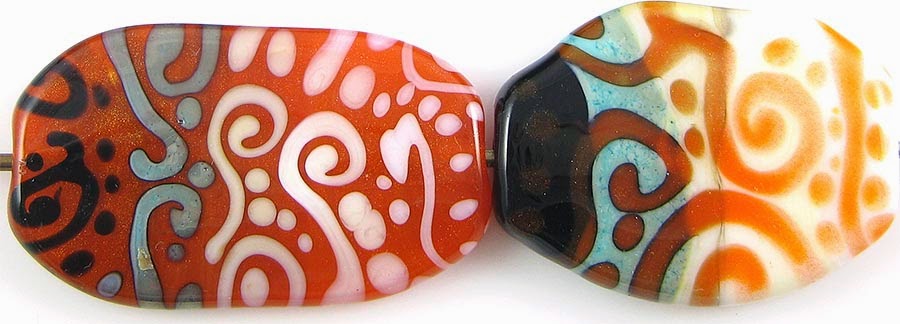

Copper Green and Tangerine Sparkle have a reciprocal dark line reaction.  When Copper Green is used on top of Tangerine Sparkle, it gets sort of weirdly shiny, and when Tangerine Sparkle is used on top of Copper Green, the Copper Green seems to keep its turquoiseness and not get as much greyish sludge developing on its surface as it does with some other colours.

On top of Ivory, Tangerine Sparkle thins out a little, losing some of its opacity.

Apart from those things, not much of interest happened in these test beads.


Here is a goddess bead made with Tangerine Sparkle.  In person, she almost looks like she's been built out of glistening orange nail polish.

This little set is Tangerine Sparkle with Ivory, SiS, Light Turquoise, and a touch of Light Teal.


May 9, 2014

Test Results :: Isar Blue

Kugler Isar Blue is a really beautiful blueish teal opaque glass. This particular batch is a hair bluer and a hair darker than it was when it was marketed by Arrow Springs as ASK Aloe Vera, but that may just be a batch variation thing with the particular rods that I have purchased, because it is meant to be the same colour.

1 - Plain, 2 - Plain (reduced), 3 - w/ Silver Leaf, 4 - w/ Silver Leaf (reduced & encased), 5 - w/ Reducing Silver Glass Frit, 
6 - w/ TerraNova2 Frit, 7 & 8 - w/ Tuxedo, Copper Green, Opal Yellow, Ivory, and Peace

I see ASK glass being sold for more than $80/lb, and I don't really understand why people would want to spend that when they can buy the new batches of the same colour numbers for less than $50/lb. I hope it is because those older batches have something really special and not that it is being sold to newer beadmakers who just don't know any better.

Anyway, I suppose I should just try to focus on the glass.


When you reduce Isar Blue, it develops a schmutzy, unbeautiful, greyish film. This is the same kind of film that develops on top of Copper Green and Dark Turquoise, except that it only happened with this colour when I reduced the glass. Normal working conditions don't seem to produce this effect.

Isar Blue is a fairly streaky colour, so if you're looking for perfect uniformity, you should find something else to melt.


Silver doesn't do anything too weird when it is left on the surface of Isar Blue, but if you reduce it and encase it after adding the silver leaf, Isar Blue undergoes a pretty weird transformation to a yellowish, alien green.


Isar Blue is a gorgeous base for silver glass. I got brilliant colour out of my TerraNova2 frit.  Unfortunately, its blueish greenness doesn't do much for reduction colours -- at least not reduction colours of the blue and green-hued variety. There just isn't enough contrast.


As I mentioned, Isar Blue is a pretty streaky colour, and you can see that pretty clearly in these test beads.

On top of Tuxedo, Isar Blue develops a concentrated dark line in the centre of dots and stringer lines.  When Tuxedo is used on top of Isar Blue, the Isar Blue rises up arouond it in little halos.

Copper Green and Isar Blue have similar reactions - on top of Copper Green, Isar Blue separates and forms a concentration line, and when it is used on top of Copper Green, little halos of Copper Green pop up around it. On top of that, the Copper Green develops a pinkish hue and goes sort of shiny.

Isar Blue bleeds into Opal Yellow when used on top of it.  When Opal Yellow is used on top of Isar Blue, no real reaction is visible.

Isar Blue and Ivory form a dark line reaction.  When the Isar Blue is used on top of Ivory, the line is subtle and sticks close to the Isar Blue. When Ivory is used on top of Isar Blue, the line is wider and lighter in colour.

I didn't notice much of a reaction between Isar Blue and Peace in either bead.

Here is a Goddess Bead and an Organic Lentil using Isar Blue. I really enjoy this colour! Even by itself in the Goddess bead, you can see all kinds of fun streakiness and curdling.


October 23, 2011

Test Results :: Sunshine

1 - Plain (reduced), 2 - Plain, 3 - w/ Silver Leaf, 4 - w/ Silver Leaf (reduced & encased), 5 - w/ Silver Glass Frit (reduced), 6 - w/ TerraNova2 Frit, 7 & 8 - w/ Tuxedo, Copper Green, Opal Yellow, Ivory and Peace

Vetrofond Sunshine is a vibrant, pure yellow. It reacts in ways that I consider predictable for an opaque yellow glass and while the rods can be a little shocky, and if you get it too hot it boils, it is not an unpleasant colour to use.

One of the tricky things about Vetrofond Sunshine is how grainy it is when it's hot. It's a hard colour to get good coverage with in thin layers, making dots and stringer lines of it on top of other colours sort of mottled and untidy.


Silver spreads out on top of Sunshine and turns a silvery brownish colour, keeping its shine. The Sunshine underneath fumes a deeper, brownish colour. I put additional dots of Sunshine on top of the silver in the bead on the left, and they stayed mostly yellow, but do have a greenish tinge to their edges and have a distinct line around them where the silver has grudgingly given way. In the bead on the right, the reduced and encased silver has taken on a sort of ethereal bent on top of the Sunshine, turning faintly blue and pink in places. If the ethereal pink and blue covered the whole bead, it would be attractive. If that is achievable every time with more careful application of the silver, that would be pretty neat. More experimentation required.


On top of Sunshine, I got really nice colour and coverage with my reducing silver glass frit, and a nice variety of blues and greens popping. In the bead on the right, my TerraNova2 frit is largely unspectacular, although I did get some colour here and there. This is a colour that seems to be a better base for reduction colours. If only it weren't yellow.

On top of Tuxedo, Sunshine looks sort of livid and splotchy. Tuxedo dots and stringer lines on top of Sunshine cause a little activity in the Sunshine underneath and receive a faint yellow outer ring.

Copper Green and Sunshine have a reciprocal dark line reaction. When Sunshine is used over Copper Green, that dark line is brown and spready, engulfing and transforming most of the Sunshine dots and stringer lines so that they look more brown than yellow. When Copper Green is used over Sunshine, it develops an army green shiniess and a black outline.

Something about using Sunshine with Opal Yellow made my Opal Yellow do some very strange greying things, in both of the test beads.

There is not much in the way of reaction between Sunshine and Ivory, but when Sunshine dots and stringer lines are made on top of Ivory, the yellowness of the Sunshine seems to creep into the Ivory, leaving what is left of the Sunshine looking more of a mustard colour and making the Ivory seem more yellow. The same effect in reverse is visible when Ivory stringer dots and lines are placed over Sunshine.

Peace and Sunshine also seem mutually reactive, but there are multiple things going on so it's hard to describe. The Peace seems to separate, both when Sunshine is on top of it and vice versa, but the two colours in combination also cause some greying/blotchiness. It's not attractive, so I'm not bothering to analyze it further.

Here are some fun rainbow beads with Sunshine. Apart from hiding it in vine cane, the only thing I can ever really think of to do with a yellow this bright is to put it into rainbow beads. When I make rainbow beads with an opaque yellow in them, I need to be careful because yellows, like Ivory, don't usually react particularly nicely to greens. To proactively solve this problem, I encase my Sunshine with Reichenbach Mystic Yellow, which is a yellow translucent that does not have that problem.

September 16, 2011

Test Results :: Caribbean

1 - w/ Silver Foil (encased), 2 - w/ Silver Leaf, 3 - w/ Silver Leaf (reduced & encased), 4 - w/ Silver Glass Frit (reduced), 5 - w/ TerraNova2 Frit, 6 - w/ Silver Glass Frit Stringer (encased), 7 - Plain, 8 - Plain (reduced), 9 & 10 - w/ Tuxedo, Copper Green, Opal Yellow, Ivory and Peace

CiM Caribbean is a pretty medium blue colour, a touch darker than Effetre Medium Blue, and quite a bit lighter than CiM Sapphire.  It also seems like it might be a hair on the greener side than Sapphire is. It is a pretty colour that is fairly stable, not reacting strongly with other colours.

I found Caribbean a relatively pleasant colour to use, although it is a little easier to boil than I really like. Working higher up in the flame solves this problem.  I only really had trouble with it when I was using it as stringer or heating the end of the rod specifically to make dots.


Silver Foil stays mostly silver when it is encased with Caribbean, although you can see that there are a couple of gold patches in the left-most bead. Putting silver on top of Caribbean makes it darker. The bead on the middle here is far darker in colour than the bead with the silver foil in it, with smudges and sprays of silver wandering over its surface. When this combination is reduced and encased, the Caribbean lightens back up so that you can see through it again and the silver takes on all kinds of attractive blue colour.

These last two reactions are pretty similar to what I experienced with CiM Sapphire.


Silver Glass Reduction Frit is pretty on top of Caribbean, but I didn't get much colour out of my TerraNova2 Frit on top of it. The bead with the silver glass frit stringer is interestingly streaky, but I didn't get any really interesting effects in it.  In terms of the reactions I have seen with other colours, this one was only moderately successful.


Unlike Sapphire, Caribbean does not turn orange when used on top of Copper Green.  It does develop a faint dark line reaction with Ivory, and it almost disappears on top of Peace.

Tuxedo is faintly translucent on top of Caribbean, Copper Green turns shiny and orangey when used on top of it. There were no really obvious reactions when Opal Yellow, Ivory or Peace were used on top of Caribbean.

Some fun beads with Caribbean:
 

August 16, 2011

Test Results :: Submarine

Warning: Very Yellow


1 - Plain, 2 - Plain (reduced), 3 - w/ Silver Leaf, 4 - w/ Silver Leaf (reduced & encased), 5 - w/ TerraNova2 Frit, 6 - w/ Silver Glass Frit (reduced), 7 - w/ Tuxedo, 8 - w/ Copper Green, 9 - w/ Opal Yellow, 10 - w/ Ivory, 11 - w/ Peace

I'm going to admit right off the bat that I really don't like this colour very much, but I think it's because it is disinclined to look nice in the kinds of beads I customarily make. It is also a really bright colour, and semi-opaque, two categories of colour that I find a little challenging. I did manage to figure out a way to make this colour work for me, which you will see if you read on.

CiM Submarine is sort of a loud yellow with greenish overtones, and is not really very opaque.  It's also, however, not very semi-opaque and it would be more accurate to describe it as a 'streaky opal' colour.  While working, Submarine is a little sensitive to boiling, although you can't really tell in the finished beads.  Working a little higher up in the flame solves this problem.

Submarine is a limited run, so if you like what you see here know that it will not be available forever.


When silver leaf is melted into the surface of Submarine, it turns a dark brown colour. This is very similar to how silver reacts with Ivory, however since Submarine is of a completely different consistency, instead of curdling and webbing, Submarine just changes colour.  With the addition of silver, the colour of Submarine deepens and becomes somewhat more subdued.  Good to know :)

When the silver is reduced and encased, it becomes an earthy brown colour.


Silver glass frit reacts and develops colour on top of Submarine nicely, but the colour of Submarine doesn't really match most silver glass colours.  I particularly like the thin whiteish lines that developed around the edges of the reduction frit in the bead on the right.


Tuxedo bleeds into Submarine, turning it a greenish colour.


Copper Green goes very pinkish and shiny when used with Submarine.  A reciprocal dark line reaction develops between these two colours which is pretty interesting.  I actually really like the left side of this bead, with the Submarine on top of Copper Green.


Submarine bleeds a little into Opal Yellow (you can see yellow outlines around the stringer work on the left side of this bead), and a faint dark line that looks like a shadow sprang up around the Opal Yellow stringer work on the right-hand side of this bead.


Submarine bleeds into Ivory.  If you enlarge this picture, you will see what I mean.  The bleeding is pretty uniform, and surrounds the stringer work on both sides of the bead.


With Peace, the same bleeding effect happens as with Ivory, only it is more pronounced.  The Peace stringer lines on the right side of this bead looks more yellow than white.

It is really hard for me to make nice beads with bright colours, and this one was very challenging for me.

Here is all I was able to manage.  I prefer the Submarine inside other colours in cane where it is not quite as livid.  In the bead on the left, it is the middle of the cane used in the bead's core, but is also the yellow around the 'wings'.  In the bead on the right, the whole bead was made on a base of submarine with some of the cored cane, a twistie and some SiS.

August 28, 2010

Test Results :: Maple

1 - Plain, 2 - Plain (reduced), 3 - Over Clear, 4 - w/ Silver Leaf, 5 - w/ Silver Leaf (reduced & encased), 6 - As Frit Stringer (silver glass frit), 7 - w/ Silver Glass Frit (reduced), 8 - w/ TerraNova2 Frit, 9 - As a Floral (over white), 10 - w/ Copper Green, 11 - w/ Ivory, 12 - w/ Opal Yellow, 13 - w/ Black

General Impressions
CiM Maple is a gorgeous, dark brown transparent. It does not tend towards orange the way the Effetre Topazes do, and it avoids being super-reactive the way Effetre Light Brown Transparent is. It is not completely non-reactive, but the reactions are not very dramatic, either. Maple is a fairly stable colour.

The colour of Maple after melting it is FAR DARKER than the rod colour would lead you to believe.  The unmelted rod colour is similar to how Maple looks when it is applied over Clear, but once melted the colour of Maple significantly darkens.


Maple has a beautiful consistency, and is a nice, stiff transparent colour to work with. It also doesn't bubble easily, unless you overheat it in a determined sort of way. I did get a few bubbles in my Maple dots on various beads, so I'll be more careful not to overheat my stringer next time I use Maple.


Maple lightens up considerably over Clear or White, and doesn't lose its essential 'brownness' when it does so.

Reactions

The silver reaction that I got with Maple is sort of a first for me.  The melted in Silver Leaf in the bead on the left has turned a strange rose colour.  Leaf, reduced and encased in the bead on the right didn't do much of note.  It does have an interesting, eggshell look to it though.


In the bead on the right, the silver glass frit blend has acquired a nice shine, and some of the pieces have developed a bit of an inner halo.

In the bead on the left, I took a gather of maple, dipped it in the silver glass frit blend and pulled it into thick stringer.  I then used that stringer to encase a base bead of Maple and then encased the whole thing in Effetre Clear. I got a moderate level of streaky visual interest in the resulting bead.  I say moderate, because this is what I'm usually hoping for when I do this test:


Maple was unremarkable with TerraNova2 frit, so I won't talk about that.


The Copper Green in this bead is unusually shiny, an effect that I am blaming on the Maple.


Over Ivory, Maple separates just a little and seems a bit streaky. Ivory seems to get a little shadow around it on top of Maple, but it is not a significant reaction.

Here's a fun bead with Maple.