June 8, 2021
First Look :: Pink Pansy
April 18, 2021
First Look :: Burnt Sugar
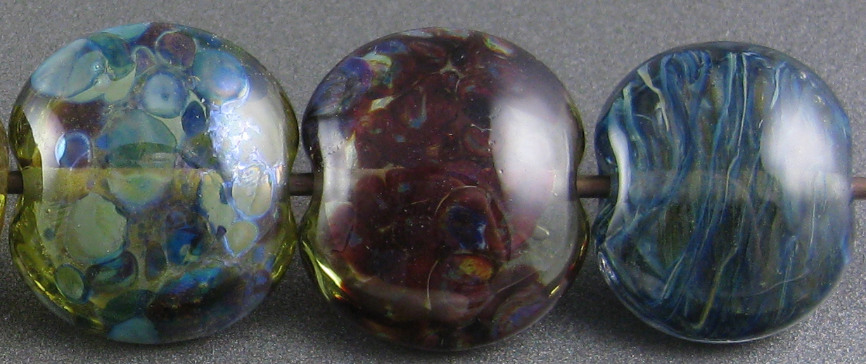
CiM Burnt Sugar (CiM733) is a brown transparent glass that is a pale brown in thin layers. Like all transparents, the more of it is bulked together, the darker it is.
On top of Burnt Sugar, silver foil looks amazing.
Because Burnt Sugar does such amazing things with silver, I thought it might be a good candidate for using with silver glass frit in stringer, but unfortunately the reaction is so strong that the results are too dark to be interesting.
I'll show you two other tests like this from the new batch of colours in future posts, and you'll see what I was hoping for here in one of them.
This colour melts like butter, and although it is possible to boil it if you hold a thin stringer directly in the flame, it is very nice to work with. In thin layers, it is a gorgeous pale brown, and in thicker layers, a deep brown. The denser the Burnt Sugar, the darker a bead made entirely of Burnt Sugar will appear.
Here's Burnt Sugar in a group with many of the other colours from this batch of Limited Runs:
May 1, 2020
Test Results :: Black Marble
Effetre Black Marble (EFF774) is a streaky, dark brown-black colour that has the same consistency as Effetre Dark Ivory. Also like Dark Ivory, it does a crazy reticulation thing that looks like little cells of different shades of brown and ivory in between veins of darker colour. It's in this glass' reactions to other colours where some big differences lie.
On a bit of a side note, this colour does not look like marble, and it is also not really black. It's more of a 'rich farmland soil' kind of dark, streaky brown.
Black Marble doesn't really change much when it is reduced. It's possible that the bead on the right got a bit darker, but it's hard to be sure since this colour has so much variation anyway.
Here I did Black Marble as stringer (wrapped about three times) on the left side of the bead and then the same amount of Silvered Black Marble on the right side. The silvered stringer is darker overall (my best guess is that the silver reacted with whatever ivory-like glass forms the lighter streaks?) and has tiny flecks of silver in it that make me happy. I made the Silvered Black Marble the same way I make Silvered Dark Ivory.
I sort of expected this colour to behave the same way with silver as light and dark ivory glasses do, but I was wrong. The silver leaf on the surface of this colour is a more interesting light golden hue. When I reduced and encased the silver, the golden-ness went away and it blushed blue in places which I have not had it do with ivory glasses.
Silver glass is very beautiful on top of Black Marble, which seems to make a decent base colour for both reducing and striking colors.
Black Marble has a much milder version of the same reaction profile as Ivory - which is to say that it does a gentle dark line reaction with Copper Green, and it is also gently reactive with Opal Yellow. Because both colours are spready, you can see where Ivory and Black Marble were used together that there is some interesting bleed at the edges of the stringer dots and lines.
My most important takeaway from these beads is that Black Marble is really awesome as stringer.
Here are some other beads that include Black Marble:
May 28, 2018
Test Results :: Sacre Bleu
CiM Sacre Bleu (CiM555) is a gorgeous, vibrant, dark blue transparent. It's buttery to work, and its only real vulnerable spot is that it can be a little bit vulnerable to sooting if you work it too hot. It's interestingly reactive, it makes a nice base for silver glass, and just a beautiful colour of blue.
Here, you can see that although Sacre Bleu is essentially the same colour as Effetre Intense Blue, it's just a bit more saturated, working up darker. It's not quite as dark or as saturated as Effetre Cobalt, but its reactions are more similar to that colour.
Sacre Bleu does not change when it is reduced.
For some reason, silver leaf turned yellow and blue on top of Sacre Bleu. I looked back at previous test results, and this reaction is pretty consistent with what I saw when I tested Effetre Cobalt, so they must contain some similar ingredients.
The way silver glass develops colour on top of Sacre Bleu also bears some similarity to how it behaves with Cobalt. The reduction frit got pretty colour and interesting edges, and the TerraNova2 frit developed colours, but mostly in the burgundy/purple range.
Using Sacre Bleu over light colours reveals its true nature. It's not as saturated as Effetre Cobalt, but it is more saturated than Effetre Intense Blue.
Like Effetre Cobalt, Sacre Bleu causes separation reactions in Copper Green, Opal Yellow, Ivory, and Peace.
Here is Sacre Bleu in some fun beads.
November 6, 2017
Test Results :: Enchanted
CiM Enchanted (CiM626) is a pale lavender-pink transparent. I found this colour a little boily/scummy, but not as troubling in that respect as the new CiM Venus, which I reviewed a few weeks ago.
Here is Enchanted with Effetre Rosata Extralux, Pale Amethyst, Dark Lavender, and Pale Lavender Blue, and with CiM Pink Champagne. Enchanted is pinker than Effetre Dark Lavender in this studio-lit photo, but is around the same shade of pinkish lavender in natural light.
Enchanted is quite a bit more reactive with silver than Dark Lavender, which I found interesting since I thought they would work up similarly. Enchanted seems to fume a deeper rose colour with the addition of silver, and encasing silver foil with Enchanted will turn the silver foil golden. Effetre Dark Lavender did not substantially alter the colour of silver and didn't change colour itself when used with it.
The leftmost bead where I used my reduction frit blend turned out sort of pretty, with the fritty bits developing diverse blues and purples, but they did that without getting any nifty outline and without developing much of a sheen. The other two beads did nothing worth discussing.
And while Enchanted is fairly reactive with silver, it's not very reactive with these other colours I tested it with. Apart from some separation of Copper Green and Ivory when they're used on top of Enchanted, I didn't observe much in this way.
I didn't make any other beads with Enchanted yet, but if I do, I'll come back and update this with pictures. On the whole, I thought this colour was pretty, but I prefer the price, consistency, and workability of Effetre Dark Lavender. I'd choose this one instead only if I were planning to also work with fine silver and wanted the reactions.
October 16, 2017
Test Results :: Venus
CiM Venus (CiM911) is meant to be a transparent coral, and I can see on the CiM page that some people had that experience with it, but for me this colour ended up a light peach rather than a coral and lost its pink blush while I was working it. Since I tend to work a little on the hot side, I'm guessing it is the blasty heat that kills the pink.
I found Venus quite difficult to work with. While I tend to struggle with a lot of the light transparent colours, this one was a real monster for me, bubbling no matter how high in the flame I tried to work with it. So, heat it slowly and carefully, and maybe you will have better luck than I did.
Silver leaf fumed blue for me on top of Venus, and when I encased Silver Foil with Venus it turned gold. Reducing and encasing silver leaf on top of Venus didn't yield anything particularly interesting - the silver turned a greyish colour with hints of blue here and there where there was a break in silver coverage.
I found Venus to be an unexpectedly nice base colour for silver glass. My reducing silver glass got all ethereal and billowy on top of this colour, and I got a pleasing starting strike from my TerraNova2 frit. My reduction frit stringer test was also moderately successful, with lots of swirling blues and turquoises.
Venus is not very reactive with other colours, although Copper Green and Opal Yellow both separate on top of it.
It does a similar thing over Copper Green to what I observed with Dark Lavender, really picking up any red streaks in the CG and showing quite deeply coloured on top of it. This is a fun effect that isn't really a reaction, and I am pondering ways to exploit it. I wonder if flowers made with Copper Green petals overdotted with Dark Lavender or Venus would be pretty?
I didn't have much interest in making additional beads with Venus after the way it misbehaved on me, but I still have almost a full rod and may revisit it in the next few weeks. If so, I'll come back and update with pictures.
August 8, 2017
Test Results :: Peridot
CiM Peridot is a pale spring green colour, and is like a paler version of CiM Mojito, and somewhat less yellow. It's a bit less reactive than Mojito, and is a pretty, unique addition to the 104 colour palette.
Like other colours in this hue group, Peridot is quite reactive with silver. You can see in the leftmost bead that silver turned this colour an interesting colour of brown when used on the surface. When the silver was reduced and encased, that brownness is not in evidence and the silver seems to have dispersed itself uniformly all over the surface, forming a snowy blanket under the clear encasement layer.
Peridot turns silver a pretty golden colour when you use it to encase silver foil.
Peridot is a pretty base for reducing silver glass frit. Peridot makes an average base colour for striking silver glass and does the fun silver glass frit stringer thing that I like to do with reactive transparents in a streaky blue way.
With other colours, Peridot is not particularly reactive. It's definitely not one of the colours that helps keep Copper Green clean,
August 2, 2017
Test Results :: Yangtze
CiM Yangtze (CiM457) is a pale yellow that is supposed to be a streaky colour, but in my beads ended up looking a bit more 'murky' than 'streaky'. It is interestingly reactive, in the same colour family as colours like Effetre Straw Yellow, Light Brown Transparent, and Pale Green Apple and CiM Mojito. It's wonderful with silver.
Overall, I'm not a huge fan of this colour. If I were wanting to use something this shade of yellow, I'd much sooner use the pretty, smooth, semi-opaque Cornsilk or the entirely transparent Effetre Straw Yellow. The streakiness of Yangtze is not very pronounced, and the streaks are not a very interesting colour. I wonder if I would like it better if the streakiness were a pretty warm colour like pink or orange?
Reducing doesn't change the colour of Yangtze.
With silver, Yangtze is sort of awesome. In the leftmost bead, you can see that my silver leaf really crusted up and took on a bluish appearance. When I reduced and encased the silver leaf in the middle bead, the lumpiness of the silver went away and it smoothed out into a greyish blanket over the Yangtze with blue fume in the gaps where no silver covers the base.
In the rightmost bead, where I encased silver foil with Yangtze over a base of Yangtze, my silver turned a deep golden colour.
In the bead on the left where I reduced silver glass frit on top of Yangtze, my silver glass fritty bits threw an iridescent outline around themselves in addition to sheening up themselves. I got a pretty starting strike from my TerraNova2 frit on top of Yangtze in the purple ranges, but not anything outstanding.
In the bead on the right, you can see that Yangtze can be used to create a fun subterranean streakiness when it's pulled into stringer with reducing silver glass frit, used to encase a bead, and then encased with clear. I love this effect. The colours I got with Yangtze are less bright than the colours I've achieved with some other colours in the same colour family, but I am always excited when a colour will cooperate with me and do this.
While Yangtze is fun and reactive wtih silver, it's not particularly reactive with other colours. I got some separation with Copper Green, Opal Yellow, and Ivory but that's about it.
I didn't make any other beads with Yangtze.