Search This Blog

Showing posts with label Turns unreduced silver pink. Show all posts

November 16, 2012

Test Results :: Dark Silver Plum

1 - Plain, 2 - Plain (reduced), 3 - w/ Silver Leaf, 4 - w/ Silver Leaf (reduced & encased), 5 - w/ Silver Glass Frit (reduced), 6 - w/ TerraNova2 Frit, 7 & 8 - w/ Tuxedo, Copper Green, Opal Yellow, Ivory and Peace

Effetre Dark Silver Plum is a colour that requires some practice to get right, I think. I was not able to get the gorgeous rainbow oilslick colours that I have seen other people get with this colour, although I did get some hints of it in my goddess (see the bottom of this post). I haven't tried Dark Silver Plum in shard form, and a lot of the really beautiful things I've seen other people do with it have involved blowing it into thin shards and applying those to the bead.

Regardless, I did make some interesting discoveries about Dark Silver Plum, which I will share with you.


In the bead on the left, I applied silver leaf to the bead, burnished it in and then melted it off. Where the silver leaf touched the bead, the metallic sheen on the Dark Silver Plum is a markedly lighter colour of pinkish purple, and in some places has turned an orangey pinkish colour. This is sort of a cool development.

When the silver leaf is reduced and encased, it forms a pale lavender blanket over the Dark Silver Plum and retains some of its shininess under the clear.


My reducing silver glass frit got beautiful colour on top of Dark Silver Plum, and I got pretty neat results from my TerraNova2 frit as well although it's so dark that it's hard to see it properly. Dark Silver Plum seems to be a decent base for silver glass colours.


Dark Silver Plum is a surprisingly unreactive colour, however there are some interesting take-aways from this set of tests.
  • When Tuxedo is used on top of Dark Silver Plum, a webby outline forms around it, that is bounded by a dark line.
  • When Copper Green is used on top of Dark Silver Plum, a dark outline forms around it. On top of Copper Green, Dark Silver Plum seems to separate slightly.
  • When Peace or Ivory is used on top of Dark Silver Plum, a dark line develops around the dots/lines and the Dark Silver Plum shininess coalesces into a silver coating around the edges of that dark line. This is by far the most interesting reaction.

Here are some fun beads with Dark Silver Plum:
The goddess bead is all Dark Silver Plum. I didn't get so much of the rainbow effect that some other people get, but I did get some hints of it. The glass is curiously matte-yet-shiny.
Here, I've used Dark Silver Plum as the border/edguing for this bead.

September 16, 2010

Test Results :: Mojito

1 - Plain, 2 - Plain (reduced), 3 - Over Clear, 4 - w/ Silver Leaf, 5 - w/ Silver Leaf (reduced & encased), 6 - Over Silver Foil, Over Itself, 7 - Over Ivory as a Floral, 8 - w/ Silver Glass Reduction Frit, 9 - w/ Silver Glass Reduction Frit, 10 - w/ TerraNova2 frit, 11 - w/ Tuxedo, 12 - w/ Copper Green, 13 - w/ Opal Yellow, 14 - w/ Ivory, 15 - w/ White


General Impressions
Until recently, it had been a while since I fell in love with a colour and I didn't really expect to love CiM Mojito, but I totally do.

Mojito looks yellowish-orange when you're working it which is a little freaky. It also seems sort of opaque when you put it on top of another transparent colour when both colours are hot. But, as promised by the rod colour, Mojito is a transparent light yellow-green that is deliciously reactive.

In spite of how light it is, Mojito is still very much present in thin layers. In this floral, I've used it on top of Ivory.
Mojito is just a little too stiff to be paired with Ivory for flower petals, but I like the colour of the Mojito over Ivory very much. Perhaps I'll give it a shot with Vetrofond Ivory once I've managed to get my hands on some more of it, since it's a little stiffer than its Effetre cousin.

Mojito has a beautiful consistency, similar to Maple. It is nice and viscous, making it easy to work with. It is a little more prone to bubbling and boiling than Maple, but still well within happy working ranges for me. That said, it was hard to avoid having at least some bubbles in my Mojito beads. Stringers of Mojito boil a little more easily, so you need to be careful to heat them at the outer edge of the flame, a little higher up than you might with other colours.

Many people compare Mojito to Effetre Pale Green Apple, but even though both colours are a pale, yellowish green, Mojito is a little less slime-green and a bit more muted than Pale Green Apple. I think this is great, because I prefer the more sedate hue of the Mojito.

Reactions


On the left, I've included a photo snippet of a bead I made with Pale Green Apple and silver glass reduction frit. On the right is a similar swath of a bead made with Mojito and a slightly different frit blend. I make these kinds of designs by pulling frit stringer with silver glass reduction frit and then using that stringer to encase a core bead. Another colour I have found to react this way so far with the reduction frit is Light Brown Transparent.

Because the frit I used in both cases was not identical, I'm not sure how much of the difference here is because my 'everything' frit blend has changed over time and how much is native to the glasses. Regardless, both effects are really cool.


Mojito is sort of weird with silver. Weird in a good way.

In the first bead, I put silver leaf onto the bead in an unconventional way because I didn't have enough glass on the mandrel after putting on the leaf and had to swipe on more glass and then add more silver. This has resulted in a very strange-looking creation indeed because the middle of the bead has fumed almost brown and there are silver splatter patterns all the way through the bead that range in colour from greenish-brown to greenish-aqua. The silver that remained on the surface inexplicably turned a shiny pinkish colour. Freaky.

In the bead in the middle, silver leaf reduced over Mojito and then encased with Moretti clear resulted in a shiny silver coating with hints of blue.

In the bead on the far right, silver foil turns brownish gold when encased with Mojito.


The reduced silver glass reduction frit over Mojito combination in the bead on the left doesn't really do a lot for me. With colours like Mojito, I prefer to use my silver glass reduction frit in frit stringers as described above.

In the bead on the right, I used TerraNova2 frit over the Mojito and am pleased with the range of blues and purples I got from it.


With Tuxedo, Ivory and White, Mojito doesn't really have much of a reaction.

On top of Mojito, Copper Green develops a strange, shiny ring around it. Where I put Mojito over Copper Green, it seems to have intensified the turquoise nature of the Copper Green and left a washy light turquoise line behind. This reaction might be worth further study.

On top of Opal Yellow, Mojito looks much more yellow than green and it develops a floaty Opal Yellow halo. On top of Mojito, Opal Yellow blushes a rosy, egg-yolk hue.


Here are some fun beads with Mojito.


August 28, 2010

Test Results :: Maple

1 - Plain, 2 - Plain (reduced), 3 - Over Clear, 4 - w/ Silver Leaf, 5 - w/ Silver Leaf (reduced & encased), 6 - As Frit Stringer (silver glass frit), 7 - w/ Silver Glass Frit (reduced), 8 - w/ TerraNova2 Frit, 9 - As a Floral (over white), 10 - w/ Copper Green, 11 - w/ Ivory, 12 - w/ Opal Yellow, 13 - w/ Black

General Impressions
CiM Maple is a gorgeous, dark brown transparent. It does not tend towards orange the way the Effetre Topazes do, and it avoids being super-reactive the way Effetre Light Brown Transparent is. It is not completely non-reactive, but the reactions are not very dramatic, either. Maple is a fairly stable colour.

The colour of Maple after melting it is FAR DARKER than the rod colour would lead you to believe.  The unmelted rod colour is similar to how Maple looks when it is applied over Clear, but once melted the colour of Maple significantly darkens.


Maple has a beautiful consistency, and is a nice, stiff transparent colour to work with. It also doesn't bubble easily, unless you overheat it in a determined sort of way. I did get a few bubbles in my Maple dots on various beads, so I'll be more careful not to overheat my stringer next time I use Maple.


Maple lightens up considerably over Clear or White, and doesn't lose its essential 'brownness' when it does so.

Reactions

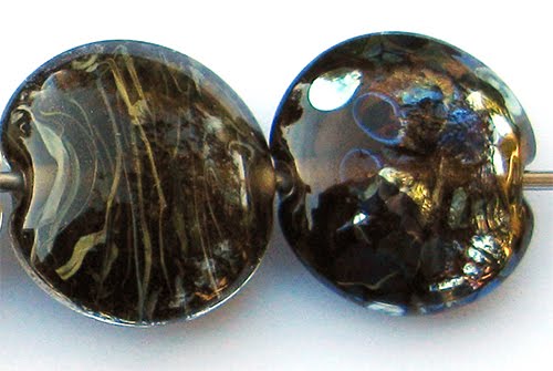
The silver reaction that I got with Maple is sort of a first for me.  The melted in Silver Leaf in the bead on the left has turned a strange rose colour.  Leaf, reduced and encased in the bead on the right didn't do much of note.  It does have an interesting, eggshell look to it though.


In the bead on the right, the silver glass frit blend has acquired a nice shine, and some of the pieces have developed a bit of an inner halo.

In the bead on the left, I took a gather of maple, dipped it in the silver glass frit blend and pulled it into thick stringer.  I then used that stringer to encase a base bead of Maple and then encased the whole thing in Effetre Clear. I got a moderate level of streaky visual interest in the resulting bead.  I say moderate, because this is what I'm usually hoping for when I do this test:


Maple was unremarkable with TerraNova2 frit, so I won't talk about that.


The Copper Green in this bead is unusually shiny, an effect that I am blaming on the Maple.


Over Ivory, Maple separates just a little and seems a bit streaky. Ivory seems to get a little shadow around it on top of Maple, but it is not a significant reaction.

Here's a fun bead with Maple.