Search This Blog

July 30, 2010

Test Results :: Mystic Coral

Finally I'm posting these.  I have two more sets sitting here on my desk but I've been just exhausted.  I get to wake up tomorrow morning and assemble all of my new Ikea furniture for my workstation, which will be located outside until I figure out what to do with the shed to make it habitable.

1 - Plain (understruck), 2 - Plain (reduced), 3 - Over Clear, 4 - As a floral, 5 - w/ Silver Leaf, 6 - w/ Silver Leaf (reduced & encased), 7 - w/ Silver Glass Frit Blend (reduced) 8 - w/ Terranova2 Frit, 9 - w/ Copper Green, 10 - w/ Tuxedo, 11 - w/ Opal Yellow, 12 - w/ Ivory, 13 - w/ White

Reichenbach Mystic Coral (RL0606) is one of the most interesting colours I have tested, and I am looking forward to getting to know it even better.  Lampworkers often refer to really vibrant colours as 'juicy' and this is a seriously juicy colour.

General Impressions

Mystic Coral is a striking color, but the strike is fairly easy to control. You pretty much just have to let it cool down and then give it a good warming. I deliberately understruck the first spacer bead for an interesting tangerine-on-coral shimmer. The smaller spacer was reduced, which meant it got an extra shot of heat.  Reducing Mystic Coral doesn't really have much effect. As with Mystic Beige, I don't quite have a handle on how you control the transparency of this glass, but I'm going to play with it and figure it out.

Putting Mystic Coral over Clear doesn't do much to tone it down.  The Clear core thins the color out just a little, but it's very dense. And gorgeous!

Reactions

In the bead on the left, the silver has darkened the surface of the Mustic Coral a fair bit, and gone sort of blue and silver and gold/yellow.  I'm always intrigued when the silver doesn't ball up and leaves a sort of stain on the bead because it always makes for an interesting effect when i encase it. In the bead on the right, I applied the silver leaf, melted it in, reduced it and then encased it with Effetre Clear. I'm a little bit awestruck by the powerful blue I got when I encased it.


Silver glass colour seems to develop well on this glass.  I hope it's apparent from the picture -- sometimes a glass base colour is just NFG for silver glass, and sometimes it is so wonderful that it cannot be believed. Mystic Coral is somewhere in the middle, leaning more towards the wonderful side. In both cases, the silver in the glass significantly darkened the base bead, but it's a pretty, deep red colour.  I can't wait to make some real beads with this colour and give it a proper workout.


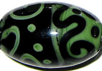
Mystic Coral and Copper Green share the same awesome reaction that Copper Green has with Lauscha Cocoa. The Copper Green separates and goes lighter wherever it is next to the Mystic Coral, which includes the Copper Green lines and dots and the place in the middle where the two colours join. With Mystic Coral, though, the reaction is even more interesting than what happens with Cocoa because the dots and lines get faintly darker around the edges in addition to the reaction that happens inside the Copper Green areas.  This reaction is very much like how Copper Green behaved with Mystic Beige.

The other neat thing that happened is that the Mystic Coral lines and dots on top of the Copper Green have a sort of shampoo sheen to them.


There isn't much in the way of reaction between Mystic Coral and Tuxedo. It's kinda cool how you can see a little of the Mystic Coral on top of the Tuxedo on the left-hand side of the bead because of its odd translucency.


Mystic Coral bled into Opal Yellow a bit in the centre of this bead, but apart from that, there's not much to see here.


Mystic Coral sort of bleeds onto Ivory too, in a gentle, transparent-blushy way. Ivory looks fantastic with Mystic Coral... I think I am in love.  In some of the beads at the end of this post, I used it with Reichenbach Porcelain, and that was really nice too.

These pictures are sort of awful, and I apologize for that.  I have to figure out the best place to take pictures in this new space.  However, here are some other beads made with Mystic Coral.


July 9, 2010

The Palette Junket

I started calling this palette a junket in my head on Monday night, and realized when I sat down to write this post that I wasn't even sure if I properly recalled what junket meant, so I looked it up. Here's what Dictionary.com has to say about the word 'junket'.

jun-ket
  1. a sweet, custardlike food of flavored milk curdled with rennet.
  2. a pleasure excursion, as a picnic or outing.
  3. a trip, as by an official or legislative committee, paid out of public funds and ostensibly to obtain information.
As it turns out, it fits nicely -- two of the three definitions sort of generally mean what I think of when I go on these little colour trips and make me feel nice about having used the word.  And, somehow, all of the trashy historical novels I've read over the last 20 years have come in handy AGAIN.

Anyway.

Holly and I made the "mistake" of going to Pier 1 last Friday as a way of taking a break from the mountain of stuff that needed to be unpacked and put away. All we went in there for was a hook-thingy to hang keys on, and this is what we left with:
  • Eight place settings of new dishes
  • A pair of red scissors with a ridiculous woodpecker head on the handle
  • A cheerful orange dish scrubber with a perfectly useless flower on the back of it
  • Three tea towels
  • No hook-thingy -- we ended up buying that at Canadian Tire

I've been feeling a bit guilty over the expenditure in a way I never seem to when I spend money on glass. Perhaps I've even been feeling a little like I cheated on glass by spending my money on other things. Who knows how my head works. Bear with me, I swear this is going somewhere.

So I was kind've regretting buying the dishes, even though I really love them, because I feel certain that they are going to start chipping any second and I'm scared I'll drop them and they might get scratched in the dishwasher or the dog might.... you get the idea.

But then, something cool happened. Monday night, I was laboriously rewriting and tweaking the same stupid list I've been making over and over again that traces out where I thought I was going colour-wise with the palette I started back in March. All of a sudden, I realized that I was pretty sick of it. And it's about time, too, since it's been almost four months. I pulled out a new piece of paper and started writing down the names of colours that I have real curiosity about, enthusiasm for and really want to be using instead. I'm actually excited to make beads this weekend, for the first time in a month or so, and it feels great.

Now that I've made you read all of this, I might as well tell you what colours got me so excited:
  • CiM Lipstick
  • REI Mystic Coral
  • LAU Olive
  • CiM Mojito
  • CiM Ming (this was supposed to be LAU Steel Blue, but I no longer seem to own any of that)
  • REI Ocean
  • KUG B181 (aka Silver Brown, Silver Cinnamon)
  • CiM Maple
  • REI Porcelain
  • CiM Charcoal

Plus the usual suspects -- some silver glass and my staple colours (Ivory, Dark Ivory, Black, White, Clear, Opal Yellow, Copper Green, Adamantium). It will be interesting to see what they do, and if they'll be as nice together as I'm hoping.  Fun!

How is this related to my trip to Pier 1 last Friday, the spendy, fear-inspiring dishes or anything else for that matter?


Well, here's a picture of the terrifying earthenware. The best part of this is that I had no idea those plates were inspiring me until the day after I made the palette when I retroactively realized why these particular colours were on my mind. I now regret nothing!

July 8, 2010

Test Results :: Split Pea

1 - Plain, 2 - Plain (reduced), 3 - w/ Silver Leaf, 4 - w/ Silver Leaf (reduced & encased), 5 - w/ TerraNova2 Frit, 6 - w/ Silver Glass Frit (reduced), 7 - w/ Copper Green, 8 - w/ Tuxedo, 9 - w/ Opal Yellow, 10 - w/ Ivory, 11 - w/ White

CiM Split Pea is an aptly named, medium spring green. I haven't used the Effetre greens much (Grass Green, Pea Green, etc), so I don't have a good baseline for comparison, which means I also don't have a lot of justification for my marked preference for the CiM greens. Split Pea, Sherwood and Dirty Martini are all greens that make me really happy.

Viscosity
Split Pea, like Sherwood and Poi, is sort of a sticky colour.  CiM Opaques seem to fall into two categories for me so far -- the stiffer, pasty ones, and the soft, sticky ones.

Reduction
Reducing Split Pea all by itself doesn't have any noticeable effect. (Bead #2)

Reactions

On top of Split Pea, silver leaf just sort of balls up and sits there, but there also seem to be some interesting, more yellowish striations in this bead and I'm wondering if the silver causes that.  In the bead on the right, with the silver reduced and encased, the effect is sort of like frost or unravelling lace.  Unlike with Sherwood, I didn't get any yellowing in the silver when I encased it.  (I use Effetre 006 clear for this test bead, every time now)


CiM Split Pea isn't as nice with silver glass as its friend Sherwood, but the TerraNova2 frit in the bead on the left did develop some colour, and the halos that formed around it are sort of cool.  The bead on the right, with the reduction frit, didn't really work out all that well.


Split Pea seems to have crazed my Copper Green... it's not sure whether it wants to be grey or turquoise and seems to be trying to be both at once.  The Copper Green lines and dots on top of Split Pea have a very crisp outline.


Tuxedo does not bleed with Split Pea the same way it does many of the other CiM greens.  I had a LOT of crazy bleeding with Elphaba Unique #2, and then a little with Sherwood and then almost none with Split Pea.


I was sort of hoping for the strange, neon outline between these two colours that I got in my Sherwwod test, but it didn't happen for me.  The only really unusual thing that happened here is that the Opal Yellow has separated so that it looks like it has two cracks running around the bead.


With Ivory, Split Pea is tons of fun.  If you look at the middle of this bead, you can see what happens when you heat these colours together enough to web.  There are more examples of this effect at the end of this post too.


And finally, you can get some interesting feathery webbing between Split Pea and White.

Here are some other beads made with Split Pea.  I made the swirly tube last fall, and then made the rest of the beads in the picture to match it for a custom order last month.  The swirly tube was originally made with (I thought) Okey Dokey Artichoky, but then when I tried to make the other beads to match it, the only colour I could find to match was Split Pea.  All of my attempts to match with Artichoky resulted in beads that were too blue or too light in colour. I had both colours in my working box at the same time, so now it's hard to know if I was confused when I thought I'd used the Artichoky and had in fact used Split Pea instead, or if the Artichoky just went like that and now only Split Pea will match it.

The colours used here in the rounds and lentil are Effetre Dark Ivory, Effetre Ivory, CiM Adamantium, CiM Split Pea, Silvered Ivory Stringer and a little Silver Leaf.


July 6, 2010

Test Results :: Yellow Opalino

1 - Plain, 2 - Plain (reduced), 3 - w/ Silver Leaf, 4 - w/ Silver Leaf (reduced & encased), 5 - w/ TerraNova2 Frit, 6 - w/ Silver Glass Frit (reduced), 7 - As a particularly sickly-looking floral (Core of Slytherin, Yellow Opalino Petals), 8 - w/ Copper Green, 9 - w/ Tuxedo, 10 - w/ Opal Yellow, 11 - w/ Ivory, 12 - w/ White

Effetre Yellow Opalino isn't nearly as ugly as I thought it was. I mean, in the rod, it is pale, sort of translucent and really, really yellow. I'm not usually drawn to yellow. The rod colour reminds me of Easter chicks, and I'll go ahead and confess that I've never really wanted to melt or wear an Easter chick, either.

I made these beads a few weeks ago, then got all caught up in the craziness of moving and didn't get around to posting them. I did get a really wide range of colour and texture from the Yellow Opalino. In Bead #8, it's sort of a mottled semi-translucent colour, which is very different from what I got in Bead #5 which is more of a butter yellow with a hint of pink, which is different again from the burnt mustard colour of Bead #2.

I nicknamed this colour 'Yop' while I was working with it, because I am apparently too lazy to even repeatedly think both of the words of its excessively long name. I am going to have to do a lot more messing around before I really feel like I know this colour, but here are some of the things I think I know about Yop after our first date.

Reduction
Yop darkens when you reduce it. (Bead #2)


Opacity
In a thin layer, Yop is translucent, but is still recognizable as itself. (Bead #7)

The reason this floral turned out so terribly is because when it's hot, Yop is invisible on Clear. It's not like White where it's invisible for a while but comes back quickly enough that you can see it before you poke the flower's center. Instead, the Yop plays hide and seek until the bead is too firm to poke, and you sort of have to do it blind. Infuriating! But I really like translucent flower petals, so I will no doubt give this another shot.

Reactions

Silver leaf seems to turn a pinkish brown colour when you melt it onto Yop and leave it on the surface. Something has also influenced the Yop and coaxed it into a more buttery, creamy version of itself. Now this is a yellow colour that even I can love! I'm not sure here if it was the silver that influenced the colour/opacity change or if it was the heating and quick cooling of pressing it that did that. Only more testing will yield that little kernel of knowledge.

In the bead on the right, the silver leaf under Clear and over Yop has taken on a sort of pinkish hue. This was interesting and a little unexpected. I understand from various sources that it's not generally considered a good idea to encase opalinos because of cracking concerns, but this little bead seems to have survived so far. I still don't think I'd risk it in a big, complicated bead though.


I'm going to conclude that there are better ways for me to use my silver glass than to pair it with Yop. Again, in the bead on the right, reducing the bead seems to have brought a more intense yellow to the Yop. Ick.


The reaction between Yop and Copper Green is pretty neat.  On the Copper Green side of the bead, the Yop lines and dots have a faint halo around them, and the Copper Green has settled into a kind of mottled, aged effect that is sort of strange. Between the two colours in the middle, a whitish line has formed. On top of Yop, Copper Green looks like a dull, mottled grey-green colour and has developed a dark outline. Under the Copper Green, the Yop is a cloudly yellow somewhat darker than the unmelted rod.


There are two interesting things about this Yop and Tuxedo combination. First, this is the bead where Yellow Opalino looks most like the unmelted rod colour. It's virtually unchanged, and I have no idea why because I don't recall working this bead any differently than I did the other ovals. Second, Tuxedo webbed into the Yop a little bit in the centre.


The reaction between Yop and Ivory is sort of greyish and dirty looking, but for some reason, it appeals to me. If it was an opaque colour, perhaps only the edges would be affected, but because the Yop is translucent, you can see the reaction through the dots and stringer. On the Yop side of the bead, the Ivory has separated and formed a thin, crack-like line through the centre.

I didn't bother to do a solo picture of Yop with White or Opal Yellow, because not much really went on in those ones.

I made some other beads with Yop -- at least I think I did.  They're sort of buried at the moment, and don't stand out in memory as anything you'd really want to look at anyway.  I am going on a bit of a palette junket and putting the Yop aside for a bit, but when I get back to it I will definitely try to post some decent beads. (Details on the junket to follow sometime soon)