Search This Blog

July 28, 2011

Test Results :: Lizard

1 - Plain, 2 - Plain (reduced), 3 - w/ Silver Leaf, 4 - w/ Silver Leaf (reduced & encased), 5 - w/ TerraNova2 Frit, 6 - w/ Silver Glass Frit (reduced), 7 - w/ Tuxedo, 8 - w/ Copper Green, 9 - w/ Opal Yellow, 10 - w/ Ivory, 11 - w/ Peace

Effetre Lizard is one of those colours that you just can't get to know intimately after just one date. It feels like a slightly unholy mixture of Mud Slide and Dark Matter, both of which I like very much. A couple of my Lizard rods have been a little shocky, but on the whole, it is pleasant to use. It seems to have enormous potential, and it is definitely unique in the 104 palette. I have fallen enough in love with this colour that I've built a small stockpile of it, since it seems to be one of the question marks in terms of whether or not there will be a regular supply of it once Mike Frantz has sold all of his stock. I guess I should ask.

Lizard is very reactive, and it's a striking colour. Repeated heating and/or the addition of silver both make Lizard browner and darker.  You can see above how my lentils and spacers are much darker in colour than the bicolor ovals that I made in the lower row of beads. I made the two spacers on the same mandrel, but only reduced one of them and you can see that the one I did not reduce looks significantly greyer than the one I did reduce. I like the earthy grey of the unreduced spacer almost as much as the rich brown of the reduced one, so it's nice that I can have both.


In the bead on the left, the silver leaf has turned yellowish on top of the Lizard, and the base bead has fumed/struck a rich brown colour. When this reaction was reduced and encased, the Lizard seems to have gone almost purple in places and the silver leaf has a mottled but blue-ish sheen to it under the encasement layer. A thin layer of yellow 'crud' is also visible on top of this reaction.


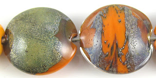
Lizard is yummy with silver glass. In the bead on the left, where I did not overstrike the TerraNova2 frit, you can see the pretty colours. It is also interesting how the Lizard is greyer and lighter in the middle of this bead, near the frit, than it is at the ends. In the bead on the right, the Lizard has developed a bit of a patina, and looks almost yellowish brown around the frit and dark grey at the ends. The reduced silver glass frit on top of the Lizard has a strange, mottled look to it. Me likes.


Lizard and Copper Green have a reciprocal dark line reaction, and you can see on the right side of the bead that the Copper Green dots and stringer lines also have a sort of brownish blush around their edges and seem to float just slightly on top of the Lizard.


On top of Opal Yellow, Lizard separates a little at the edges of dots and stringer lines, leaving a brownish residue. The Lizard also seems to coagulate in the centre of the stringer lines, looking much darker in hue there. On top of Lizard, Opal Yellow develops a thin dark outline and on both sides of the bead, the Opal Yellow has blushed a rich yellow with some darker, mustardy mottling.


On top of Ivory, Lizard's outline is sort of translucent, and the Lizard has the appearance of floating slightly on top of the Ivory glass. It also looks pretty brown on top of Ivory. Under Ivory, the Lizard has separated slightly in spots, giving the appearance of cracks in the surface (although there aren't any).


Peace lines and dots on top of Lizard separate slightly, forming some translucency at their centre. On top of Peace, Lizard spreads and develops a yellowish outline that contributes to the illusion that the Lizard lines are three dimensional.

I have made a lot of beads with Lizard, but I apparently haven't taken pictures of any of them. If that changes in the next little while, I will come back and update with pics. Lizard is making a fabulous 'earth' colour for the ground in my new mushroom focal design.

July 21, 2011

Test Results :: Straw Yellow

1 - Plain, 2 - Plain (reduced), 3 - w/ Silver Leaf, 4 - w/ Silver Leaf (reduced & encased), 5 - w/ Silver Foil, 6 - w/ TerraNova2 Frit, 7 - w/ Silver Glass Frit (reduced), 8 - w/ Silver Glass Frit Stringer (encased), 9 - w/ Tuxedo, 10 - w/ Copper Green, 11 - w/ Opal Yellow, 12 - w/ Ivory, 13 - w/ Peace

I love this colour. Effetre Straw Yellow is not very exciting on its own (or even, really, in combination with other colours) but it is a very pretty neutral transparent, and it does wonderful things with silver glass. It is a very soft transparent, so it melts very easily, and it is not prone to bubbling or boiling at all.


Here on top of Straw Yellow, silver leaf melted into the surface sort of disperses and develops faint, blue-ish halos. The addition of the silver has significantly darkened the colour of the Straw Yellow base bead.  When the leaf is reduced and encased, it forms a soft, translucent blanket on top of Straw Yellow. In the bead on the right, it is as if the reduction and clear encasement layer have zeroed out the darkness that you see in the bead on the left..


In this bead I used a core of Straw Yellow, wrapped it in silver foil, and then encased the foil with Straw Yellow being careful not to overheat it so that the foil stayed intact under the encasement layer. The reaction between the silver foil and Straw Yellow makes the silver appear to be a rich, coppery hue.


Straw Yellow, like Pale Green Apple, Light Brown Transparent, Kelp and Mojito makes a good base for silver glass. Usually, if a colour will turn silver a coppery-gold colour and will do the stringer thing that you see below, it will be an excellent base colour for silver glass as well in my experience.


This is Straw Yellow frit stringer, made with Double Helix reduction frits (blend of Gaia, Elektra, Nyx, Psyche and Kronos). The bead is encased in Effetre 006 Clear. The result of this is less vibrant than with Pale Green Apple, but is still very effective.


And here it is with Copper Green, Opal Yellow, Ivory and Peace.  

The only real reaction of note is with Opal Yellow. The Opal Yellow under Straw Yellow has a fair bit of pink blushing, and there is some reaction inside the Straw Yellow stringer lines on the left-hand side of the bead because the lines look very intensely yellow. As we can see, the Opal Yellow is not that colour naturally and Straw Yellow is not similarly concentrated in any of the other test beads.

I got distracted and didn't make any real beads with Straw Yellow, but I'll be back to update this when I eventually do. 

July 14, 2011

Test Results :: Peach

1 - w/ Silver Leaf, 2 - w/ Silver Leaf (reduced & encased), 3 - w/ Silver Foil, 4 - w/ TerraNova2 Frit, 5 - w/ Silver Glass Frit (reduced), 6 - w/ Silver Glass Frit Stringer, 7 - Plain, 8 - Plain (reduced), 9 - w/ Copper Green, 10 - w/ Opal Yellow, 11 - w/ Ivory, 12 - w/ Peace

Lauscha Peach is a very pale, subdued peach transparent glass.  It is a little reactive with silver, although not on the same scale as Light Brown Transparent or Straw Yellow, and has a beautiful consistency.  It is not particularly prone to boiling.


Silver leaf melted onto the surface of a Peach bead is not terribly interesting, just looking like random greyish surface discolouration, however when the silver leaf is reduced and encased, it takes on a shiny, ethereal appearance under the encasing layer with a tinge of lavender to it.


When Peach is applied over silver foil, the silver foil turns a rich gold colour.


Peach is an average base colour for silver glass frit.  Nothing exceptional happened, but there was no epic fail either.


Here I used frit stringer made from Peach and silver glass reduction frit (Kronos, Psyche, Gaia, Elektra) to encase a core of Peach, and then encased the whole thing with Clear.  The resulting striations are interesting, but don't have much colour to them.  I got much prettier results with this technique with Effetre Straw Yellow, Effetre Light Brown, Effetre Pale Green Apple and CiM Mojito, but this less colourful result has possible uses as well.


And here is Peach with Copper Green, Opal Yellow, Ivory and Peace.  Not much to report here in terms of reactions.

I haven't made anything very fun with Peach yet, but I still have a couple of rods left so I will try to get something posted in the next couple of weeks.

July 7, 2011

Test Results :: Orange Sherbet

1 - Plain, 2 - Plain (reduced), 3 - w/ Silver Leaf, 4 - w/ Silver Leaf (reduced & encased), 5 - w/ TerraNova2 Frit, 6 - w/ Silver Glass Frit (reduced), 7 - w/ Tuxedo, 8 - w/ Copper Green, 9 - w/ Opal Yellow, 10 - w/ Ivory, 11 - w/ Peace

Orange Sherbet is a Vetrofond odd lot, and is so beautiful in rod form that up until recently, I was hoarding it instead of melting any. This has also partially been because I know, after repeated disappointment, that the beautiful colour of the rod never survives the melting and annealing process. Don't get me wrong, I like this extreme tangerine thing that Orange Sherbet actually IS, I just wish that things could be different. It's a little like the way a child feels when they eventually find out there's no Santa Claus -- a sense of having been deceived about something very important and wistful about how the fictional thing was preferable to reality, but still very much into presents and Christmas dinner with all the fixings.

I have two different rod colours of Orange Sherbet, one slightly pinker than the other, but they both turn out the same in the end.

Orange Sherbet rods are not particularly shocky, and they are a pleasure to use because it is a soft colour and is not particularly prone to boiling. It holds up pretty well in rose cane, and doesn't smear as easily as other soft colours like White do.


Silver leaf, melted onto Orange Sherbet, fumes the orange a brownish colour.  The silver leaf here also has developed into a sort of crust, turning yellow in patches. When this reaction is encased, it goes a funky purplish gunmetal colour. I sort of want to try this again, being careful to get good, even coverage with the silver.


Similar to what happened when I used silver glass with Rhubarb, it develops colour fairly well on top of Orange Sherbet, but has a dullish look to it, like it's only barely awake.


On top of Tuxedo, Orange Sherbet frazzles, for lack of a better word. Its borders get all frizzy and indistinct it and concentrates itself in the middle. The stringer lines look pretty interesting but the dots of Orange Sherbet on Tuxedo just look sad and pathetic. When Tuxedo is used over Orange Sherbet, it raises halos of Orange Sherbet around itself. It also seems to become a little transparent, especially where I smeared it.


Orange Sherbet with Copper Green is the clear winner out of all these results in terms of 'wow'. Here, the Orange Sherbet looks closest to what I want it to look like. It has a faint pinkish tinge to it which is reminiscent of its pretty in-the-rod colour, and it is not streaky at all. Why isn't it streaky? I have no idea, because it is crazily streaky in all of the other test beads. And let's talk about the Copper Green for a minute, too. Why is it that colour? Copper Green is almost never that colour of dark, greyish green.

On top of Orange Sherbet, in addition to turning a freaky dark grey-teal colour, the Copper Green develops a double outline. The first layer of the outline is a dark line and the second is a faint lightish band, making it look like a three dimensional ridge. When Orange Sherbet is on top of Copper Green, only the dark line is in evidence. If I ever run out of Copper Green and can't get more, I think I'll cry.


Oddly enough, Orange Sherbet and Opal Yellow have a reciprocal dark line reaction. On the Opal Yellow side of the bead, the line that has formed around the Orange Sherbet is a yellowish brown colour.  On the Orange Sherbet side of the bead, the line is darker and more distinct.


This is a messy bead, so it might not be obvious that there's not much of a reaction between Ivory and Orange Sherbet. You can see that the Orange Sherbet has lightened up significantly towards the edges of the bead, and I'm not really sure why that happened. It lightened up on the Peace side of the bead below too.  It could be partially because it is a thin layer and the base is showing through, but it could also be a striking thing. I just don't know.


Orange Sherbet spreads on and sort of bleeds into Peace. On the Orange Sherbet side of this bead, you can see how the Peace has thinned out around the edges of the dots and stringer lines and coalesced in the centre.  A thin translucent line appears in the centre of Peace stringer lines on top of Orange Sherbet.

Here is a fun bead with Orange Sherbet.