Search This Blog

October 29, 2014

Test Results :: Tangerine Sparkle

1 - Plain (reduced), 2 - Plain, 3 - w/ Silver Leaf, 4 - w/ Silver Leaf (reduced & encased), 5 - w/ Silver Glass Frit (reduced), 6 - w/ TerraNova2 Frit, 7 & 8 - w/ Tuxedo, Copper Green, Opal Yellow, Ivory, and Peace

I really love Vetrofond Tangerine Sparkle (944). I think that it is one of the Vetrofond colours that I am going to miss the most once I've used mine up completely. It is a bright, translucent, striking orange that is easy to get and keep orange, and doesn't turn red on me.  You can still find this colour for sale if you look really, really hard, but most vendors in North America have been out of it for quite a while.

Reducing Tangerine Sparkle without any additives does not seem to have any impact at all on the colour. Deep in the Tangerine Sparkle, as you might imagine, there are sparkles. Teeny, tiny sparkles all through it that glisten in the light.  You can only sort of see them in the photos, but they are beautiful in person.


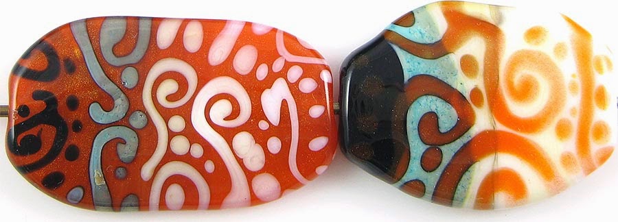
Tangerine Sparkle is sort of interesting with silver.  In the leftmost bead, the silver has turned blue in spots and grey in other spots. It has also coalesced in little groupings of tiny silver beads in a really attractive way.  In the bead on the right where I reduced and encased the silver, everything that is beautiful about silver on Tangerine Sparkle left the building and it is just sort of mottled and grungy looking.


Tangerine Sparkle makes a surprisingly good base for silver glass.


Copper Green and Tangerine Sparkle have a reciprocal dark line reaction.  When Copper Green is used on top of Tangerine Sparkle, it gets sort of weirdly shiny, and when Tangerine Sparkle is used on top of Copper Green, the Copper Green seems to keep its turquoiseness and not get as much greyish sludge developing on its surface as it does with some other colours.

On top of Ivory, Tangerine Sparkle thins out a little, losing some of its opacity.

Apart from those things, not much of interest happened in these test beads.


Here is a goddess bead made with Tangerine Sparkle.  In person, she almost looks like she's been built out of glistening orange nail polish.

This little set is Tangerine Sparkle with Ivory, SiS, Light Turquoise, and a touch of Light Teal.


October 22, 2014

Test Results :: New Violet

1 - Plain (reduced), 2 - Plain, 3 - w/ Silver Leaf, 4 - w/ Silver Leaf (reduced & encased), 5 - w/ Silver Glass Frit (reduced), 6 - w/ TerraNova2 Frit, 7 & 8 - w/ Tuxedo, Copper Green, Opal Yellow, Ivory & Peace

This Effetre colour is called New Violet (273).  I'm not sure which it is, but either we don't like change in the lampworking community, or we just like to prolong the excitement of getting new colours for years past their debut, so we have continued to call this one 'New Violet' long after it actually stopped being new. New Violet is a perkier, bluer colour than Violet 272 (which, presumably, we could now legitimately call 'Old Violet').

New Violet is a quite streaky colour, and is reminiscent of the purple colour that bathtubs and sinks came in, back in the 70s. The first house I bought had bathroom fixtures this colour, and I remember being amused by the novelty of it.  The colour is much less amusing in glass rod form, however it does have some interesting properties, which I will tell you about now that I have exhausted my supply of chatter.


On top of New Violet, silver does not really do much.  There is a little yellowing, signalling some reactive potential, but not much in the way of interesting happenings here.


However, when I used silver glass on top of New Violet, all kinds of dramatic things happened.  In the bead on the left, after reducing the silver glass frit blend, you can see that New Violet has abdicated all of its violetness in favour of becoming more of a grey. Why? I have no idea. It did not happen when I reduced New Violet without putting silver on it, and it did not happen when I put silver on New Violet without reducing it. Weird, right?

In the bead on the right, I did not get very satisfying colour from the TerraNova2 frit, however I did get very interesting separation lines in the New Violet underneath the frit. It has risen up in lighter-coloured halos all around the fritty bits.


On top of Tuxedo, New Violet not only separates, but really seems to do an interesting curdling thing. You can see in places where there almost seems to be texture in the New Violet lines because of the strength of the reaction. When Tuxedo is used on top of New Violet, the New Violet rises up around it in light halos, looking almost like a black and violet compound line/dot floating on top of a bed of violet.

New Violet seems to be one of those colour that, when used on top of Copper Green, keeps the Copper Green from greying up. Around the dots and stringer lines of New Violet, which has separated into two colours, there is also a more concentrated Copper Green 'shadow' around the New Violet stringerwork. As a result, it is a three-layer reaction, which is always a bit of a thrill :)  In the right-most bead, you can see a faint three-dimensional-looking border around the Copper Green dots and lines, but not nearly the same level of drama as you see when the New Violet is the colour on top.

New Violet is still streaky on top of Opal Yellow, but is otherwise not very interesting in that combination. In the bead where I used Opal Yellow on top of New Violet, nothing interesting happened at all.

Ivory spreads out and develops a really interesting streakiness on top of New Violet. When New Violet is used on top of Ivory, it separates the same way it does on top of  most of the other colours, but the effect is different somehow because of the light background because visually you see the superlight Ivory, then a lighter purple, and then the concentrated violetness of the New Violet pure in the centre of the dots and stringer lines.

Peace is sort of a different animal with this colour.  On top of Peace, New Violet loses all of its streakiness and looks like a more pastel, solid version of itself. Peace separates into two different versions of itself on top of New Violet, the outer band more translucent.


Here is a goddess bead made from New Violet.  You can see here how very streaky this colour is.  Its a very soft colour, so it's a bit frustrating for sculptural work, but I managed, so you can, too!

October 15, 2014

Test Results :: Soft Rose


1 - Plain (reduced), 2 - Plain, 3 - w/ Silver Leaf, 4 - w/ Silver Leaf (reduced & encased), 5 - w/ Silver Glass Frit (reduced), 6 - w/ TerraNova2 Frit, 7 & 8 - w/ Tuxedo, Copper Green, Opal Yellow, Ivory & Peace

Kugler Soft Rose (B151) is a gorgeous light to medium pink colour.  I really like some of its reactions, and it was buttery soft to work with.  I was looking for similarities with either Effetre Silver Pink or Lauscha Faded Rose, but apart from its tendency to fume yellow with silver, I didn't really find much similarity with either colour.  This isn't a bad thing at all -- variety is good!  I often find my expectations turned around this way with glass, and it keeps me on my toes :)

It is not a good idea to encase this colour -- like Golden, its transparent cousin, this colour does NOT do well underneath other colours.  It is, however, moderately reactive and seemed to have tons of potential in organic designs.


The most disappointing thing about Soft Rose is that it seems not to be compatible when layered with other colours. I made this set of beads with Soft Rose as the base, and all of the other ingredients are things that I routinely use in beads of this style.  The Soft Rose has cracked all over the place in tiny incompatibility fractures. I had hoped that this colour was just incompatible with being encased, but the problem seems more serious than that.

As a result, I won't be purchasing this colour again or using it in my beads. It is possible that the problem is batch-dependent and that some future batch of Soft Rose will work just fine, but there are too many nice colours that don't have this problem for me to bother coming back to this one.


Soft Rose is sensitive to flame chemistry, and as you can see in the bead on the left, darkens and deepens in colour when it is reduced.


Like many pinks, Soft Rose fumes yellow when silver is added to it.  I'll say it again - don't encase this colour. There are crazy cracks all through the other side of the rightmost bead, and as you can see, a giant crack right through this side of it.


I'd say that Soft Rose is average as a base colour for silver glass.  The leftmost bead got some interesting colour and shine, and I got a little colour from my TerraNova2 frit. (See cracking notes above - it doesn't matter how nice the reactions are if the result is a bead fit for the garbage)


I won't be able to talk about what Opal Yellow looks like on top of Soft Rose, because apparently I accidentally picked up my Ivory stringer when it was time to do the stringer dots and lines with Opal Yellow, and did Ivory twice instead of Opal Yellow and then Ivory.  Oops!

Tuxedo spreads out and causes a purplish halo reaction when used on top of Soft Rose.  When Soft Rose is used on top of Tuxedo, the edges of the Soft Rose stringer lines and dots get a three-dimensional puffy look to them.

Ivory spreads out and does really interesting mosaicy (that's a word, right?) things on top of Soft Rose.  You can see that in the space in the leftmost bead where I was supposed to do Opal Yellow dots and lines, and also in the usual spot.  The Ivory has separated the Soft Rose so that it rises up in halos around the Ivory, and then the Ivory has gone sort of brownish around its edges, and then where it has remained Ivory, gone sort of 'fluffy' for lack of a better word and developed interesting curdling/reticulation effects to boot.  Three reaction effects for the price of one... it really doesn't get much cooler than that.


Here is a goddess bead made with Soft Rose.  You can see some yellowish blushing that I guess is the result of striking the glass during its construction.  My flame is a little reducing since I only have a 5 lpm concentrator, so that may also be part or all of the cause.

October 8, 2014

Test Results :: Flax

1 - Plain (reduced), 2 - Plain, 3 - w/ Silver Leaf, 4 - w/ Silver Leaf (encased), 5 - w/ Silver Glass Frit (reduced), 6 - w/ TerraNova2 Frit, 7 - w/ Silver Glass Frit Stringer (encased), 8 - Over Silver Foil, 9 & 10 - w/ Tuxedo, Copper Green, Opal Yellow, Ivory, and Peace

I was so excited when I first saw CiM Flax, because I have really been wanting a nice, cool, pale yellow.  I was a little less excited when I found that Flax will strike with repeated heating and cooling, but after doing some sculptural work with it I felt happy again because it seems like this is a controllable thing, although I don't yet have many useful words for you about how you might control it.

What I can say for sure is that sometimes it struck to bright yellow on me, and sometimes it did not. In the beads where it did, the common factor is that I pressed them with a cool tool. I am guessing that it is repeated, dramatic heating and cooling that will move it away from its beautiful, pale, champagne colour into a more 'electric yellow' hue range. So, if you want to keep it pale, keep it cool!


As you can see here, unstruck Flax is significantly lighter in colour than Effetre Straw Yellow.  It stayed pale in this bead, and between this and the spacers in the group shot, I am able to tell you that this colour is way less prone to strike than its Effetre counterpart, Electric Yellow. I made and garaged this bead pretty quickly, and so the fact that it stayed light may be due to the short duration of its exposure to the flame.


Although this colours strikes to a bright yellow like Effetre Electric Yellow, its reactions with silver and other colours are significantly different.  Firstly, while Electric Yellow turns grey when used with silver, Flax seems not to.  The silver spread out on top of this colour and developed a bit of a blueish haze, but did not blacken at all.  This colour's reactions are more consistent with Straw Yellow's behaviour, but not exactly the same.

While the silver foil in this bead does look sort of golden like it might have colour-changed under the Flax, it could just be that the Flax struck to bright yellow and so it is a reflection rather than a change. This last idea is sort of reinforced by the fact that the whole encasement layer looks a little yellow when you look at the bottom edge of the bead, however a reflection might also make it do that since glass is so light-sensitive.  I apologize for the number of words you had to read there to find out I didn't really have much in the way of useful things to say about this test.


Flax seems to be an interesting base for silver glass.  There is one fritty bit in the leftmost bead that is particularly interesting looking, with both a black line AND a halo around it.  If only I knew what silver glass that piece was, we would really have an interesting discovery.  I know for sure that it is either Psyche, Triton, Kronos, Aion, Elektra, or Gaia which narrows it down a little if you feel like experimenting further. Flax was pretty friendly to my striking silver glass as well in the bead in the middle, and I was able to get some pretty blues from the TerraNova2 without much effort investment.

In the rightmost bead, I got an interesting effect by pulling frit stringer with Flax and my silver glass reduction blend.  I wrapped the stringer around a Flax core and then encased it with Clear. There are glasses that do this effect better, but way more colours that don't work to get this interesting streakiness at all.  In the bead where I did this test with Effetre Electric Yellow, the stringer mostly just turned an icky grey. I would categorize Flax as a pretty silver-friendly colour, overall.


Here the Flax really struck to bright yellow.  In the construction of these beads, I make the base, and then I put all of the decoration on.  I heat the bead and mash it, and then I heat it gently to firepolish the chill marks out.  The steps were the same for both beads.

In terms of interesting reactions, I got a light separation line between Flax and Copper Green on the Copper Green side of the equation in both beads, although the effect looks very different in each.  I also got some fairly interesting separation with Opal Yellow which bears further exploration because I think that the yellow-on-yellowness of it has interesting design potential.  There was a little separation of Peace as well, but not as significantly.

My Tuxedo seemed to thin out and looks sort of blue where I used it on top of Flax.


Here is a sculptural bead with Flax.  It is interesting to note here that the Flax has just barely started to strike in this bead in spite of it being repeatedly and thoroughly heated and cooled during its construction.  I am going to attribute this to the fact that I use very few tools in the construction of my goddess beads and that as a result, the bead did not receive the same dramatic quick-heating/cooling cycles as the beads that I used metal tools on did.

October 3, 2014

Back in Action

It's been a while since I posted anything at all, and this last year has been very slow for this blog in general for a variety of reasons.  My dad was really sick with cancer and he passed away in May of this year, work has been hectic, and as a result, my creative energy has been pretty low.

The good news is that I am starting to feel like myself again, and am coming back to the torch with a vengeance.  You can expect to start seeing colour testing posts in this space in the very near future.

The final thing that has been slowing my blogging down is that I have started a new business.  I bought Gail Joseph's 104 COE frit blend recipes and a really large quantity of 104 COE frit, and I will be selling both her frit blends and recipes that I develop myself under the brand name FrittyBits™.  

My new business is called 'Melanie Graham Studios', and you can find my new website here.  I am selling both beads and frit mainly out of my Etsy shop, which is also feeding my website.  It is all very integrated, which was way easier than I thought it was going to be.

If you like the idea of frit that is all 104 COE so that you can use as much of it as you want with your 104 COE glass, then these are the frit blends for you.  Here are a few pictures of the frit blends that I have for sale.  I have 37 different blends at present, which I will be expanding over the next few months leveraging my colour testing results.