Search This Blog

March 12, 2011

Test Results :: Poison Apple

1 - Plain, 2 - Plain (reduced), 3 - w/ Silver Leaf, 4 - w/ Silver Leaf (reduced & encased), 5 - w/ TerraNova2 Frit, 6 - w/ Silver Glass Frit (reduced), 7 - w/ Silver Glass Frit Stringer (encased), 8 - w/ Tuxedo, 9 - w/ Copper Green, 10 - w/ Opal Yellow, 11 - w/ Ivory, 12 - w/ Peace

I tried this colour as a challenge to myself, because my fear of very bright colours is still very much alive and well. As it turns out, CiM Poison Apple is awesome.

It doesn't have a lot of spectacular reactions, but just the fact that it (and I love this about CiM Kryptonite as well) is one of those colours that basically gets along with everyone else in the colour sandbox makes it a really valuable tool.  Most greens either react like a turquoise and have a dark line reaction with Ivory, or behave like Ivory and turn black when used with silver.  It is always exciting to find a colour that doesn't do either of these things; especially one that is green or turquoise.

Melting silver leaf into the surface of Poison Apple disrupts the surface of the Poison Apple and turns it sort of curdly and veiny, like little crystals have formed just under the surface of it.  Reducing and encasing this reaction makes the Poison Apple appear considerably lighter, and the silver looks sort of light and snowy with a subtle dark line surrounding it under the clear in the bead on the right.


Poison Apple is not a strong contender in the 'best base for silver glass' category, but silver glass doesn't hate it, either.


This is a fun experiment I tried.  I dipped a gather of Poison Apple into reducing silver glass frit a couple of times and used the resulting frit stringer to encase a base of Poison Apple and then covered it with Effetre 006 Clear.  The streakiness is pretty fun, although I prefer the effect I get when I do this with certain transparent colours (e.g. Light Brown Transparent, Pale Green Apple, Mojito)


Nothing exciting to see here.  Just some translucency to the Poison Apple when used on top of Tuxedo, which is normal since it's a semi-opaque colour.


Poison Apple has made my Copper Green take on that reddish shiny patina, and the Copper Green lines on top of Poison Apple look curiously precise, like they've developed a fine, darker outline.


Poison Apple curdles Opal Yellow - you can see underneath the Poison Apple dots and lines that the Opal Yellow is floating up in halos around the stringer work.  On top of Poison Apple, Opal Yellow separates a little and gets a fine, translucent line in the centre of the dots and lines.  The Opal Yellow looks particularly yellow in the middle of this bead, where it touches the Poison Apple.


On top of Poison Apple, Ivory stringer lines seem to float a little above the surface, and like Opal Yellow when used with Poison Apple, separate and develop a fine, translucent centre line.  On top of Ivory, Poison Apple just looks sort of translucent and green.


I have started using Peace as my test white to try it out, so a lot of posts (but not all of them because of the convoluted order I'm posting things in) from here on out use Peace instead of White as the test white.  The reaction here between Peace and Poison Apple is pretty much identical to the reaction between Ivory and Poison Apple.

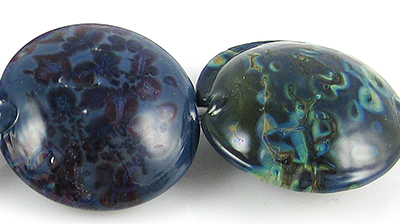
Here are some fun beads with Poison Apple.  The twisties used on all of these beads had a base of Poison Apple, with 104 Raku, Copper Green and Triton.  The base colour of the heart bead, and the colour used for the mustard-coloured dots is Effetre Yellow Ochre (aka Mustard).


March 5, 2011

Test Results :: Steel Blue

1 - Plain, 2 - Plain (reduced), 3 - w/ Silver Leaf, 4 - w/ Silver Leaf (reduced & encased), 5 - w/ TerraNova2 Frit, 6 - w/ Silver Glass Frit (reduced), 7 - w/ Tuxedo, 8 - w/ Copper Green, 9 - w/ Opal Yellow, 10 - w/ Ivory, 11 - w/ White

Lauscha Steel Blue has to be one of the most interesting opaque colours I've tried. I love Lauscha Cocoa and Lauscha Olive as well, but the hue of Steel Blue does something to me. All three of these are interesting to work with -- stiff while you are melting them, but spreading wildly on top of other glasses, translucence on top of some colours, and fun with silver glass.


The addition of silver is a transformative experience for Steel Blue, making it look completely unlike itself.  Here, in the bead on the left you can see that the silver has turned gold, and wisps and webs its way over the surface of the bead.  You can also see, in that same bead, how the Steel Blue itself has gone super-dark, except in a couple of areas where the silver has blown a royal blue blush through it.  In the bead on the right, the silver leaf was reduced and encased, and all of the visible Steel Blue looks more of a royal blue colour than Steel Blue's typical, deeper hue.  Also in that bead, the silver has taken on a dull greyish-lavender colour.


Steel Blue makes a very interesting base colour for silver glass. My TerraNova2 frit did all kinds of pretty blue and purple things on top of Steel Blue, and the reducing silver glass frit just went sort of crazy, and turned the visible surface of the Steel Blue base a kind of oily teal colour.  Nifty.  I particularly like the way the reducing silver glass frit has bloomed on top of the Steel Blue.


There is no noticeable reaction between Steel Blue and Tuxedo.


I love colours that make Copper Green do this.  A lighter, turquoise line springs up around Copper Green wherever it touches Steel Blue.  Also, the Steel Blue stringer lines and dots spread a bit on top of Copper Green and have more translucency than you'd expect. Some magical ingredient in th Steel Blue prevents Copper Green from getting that shiny, metallic patina on it, too. Other colours that spring to mind that are this much fun with Copper Green include Lauscha Cocoa, Lauscha Faded Rose, CiM Charcoal, CiM Ming (in it's own wacky way), REI Mystic Grey-Blue, Lauscha Olive and CiM Slytherin, although that's hardly a definitive list.  What do all of these colours have in common?  Good question.  Apart from how much they love Copper Green, I have no idea.


Opal Yellow is seriously yellow with Steel Blue.  And curdly when used underneath it.


On top of Steel Blue, Ivory gets a fine translucent line in the middle of stringer lines and translucent pinpricks in the centre of dots.  On top of Ivory, Steel Blue spreads out, a lot, and feathers its colour out into the Ivory base.  This is almost identical to the reactions I got with Lauscha Olive and Lauscha Cocoa when I used them with Ivory.

Nothing interesting to report with regard to White reactions except that when you use White on top of Steel Blue, be prepared for the White to look more blue than white, because the Steel Blue will bleed up through it and change its colour.

Here is a fun bead made with Steel Blue.  I've been using Steel Blue a lot in twisties and other organics, and I think I have a few other pictures I can include once I get the rest of my beads photographed.

March 1, 2011

Test Results :: Butter Pecan Unique #5

1 - Plain, 2 - Plain (reduced), 3 - w/ Silver Leaf, 4 - w/ Silver Leaf (reduced & encased), 5 - w/ TerraNova2 Frit, 6 - w/ Silver Glass Frit (reduced), 7 - w/ Raku, 8 - w/ Tuxedo, 9 - w/ Copper Green, 10 - 2/ Opal Yellow, 11 - w/ Ivory, 12 - w/ White, 13 - w/ Olive

CiM Butter Pecan Unique #5 is officially one of my favourite colours, so I hope there's still some left when I allow myself to order glass for the first time this year.  This colour is versatile and interesting, and makes a brilliant base colour for organics.  I like it better than Butter Pecan Unique #4, which I posted about last October.

When you reduce Butter Pecan Unique #5, the colour of it warms up a bit and the surface goes faintly shiny. This is evident in the little crystal that I reduced as well as in the lentil I made with reducing silver glass frit. This colour, like Butter Pecan Unique #4, is very, very soft and drippy when you get it really hot.  For me, this means that if I'm going to make a pressed lentil with it, I want a core of Clear underneath the Butter Pecan Unique #5 or I squoosh the glass too much and end up with knobby bits at the end of my bead.  Yuck.  This is totally a heat control thing, and I know it, but coring the bead with Clear helps me avoid this problem.


Silver leaf is gorgeous on top of Butter Pecan Unique #5, crystallizing and forming a golden crust while fuming the surface of the bead to a rich brown.  Reduced and encased, this reaction is a vivid royal blue interspersed with silver.  Butter Pecan Unique #4 did not turn my silver blue this way, and silver leaf sits on top of Butter Pecan Unique #4 with more of a flat, shiny finish.


Butter Pecan Unique #5 is not a star with silver glass either, which is the wording I used to describe how I felt about Butter Pecan Unique #4 and silver glass.  However, I did find that I sort of like how Butter Pecan Unique #5 looks with 104 Raku.

One thing sort of interesting and worth a bit of a note is how the Butter Pecan Unique #5 went sort of satiny in the bead with the reducing silver glass frit after it had been reduced.  You can see in the picture, above, the way the light plays off of the Butter Pecan Unique #5 that has been fumed by the silver glass.  The other interesting thing is how the Raku has made the Butter Pecan Unique #5 sort of rise up and separate from itself around the Raku stringer in the bead on the far right (above).


Tuxedo bleeds into Butter Pecan Unique #5 in the middle of this test bead, and creates a strange blueish purple streakiness. The Butter Pecan #5 has sort of risen around the Tuxedo stringer work in places, and the colour of the Butter Pecan #5 side of this bead seems almost tea-stained. On top of Tuxedo, Butter Pecan Unique #5 develops a shiny outline to its dots and stringer lines.


On top of Butter Pecan Unique #5, Copper Green develops a dark outline and a shiny, dark patina.  When Butter Pecan Unique #5 is used on top of Copper Green, there is no reaction to speak of.  I really find this odd, because my expectation is that if the colours are reactive, they will behave oddly under both circumstances (as the base AND as decoration) but that was totally not the case here.


In a very similar way to what I noticed with Butter Pecan Unique #4, Butter Pecan Unique #5 and Opal Yellow have an odd relationship.  On top of Opal Yellow, Butter Pecan Unique #5 develops a dark line around the dots and stringer lines.  On top of Butter Pecan Unique #5, Opal Yellow looks sort of chalky, floaty and dirty.


There's nothing too exciting to report on the Ivory and White fronts, although the Ivory dots in the picture on the left seem sort of floaty on top of the Butter Pecan Unique #5.


Like Butter Pecan Unique #4, some serious separation and curdling happens when it is used on top of Lauscha Olive.  This reaction is milder than the one with the #4 unique though, because the green of the Olive hasn't permeated the Butter Pecan Unique #5 and migrated into the centre of the dots.

And here are some fun beads with Butter Pecan Unique #5.  I have some serious love for this colour.