Search This Blog

June 20, 2016

Test Results :: Streaky Denim


Effetre Streaky Denim is very streaky indeed. It is, however, not denimy at all, denim typically being neither purple nor cobalt blue in colour. Streaky Denim is one of the Effetre 'Cool Colours', a term which I have never heard explained. I used to think that these colours were so-classified because they were special batches of colour mixed from other regular production colours, and I guess for all I know that impression of mine could be true, but if it is, I wonder what this one would have in it. Maybe it's New Violet plus Light Cobalt?

Anyway, Streaky Denim is among the few of these so called 'Cool Colours' that I actually think is cool. I love Earth best, but you can't seem to be able to get that any more so it's best to just put it out of your head. In fact, I shouldn't have tempted you. Bad Melanie.


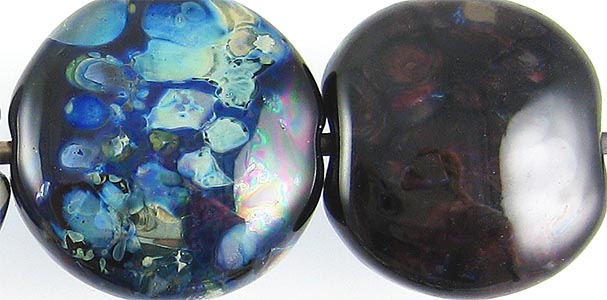
Where I used silver leaf on top of Streaky Denim, it sort of dispersed and is mostly not really visible on the bead's surface. However, when the bead is subsequently reduced and encased, you can see that the reason it was not visible on the surface was because it has spread itself thinly all over the bead. The rightmost bead in this picture has a shiny, mother-of-pearl effect under the encasement layer, and iridescent flashes of blue.

I've done this test with a lot of colours now (I think this might be colour #192 or #193) and at this point, what I am noticing is that some colours make silver spread out, some colours make it condense in on itself, and some colours don't influence its behaviour at all.


In my opinion, this colour doesn't make a great base for silver glass. The reducing silver glass frit looks washed out on top of it, and I had a hard time striking my TerraNova2 frit.


On top of Tuxedo and Copper Green, Streaky Denim separates and gets silvery around the edges. This reaction is pretty neat, and did not prepare me at all for what happened on the rest of the bead. For some reason, on top of Opal Yellow, Ivory, AND Peace, my Streaky Denim turned brown. This surprised me, and I'm not sure why it happened.  I should add also that in other beads, I have used Streaky Denim on top of both Opal Yellow and Ivory without this happening.  *sigh*

In spite of all this weirdness when it gets to be on top, when Streaky Denim is used as the base colour, the results are much less shocking, if not less confusing. Dots and stringer lines of Tuxedo, Opal Yellow, Ivory, and Peace on top of Streaky Denim seem not to react at all, and Copper Green's only response is to blush turquoise and separate slightly, and fail to develop the dingy army-green sheen that it had in the bead on the left.

Here are some fun beads with Streaky Denim:


June 2, 2016

Test Results :: Very Cherry


Effetre Very Cherry is a supersaturated transparent red that looks almost black until it is thinned out on top of other colours. It is not materially affected by a reducing flame, and once thinned out over white or clear, is a beautiful shade of red. Very Cherry also does not seem to get livery the way a lot of other reds do with long working., and it's a good colour to use in hollows, as well as twisties, wigwags and other kinds of cane since it holds its colour so beautifully in thin layers.


With silver, Very Cherry behaves much as it does for many other colours that are Ivory-friendly. The silver crusts up on the surface, much as it does with Ivory only without the blackening that accompanies this reaction on top of Ivory. In the bead on the right, you can see that reducing and encasing the silver made it turn blue. This is similar to results I've gotten with other hot transparent colours like Reichenbach Mystic Coral and Effetre Striking Orange.


Very Cherry also seems to be a really nice base for silver glass.  My TerraNova2 frit struck beautifully without any of the nasty discolouration that many other similarly effective base colours (e.g. Ivory) have when used with silver glass.


Reactionwise, Very Cherry doesn't really seem to pick a fight with other colours. You can see that it thins out and spreads on top of Peace which is probably a useful thing for it to do when used for flower petals, and some colours (Ivory, Copper Green, Opal Yellow) separate when used on top of it.

Here are some fun beads with Very Cherry:


May 29, 2016

Test Results :: Cleopatra


CiM Cleopatra is a very dark and dense transparent purple. It's so saturated that in order to see any colour in it at all, you need to use it in very thin layers over much lighter colours. Like most transparent colours, its apparent colour is very sensitive to the colour that is placed underneath it. For instance, as you can see in the the photos, it makes a very big difference to the resulting colour whether I've put it over Opal Yellow, Ivory, or Peace.

While I tested CiM Cleopatra, I thought about Effetre Dark Violet and my test results with that colour, and the first very significant difference I noted was that Cleopatra is redder than Effetre Dark Violet and more of a true 'purple' shade, at least when it's used over White.


To illustrate this, here are my pictures of Dark Violet and Cleopatra side by side.  To see my other Dark Violet test results, follow this link.  It is sort of interesting to note that while the colour of Cleopatra differed very greatly depending on what I placed it over, the colour of Dark Violet was less influenced by the base colour under it. I have no idea why, but I love glass and its mysteries.
Here, Effetre Dark Violet is on the left, and Cleopatra is on the right. You can barely see that the Effetre Dark Violet is a bit less saturated than the Cleopatra, which you can't see any light through at all.


Silver on top of Cleopatra is a very different set of reactions from what I got with Effetre Dark Violet, so the glasses are of very different composition. On top of Effetre Dark Violet, silver dissipates and beads up. On top of Cleopatra, it crusts up more like it does on top of Ivory. The appearance of the reaction is also different when reduced and encased, in that with Cleopatra it takes on a more cloudy, lighter appearance.


I am using a slightly different reducing silver glass blend now than I was last year when I tested Dark Violet, but the blend is still pretty similar and contains many of the same silver glass colours.  While I like what it did on top of Dark Violet, I really love the vibrant blues that came out on top of Cleopatra.


When used on top of Cleopatra, Opal Yellow, Peace, and Ivory all separate slightly and look three-dimensional.

The two tests here where the results are dramatically different from Dark Violet were with Copper Green and Opal Yellow. Specifically, Copper Green separates more dramatically on top of Cleopatra than on top of Dark Violet and Opal Yellow tolerates being topped with Cleopatra much better than it did with Dark Violet. The Opal Yellow stayed yellow and the Cleopatra stayed together.

Here are some fun beads with Cleopatra: