Search This Blog

May 29, 2016

Test Results :: Cleopatra


CiM Cleopatra is a very dark and dense transparent purple. It's so saturated that in order to see any colour in it at all, you need to use it in very thin layers over much lighter colours. Like most transparent colours, its apparent colour is very sensitive to the colour that is placed underneath it. For instance, as you can see in the the photos, it makes a very big difference to the resulting colour whether I've put it over Opal Yellow, Ivory, or Peace.

While I tested CiM Cleopatra, I thought about Effetre Dark Violet and my test results with that colour, and the first very significant difference I noted was that Cleopatra is redder than Effetre Dark Violet and more of a true 'purple' shade, at least when it's used over White.


To illustrate this, here are my pictures of Dark Violet and Cleopatra side by side.  To see my other Dark Violet test results, follow this link.  It is sort of interesting to note that while the colour of Cleopatra differed very greatly depending on what I placed it over, the colour of Dark Violet was less influenced by the base colour under it. I have no idea why, but I love glass and its mysteries.
Here, Effetre Dark Violet is on the left, and Cleopatra is on the right. You can barely see that the Effetre Dark Violet is a bit less saturated than the Cleopatra, which you can't see any light through at all.


Silver on top of Cleopatra is a very different set of reactions from what I got with Effetre Dark Violet, so the glasses are of very different composition. On top of Effetre Dark Violet, silver dissipates and beads up. On top of Cleopatra, it crusts up more like it does on top of Ivory. The appearance of the reaction is also different when reduced and encased, in that with Cleopatra it takes on a more cloudy, lighter appearance.
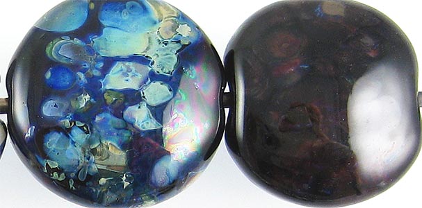

I am using a slightly different reducing silver glass blend now than I was last year when I tested Dark Violet, but the blend is still pretty similar and contains many of the same silver glass colours.  While I like what it did on top of Dark Violet, I really love the vibrant blues that came out on top of Cleopatra.


When used on top of Cleopatra, Opal Yellow, Peace, and Ivory all separate slightly and look three-dimensional.

The two tests here where the results are dramatically different from Dark Violet were with Copper Green and Opal Yellow. Specifically, Copper Green separates more dramatically on top of Cleopatra than on top of Dark Violet and Opal Yellow tolerates being topped with Cleopatra much better than it did with Dark Violet. The Opal Yellow stayed yellow and the Cleopatra stayed together.

Here are some fun beads with Cleopatra:


April 27, 2016

Test Results :: Ecru


1 - Plain (reduced), 2 - Plain, 3 - Ecru dots over Clear and encased, 4 - w/ Silver Leaf, 5 - w/ Silver Leaf (reduced & encased), 6 - w/ Silver Glass Frit (reduced), 7 - w/ TerraNova2 Frit, 8 & 9 - w/ Tuxedo, Copper Green, Opal Yellow, Ivory, and Peace

CiM Ecru is one of the newer CiM colours, and I am a fan. It melts beautifully, and none of my rods were in the least shocky. It fills a much-needed spot in my palette, there not being much in the way of semi-opaque neutral colours that aren't a nightmare to use in 104.

I intentionally tested this colour directly after testing Ivory Alabastro so that I would have a basis for comparison, and the results showed me that the colours are very different. The first major difference is workability. Ecru won this battle hands down, refusing to boil, shock, or splinter as I melted it. Second, the reactions I got with Ecru were quite different to what I found with Ivory Alabastro. Rather than describe the differences, I encourage you to go look at those results, which are in the post directly before this one.


The left side of this bead is Effetre Ivory Alabastro, and the right half of the bead is CiM Ecru. You can see here that Ecru is a bit warmer and a bit darker than Ivory Alabastro.


In this close-up of the smallest beads, what I see is that reducing Ecru hasn't changed it at all, and that pinkish brown webbing is evident in the surface of Ecru, although only at this magnification. I can't see it at all in these beads when I'm not wearing my magnifiers. In the right-most bead, I made a small core of Clear, added Ecru dots, and then encased the bead with Clear. What I learned here is that Ecru is so transparent in thin layers that you can barely see it. In person, it is only slightly more evident.


The addition of silver browns Ecru up considerably. You can see in the leftmost bead how it's gone a beautiful warm caramel colour. When the silver is reduced and encased, it results in a pinkish/blueish mottled appearance under the clear that has a faint MoP gleam to it.


Here in the leftmost bead, you can see that the 'caramelization' of Ecru also happens when you reduce silver glass on it.


When Copper Green is used on top of Ecru, it separates AND develops a dark line reaction around the dots and stringer lines. When Ecru is used on top of Copper Green, it separates the Copper Green slightly (the pale line around the Ecru stringer lines) but for some reason, no dark line develops.

Opal Yellow separates on top of Ecru. On top of Opal Yellow, Ecru spreads and feathers out, making its edges look all fuzzy.

Ivory separates on top of Ecru.

Sadly, due to my sad lack of photography skills, anything that might be interesting in the rightmost side of the rightmost bead has been lost to you, but you are not missing much because there's not a lot to see there. Ecru behaves with Peace much as it does with Opal Yellow, only less so, and less visibly since there's less contrast between the colours. And you can't really see Ecru very well on top of Ivory.

I made these spacers from a cane that was constructed similarly to the one I made with Ivory Alabastro, using the same other colours, and the result was that these beads came out a bit more uniform in colour and more translucent than the similar set made with the Ivory Alabastro.


Here are some fun beads with Ecru:


April 8, 2016

Test Results :: Ivory Alabastro

1 - Plain (reduced), 2 - Plain, 3 - w/ Silver Leaf, 4 - w/ Silver Leaf (reduced and encased), 5 - w/ Reducing Silver Glass Frit, 6 - w/ TerraNova2 Frit, 7 & 8 - w/ Tuxedo, Copper Green, Opal Yellow, Ivory, and Peace

Effetre Ivory Alabastro. You know that sound that vampires make in movies when light is shone on them?  That's the sound that I want to make now when I think about this colour. This one really fits 'Alabastards', the nickname generally used for this group of colours.

Adjectives to describe it?  Finicky, Shocky, Explosive, Boily, Vexing

It's too bad, because some of the reactions are really interesting, and it would be fun to explore them further. Except that it wouldn't be.  Grrr.


This picture is reminiscent of a polar bear in a snowstorm in that you will have to take my word that there are beads in it at all.  The reason they're so white is because this glass boils really easily, and the resulting white haze is permanent.

I made these beads first, and so I learned a little about how high in the flame I had to keep this colour. As a result, I had a bit better success with the remaining beads.  This helped me keep the colour from boiling, but between the slow melting and the shockiness, these beads took forever to make.


Ivory Alabastro seems to turn silver golden, which is sort of neat.


And the bead on the left really popped with the reducing silver glass frit.


In terms of reactions, the only things that were really interesting about Ivory Alabastro were the way it separated when used with Tuxedo and Copper Green,  If you look at the left-most bead, you can see the little halos around those two colours.

Here are the spacers I made from Ivory Alabastro, Dusty Rose Coral, and Effetre Very Cherry. I wouldn't have even made these, except that by the time I realized what I was in for, I had already made the cane and was too stubborn to waste it.