August 31, 2017
Test Results :: Tardis
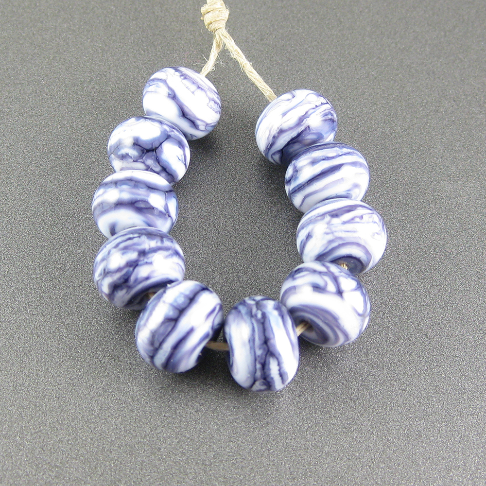
CiM Tardis (CiM552) is a gorgeous semi-opaque blue glass. In thin layers and if you don't strike it in the flame, it stays wonderfully translucent. My rods of this colour had great workability, not shocking, bubbling, or scumming in the flame.
Here, in the rightmost bead, you can see the Tardis beginning to opacify after giving it an extra blast of heat in a reduction flame. The reduction quality of the flame isn't important for this - repeated heating and cooling of this colour in a neutral flame has the same effect.
Here is Tardis with some other blues for reference. It's pictured with CiM Chalcedony, CiM Poseidon, Effetre Dark Periwinkle, Effetre Laguna, and CiM Electric Avenue. Ideally, I would have included a picture of CiM Atlantis in this picture to show how much bluer Tardis is than Atlantis, but I didn't have any so you'll have to just take my word for it.
CiM Tardis is most similar in colour to CiM Electric Avenue, but is somewhat more muted and a touch deeper in colour than CiM Electric Avenue. It also retains its translucency a little easier/better than Electric Avenue, although it, too, can opacify with repeated heating and cooling.
Silver dissipates on the surface of CiM Tardis. When the silver is reduced and encased, you can see that it has coated the bead in a uniform layer and takes on a snowy, bluish glow.
My reducing silver glass frit turned Tardis green, which was interesting but not at all what I was expecting. Because blue-on-blue is as interesting as a polar bear in a snowstorm, there's not much else to say about that bead. My striking silver glass got off to a decent striking start on top of Tardis, which means to me that Tardis would be a decent (but not awesome) base for striking silver glass.
Tardis awesomely does not have negative blackening reactions with Ivory. Since many blues and greens do yucky things with Ivory, I always feel lucky when I find one that doesn't.
Copper Green, Opal Yellow, Ivory, and Peace all separate on top of Tardis. In the rightmost bead, you can see that the Tardis inundates the Opal Yellow dots and stringer lines, making the edges look battered and intermittently pale blue. This happens to a lesser extent with Ivory and Peace.
Here are some other beads with CiM Tardis:
Posted by
Melanie Graham
0
comments
Labels:
Blues,
Creation is Messy,
Separates Copper Green,
Separates Ivory,
Separates Opal Yellow,
Separates Peace,
Tardis,
Turns reduced silver blue
August 28, 2017
Test Results :: Olive (Reichenbach)
Reichenbach Olive (RL4203) is a very pretty medium green. It's an opaque colour in that you can't see through it when you use it in thick layers, but I think it would be more accurate to call this colour an "opal" because it is definitely transparent when pulled thin, and has a sort of glow to it even when used in solid, self-coloured beads.
This is a little odd, but it seems like maybe Olive gets lighter when you strike it. I am used to striking colours darkening with repeated heating and cooling, but this one seems to do the opposite. This only happened in the beads where I restruck the colour in a reduction flame, so maybe it only happens in a propane-rich environment.
Here is Olive with a bunch of lighter colours, and then with it's closest colour cousin, CiM Shrubbery. Unlike many 104 CoE greens, Olive is not even a little bit streaky. This is nice if you're going for a more solid-looking green and not looking for an organic effect.
Silver on top of Olive doesn't change its basic greenness at all. When the silver is reduced and encased on top of Olive, its edges turn blue.
I got pretty colour out of both my reducing silver glass and my TerraNova2 frit on top of this Olive.
Here, you can really see how Olive thins out to translucency when applied in a thin layer.
Copper Green, Opal Yellow, Ivory, and Peace all separate on top of Olive. Out of these, only Opal Yellow separates when Olive is used on top of it.
When Olive is used on top of Copper Green, a thin outline of a lighter turquoise is visible around the Olive stringer lines and dots.
Here is an Olive goddess bead. I want to make some additional beads with this colour because I still have some, but they aren't ready yet. I'll come back and update this post with them after they're made.
Posted by
Melanie Graham
0
comments
Labels:
Greens,
Olive,
Reichenbach,
Separates Copper Green,
Separates Ivory,
Separates Opal Yellow,
Separates Peace
August 24, 2017
Test Results :: Canoe
CiM Canoe is a gorgeous, tawny striking brown. People who make sculptural animal beads are going to go nuts for this colour, since it is decidedly lion-coloured. It's also really well-suited to organic bead designs, because it's fabulously reactive without any of those reactions causing unpleasant blackening and muckiness.
This colour is a striking colour. These spacers were made at the same time, but the rightmost one got an extra blast of heat in a reduction flame before being popped into the kiln, resulting in a darker, warmer colour.
Here is Canoe with Kugler Beadmaking 104 Silver Petrol (previously known as ASK Silver Rattan), CiM Pumpkin Unique #1, ASK Caramel Apple (now known as Iris Savanne), Kugler Silver Brown (previously known as ASK Silver Cinnamon), and CiM Stone Ground.
ASK Silver Brown, in this picture, looks almost the same colour as Canoe, but I don't think that Canoe, even with the addition of silver, strikes to as dark a colour as Silver Brown does. Canoe is substantially browner and darker than Stone Ground.
The addition of silver darkens the colour of Canoe. When I reduced and encased silver leaf with Zephyr on top of Canoe, my bead cracked. The crack is an incompatibility crack, occurring both lengthwise and across the bead hole. So, encase this colour with caution, and maybe not with Zephyr and silver.
Oh my, this colour is gorgeous with silver glass. My silver glass reduction frit bloomed like crazy on top of this colour, engulfing the Canoe between the fritty bits. I also got beautiful colour from my TerraNova2 frit, which spread like crazy on top of this colour.
I had hoped that, since this colour was so much like the ASK browns both in the rod and in small beads, that it would have similar reactions. It doesn't, which is a bit sad since our last Kugler Beadmaking 104 vendor here in North America has recently decided to discontinue their sales of 104 CoE glass entirely. However, this colour is very interestingly reactive in its own right.
When Tuxedo is used on top of this colour, the Canoe rises up in halos around the Tuxedo stringerwork.
Canoe and Copper Green have a mutual separation thing -- it separates on top of Copper Green, asnd Copper Green separates on top of it. In both cases, a faint brownish line forms around the colour that is on top.
Canoe and Opal Yellow also mutually separate when used on top of one another. Where Canoe is on Opal Yellow, the separation is almost violent, looking fissure-like in the middle of the stringer lines. Opal Yellow separates a bit more gently, and spreads like crazy on top of Canoe.
On top of Ivory, Canoe looks darker than it does on top of other colours, and a dark line froms around its dots and stringer lines. The Ivory also bleeds into it, feathering at the edges of the Canoe decoration. Ivory separates on top of Canoe, and becomes surrounded by a dark Canoe halo.
Peace spreads on top of Canoe, but does not otherwise react with it.
Here is an organic bead made using Canoe both as the base colour and as part of the surface decoration.
Posted by
Melanie Graham
0
comments
Labels:
Canoe,
Creation is Messy,
Dark line w/Copper Green,
Neutrals,
Separates Copper Green,
Separates Ivory,
Separates Opal Yellow,
Separates w/Copper Green,
Separates w/Opal Yellow,
Separates w/Tuxedo,
Strikes
Subscribe to:
Posts (Atom)