Search This Blog

October 31, 2011

Test Results :: Evil Queen

Evil Queen is my 100th colour test. That sort of seems like a lot, yet there are more (maybe even a lot more) than 300 104 COE colours out there that I haven't even tried yet. Isn't it fortunate that being tasked with something that even I recognize to be impossible only makes me work harder?
1 - Plain, 2 - Plain (reduced), 3 - w/ Silver Leaf, 4 - w/ Silver Leaf (reduced & encased), 5 - w/ TerraNova2 Frit, 6 - w/ Silver Glass Frit (reduced), 7 - In Silver Glass Frit Stringer (encased), 8 - w/ Tuxedo, 9 - w/ Copper Green, 10 - w/ Opal Yellow, 11 - w/ Ivory, 12 - w/ Peace

CiM Evil Queen is the nicest opaque purple glass I have yet used. As luck would have it, it is also one the most expensive, trailing just behind Effetre EDP in terms of cost.

The consistency of Evil Queen is very soft, smooth and drippy.  Some of the other very soft CiM opaques have a noticeable 'stickiness' to them (e.g. Poi, Split Pea, Sherwood) but Evil Queen does not, although that is a pretty meaningless observation because the colours that do have that 'stickiness' are equally pleasant to use. In very thin layers or as hair-thin stringer, Evil Queen is slightly more on the semi-opaque side of opaque, so it's not an ideal colour for surface detail work.

Evil Queen does not devitrify, and pretty much stays where you put it on a bead. It is a little reactive, but in a gentle way, as opposed to the crazy reactivity I experienced with EDP. It does not turn a livery brown with repeated striking the way Effetre Dark Violet does, and isn't particularly streaky like Effetre New Violet or CiM Poi are.


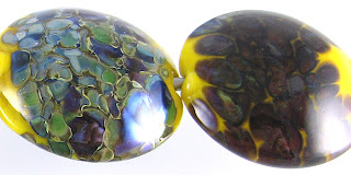
Evil Queen does not change colour when silver leaf is added to the surface, and the silver leaf sort of fans out and balls up on the surface, creating a sort of mist of silver spray. When the silver is subsequently reduced and encased, it gets some blue highlights and forms a solid, matte armour-like coating over the core of Evil Queen. I think the yellowing that we can see in the bead on the right is due to a reaction between the Clear and the silver, and is not attributable to the Evil Queen.


Silver Glass on Evil Queen isn't very exciting. My TerraNova2 frit stubbornly refused to strike, although the light purple halos that sprung up around it are very neat. The reducing silver glass frit on top of it just looks kind of mottled and sad, but it is kind've intriguing how reducing the silver glass made the Evil Queeen underneath take on a shiny, purple iridescence. When I used Evil Queen with silver glass frit in frit stringer, wrapped that around a core of Evil Queen and then encased it, I got a little bit of interesting streakiness, but Evil Queen is just not reactive enough to really succeed with this technique.


Evil Queen and Tuxedo are mutually reactive. When Tuxedo is used on top of Evil Queen, the Evil Queen rises up around the Tuxedo dots and stringer lines and forms a lighter purple outline around its edges. When Evil Queen is used on top of Tuxedo, it separates, developing a dark, translucent purple line in the middle of stringer lines, and the edges of the stringer lines and dots look a little hazy on the left side of this bead.


The combination of Evil Queen and Copper Green doesn't really result in a lot of reactivity, but a couple of things sort of spark my interest here. First, the Copper Green develops a bit of a sheen. On the left side of the bead where the Evil Queen is over Copper Green, the Copper Green looks sort of vibrantly turquoise, but has also sheened up, taking on a dreamy, mottled appearance. On the right side of the bead where Coper Green is over Evil Queen, the Copper Green does not have that vivid turquoise colour, but does seem to have spread a little and is definitely somewhat shiny.

On the left side of the bead, you can see how the dots and stringer lines of Evil Queen have separated gently, and a darker line of purple runs through the stringer lines. The edges of the Evil Queen dots and stringer lines seem a little blueish and indistinct.

Opal Yellow and Evil Queen are both soft, spready colours, so it was not very surprising that I experienced some spreading of the dots and stringer lines on both sides of this bead. On the right side, where Opal Yellow is over Evil Queen, the edges of the Opal Yellow are sort of indistinct and have a somewhat violet hue to them. On the left side, where Evil Queen is over Opal Yellow, the Evil Queen has also spread a little, and has also separated into two different shades of purple, a thickish, lighter line forming around the edges of the dots and stringerwork. Neat.


Ivory spreads out a little on top of Evil Queen, and my Ivory stringer lines and dots also have a curdled, mottled appearance. On the left side of the bead, the Evil Queen dots all have a lighter purple outline and faintly darker centre. Their edges are also a little cloudy and indistinct.


Over Peace, Evil Queen seems more of a semi-opque than an Opaque. Peace spreads on top of it, and you can see in the centre of the bead how the Evil Queen has bled into the Peace turning it a purplish blue colour.

I didn't make any real beads with Evil Queen, but I am sure that I will revisit this colour. When I do, I will come back and update this post with some pictures.

October 23, 2011

Test Results :: Sunshine

1 - Plain (reduced), 2 - Plain, 3 - w/ Silver Leaf, 4 - w/ Silver Leaf (reduced & encased), 5 - w/ Silver Glass Frit (reduced), 6 - w/ TerraNova2 Frit, 7 & 8 - w/ Tuxedo, Copper Green, Opal Yellow, Ivory and Peace

Vetrofond Sunshine is a vibrant, pure yellow. It reacts in ways that I consider predictable for an opaque yellow glass and while the rods can be a little shocky, and if you get it too hot it boils, it is not an unpleasant colour to use.

One of the tricky things about Vetrofond Sunshine is how grainy it is when it's hot. It's a hard colour to get good coverage with in thin layers, making dots and stringer lines of it on top of other colours sort of mottled and untidy.


Silver spreads out on top of Sunshine and turns a silvery brownish colour, keeping its shine. The Sunshine underneath fumes a deeper, brownish colour. I put additional dots of Sunshine on top of the silver in the bead on the left, and they stayed mostly yellow, but do have a greenish tinge to their edges and have a distinct line around them where the silver has grudgingly given way. In the bead on the right, the reduced and encased silver has taken on a sort of ethereal bent on top of the Sunshine, turning faintly blue and pink in places. If the ethereal pink and blue covered the whole bead, it would be attractive. If that is achievable every time with more careful application of the silver, that would be pretty neat. More experimentation required.


On top of Sunshine, I got really nice colour and coverage with my reducing silver glass frit, and a nice variety of blues and greens popping. In the bead on the right, my TerraNova2 frit is largely unspectacular, although I did get some colour here and there. This is a colour that seems to be a better base for reduction colours. If only it weren't yellow.

On top of Tuxedo, Sunshine looks sort of livid and splotchy. Tuxedo dots and stringer lines on top of Sunshine cause a little activity in the Sunshine underneath and receive a faint yellow outer ring.

Copper Green and Sunshine have a reciprocal dark line reaction. When Sunshine is used over Copper Green, that dark line is brown and spready, engulfing and transforming most of the Sunshine dots and stringer lines so that they look more brown than yellow. When Copper Green is used over Sunshine, it develops an army green shiniess and a black outline.

Something about using Sunshine with Opal Yellow made my Opal Yellow do some very strange greying things, in both of the test beads.

There is not much in the way of reaction between Sunshine and Ivory, but when Sunshine dots and stringer lines are made on top of Ivory, the yellowness of the Sunshine seems to creep into the Ivory, leaving what is left of the Sunshine looking more of a mustard colour and making the Ivory seem more yellow. The same effect in reverse is visible when Ivory stringer dots and lines are placed over Sunshine.

Peace and Sunshine also seem mutually reactive, but there are multiple things going on so it's hard to describe. The Peace seems to separate, both when Sunshine is on top of it and vice versa, but the two colours in combination also cause some greying/blotchiness. It's not attractive, so I'm not bothering to analyze it further.

Here are some fun rainbow beads with Sunshine. Apart from hiding it in vine cane, the only thing I can ever really think of to do with a yellow this bright is to put it into rainbow beads. When I make rainbow beads with an opaque yellow in them, I need to be careful because yellows, like Ivory, don't usually react particularly nicely to greens. To proactively solve this problem, I encase my Sunshine with Reichenbach Mystic Yellow, which is a yellow translucent that does not have that problem.

October 17, 2011

Test Results :: Strawberry

1 - w/ Silver Leaf, 2 - w/ Silver Leaf (reduced & encased), 3 - w/ Silver Glass Frit (reduced), 4 - w/ TerraNova2 Frit, 5 - Plain, 6 - w/ Plain (reduced), 7 & 8 - w/Peace, Ivory, Opal Yellow, Copper Green and Tuxedo

Reichenbach Strawberry (RL6213) is a bright, cherry red opaque that has just the slightest bit of translucency to it. I didn't really like working with this colour, because as you can see in the beads above, it tends to grey up with repeated striking. All of the smaller beads I made are fine, but the larger ones look just terrible. I didn't do enough experimentation to really get a feel for how to control the greyness.

This is an awfully pretty colour of red if you can figure out how to make it stay red, and it does have some interesting reactive properties.


Strawberry turns black where it meets silver leaf, and the silver leaf in the bead on the left has a grainy, webby consistency to it that is rather attractive. Reducing and encasing the silver removes some of the texture and doesn't really add anything nice to the effect. The silver over Strawberry after encasement looks a little like the surface of the moon.


Silver glass frit doesn't really do very well on top of Strawberry. A black line develops around the edges of the frit and sort of overwhelms it. In the bead on the left, I got some nice blues and turquoises where the black did not completely engulf the silver glass, but my TerraNova2 frit bead just looks kind've sad and yucky.

Strawberry has some interesting reactions with other colours, although they are not easy to read here because the Strawberry, in a lot of places, has turned almost completely a uniform dark grey colour. However, even through this yucky grey, some reactions are evident:
  • Copper Green separates slightly on top of Strawberry, developing a thin, dark green line down the centre of stringer lines and faint translucent halos inside dots.
  • When Strawberry is used over Opal Yellow, it causes separation in the surface of the Opal Yellow and a thin yellow line rises up from the Opal Yellow to surround the Strawberry stringer lines and dots.  When Opal Yellow is used over Strawberry, it separates very dramatically, and spreads out, curdling around the edges.
  • When Strawberry is used over Peace, it causes separation in the surface of the Peace and a thin white line rises up from the Peace to surround the Strawberry stringer lines and dots. This reaction is less dramatic and less consistent than the same reaction with Opal Yellow. Peace separates on top of Strawberry, developing a thin dark line/dot in the middle of stringer lines and dots.
  • Ivory curdles underneath Strawberry. On top of Strawberry, Ivory stringer lines and dots get jagged edges around them and develop fine, translucent centre lines/dots.
Here is a fun rainbow bead with Striking Red-encased Strawberry.
 

October 13, 2011

Test Results :: EDP (Evil Devitrifying Purple)

1 - Plain, 2 - Plain (reduced), 3 - w/ Silver Leaf, 4 - w/ Silver Leaf (reduced & encased), 5 - w/ Silver Glass Frit (reduced), 6 - w/ TerraNova2 Frit, 7 - w/ Tuxedo, 8 - w/ Copper Green, 9 - w/ Opal Yellow, 10 - w/ Ivory, 11 - w/ Peace

Effetre Purple, most commonly known as Evil Devitrifying Purple (EDP), is a very strange colour. The reactions with EDP and other colours are strikingly similar to the reactions I got with Reichenbach Flamingo. This is a very reactive colour. It is also a very frustrating colour because of its tendency to devitrify, turning matte and white in odd ways and places.

What I think I've discovered about working with EDP is that it is important to work it hot, and to not let it cool too much before finishing the bead. Cooling the surface of the bead -- by waiting outside the flame, by pressing -- and then reheating it seems to be what caused me the most devitrification headache. Keeping the bead pretty hot and cooling it only once, at the end on it's way to the kiln, is what helped me keep the devitrification off of these test beads. Where I did get some, I reheated the bead and got rid of it and put the bead away fast before my luck changed.

I find that when I work on large focals with EDP or Sedona (it devitrifies too *sigh*) that I usually just end up either etching or encasing the bead because I get discouraged once the bead is well and truly devitrified. I learned from Kimberly Affleck that you can reduce the devit off in a dragon's breath flame, but sometimes I don't really want to reduce my bead, and as you will see below, reducing EDP can have some unpleasant effects.

Here we have two plain spacers made from EDP. The one on the left is a rich purple with hints of blue. The one on the right was reduced, and is now a shiny, brownish purple. I did not know that EDP did this when it was reduced, so it was an interesting surprise.


EDP and silver don't really seem to like each other very much. You can see in the bead on the left how the EDP has sort of gone haywire under the silver, getting all pink and yellow. The silver leaf on top of the EDP has a strange greenish orange cast to it. When the silver is subsequently reduced and encased, almost every interesting thing that silver and EDP do together is no longer evident, the silver just looking like a dirty white shell over the mottled purple core of the bead.


Here, in the bead on the left, the EDP has turned almost all of the reduction fritty bits yellow. Underneath the frit, the EDP has turned pinkish and yellow (from the silver) and brown (from the reduction). In the bead on the right, my TerraNova2 frit sort of stubbornly refused to strike, and all around it, the EDP has turned pink and coral.

On top of Tuxedo, EDP looks blue and cloudy.

EDP makes copper green separate into two different colours of turquoise, and seems to prevent the copper green from getting that greyish sheen. The EDP is sort of mottled in this bead, looking like itself in some places and looking bluer and cloudier in others. This is an awesome reaction, and if you are familiar with the classic EDP/Copper Green/Opal Yellow colour combination and are looking for other colours that will work, I'd start by looking for other colours that do this to Copper Green. 

A few opaque colours that I have found so far that have this kind of dramatic reaction include Lauscha Olive, Lauscha Steel Blue, Lauscha Cocoa, CiM Rainforest and Reichenbach Flamingo. Of course, I have not tested them in combination with both Copper Green and Opal Yellow, so I don't know what the final result would look like, but these all seem like they'd be good ones to experiment with.


This is the yellowest yellow I have ever achieved with Opal Yellow, although Opal Yellow has behaved strangely with all of the same colours that have made Copper Green go crazy. In this bead, the EDP is a mottled pink and purple, and has formed a sort of pinkish brown line between itself and the Opal Yellow. The Opal Yellow, apart from being a lot yellower than I would have thought on the left-hand side of the bead, has also separated and developed purple dots in the centres of its dots where I've put it on top of EDP. Fun!


Weirdness with Ivory, again in almost exactly the same way Reichenbach Flamingo was weird with Ivory, turning it black. EDP looks sort of blueish on top of the blackened Ivory, in the same cloudy way that it looked blue on top of Tuxedo. The Ivory lines and dots on top of EDP look black, but in a strange pencil-lead kind of way that makes them look sketched on instead of painted on.


On top of Peace, EDP looks almost pink, and spreads a little. Peace on top of EDP separates, and all of the dots and stringer lines get a dark, translucent purple centre.

Here are some fun beads with EDP.


In all of the crunched beads, I used a cane that I made from EDP, Light Turquoise, Celadon and Iris Dense Blue. All of the orange you see in the beads is from a reaction between the EDP and Iris Dense Blue. The unencased bead (bottom left) devitrified pretty heavily, but you can't see any devit in the two beads I encased, and I rather like the resulting mottledness.

October 8, 2011

Test Results :: Candy Corn

1 - Plain, 2 - Plain (reduced), 3 - w/ Silver Leaf, 4 - w/ Silver Leaf (reduced & encased), 6 - w/ Silver Glass Frit (reduced), 6 - w/ TerraNova2 Frit, 7 - w/ Tuxedo, 8 - w/ Copper Green, 9 - w/ Opal Yellow, 10 -w/ Ivory, 11 - w/ Peace

Rods of Candy Corn are orange on the outside and have what seems to be a core of White running through them. What this translates to in a bead is a streaky orange that ranges from a pretty light orange to a dark, tomato colour.

Candy Corn, like the other Vetrofond veiled odd lots, can be a little annoying to work with. It's not as bad as Honey Crunch or Avocado Marble, but some of my rods did have that problem with cracking off every few inches while I was working.


On top of Candy Corn, silver leaf gets a yellowish, crusty look to it, and causes a bit of a dark line reaction between it and the Candy Corn, otherwise pretty much staying put. When the silver is subsequently reduced and encased, it turned back to silver except for some patches that either stay yellowish or develop a blueish tint.


My reducing silver glass looks bluer on top of Candy Corn than it has on top of other colours, but I have been using the same blend for most of this year. The silver glass on both beads has a very distinct black border around all of it's little fritty bits. The TerraNova2 frit in the bead on the right didn't really get off the ground in terms of striking.


No reactions to see here, really, but it is interesting how on the Tuxedo side of the bead the Candy Corn stringer lines have a light outline. I think this is from the streakiness of the glass, and I like how that streakiness translates into a textured look in the stringerwork.


Candy Corn and Copper Green develop a mutual dark line reaction. Again, the Candy Corn stringer lines have a beautiful streakiness that makes them look almost three dimensional, or like they've been intentionally shaded.


On top of Ivory and Peace (much more so on top of Peace), Candy Corn spreads a little and because of its streakiness, has some interesting things going on. Peace separates and develops a thin, translucent line down the middle on top of Candy Corn.

I've taken some short cuts here, but Candy Corn just isn't a very reactive colour. The streakiness is fun though, and I can't wait to work with the other Vetrofond odds that are languishing in my glass box.

Here's a fun bead with Candy Corn.

October 2, 2011

Test Results :: Electric Yellow

1 - w/ Silver Leaf, 2 - w/ Silver Leaf (reduced & encased), 3 - w/ TerraNova2 Frit, 4 - w/ Silver Glass Frit (reduced & encased), 5 - w/ Silver Glass Frit (encased), 6 - Plain, 7 - Plain (reduced), 8 - w/ Copper Green, 9 - w/ Opal Yellow, 10 - w/ Ivory, 11 - w/ Peace

Effetre Electric Yellow is not all that electric. For some reason, I was expecting a brighter, less tolerable colour when I saw what they'd named it, but it's sort of surprising that I didn't know better since I've done more than eighty of these colour tests now and it's pretty common for the colour names to not elicit the right mental picture.


I didn't do a great job of striking the Electric Yellow in small spacers, but since I never make small beads, that won't ever matter to me very much. In all of the other beads, I had no trouble striking it at all - it seemed to happen naturally just by working it.

The irritating thing about Striking Yellow is that it looks exactly the same as a lot of other colours that aren't yellow. For instance, it's sort of hard to tell Electric Yellow apart from Clear unless you've melted the end of it, and it's almost impossible to tell it apart from Striking Red, too. This can make a torching session a little like a game of Russian Roulette if you aren't careful about keeping track of where you put stuff down. The very first thing I do now when I 'm working with this colour (or Striking Red) is melt one end of the rod slightly and tease a strike out of it, and then use that end as the handle from then on (AFTER it cools. OUCH!) so that no accidents happen.


Electric Yellow does the same thing opaque yellows do when you add silver to it, which is turn brown. Silver leaf on top of Electric Yellow goes very brown, almost black in places, with some silvery bits crusting on the surface. Encasing this reaction predictably nets silver and brown under clear.


Silver glass is surprisingly nice on Electric Yellow, or at least the reducing silver glass frit was. The TerraNova2 frit didn't seem to get a very good strike on the face of the beads, but on the edges where it naturally cooled more, it is nicer. This tells me that the lack of colour here is MY fault. The reducing silver glass frit looks really neat, sort of blending together and forming those funky yellow lines around its edges.


Blech. This is the result of making frit stringer with Electric Yellow and reducing silver glass frit, using that to encase a bead made from Electric Yellow and then encasing with Clear. Not attractive at all, although some of the effects inside are interesting to look at.


Copper Green and Electric Yellow are also surprisingly nice together. I particularly like the side of the bead where the Electric Yellow is on top of the Copper Green. There is not much in the way of reaction on the Striking Yellow side of the bead, although the Copper Green does have an interesting sheen to it and is noticeably paler and faded around the edges of the dots and stringer lines. The light line that has formed around the Electric Yellow dots and stringer lines on the right-hand side of the bead are more interesting, and really just sort of cool. Like.


And then Electric Yellow just sort of stopped being interesting. Ivory and Peace separate on it a little bit, but honestly, that happens with a lot of colours so it's hard to get excited about. There is really not much of a reaction between Opal Yellow and Electric Yellow at all.

I didn't really make a lot of beads with Electric Yellow because I was afraid (unnecessarily, as it turns out) that it would be stupidly reactive and wreak havoc with the other colours I was using, but I did make this rose cane. The cane is Electric Yellow and a hand-mixed yellow that I made by combining Orange Sherbet and Dark Ivory in roughly equal proportion.