Search This Blog

March 30, 2013

Test Results :: Sprout

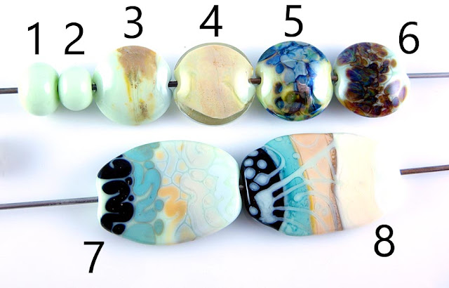
1 - Plain, 2 - Plain (reduced), 3 - w/ Silver Leaf, 4 - w/ Silver Leaf (reduced & encased), 5 - w/ Silver Glass Frit (reduced), 6 - w/ TerraNova2 Frit, 7 & 8 - w/ Tuxedo, Copper Green, Opal Yellow, Ivory and Peace

Both CiM Sprout and CiM Cardamom are light green opaque colours, however what I'm seeing is that Sprout is a bit lighter, and much less yellow. It's a brighter, more cheerful colour than CiM's other production pale green, Dirty Martini (which I have yet to test.... hopefully soon!), which I love very much. All of these colours are wonderful, but I think Sprout might just be my favourite of the three.

Sprout's reaction profile is much different than Cardamom's, and I won't be able to compare it to how Dirty Martini behaves until I've tested that colour. However at first blush I think I'll guess that these reactions and the reactions Dirty Martini shows us will have more in common than the reactions I got with Cardamom.

Sprout doesn't seem to change colour or have any other odd surface reaction when it is reduced.


On top of Sprout, silver turns a pinkish orange colour when it is simply burnished on and then melted into the surface of the glass. When the silver is reduced and encased, it forms a pinkish peach 'blanket' under the clear.

The other thing that's very interesting about the bead I reduced and encased is that the colour of the Sprout has turned very yellow, looking much more like CiM Cardamom. What I don't know (because I didn't test it *sigh*) is whether the silver is necessary for this discolouration or if Sprout will always look yellower under encasement.  It's hard to think of everything... especially since everything just looks orange when it's hot.

Another plus: Sprout didn't crack when I encased it.


Now, I'm not thrilled with the colours that Sprout pulled out of my silver glass, but I think there's some interesting potential here. In the bead on the left, with my reducing silver glass frit, you can see some brownish/yellowish fuming around some of the fritty bits. I got nice blues and nice shine out of my frit blend on that bead.

Regarding the bead on the right, I got a few good colour spots from my TerraNova2 frit which seem to indicate that the striking might just be slower on top of this colour. The most exciting thing about this bead is the weird haloed veining that occurred in the Sprout underneath the TerraNova2. You can see the light green that has risen up around the frit, and then the much darker green, grouty 'veins' between them. Neat.


When Tuxedo is used on top of Sprout, some subtle bleeding occurs. You can see that the Sprout, around the Tuxedo, has turned darker and sort of blueish. When Sprout is used on top of Tuxedo, the Sprout separates. And it separates in the exact opposite way from how colours usually separate, with the thinned out, translucent side of the separation on the outside of the dots and stringer lines and the more opaque centre of the separation being on the inside of the dots and stringer lines. Weird.

Sprout seems to be another one of those colours that helps Copper Green not to go all grey when they are used together. On top of Sprout, Copper Green seems to develop a faint dark line reaction. When Sprout is used on top of Copper Green, the line is turquoise.

Opal Yellow on top of Sprout is pure weirdness. The Opal Yellow has spread, and my dots and lines seem almost to form a mosaic, with darker veins like grout between them. The effect is especially cool because there is also a pale green halo around the Opal Yellow, resulting in two distinct reaction lines instead of the usual one. Opal Yellow seems to want to strike very butter-yellow both on top of and underneath this colour, although in a sort of patchy way.

Ivory on top of Sprout has to be the coolest thing in these tests. Like Opal Yellow, Ivory spreads out on top of Sprout and develops faint green halos around it and that interesting green grout reaction. Ivory has the additional feature of having separated in a wierd, shaded way. It almost looks like someone drew the Ivory lines on with oil pastels and did some blending, because the effect is very stylized. When Sprout is used on top of Ivory, it sort of gets swallowed.

Nothing very interesting happens between Sprout and Peace, but it's hard to feel sad about that when there's so much else going on. If anything, Peace seems to steal colour from the Sprout because my white lines and dots don't look all that white on top of Sprout.

So, now I need to tell you that there isn't much of this available. Frantz Art Glass has it in their funhouse currently, and you can buy 1/4# at a time. If you really have a burning need for this colour, the best place I've found to purchase it  is at Artistry in Glass in Ontario, because they haven't imposed a quantity limit.
March 24, 2013

Test Results :: Opal Raspberry


Reichenbach Opal Raspberry (RL6219) is a bright, dark pink colour. It might be the only consistent dark pink opaque colour in our palette that doesn't devitrify like my dog's life depends on it. It's also a really odd colour, both in terms of behaviour on its own and reactions with other colours. The reactions are a lot like the reactions I've observed from Sedona, EDP, Rubino Oro and Reichenbach Flamingo, so there's a whole category of pink and purple colours that are this strange.


In the bead on the left, you can see how Opal Raspberry mottles and streaks and develops separation lines with itself that look almost like cracks in the surface of the bead, although that's just an illusion. In the bead on the right, I reduced the Opal Raspberry resulting in a dark burgandy, shiny reduction film. The mottled surface of the bead shows through the reduction film - you can see it in the middle of the bead.


When silver leaf is melted into the surface of Opal Raspberry, it turns the pink to a vivid shade of yellowish orange. The silver settles into veins on the surface of the bead. When the bead is reduced and encased, the silver forms an interesting, lacy pattern over the discoloured Opal Raspberry. You can see its yellowish orangeness peeking through the 'holes' in the silvery lace coating under the clear.


Opal Raspberry is a beautiful base for silver glass colours, both striking and reducing. In the bead on the left, I got beautiful shine and variation from my reducing silver glass frit, and then in the bead on the right my TerraNova2 frit has struck to blues and greens very nicely.


Reaction-wise, quite a lot is going on in these beads.

When Opal Raspberry is used on top of Tuxedo, it looks not quite opaque and develops separation lines in the centre of dots and lines that are sort of messy in appearance.

On top of Opal Raspberry, Copper Green separates into a lighter and a darker, brighter version of itself. This is the same as the reaction Copper Green has to Lauscha Cocoa, Lauscha Steel Blue, Lauscha Cocoa, Effetre EDP, Effetre Sedona, and Reichenbach Flamingo, to name a few. When Opal Raspberry is used on top of Copper Green it separates the Copper Green underneath it so that a lighter line appears directly around the pink but then the darker, vivid turquoise remains between the dots and stringer lines. This reaction is not quite as attractive as the reaction with, say, EDP because the Opal Raspberry does not thin out enough around the Copper Green and lose enough of its opacity to really make the reaction work.

On top of Opal Raspberry, Opal Yellow takes on a decidedly orange appearance, especially around its edges. The separation lines that Opal Raspberry gets here are around the edge of the Opal Yellow instead of just down the middle, resulting in a sort of three-dimensional illusion of a crack wandering around the edges of some of the stringer work and a divot appearing in the centre of my dots. When Opal Raspberry is used on top of Opal Yellow, it causes the Opal Yellow to separate from itself and instead of the crack-like appearance, it looks rather like the base bead of Opal Yellow had a dot of clear and then another dot of Opal Yellow on top of it underneath my Opal Raspberry dots.

Ivory develops a serious dark black-brown line around it on top of Opal Raspberry. When Opal Raspberry is used on top of Ivory, because the Opal Raspberry is not completely opaque the entire line takes on a brownish purple appearance with smears of pink wandering around on top of it.

With Peace, the reactions are much less evident. When Peace is used on top of Opal Raspberry, it develops faint separation lines in the stringer work. When Opal Raspberry is used on top of Peace, it thins out to a semi-opaque appearance in an uneven, mottled way.

Here are some fun beads with Opal Raspberry. I had a bit of a fingerpainting session when I tested this glass, wanting to see if anything good would come of using Opal Raspberry in place of the EDP in the classic OY/EDP/CG reaction. Those beads also have some Periwinkle in them.

The goddess is self-coloured Opal Raspberry. Opal Raspberry is weird glass, but pretty!

March 19, 2013

Test Results :: Opal Yellow

1 - Plain, 2 - Plain (reduced), 3 - w/ Silver Leaf, 4 - w/ Silver Leaf (reduced & encased), 5 - w/ Silver Glass Frit (reduced), 6 - w/ Terranova2 Frit, 7 & 8 - w/ Tuxedo, Copper Green, Ivory and Peace

Effetre Opal Yellow is one of my favourite colours, and is on my list of colours where, if it were to suddenly be no longer available, I would be a very sad girl indeed. Opal Yellow is a very stable base colour, the only weird thing about it being that it tends to blush pink when either silver is added or it is struck repeatedly. It's versatile - there's almost nothing that you would want do do with a glass colour (apart from encase, since it's opaque) that you can't do with Opal Yellow. It makes a great base for silver glass, and because it is not super-reactive, it can be used in combinations with most other colours (with the possible exception of colours in the 'sulfur' family, like Ivory) without worry.


Here you can see how the Opal Yellow has gone quite pink after adding the silver. It's more pronounced in the bead on the left. The silver leaf when left unencased kinda sits on the surface of Opal Yellow and doesn't do anything all that magical. The appearance of it is not improved by encasing it - it turns it a light pink colour that is sort of  lost against the yellow. OK, so there's one thng that Opal Yellow isn't so good at. :)


Opal Yellow loves silver glass. It's a great base colour for both striking and reducing silver glass colours. In both of my test beads, the silver glass got great colour and did exactly what I expected it to do.


When Tuxedo is used over Opal Yellow, it bleeds. You can see a faint blueish stain around my Tuxedo stringer work in the bead on the left. On top of Tuxedo, the edges of Opal Yellow look sort of indistinct and sort of like a milk moustache.

Opal Yellow is another colour that keeps Copper Green from getting that greyish film on it. My Copper Green in these beads looks bright and beautiful. The most interesting thing about Copper Green and Opal Yellow is the faint line that develops between them. When Opal Yellow is used on top of Copper Green, it develops a faint dark turquoise line around it. When instead Copper Green is used on top of Opal Yellow, the line that forms is more of an orange colour. In both cases, it is the colour used as an accent that develops a faint separation reaction.

We've seen this before in my test results for Ivory and Dark Ivory, but Opal Yellow and Ivory don't so much get along. Ivory tends to go grey on top of Opal Yellow.

Peace dots and lines on top of Opal Yellow get a rosy orangey look to the edges and separate slightly. As a result, they almost disappear on top of the bead. When Opal Yellow is used on top of Peace, it seems even more inclined than usual to blush a pinkish colour.

In this bead, I used Opal Yellow as the base colour for the frame. I then liberally striped it with Silvered Ivory Stringer. The rod of Opal Yellow I used here was from a strangely pale batch, and it really reacted with the Silvered Ivory, resulting in it having a very aged appearance to it.
 

This fun set is made with KUG Pea Green, CiM Phoenix, EFF Periwinkle and EFF Opal Yellow. I love the reactions in these beads, which seem to be mostly due to the Pea Green. I haven't tested Pea Green yet, but will someday soon. Kugler Pea Green used to be known as ASK Mediterranean Olive.

This is Opal Yellow with Precision 104 Black Pearl. I love the reactions.

This one is Opal Yellow with a rainbow wigwag, rainbow murrini, and Hades decoration.

March 13, 2013

Test Results :: Tangerine

1 - Plain, 2 - Plain (reduced), 3 - w/ Silver Leaf, 4 - w/ Silver Leaf (reduced & encased), 5 - w/ Silver Glass Frit (reduced), 6 - w/ TerraNova2 Frit, 7 - Over Silver Foil, 8 - w/ Silver Glass Frit (frit stringer), 9 & 10 - w/ Tuxedo, Copper Green, Opal Yellow, Ivory and Peace

CiM Tangerine is a transparent orange colour that requires striking in order to achieve its full brilliance. I didn't have the best of luck with this colour and found it harder to strike than Effetre Striking Orange. Tangerine is similar enough to Striking Orange, huewise, that I consider Striking Orange to be a better colour because of its relative ease of use. I haven't tested CiM Clockwork yet, and am interested in what I will find when I do. Lots of people prefer Clockwork to Striking Orange and I am looking forward to finding out why.


Here you can see in the bead on the right that I had some trouble striking this glass. The bead on the right is reduced, so either I didn't strike the glass properly before reducing it, or striking it in the reduction flame unstruck the colour. It's sort of hard to say without conducting some more tests to be sure.


Here, in the bead on the left you can see that my silver leaf has changed the colour of the Tangerine almost to black, and only a few bright beads of silver are visible on the surface. When the silver is reduced and encased, it turns grey and blue and shiny. Interestingly enough, the orange shows as orange again rather than black once it's encased.

In Bead #7 (see group shot) I tried to encase some silver foil to see what colour the foil would turn, and it turned black pretty uniformly. I also tried my frit stringer test in Bead #8, and that also produced nothing very beautiful, with my frit stringer turning a mottled grey underneath the clear encasement layer.


However, although Tangerine is kinda weird and dark with silver, my reducing silver glass looks stunning on top of it. Like the silver leaf, it has turned the Tangerine a very dark colour but the frit has reduced very nicely on top of Tangerine and its edges have a mottled, three-dimensional appearance. The test with TerraNova2 yielded some patches of interesting colour, but not enough to try it again. Tangerine definitely seems to be a nicer base for the reduction silver glasses.


Reactions with Tangerine are not that exciting, but Copper Green, Opal Yellow, Ivory and Peace all separate on top of it. Tangerine seems to be one of those colours that helps Copper Green not 'grey up' and get that metallic grey film on it.

The strangest reaction is on top of Opal Yellow, where you can see the brownish middle of the line where I applied Tangerine stringer, and then a sort of paler ghost line surrounding it.

Here, I used Tangerine with Light Zucca, Clear and Peace in the cane for the flower petals.


March 10, 2013

Pantone Colours - Fall 2013

I had so much fun with this with the Spring palette, that I've decided to give it a shot again for the Fall one.


So, here we have the women's palette on top and the men's palette on the bottom. The only colour that is different between the two, apart from the order the colours are shown in, is the 'pink' which is noticeably purpler in the men's palette (Beaujolais vs. Vivacious).

The only colour in the fall palette that was also in the spring palette is that darned Emerald colour. The one colour I wasn't super-fond of in the Spring palette just won't die.

Matching 104 COE glass colours to some of the colours in this palette is a bit of a challenge, but I've done my best below. I'll continue to think about it and come back here to update anything that occurs to me over the next little while.

Samba
EFF Purple Red
CiM Valentine (A little dark, maybe not quite purple enough)
EFF Spanish Leather (a little on the orange side maybe)

Koi
EFF Striking Orange Transparent
CiM Phoenix
EFF Light Zucca (this is streaky, and will end up having yellow in it though)

Linden Green
EFF Olive Transparent (also called Envy - this might be a little dark, but it's close)
CiM Gooseberry (limited run)
EFF Spring Willow
CiM Mojito
LAU Thüringen Herb (not currently available)
EFF Pale Green Apple

Deep Lichen Green
LAU Thüringen Forest (This is a pale transparent, but the hue is about right)
KUG Isar Blue (This is not as dark either, but in the right ballpark)
EFF Dark Steel Grey (Especially over Ivory)
EFF Chocolotta Verde (On the brown side, but closer than a lot of other colours)
LAU Olive (Not quite dark enough or grey enough, but close)
CiM Dried Sage (limited run)

Emerald
CiM Sherwood
CiM Moana (limited run)
CiM Sea Foam (limited run)
EFF Light Teal Transparent
CiM Galapagos (limited run)
EFF Petroleum Green

Mykonos Blue
EFF Earth (This gets streaks of turquoise in it which aren't, strictly speaking, in the palette)
REI Iris Dense Blue (a little dark, but as I said, this is kinda hard!)
CiM Electric Avenue (a little green)
LAU Steel Blue (a lot dark really, but this is a seriously hard colour to match)
CiM Leaky Pen (thinned out, on top of lighter colours, this is very close)
REI Mystic Blue

Acai
EFF Dark Violet Transparent
EFF Light Violet Transparent
CiM Thai Orchid

Beaujolais
CiM Simply Berry
CiM Mulberry (limited run)
EFF Dark Purple Transparent (also Medium, Light and Pale for the full saturation spectrum)

There's a lot of this colour in TerraNova2/2.1 depending on how much you strike it. Actually, TerraNova2/2.1 probably also brings us Acai and Mykonos Blue. A lot of the striking silver glasses will strike with colours falling into this palette. TAG Fire Lotus also springs to mind as another that would probably contain Mykonos Blue, Acai, Beaujolais and even Vivacious if you're really sweet to it.

Vivacious
EFF Dark Pink (no matter which batch, it won't be dark enough, but I can't think of any other opaque that will work here)
EFF Rubino Oro
CiM Cranberry
REI Pink Lady

Turbulence
VET Medium Grey
CiM Charcoal (limited run)

Carafe
LAU Cocoa
EFF Oliva Nera
CiM Adamantium (a little on the grey side, but what the heck)
CiM Truffle (limited run)
EFF Dark Walnut

March 7, 2013

Test Results :: Laguna

1 - Plain, 2 - Plain (reduced), 3 - w/ Silver Leaf, 4 - w/ Silver Leaf (reduced & encased), 5 - w/ Silver Glass Frit (reduced), 6 - w/ TerraNova2 Frit, 7 & 8 - w/ Tuxedo, Copper Green, Opal Yellow, Ivory and Peace

CiM Laguna is both darker and bluer than CiM Mermaid, and is very reminiscent of the beautiful Mermaid Unique #1, although this colour has more interesting reactions with silver. If you liked Mermaid Unique #1, you are going to love this colour.

Like the vast majority of CiM Opaques, Laguna is stiff but creamy and is somewhat streaky. It's nice glass to work with, and the colour is to die for!


In the bead on the left, the silver leaf has melted down and dispersed almost completely. It has left a faint yellowish residue on the bead, but it's not very visible. The interesting thing about both of these beads is how much streakier the glass is under where the silver was put down.

In the bead on the right, I reduced and encased the silver leaf and boy, is it ever yellow. Mustard is the descriptor that comes to mind. Very neat, but it's not very often that I feel compelled to use teal with mustard yellow. This yellow thing happened with Celadon, too, if I recall correctly. Oddly enough, I didn't really get this reaction so much with either Mermaid or Mermaid Unique #1.


This colour is gorgeous with striking silver glass -- I got beautiful colours from my TerraNova2 frit. The reducing silver glass frit also behaved nicely on top of it, however the colours sort of blend in with the Laguna background, so it doesn't really stand out.


There isn't really very much to report here in terms of reactions. The colours all behave slightly strangely on top of Mermaid, but not really weirdly enough that I have useful words to describe the behaviour. The reactions that really jump out at me are the strange way that Copper Green separates on top of Laguna, and the vivid dark line that appears around it when it's used on top of Ivory.

Here are some fun beads with Laguna. The goddess is solid Laguna, and the Shroomery and Extraposy both have Laguna in some of their twisted canes.