Search This Blog

Showing posts with label Dark Line with Ivory. Show all posts

October 4, 2018

Test Results :: Serenity


CiM Serenity (CiM557) is a gorgeous medium teal transparent. It's a beautiful shade of teal blue and really fills a hole in my palette. Although it is a blue-green and does react like one, its reactivity is far gentler than other colours in the same hue range, making it possible to use this colour with Ivory and other sulfur colours without significant discolouration.


I found Serenity nice to work with. It can boil if you let it get too hot, and you can see some small bubbles in one of the spacer beads above, but on the whole, bubbling problems with Serenity are avoidable by working cool. Serenity does not change colour when you reduce it.


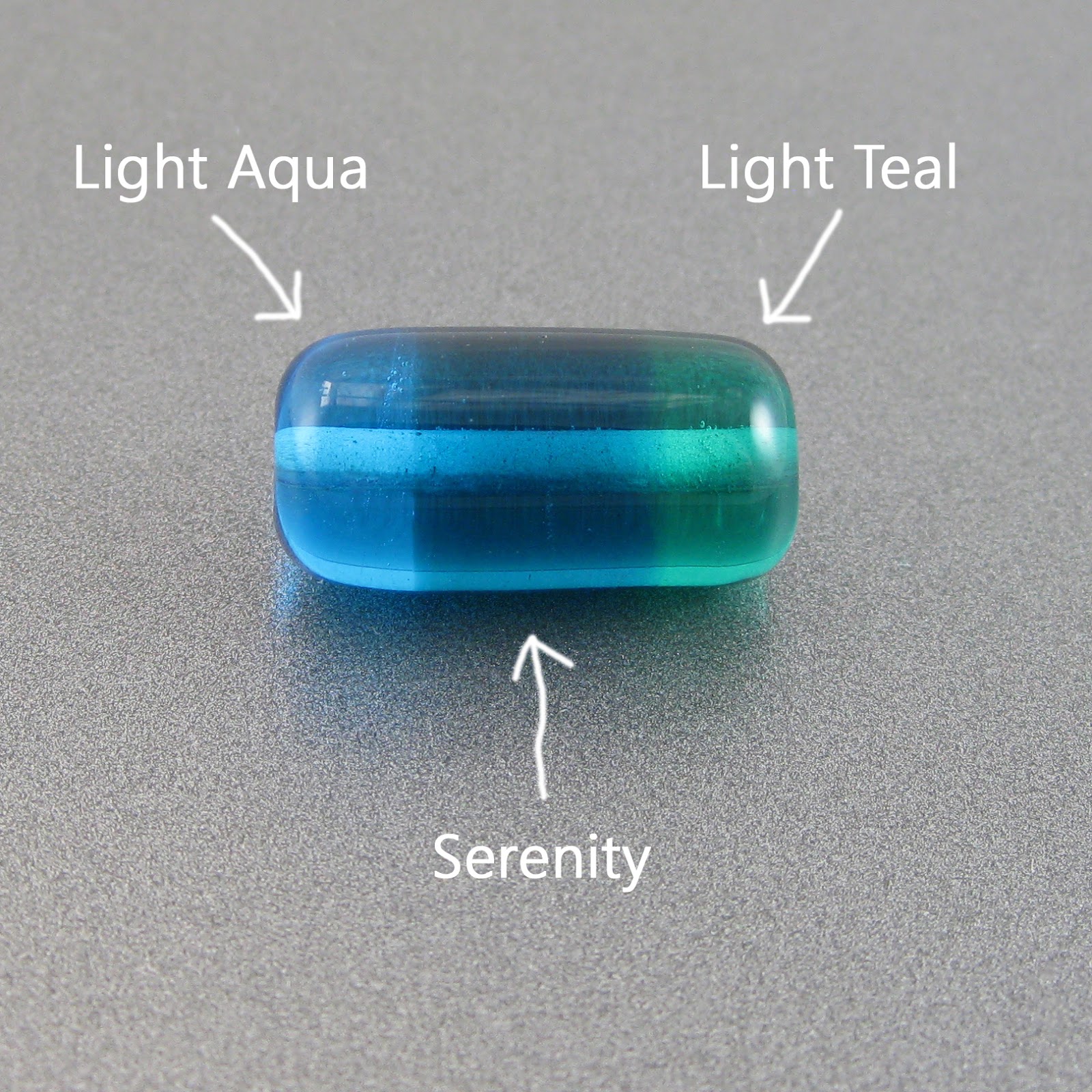
Serenity is not as saturated as CiM Great Bluedini but it is around the same shade of teal. It is a great deal bluer than Effetre Light Teal and is both darker and greener than Effetre Light Aqua.


Silver leaf beads up and largely disappears on top of Serenity, and if the silver is reduced and encased, it forms a greyish blanket under the clear layer. These reactions are both consistent with what I experienced with CiM Great Bluedini.


Also similarly to Great Bluedini, Serenity makes a decent base colour for silver glasses. The reduction frits look pretty on top of it, and I got a reasonably good starting strike from my TerraNova2 frit.


First, I apologize for the dirt in this picture. I try to get all of the beads clean, even soaking them in clean water after cleaning the bead release out, but some of it always seems to get by me.

Like other teal colours, Serenity will develop a dark line reaction with Ivory. In Serenity's case, this reaction line is very thin and gentle, which is nice.

Copper Green, Opal Yellow, Ivory, and Peace all separate on top of Serenity.

Serenity's presence seems to inhibit Copper Green from developing that greyish sheen it often likes to develop in the flame.

These beads all contain some Serenity.


September 3, 2018

Test Results :: Dark Sky Blue


Effetre Dark Sky Blue (EFF228) is a medium, turquoise opaque colour. Its reaction profile is similar to that of Light Turquoise or Dark Turquoise. In fact, this colour is so similar to Dark Turquoise that I have trouble telling the two apart in rod form. I did, however, find that this colour pits less than Dark Turquoise.


Here, you can see the greyish metallic sheen that Dark Sky Blue develops. This is the same sort of greyness that we see with Light and Dark Turquoise and Copper Green. Reducing the bead on the right made the grey sheen deeper and darker.

It is the unpleasant dirtiness that Effetre Dark Sky Blue and Dark Turquoise acquire in the flame that makes me prefer CiM Fremen and CiM Smurfy when I'm looking for a turquoise that is in this hue range. The CiM colours don't do this icky thing.


On top of Dark Sky Blue, silver leaf takes on a greyish-green appearance. When the silver is reduced and encased, though, it looks more of a yellowish-pink colour.


Silver glass on top of Dark Sky Blue surprised me a little because I never think of turquoise when I'm choosing a base for silver glass. It seems like maybe this means that I am resistant to my own testing information, because I looked back and found that I got neat results from silver glass on top of both Light Turquoise and Fremen but apparently failed to remember it. I guess that's why I keep posting these - I need this blog as a reference :)

On top of Dark Sky Blue, my silver glass reduction frit developed pretty colours, and an interesting light outline around the fritty bits. In the rightmost bead, the TerraNova2 frit got a nice starting strike to it.


Dark Sky Blue separates on top of both Tuxedo and Copper Green, and it develops a dark line when used with Ivory. Opal Yellow separates on top of Dark Sky Blue.

These beads all contain a little Dark Sky Blue.


April 10, 2017

Test Results :: Copper Green


Effetre Copper Green (219) is a medium teal/turquoise opaque glass. It's handpulled and can be on the shocky side, but I don't mind that so much in light of all it's other traits.  It's sort of unbelievable that I am only just now posting test beads for this colour, but it's been included in every test set I've ever posted so I guess it makes sense that I just lost track of not having done it yet.

I love Copper Green.  Mostly I love the colour of it, but I also think it is a pleasantly reactive and versatile colour. I love it so much that I wrote a poem about it on my lunch break one day back in 2009 while at work. That poem won me a box of random glass from Frantz Art Glass, because, I guess, Mike was looking for the corniest possible entry to his poetry contest.

---
An Ode To Copper Green

In rod form I love you and can't get enough,
It's when I cremate you the going gets tough.

Your colour is tricky and goes all askew
Transforming from green into two shades of blue

With some shades you develop a big, thick black line,
But with purple, the line looks a lot more like wine.

Under clear, you turn yellow! Why is that, o Green?
When you get too hot there's an odd silver sheen...

You spark and you pit and you hate to be hot,
But in spite of all that I still love you a lot.
---

I'm such a nerd. 

Anyway, Copper Green is both awesome and irritating. It's very reactive, and it develops a yucky grey patina on its surface from its high copper content.  I don't really believe anymore that the sheen that develops on Copper Green is related to the level of heat.  I've found that using Copper Green in combination with some colours limits its ability to develop this patina, but when it's used alone it invariably develops it.  I'd give examples of the colours that it hasn't sheened up with but unfortunately I haven't been tracking that information very closely and am disinclined to read through all of my past blog entries to figure it out.  I'm basically taking a "lazy pass" here. You can do that, if you want :)  Where I've observed it, I have generally mentioned it.

I also used to think that the reason I got so much grey yuckiness on my Copper Green was because I was using a Minor with a 5L concentrator and my flame was probably a bit on the reducing side, but was disabused of that notion when I upgraded my oxycon to a 10L and the sheen kept coming. It's just what Copper Green does.

Once it has sheened up with that greyish muckiness, you have a few options. You can decide that the greyish sheen is a feature rather than a bug and go with the army grey-green-ness of it, you can soak the bead in toilet bowl cleaner, Coca Cola, CLR, pickling solution or some other chemical compound to try to get rid of it (with varying degrees of success), or you can etch it off of the surface of the bead with etching solution or by tumbling it with silicon carbide grit.  I generally go for the tumble-etching option because I love the finish I get on my tumble-etched beads and it always, always works.


Here you can see that I got the yucky grey sheen even on the bead I did not reduce.  I use a 10L concentrator on a Nortel Minor and my flame was not in any way a reducing one.  In the bead that I did reduce, the sheen is a good deal more pronounced and some red patina developed from the copper in the glass coming to the surface.


Silver on top of Copper Green takes on a greyish appearance and gives the glass surface an interestingly aged appearance.  When the silver is reduced and encased, it turns yellow. This yellowing is consistent with results I've gotten on other turquoise/teal colours.  (e.g. CiM Celadon, Reichenbach Pastel Blue)


Copper Green is an average base for silver glass. It doesn't offer a lot of contrast for the reducing silver glasses, but it doesn't impede their natural beauty in any way. With my TerraNova2 frit, I got an interesting halo effect around the fritty bits and some slow starts to the striking sequence.  Probably I could make the frit bloom on this colour with some effort, but there was no magic here.


Reaction summary:

  • Copper Green forms a light halo around Tuxedo dots and lines.  On top of Tuxedo, Copper Green separates but develps a strong greyish sheen so the effect is somewhat disguised. Etching would fix that.
  • Opal Yellow separates on top of Copper Green.
  • Ivory and Copper Green develop a reciprocal dark line reaction.
  • Peace separates on top of Copper Green.

Here are some beads made with Copper Green:


March 7, 2013

Test Results :: Laguna

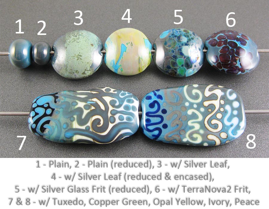
1 - Plain, 2 - Plain (reduced), 3 - w/ Silver Leaf, 4 - w/ Silver Leaf (reduced & encased), 5 - w/ Silver Glass Frit (reduced), 6 - w/ TerraNova2 Frit, 7 & 8 - w/ Tuxedo, Copper Green, Opal Yellow, Ivory and Peace

CiM Laguna is both darker and bluer than CiM Mermaid, and is very reminiscent of the beautiful Mermaid Unique #1, although this colour has more interesting reactions with silver. If you liked Mermaid Unique #1, you are going to love this colour.

Like the vast majority of CiM Opaques, Laguna is stiff but creamy and is somewhat streaky. It's nice glass to work with, and the colour is to die for!


In the bead on the left, the silver leaf has melted down and dispersed almost completely. It has left a faint yellowish residue on the bead, but it's not very visible. The interesting thing about both of these beads is how much streakier the glass is under where the silver was put down.

In the bead on the right, I reduced and encased the silver leaf and boy, is it ever yellow. Mustard is the descriptor that comes to mind. Very neat, but it's not very often that I feel compelled to use teal with mustard yellow. This yellow thing happened with Celadon, too, if I recall correctly. Oddly enough, I didn't really get this reaction so much with either Mermaid or Mermaid Unique #1.


This colour is gorgeous with striking silver glass -- I got beautiful colours from my TerraNova2 frit. The reducing silver glass frit also behaved nicely on top of it, however the colours sort of blend in with the Laguna background, so it doesn't really stand out.


There isn't really very much to report here in terms of reactions. The colours all behave slightly strangely on top of Mermaid, but not really weirdly enough that I have useful words to describe the behaviour. The reactions that really jump out at me are the strange way that Copper Green separates on top of Laguna, and the vivid dark line that appears around it when it's used on top of Ivory.

Here are some fun beads with Laguna. The goddess is solid Laguna, and the Shroomery and Extraposy both have Laguna in some of their twisted canes.
  

November 16, 2012

Test Results :: Dark Silver Plum

1 - Plain, 2 - Plain (reduced), 3 - w/ Silver Leaf, 4 - w/ Silver Leaf (reduced & encased), 5 - w/ Silver Glass Frit (reduced), 6 - w/ TerraNova2 Frit, 7 & 8 - w/ Tuxedo, Copper Green, Opal Yellow, Ivory and Peace

Effetre Dark Silver Plum is a colour that requires some practice to get right, I think. I was not able to get the gorgeous rainbow oilslick colours that I have seen other people get with this colour, although I did get some hints of it in my goddess (see the bottom of this post). I haven't tried Dark Silver Plum in shard form, and a lot of the really beautiful things I've seen other people do with it have involved blowing it into thin shards and applying those to the bead.

Regardless, I did make some interesting discoveries about Dark Silver Plum, which I will share with you.


In the bead on the left, I applied silver leaf to the bead, burnished it in and then melted it off. Where the silver leaf touched the bead, the metallic sheen on the Dark Silver Plum is a markedly lighter colour of pinkish purple, and in some places has turned an orangey pinkish colour. This is sort of a cool development.

When the silver leaf is reduced and encased, it forms a pale lavender blanket over the Dark Silver Plum and retains some of its shininess under the clear.


My reducing silver glass frit got beautiful colour on top of Dark Silver Plum, and I got pretty neat results from my TerraNova2 frit as well although it's so dark that it's hard to see it properly. Dark Silver Plum seems to be a decent base for silver glass colours.


Dark Silver Plum is a surprisingly unreactive colour, however there are some interesting take-aways from this set of tests.
  • When Tuxedo is used on top of Dark Silver Plum, a webby outline forms around it, that is bounded by a dark line.
  • When Copper Green is used on top of Dark Silver Plum, a dark outline forms around it. On top of Copper Green, Dark Silver Plum seems to separate slightly.
  • When Peace or Ivory is used on top of Dark Silver Plum, a dark line develops around the dots/lines and the Dark Silver Plum shininess coalesces into a silver coating around the edges of that dark line. This is by far the most interesting reaction.

Here are some fun beads with Dark Silver Plum:
The goddess bead is all Dark Silver Plum. I didn't get so much of the rainbow effect that some other people get, but I did get some hints of it. The glass is curiously matte-yet-shiny.
Here, I've used Dark Silver Plum as the border/edguing for this bead.

November 8, 2012

Test Results :: Supernatural


1 - Plain, 2 - Plain (reduced), 3 - w/ Silver Leaf, 4 - w/ Silver Leaf (reduced & encased), 5 - w/ Silver Glass Frit (reduced), 6 - w/ TerraNova2 Frit, 7 & 8 - w/ Tuxedo, Copper Green, Opal Yellow, Ivory and Peace

Effetre Supernatural is a very interesting colour. All by itself, it's a little boring - just streaky grey and white. However, reducing it, using it with silver and using it with other colours can change its appearance. I think I like it best reduced and with silver leaf. You'll see why, below.

It's not evident in the test beads, but superheating Supernatural brings out turquoise streaks, I'm assuming because it makes the copper in the glass separate from the rest of the colour. You can't see that in my test beads, but it is evident in the goddess bead at the end of this post.


You can see here in the spacer on the left the whiteish grey streakiness of Supernatural. When supernatural is reduced, it develops a translucent pinkish red coating.


When I used silver leaf on top of Supernatural, it fumed the Supernatural a yellowish colour. Additionally, the silver has turned a blueish colour. It's rather pretty, actually. When the reaction is reduced and encased, most of the prettiness goes away and it just looks like a whiteish coating surrounded by yellowish and pinkish patches, which is way less appealing.


When I reduced silver glass on top of Supernatural, I gor a brownish, yellowish fuming from the Supernatural, all around the frit. This is a pretty neat effect. On top of Supernatural, my striking silver glass frit got an interesting strike - I'm not thrilled with the amount of strike, but I am intrigued by the fact that each bit of frit seems to have developed colour in little patches. This makes me want to try it again, for sure.


Supernatural is a streaky colour, so in most cases above, it's not easy to see if there is a reaction. However, a few things come through loud and clear:

  • Copper Green turns darker and pinkish when Supernatural is used on top of it.Supernatural gets a brown line around it when it's used on top of Opal Yellow. This line does not seem to appear when Opal Yellow is used on top of Supernatural.
  • There is a reciprocal dark line reaction between Ivory and Supernatural. This dark line appears regardless of which colour is used as the base.

Here are some fun beads with Supernatural:
Supernatural's streakiness and its tendency to reduce even in a more or less neutral flame are both evident in this goddess bead. You can see the deep, turquoise streaks, the grey mottled streakiness of the glass itself and the patches of brick-red reduction here.

Here, I've used Supernatural both in the core of the bead under transparent light aqua and silvered, in the mushroom cap and stem.