Search This Blog

April 24, 2020

Product Review :: Warm Transparents and Blueberry Muffin

This week I have been focused on using some of the new transparents and the new lapis-hued semi-opaque colour called Blueberry Muffin. 

Candlelight (CiM322) is a very pale yellow transparent colour. It comes out very true to the colour of the rod, although while you are working it it blushes a deep yellow. I wasn't exactly sure what I was going to get when they went into the kiln and was thrilled when they came out such a unique and useful colour..

This colour works beautifully without any bubbling or scumming or fuss. I found the melted ends liked to crack off when reintroducing them to the flame, but that happens with many of the transparent colours from all the manufacturers.


Here you can see that Candlelight is substantially paler than Effetre Straw Yellow. I am excited about this colour and want more of it, because it has so much potential for fun.


One of the tests that I like to do with pale and medium transparents is to see what happens to silver foil when I use them to encase the foil. When I do this test, this is exactly the reaction that I am hoping to find - check out how golden and beautiful the silver foil went under Candlelight. This means that Candlelight will also make wicked silver glass frit stringer. 

Other colours that do this to silver foil include Effetre Straw Yellow, Effetre Light Brown Transparent, Effetre Pale Green Apple, Effetre Kelp, and CiM Mojito. I am sure I am forgetting some in that list, and there are colours I have not tested yet, so that list is not definitive.

These beads all contain Candlelight:


Goldfish (CiM218) is a slow-to-strike transparent orange that, when fully struck, is pretty much identical to Clockwork. I found this colour slow to develop in the flame, so if you want the deep, bright orange that it can become, you will want to use it in larger or more complex beads that have longer working time so that the beautiful colour has time to develop. I would not say that this colour is difficult to strike, but it does take some time and patience. Like Candlelight, Goldfish is a transparent colour without bubbliness, scumminess or other workability problems. Like Clockwork, this orange opacifies as it strikes, and looks very opaque in thick layers when fully struck.

Understruck Goldfish ranges from yellow to golden orange, and I sort of appreciate the variation you can get from it. All of the other oranges that I've used (pictured below) develop colour much more readily, which can be nice but does not offer the flexibility that Goldfish does, where you can strike it as much or as little as you want to get different shades of orange.


Here you can see Goldfish with Effetre Orange, Vetrofond Orange, and Clockwork. The three other oranges all strike much more quickly than Goldfish.I like all of these colours for different reasons, and isn't it nice that they are so different from each other and differently useful that we can totally excuse owning all of them?

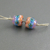
These beads all contain Goldfish. As you can see, I was much more successful striking it in these 'real' beads than I was in the test cylinder above because the working time was substantially longer and the beads all had more heating/cooling cycles as I decorated them.


Firedragon (CiM124) is a beautiful orange-red transparent, a few shades warmer and lighter than Sangre. I found this colour equally nice to use as I did Candlelight and Goldfish. It fills a bit of a gap in my palette, since there really are no other transparent colours that I know of that are on the cusp of orange and red the way this one is.


Here are some beads that include Firedragon:


Blueberry Muffin (CiM633) is supposed to be the same hue as CiM Lapis. It seems lighter in most of my beads because I have used it in thin layers over light colours. 

This colour is pleasantly reactive, and I absolutely think that CiM should keep making it. It's like a deep, dense ink blue with fun reactive potential and I am very excited about all the crazy things we will do together. 

If I could change anything about this colour it would be to make it more translucent. Even in thin layers, it can look almost opaque. I wonder what it would be like as a Misty Opal?


That's all for this week!  I am not sure what I'll post next because there are still so many delectable choices, but I will be back next week with more colour news.

April 13, 2020

Test Results :: Circus Tent


CiM Circus Tent (CiM220) is a very interesting 'threaded transparent' colour where multiple long filiments of various colours are drawn thin inside a clear rod. The clear that CiM  used for Circus Tent is much smoother, more buttery, and less prone to boiling than my previous experiences with CiM Clear would have led me to expect and I found it really nice to use.

I am not sure I love the colour combination inside this particular colour, but I am very excited about possible future colours built using this technique, maybe inside clear, maybe inside misty opal colours with more appealing colour combinations. For instance, I would love something like this with more than one layer of oranges and yellows inside it to use as stamen cane, and I'd also really appreciate a pale aqua that contained filiments of various blues and teals.


Reducing Circus Tent doesn't change its colour.


Silver is the same on top of Circus Tent as it is on top of Clear. Nothing very interesting happens, but the silver has nice visibility on the surface of it (leftmost bead).


Reducing silver glass frit develops nicely on top of Circus Tent, making me want more of the clear glass that Circus Tent is made from.


Circus Tent is not a reactive colour. The main thing I find interesting in these test beads is the way Ciircus Tent pulls into a very slightly streaky stringer.

Here are some beads made with Circus Tent:


April 10, 2020

Product Review :: New CiM Cloudy Transparents

I am crazy about so many of these new CiM colours and I will be coming back to blog about some of them in greater detail over the next few months. Because the volume of colours this time is so big, I wanted to make sure that I at least posted some initial impressions and photos of them all but will do my detailed colour explorations only for those colours that I decide to incorporate into my palette more permanently. I made this decision after I had already dived in and done a bit of testing, so you will see some more detailed posts for a few colours right away, beginning next week.

I haven't used all the colours yet, and this post will be focused on what I've been making with some of the new Cloudy Transparent colours. I really like this new rod format with the pigment filaments suspended in Clear, and I am hoping for a whole range of colours in the future. I think that a dark blue, a dark teal, and some bright oranges, pinks, and yellows would be particularly fun.

In general, I have found the Cloudy Transparent colours to be a bit shocky. For for the most part, this was quite manageable and well worth the effort, at least for the colours I've tried so far. Heather is the one that I've had the most trouble with out of this group. Another thing common to all of these colours (so far) is that they can be easy to boil, so you really have to watch your heat. This is true not only with fine stringer, but also when applying the glass from the rod to your bead. Work higher up in the flame and a bit cooler to avoid this problem. I have not specifically tested any of these for colour reactions yet. When I do, I might find out something interesting, but so far they do not seem very reactive with other colours.

These beads all contain Heather (CiM922) or Luzern (CiM924). The only real difference between these glasses for me was that my rods of Luzern had more colour density. Heather and Luzern are a magenta/lilac-coloured streaky transparent where the pigment filaments are suspended in clear glass. Both of these colours are stunning, and I am hoping to get some more of at least one of them.


Colours: CiM Heather/Luzern, CiM Sunset, Effetre Opal Yellow, 
Effetre Light Turquoise, CiM Loch Ness, CiM Serenity, CiM Circus Tent, 
Effetre Super Clear, and various colours of enamel.

Fruit Punch (CiM730) is described as a reddish brown cloudy transparent but I found that it lightened substantially while I worked it and came out looking more like a cloudy pinkish peach colour.


Colours: CiM Fruit Punch, CiM Sunset, Reichenbach Pink Lady, CiM Serenity, 
Effetre Light Turquoise, CiM Adamantium, Effetre Opal Yellow, and various colours of enamel.

Chocolate (CiM731) is a gorgeous, deep, dark brown transparent colour. Out of all the new cloudy transparents, this one might be the one I am most excited about. Because it is a very dark colour, when used in thick layers this colour is a very opaque deep brown, but you can lighten it as much as you want by applying it in thinner layers on top of other colours. This offers quite a lot of flexibility when you're designing with it.


Colours: CiM Chocolate, CiM Light Turquoise, Effetre Opal Yellow, Effetre Light Red, 
CiM Sunset, CiM Loch Ness, CiM Serenity, and various colours of enamel.

CiM Watermelon (CiM219) is a bright coral cloudy transparent that darkened a little as I worked it. I really liked it. I am wondering if it could have been made even more beautiful by suspending the coral filiments in a very pale pink instead of clear.


Colours: CiM Watermelon, CiM Chocolate, Effetre Opal Yellow, 
CiM Sunset, Reichenbach Pink Lady, and CiM Loch Ness.

And finally, this last bead is made with a colour that I don't think will be for sale (at least not this time around), doesn't have a name, and is a bright, royal blue cloudy transparent. In these beads, you can see both how the bright blue base looks almost opaque, and how the same colour in a thin layer in the bead's raised dot decoration looks streaky and wispy and almost transparent.


What a lot of fun! I can't wait to see where CiM takes this product line in the future.