1 - Plain, 2 - Plain (reduced), 3 - Over Clear, 4 - w/ Silver Leaf, 5 - w/ Silver Leaf (reduced & encased), 6 - w/ Silver Glass Frit (reduced), 7 - w/ TerraNova2 Frit, 8 & 9 - w/ Tuxedo, Copper Green, Opal Yellow, Ivory, Peace
Effetre Striking Orange is a medium orange transparent colour with reddish overtones.
Striking Orange goes clear when it's hot, and only after heating and cooling it does the orange colour reappear. That said, it's not difficult to strike this colour - it happens naturally as you work it. My spacer beads were cooled and reintroduced to the flame before popping them into the kiln, but I didn't intentionally try to NOT get the colour so I'm not sure what would have happened if I just wound them onto the mandrel, melted them out and then garaged them.
On the whole, I found this colour easier to strike than the Striking (Electric) Yellow, because I used the same approach with the spacers I made for that colour's test results with much less impressive results.
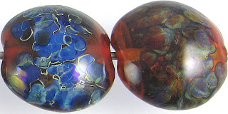
Silver is very interesting with Striking Orange. First, the addition of silver seems to have significantly darkened its colour. Second, the silver has gone navy blue in both of these test beads. Where the silver is reduced and encased, the blue is a little more obvious and a little softer, but it is definitely pronounced on both beads.
Silver glass is also pretty interesting on top of Striking Orange. I got beautiful, vibrant blues out of my reduction frit on top of this colour. The TerraNova2 frit didn't strike to the vibrant blues and greens that I love so much, but it spread out beautifully on top of this colour and got some beautiful variegated colours in it. This is a win.
Striking Orange and Copper Green form a mutual dark line reaction. This is most evident in the bead on the left, where Striking Orange has been used on top of Copper Green. In the bead on the right, the Copper Green has a weird three-dimensional effect because of the dark line, and then the way the grey film has developed on top of the Copper Green with a slight gap between it and the dark line reaction. This is pretty cool.
The only other thing that's happened here is that on top of Striking Orange, a very slight amount of separation has occurred in the Opal Yellow, Ivory and Peace on top of Striking Orange. However, the amount of separation is barely worth mentioning except to point out that trying to use any of these colours to do stringer work over Striking Orange will result in some mottling that you may or may not want in your final result.
I really like the way Striking Orange looks over Ivory. I am going to try those colours together in an encased floral.
Here's a fun bead with Striking Orange. I used it in the flower cane.


No comments:
Post a Comment