Search This Blog

August 28, 2010

Test Results :: Maple

1 - Plain, 2 - Plain (reduced), 3 - Over Clear, 4 - w/ Silver Leaf, 5 - w/ Silver Leaf (reduced & encased), 6 - As Frit Stringer (silver glass frit), 7 - w/ Silver Glass Frit (reduced), 8 - w/ TerraNova2 Frit, 9 - As a Floral (over white), 10 - w/ Copper Green, 11 - w/ Ivory, 12 - w/ Opal Yellow, 13 - w/ Black

General Impressions
CiM Maple is a gorgeous, dark brown transparent. It does not tend towards orange the way the Effetre Topazes do, and it avoids being super-reactive the way Effetre Light Brown Transparent is. It is not completely non-reactive, but the reactions are not very dramatic, either. Maple is a fairly stable colour.

The colour of Maple after melting it is FAR DARKER than the rod colour would lead you to believe.  The unmelted rod colour is similar to how Maple looks when it is applied over Clear, but once melted the colour of Maple significantly darkens.


Maple has a beautiful consistency, and is a nice, stiff transparent colour to work with. It also doesn't bubble easily, unless you overheat it in a determined sort of way. I did get a few bubbles in my Maple dots on various beads, so I'll be more careful not to overheat my stringer next time I use Maple.


Maple lightens up considerably over Clear or White, and doesn't lose its essential 'brownness' when it does so.

Reactions

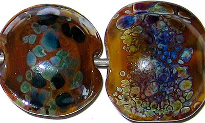
The silver reaction that I got with Maple is sort of a first for me.  The melted in Silver Leaf in the bead on the left has turned a strange rose colour.  Leaf, reduced and encased in the bead on the right didn't do much of note.  It does have an interesting, eggshell look to it though.


In the bead on the right, the silver glass frit blend has acquired a nice shine, and some of the pieces have developed a bit of an inner halo.

In the bead on the left, I took a gather of maple, dipped it in the silver glass frit blend and pulled it into thick stringer.  I then used that stringer to encase a base bead of Maple and then encased the whole thing in Effetre Clear. I got a moderate level of streaky visual interest in the resulting bead.  I say moderate, because this is what I'm usually hoping for when I do this test:


Maple was unremarkable with TerraNova2 frit, so I won't talk about that.


The Copper Green in this bead is unusually shiny, an effect that I am blaming on the Maple.


Over Ivory, Maple separates just a little and seems a bit streaky. Ivory seems to get a little shadow around it on top of Maple, but it is not a significant reaction.

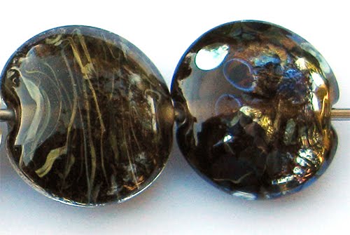
Here's a fun bead with Maple.
 

August 8, 2010

Test Results :: Lipstick

Like Silver Brown, Lipstick is also one of those glasses where manufacturer names have overlapped.  The Lipstick under discussion here is CiM Lipstick. Reichenbach also makes a 104 colour called Lipstick, which I have not yet tried.
1 - Plain, 2 - Plain (reduced), 3 - w/ Silver Leaf, 4 - w/ Silver Leaf (reduced & encased), 5 - w/ Silver Glass Frit Blend (reduced), 6 - w/ Terranova2 Frit, 7 - w/ Copper Green, 8 - w/ Tuxedo, 9 - w/ Opal Yellow, 10 - w/ Ivory, 11 - w/ White

General Impressions
CiM Lipstick is a gorgeous deep red opaque colour.  The colour of Lipstick is a little darker and duskier than my bead picture portrays, and seems to be a little difficult to photograph.

I've mentioned before that CiM opaques tend to fit into one of two categories for me -- the stiff ones and the softer, spreadier ones.  Lipstick is in the stiffer category, and only faintly streaky.  The consistency of it is wonderful, really.  I love these stiffer opaque colours because they hold up really well to abuse from pressing.  I didn't do a very good job with pressing these beads, but if Lipstick were a less forgiving colour, they'd be much worse.

Reduction
Reducing CiM Lipstick all by itself has little or no effect on the surface colour of the bead.

Reactions

In both of these beads, the reactions with silver are interesting. In the bead on the left, the silver has significantly darkened the colour of the lipstick, and has made a yellowish 'stain' on the bead. Fine granules of silver are visible on the surface.  In the bead on the right, I reduced the silver leaf and then encased it. Like with Reichenbach Mystic Coral, the silver has turned blue after this treatment. Also, after encasing the lipstick, the 'darkness' caused by the silver seems pretty much gone. These reactions are almost identical to the reactions I got with Mystic Coral, although they are a little less vivid.


Silver glass darkens Lipstick a little more than I'd like, but that doesn't seem to stop it from doing its thing. I got good colour from both silver glass tests, although the bead on the right shows how much black 'goo' springs up around the silver glass frit.


It's nice when things do what you think they're supposed to do.  Lipstick and Copper Green have a reciprocal dark line reaction.


Tuxedo bleeds into Lipstick a little.  You can see on the left side of the bead some black smeariness around the black dots and lines.  On the Tuxedo side of the bead, the Lipstick lines and dots have an 'inside halo' that is greyish in hue and faintly shiny.  This is a pretty neat effect.


There is no really noticeable reaction between Opal Yellow and Lipstick... I would not normally not show a bead when this is the case, but I really think these two colours are stunning together and wanted to show that.  The dots and lines are crisp and beautiul. The only other thing worth mentioning is how the Opal Yellow has blushed quite dramatically in places.


Ivory really likes to spread on top of Lipstick.  A great way to exploit this is to use silvered Dark Ivory on top of Lipstick and watch it spread out. This test bead was with regular Ivory, but you can see how the Lipstick has sunk into it (thinner line) and the Ivory has bulged right out over it and gone to fuzz in the middle.


White and Lipstick seem to have a fairly even relationship.  The White did spread a little bit, but there is no noticeable discolouration or striation in either colour in this test bead.


I have not made any normal beads with Lipstick yet apart from this pressed oval that I already showed with the Mystic Coral results, but I'll add some as I do some more experimentation.

August 3, 2010

Test Results :: Silver Brown

I'm sure this little problem is only going to get worse as time passes and more and more glass colours get created, but isn't it irritating how there is that tiny bit of overlap between manufacturers with regard to naming? The glass I'll be talking about in this post is Kugler Silver Brown (B-181) which used to be called Silver Cinnamon when it was distributed through Arrow Springs and was an ASK (Arrow Springs + Kugler) colour.  It should not be confused with Reichenbach Silver Brown or Dark Silver Brown, because those colours are completely different.
1 - Plain, 2 - Plain (reduced), 3 - w/ Silver Leaf, 4 - w/ Silver Leaf (reduced & encased), 5 - w/ Silver Glass Frit Blend (reduced), 6 - w/ Terranova2 Frit, 7 - w/ Copper Green, 8 - w/ Tuxedo, 9 - w/ Opal Yellow, 10 - w/ Ivory, 11 - w/ White

General Impressions
When it is hot, Kugler Silver Brown is transparent, but it cools to a yummy chocolate brown opaque. This colour is very reactive, and it is also quite soft.

My results with Kugler Silver Brown are not very reminiscent of pictures of other people's beads that I've seen using ASK Silver Cinnamon, but I guess batch-to-batch variability could be to blame for that, as well as my relative inexperience with the colour.  These are my first beads with Silver Brown, and there won't be many more since I've only got two short rods of it left.

Reduction
The effect does not photograph well, but in Beads #2 and #5, reducing the Silver Brown did result in a slight mirroring of the brown colour and a slight milkiness to its finish.  In Bead #4, where I reduced and encased the silver leaf, I feel sure that the blue colour is the result of the reduced and encased Silver Brown, but it's hard to be positive without more in-depth testing.

Reactions


In the bead on the left, the silver pretty much just balled up and didn't do much. However, in the bead on the right, reducing and encasing the silver on top of the Silver Brown resulted in something a little more noteworthy.  Th Silver Brown portions of the bead have turned blue, and the silver has stayed silver. Usually when I get blue in this particular test bead, it is the silver itself turning blue. I need to do some more work with this someday, but it seems like it might be the Silver Brown that turns blue here.


The colours and shine on the reduced silver glass frit in the bead on the left developed well too, but I don't much like that bead.  The bead on the right (in spite of its deformities) has something cool going on. Silver Brown is a GORGEOUS base for striking silver glass.  I got amazing colour out of my TerraNova2 frit on this colour.


Copper Green makes Silver Brown bleed. On the left side of the bead, dark brown halos surround the Silver Brown where it is on top of Copper Green, and brown smears mar the surface.  On the right-hand side of the bead, the Silver Brown infiltrates the Copper Green lines and dots, giving an aged effect to the scrollwork. This reaction probably has its uses, but I don't think I'm a big fan.  (To get a better look at the bead, click on it to see it enlarged)


On the left side of the bead, you can see how Opal Yellow likes to spread on top of Silver Brown.  The Opal Yellow stringer that I used was approximately the same diameter as all of the other stringers I use in this test, but when I used Opal Yellow on top of Silver Brown, the best word I can think of to describe the results is 'bulbous'. On the Opal Yellow side of this bead, an interesting, pinkish outline has formed around the Silver Brown that I find intriguing.  Silver Brown has more of a reddish hue when used with Opal Yellow.


This is my favourite reaction with Silver Brown so far. It's not every glass reaction combination that gives you three reactions for the price of one.

Putting these two colours together yields both a shimmering, thin silver outline AND a thicker black one. It happened on both sides of the bead, but doesn't look quite the same because the black part of the reaction happens next to the Ivory, whereas the silver portion of the reaction happens between the Black and the Silver Brown.  Neat, right?

Also. look at what happened to the Ivory on both sides of the bead. On the left, in the dots and lines, the Ivory has separated and formed a translucent line down it's center.  On the right side of the bead, it's curdled like crazy. Yum.


In this bead, White has separated a little and left a translucent outline around itself wherever the Silver Brown touches it. I've christened this the 'Milk Mustache' reaction. Like with Opal Yellow, Silver Brown has more of a reddish hue when used with White.

Here are some of the other beads I've made with this colour so far.