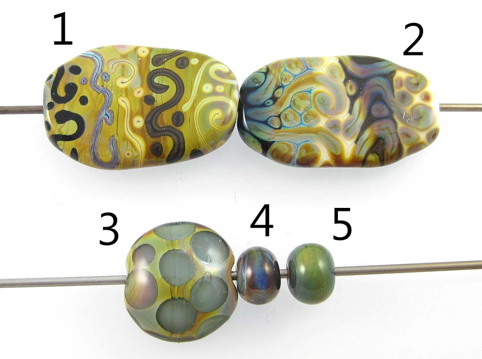
1 - Plain, 2 - Plain (reduced), 3 - w/ Silver Leaf, 4 - w/ Silver Leaf (reduced & encased), 5 - w/ Silver Glass (reduced), 6 - w/ TerraNova2 Frit, 7 & 8 - w/ Tuxedo, Copper Green, Opal Yellow, Ivory, and Peace
I love this colour. Effetre Antique Green is Copper Green's paler, smoother, less socially awkward cousin. It is smoother in that it isn't grainy like Copper Green, and therefore does not pit while you're working it. What I mean by 'less socially awkward' is that while it has a lot of the same sorts of reactions with other colours that Copper Green has, those reactions are less dramatic, and therefore less likely to take over any given bead. It is milder in colour, being a light seafoam green and never the vivid turquoise that we can get from Copper Green. Oh, and the best part? It does not scuzz up in a neutral flame the way Copper Green can.

You can see the smooth seafoam colour of the Antique Green in the bead on the left. On the right, the reduced bead has a mottled red coating. This beautiful brick-red colour is not very even, but I feel sure that it could have been if I'd been trying for that effect and was very methodical in my reduction.

You can see in the bead on the left that reducing silver on Antique Green gives a soft, pinkish haze around the edges of the silver. This is a beautiful and completely exploitable effect that is particularly beautiful when you make dot beads with Antique Green and a silver-rich glass.
In the bead on the right, you can see that there is some cracking along the mandrel line. I'm not really sure what caused that - it may be that Antique Green doesn't much like being encased, but I also may have waved this around in the air and stared at it for too long before putting it in the kiln. I need to do a bit more research here.

In the leftmost bead, you can see the same kind of pink blushing around the silver glass frit as you saw in the silver-encrusted bead (above). In both beads, I got beautiful colour from the silver glass frit I used -- I was particularly excited by the pretty rainbow that I got in the TerraNova2 frit in the bead on the right. Antique Green is clearly a colour that loves silver.

Antique Green is a bit funny in its reactions, too, in that it appears to be reactive with just about everything. For the most part, it behaves like Copper Green -- reciprocal dark line reaction with Ivory, separation reactions with other greens/blues, but it also has some interesting differences. For instance, it is reactive in a dark pink line way with Opal Yellow, and it separates when used with Tuxedo.
All in all, I find this colour beautiful, wonderful to work with, and exciting to combine with other colours. I wish more vendors carried it, because eventually my supplier is going to run out and then I am not sure where I will get more!
Here are some fun beads with Antique Green.