Search This Blog

October 29, 2010

Test Results :: Charcoal

1 - Plain, 2 - Plain (reduced), 3 - Over Clear, 4 - w/ Silver Leaf, 5 - w/ Silver Leaf (reduced and encased), 6 - w/ Reduced Silver Glass Frit, 7 - w/ TerraNova2 Frit, 8 - As a floral (over White), 9 - w/ Copper Green, 10 - w/ Opal Yellow, 11 - w/ Ivory, 12 - w/ White, 13 - w/ Raku 

General Impressions
It is really hard to tell CiM Charcoal rods apart from Black if stuff gets mixed up.  In fact, during its time in my working box, I have lost a rod of Charcoal and I think it has covertly combined itself with my bundle of Tuxedo, which will no doubt screw me right up down the road. Grrr. The four other rods I have are all subtly transparent letting just the tiniest amount of light through them, but in spite of my careful and repeated examination of all of my Tuxedo rods, I can't find that missing rod of Charcoal and it seems to be a goner.

Charcoal had some weird white spots on the rods that smoked in the flame, but this didn't result in anything weird being evident in the finished beads. It looks green when it's hot, especially in thin layers, which is really strange. Holly says that it looks green cooled down too, but I have to admit that I just don't see it. Maybe just a little on top of Opal Yellow?

Charcoal is much softer than I thought it was going to be. It's wonderful to encase with, and doesn't bubble while working. I like this colour.  A LOT.

Alone, Charcoal is a pretty dark grey. It looks black, really... you can't see through it at all. Over Clear, it lightens up a little, but if you look at the lentil below you can only barely see the mandrel line through the centre of the bead, so it's still a very dark colour.
In a thin layer over White, Charcoal lightens up much more, and is a pleasant dark grey colour. Ignore the odd orange bits in the bead above... those seem to be Charcoal reacting to my camera flash because they aren't present in the bead when it's right in front of you.

Reactions
Lots to see here!  This is a really fun, reactive colour with some new things to bring to the table that I haven't encountered yet in my colour tour.
In the bead on the left, I melted silver leaf onto the surface of the Charcoal.  That simple step has resulted in a variegated blue finish that is pretty cool... I have had silver turn blue and green on top of other colours (CiM Mink comes to mind) but never this colour of blue before.

In the bead on the right, I reduced and encased some silver leaf on top of Charcoal, under Effetre 006 Clear. The result is that shiny silver blanket I so often get, but accompanied by vibrant blue staining on either side of the silver. Awesome.
Silver Glass loves Charcoal, and Charcoal totally seems to love it back. These pictures are sort of dark, but even with my crummy photography, you can still easily see how awesome both the reduced silver glass frit (on the left) and the TerraNova2 frit (on the right) look on top of Charcoal. This glass has shot up to the top of my wish list in terms of ordering more.
I got weird colour out of Raku on top of Charcoal. Instead of the washed out brownish blue and brownish green I usually get, I got reds, pinks, blues and yellows. Neat.

On top of Charcoal, Copper Green separates so that it is lighter on the outside than it is in the middle of the dots and stringer lines I applied. Charcoal also seems to help Copper Green stay beautiful and unsheened with that silvery grey stuff.

When I put Charcoal on top of the Copper Green, the Copper Green got sort of striated and odd-looking and a lighter line formed around the Charcoal lines and dots.

In the middle of the bead, a lot of the darker colour in the Copper Green seems to have fled away from where the Copper Green and Charcoal meet.

Opal Yellow seems to separate a little when used on top of Charcoal, and on top of Opal Yellow the Charcoal takes on a greenish hue. It also seemed to spread a little.
Charcoal spreads a little on top of Ivory, too. It's a little strange because I'm used to transparents being denser and not really all that prone to spreading on top of the softer opaque colours. Charcoal also looks a little more blue on top of Ivory, especially when you compare it to how it looks on top of Opal Yellow above.

Ivory lines on top of Charcoal look crisp and beautiful and get just the faintest amount of separation that makes the edges look really well established in my stringer lines and dot work.

White and Charcoal don't really have much of a reaction and I got lazy here in the bead on the right.

I made a pretty cool clear-encased bead with Charcoal and reduced silver glass frit, and I meant to take a picture of it, but someone bought it from me while I was having lunch at the Fraser Valley Bead Show in Langley last weekend. I've remade it, so here it is with a friend.


October 25, 2010

Test Results :: Butter Pecan Unique #4

1 - Plain, 2 - Plain (reduced), 3 - w/ Silver Leaf, 4 - w/ Silver Leaf (reduced & encased), 5 - w/ TerraNova2 Frit, 6 - w/ Silver Glass Frit (reduced), 7 - w/ Tuxedo, 8 - w/ Copper Green, 9 - w/ Opal Yellow, 10 - w/ Ivory, 11 - w/ Raku & Lauscha Olive, 12 - On Lauscha Olive

CiM Butter Pecan #4 is more interesting than I thought it would be after my initial foray into this new collection of CiM Uniques.  I posted in a very preliminary way about this colour (among others) here.

This version of Butter Pecan is really, really soft. So drippy in fact that it rivals White and Opal Yellow for drippiness. I still haven't tested the original Butter Pecan, so I'm not sure if this is typical of all of the colours in the Butter Pecan lineup or not. Also, two of the three rods of Butter Pecan #4 that I had were unpleasantly shocky even though they were very thin. One of the rods was so shocky that it was nearly impossible to work with, which is why I haven't made my customary oval test beads for this colour and won't have any fun beads to share at the bottom of this post.

Fortunately, not all of the rods are that shocky because I have had a few rods that were not shocky at all.  Just proceed with caution, and introduce gently to the flame until you know what kind of rod you've got in your hand.

I struggled a bit filling my Crystal press (as usual) and had to put multiple layers of glass on these first beads.  The result?  Strange variations in the surface colour.  So, Butter Pecan #4 does not meet smoothly when you add additional glass.  I thought that it would since it's not a very streaky colour, but I often misanticipate these things.
Reducing Butter Pecan #4 blushes the colour a little, turning it a little more pink and a little more grey.

Reactions
Butter Pecan #4 is awesome fun with silver.

In the bead on the left, I applied silver leaf and melted it in. The result is a variegated silver and gold effect, and a bead that has fumed very brown in places.

In the bead on the right, I applied my silver leaf, melted it in, reduced it and then encased it with Effetre 006 Clear. The silver under the Clear is bright and shiny, and while you can still see some of the brown fuming right around the edges of the silver and in a gentle, warm way on the right-hand side of the bead, for the most part the Butter Pecan in this bead looks a little closer to the natural colour than the bead on the left does.


Butter Pecan #4 is not a big star with silver glass frit. I didn't manage to really strike my TerraNova2 Frit on this colour, although I was careful to try not to overstrike it after my humiliating experience with Porcelain. Around the edges of the TerraNova2 frit, you can see a faint brown stain on the surface of the Butter Pecan #4.

In the bead on the right, my silver glass frit didn't really acquire much in the way of shine and just looks sort of blah sitting on top of the bead. The Butter Pecan has more fumed brown on this bead, and I suspect that is because of the reduction.
With Tuxedo, Butter Pecan #4 looks like a much cooler colour and takes on a pinkish sheen. Butter Pecan #4 dots on top of Tuxedo get a concentric ring around the edge, and a very thin lines that is only subtly shiny shows up around the very edge of the Butter Pecan #4, like a little mirrored border.

Butter Pecan #4 barely reacts with Copper Green. You can see, around the Butter Pecan #4 dots, a faint greyish-brown line around the butter pecan, but it almost escapes notice. Butter Pecan #4 does not appear to be one of those colours that keeps away the grey sheen of of our friend Copper Green.

On top of Opal Yellow, Butter Pecan #4 develops a darker pink outline. Opal Yellow seems to float just on top of the Butter Pecan #4.

With White and Ivory, Butter Pecan #4 doesn't really do much of note. I had a dirty-looking spot on the Ivory/ButterPecan #4 bead, but that's pretty much it.
But, the star of this reaction show are these two beads that I made with Lauscha Olive.

On top of Butter Pecan #4, I got reasonable colour out of my Raku, The Lauscha Olive dots I put on the Butter Pecan #4 spread a little, and made the Butter Pecan #4 rise up in halos around it, creating a more dramatic petal effect in my flowers. On top of Lauscha Olive, Butter Pecan #4 dots develop strange green ellipses in their centres.

And that's all!  I like this colour enough after testing it that even the odd shocky rod won't be enough to scare me off.  I think it will make a fabulous base for the kinds of beads I love to make. I can't wait to test the Butter Pecan #5.

October 16, 2010

Test Results :: Porcelain

1- Plain, 2 - Plain (reduced), 3 - w/ Silver Leaf, 4 - w/ Silver Leaf (reduced & encased), 5 - w/ TerraNova2 Frit, 6 - w/ Silver Glass Frit (reduced), 7 - w/ Tuxedo, 8 - w/ Copper Green, 9 - w/ Opal Yellow, 10 - w/ Ivory, 11 - w/ White

General Impressions
Reichenbach Porcelain (RL7202) is a weird and wonderful colour that looks very similar to White in rod form.  I've been pestering one of my friends to melt the half-pound she bought earlier this year every chance I get, but she has been avoiding it because it just looks like boring old White in the rod.  Boy, has she been missing out!  I'm not sure I have completely grasped all of the strange things going on in my Porcelain beads, but the things that I have found so far have been awesome.

While Porcelain looks like White in rod form, it is definitely not white in the same way that Effetre White is white.  It is well-named, because it really does remind me of porcelain - not quite white, not quite ivory, but somewhere in between and very reminiscent of bone.

In thin layers, Porcelain is translucent, which is an interesting effect both in florals and in surface decoration on top of other colours.  As a base colour, it can be reactive, but it does not really react in ways that I consider predictable for a white or ivory family kind of colour.

In the picture below, you will see two crystals that I made with Porcelain in my crystal press.  I added a second layer of dots to get the size right for my press, and this has resulted in a thin, pink translucent line forming in between where the layers meet.  This effect is not unpleasant, but it means that solid crystals or other pressed shapes where you might need to add glass will be sort of challenging with porcelain if the end result is supposed to be smooth and seamless.


Also, I'm not really sure where the pink is coming from.  You'll see it in a few more beads as you read through the rest of this, and I would need to test a host of other colours with Porcelain to be able to definitively say 'I think this is why it's pink'.  Either it is pink here because it is reacting with itself, or it is pink here because Porcelain can strike to pink and it happened because of my brass press, or it is pink for some other, more arcane, reason.  I'm not really sure :)

The reactions I have obtained with Porcelain in this limited set of test beads completely blew me away, and I think that Porcelain is one of my new favourite colours.

Reactions

In the bead on the left, I added silver leaf to the porcelain and just melted it in.  It has left a brown residue over a lot of the bead.  In the bead on the right, I added silver leaf to the Porcelain, melted it in, reduced it and then encased it with Effetre Clear.  The result of that is the snowy white blanket that I sometimes get in this test and a slight yellowing of the Porcelain that I suspect is from reducing the silver.


In the bead on the left, I overstruck my TerraNova2 frit, which is the first time that's happened to me in a while.  How embarrassing!  The weird thing here is how very pink the Porcelain has gotten under the frit. Again, I pressed this bead and I struck it repeatedly (*sigh*) so I'm not sure if it was that striking or if it was the silver glass that turned it pink. I feel strongly that the TerraNova2 frit problem is all my fault, and deep inside, I know this is a colour that will be nice with striking colours. You will see below what it does with Raku.

In the bead on the right, the Porcelain has turned yellow with the reduced silver glass frit.  The silver glass frit developed its colour nicely, and I am pretty happy with how the reduction colours look on Porcelain.  I am hypothesizing that reducing the silver glass made it fume yellow on this one, too.  Odd contrast though, right?  I wouldn't have imagined this in 1000 years.
 
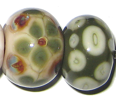
And holy crap, this is Porcelain with Raku.  Raku and I are not the best of friends, but this reaction is killing me.  A white-ish halo rises up out of the Porcelain to support the Raku stringer dots and lines, and leaves a darker pink line in between.  Then, to put icing on the cake, the darker pink reactiony bits boiled but the rest of the bead didn't, which means I have two sets of decoration here.  The decoration I applied... and then the decoration that boiled, because the boily bit is every bit as precise as the stringer work I did and looks like it was etched or sandblasted on purpose but stayed sparkly.  Cool, right?


Tuxedo bled onto Porcelain just a bit, and the Porcelain has just the faintest tinge of pink when used with this colour.


I love the way Copper Green behaves with Porcelain.  No grey-green sheen on this Copper Green.  On top of Porcelain, the Copper Green has separated so that the outsides of the lines and dots have a lighter outline and darker middle.  The Porcelain on the right side of this bead has turned pinkish in places, but not uniformly like in some of the other beads.

On the left side of the bead, the Copper Green has really brightened up and is a turquoise colour that is just gorgeous.  Apart from keeping the Copper Green clean, there is not much reaction from the Porcelain on top of Copper Green.


I don't really know what happened here.... one side of the bead was supposed to be Opal Yellow and the other side was supposed to be Porcelain, but as it turns out, they don't really look different enough when they're hot for me to keep them straight when I forget to focus at the torch.

Regardless, the Opal Yellow almost looks dirty when used with Porcelain, the Porcelain struck to pink on top of Opal Yellow, and where I used Opal Yellow beside or over top of the Porcelain, it developed a lighter outline and a darker, dirtier centre colour to the dots and lines.


Here you can see the colour difference between Ivory and Porcelain pretty well.  On the right side of the bead, you can see that Ivory is a fair bit warmer than Porcelain.  On the left side of the bead, you can see that Ivory has a hard time dealing with this... it looks all yellowed where it is right up against the Porcelain and then dirty in a big swath and then finally, more like itself towards the end of the bead.


And here is Porcelain with White.  There is no obvious reaction here but you can see on the right side of the bead that the Porcelain is a warmer colour than white, and looks sort of like a greyish ivory colour.

Regardless, it's all yummy.  This colour and I are going to have a long relationship together.  The viscosity of it makes it dreamy to work with in stringer form, it makes a fantastic base colour for Raku (and hopefully other reactive colours as well) and doesn't do that dark line thing with turquoises.  It's versatile, it's beautiful and it's interesting.

Here are some of my fun beads with Porcelain:


October 6, 2010

Test Results :: Ocean

1 - Plain, 2 - Plain (reduced), 3 - w/ Silver Leaf, 4 - w/ Silver Leaf (reduced & encased), 5 - w/ Silver Glass Frit Blend (reduced),  6 - w/ TerraNova2 Frit, 7 - w/ Copper Green, 8 - w/ Opal Yellow, 9 - w/ Ivory, 10 - w/ White, 11 - As a Floral (over White) 

General Impressions
Reichenbach Ocean (RL1012B) seems to be a veiled cane. I am theorizing that it is a core of Clear encased in a rich, dense transparent Blue, and then encased in Clear again. It's easy to see why I think that the whole cane is clear-cased when you look at a rod of Ocean, but the theory that it is clear-cored as well comes from a fun effect I observed in some of the beads I've made with it.

This 'fun effect' happens when you use it without mucking up the end of the rod and squishing it all together -- i.e. getting the whole end hot but not so molten that it gathers and folds in on itself. It's fun to draw ribbon-like stripes of it around a bead that is encased, and then encase over it to magnify. It looks like transparent blue ribbons, each with a darker blue outline. It's the darker blue outline that has me convinced that the rods are cored with clear. This colour makes me want to make veiled cane out of all of my densely saturated transparent colours, so I guess we'll be seeing some of that on this blog in the future.

I read somewhere (but have no idea where it might have been) that both Ocean and Antique Green are variations on the Reichenbach Soft Crystal, which I have not yet used because I also read (again, not sure exactly where) that the Soft Crystal has some compatibility issues with other 104 glass, but I am happy to report that I have not had any cracking issues at all with Ocean.

Ocean seems, when you look at the rods, like it might have some mica flecks or sparklies in it, but there is no evidence of this in any of my finished beads. My favourite beads so far with this colour all use Ocean fairly sparingly, over White or in an encased focal surrounded by Clear.

Reactions
I haven't done any of my colour tests with Clear -- Reichenbach or any other, so I can't say with any certainty whether the reactions noted here are unique to Ocean or if they might also be reactions you'd get with Reichenbach Soft Crystal and/or other Clears. Someone with some extra time on their hands could try it and let us know :)


Silver leaf goes sort of filmy and leaves greyish brown smears when melted into Ocean. When it is reduced and encased, the film becomes shinier and more interesting-looking, but doesn't really do much in the way of fun things.


I didn't really expect much from Ocean with silver glass, but both my reduction frit blend and my TerraNova2 frit seem to love this colour. I got nice colour from the TerraNova2, and the reduction frit looks nice on it as well. One of the things I like about this testing is that the glass always surprises me.


Ocean leeches the colour out of Copper Green and keeps it from doing that dark grey-green metallic thing that Copper Green so loves to do. You can see in the middle of this bead and around the dots and lines on the left-hand side how around the Ocean, the colour in the Copper Green sort of flees from the Ocean like it's afraid to get wet. On top of Ocean, the Copper Green separates so that it is lighter around the edges and darker in the middle.


Ocean doesn't really react with Opal Yellow at all, but I love how the stringer dots and lines have a dark blue edge. This is because of the nature of Ocean, not because of a reaction, but it's still pretty neat.


On top of Ivory, the blue in Ocean turns brown in a similar fashion to what happens with other blues and greens like Light Teal and Light Aqua except in a less uniform way. On top of Ocean, Ivory seems to flee to the middle of the dots and lines in a similar way to what happened with the Copper Green.


In a floral over white, you can really see the streaky results of using Ocean as stringer. The effect is messy, but still interesting. White thins a bit on the outside of the dots and lines, similar to what happened with Ivory only less strongly. There is no noticeable reaction when Ocean is used over White.

I've had quite a bit of fun with Ocean so far. Here's a little Ocean eye-candy.


September 30, 2010

Test Results :: Ming

1 - Plain, 2 - Plain (reduced), 3 - w/ Silver Leaf, 4 - w/ Silver Leaf (reduced & encased), 5 - w/ TerraNova2 Frit, 6 - w/ Silver Glass Frit Blend (reduced), 7 - w/ Tuxedo, 8 - w/ Copper Green, 9 - w/ Opal Yellow, 10 - w/ Ivory, 11 - w/ White

General Impressions
CiM Ming is a medium, translucent blue. By itself, it's quite a bit brighter than I'd normally like, and it's a very 'webby' colour. It's also pretty shocky. Not as shocky as Anise White or some of the Vetrofond odds, but definitely shockier than I would prefer.

Some of the redeeming features of Ming are how interestingly it reacts with other colours, and how it can be applied in a thin layer and lose some of its crazy brightness in ways that just aren't possible with other blues of similar hue. The reactions that are possible with Ming are pretty interesting, and I haven't ever seen some of them before which was kind've thrilling.

Reactions

With silver leaf on its own, Ming just lets it vein through without much in the way of a reaction. You can see the veins of silver in the bead on the left.  However, if you reduce and encase that silver, you get the wild, webby, crazy, shiny reaction we see in the bead on the right. I really like this reaction.


In the bead on the left, the TerraNova2 frit has struck nicely, but more in the blue and purple ranges that make it not stand out so well against the Ming. In the bead on the right, some of the bits of frit have developed an interesting halo around them. I need to do a little more testing with Ming and Silver Glass. The other interesting thing about these two beads is that the Ming has lost some of its harshness and some of its translucency and become a more milky blue.


With Tuxedo, the cloudy marbling in the ming is mild, but there is some curdling of the surface of the colour. The Tuxedo dots and lines look fairly crisp on the Ming though, unlike what happens in the beads below.


Over Copper Green, Ming thins out to almost nothing, looks completely transparent and really befuddles the surface of the Copper Green. It develops light turquoise halos around it and odd, grainy veins of Ming concentrate in the surface of the dots and lines of the stringerwork that remind me of cracks in cement walls.

On top of Ming, Copper Green gets frazzled around the edges and separates into two parts -- a shiny outer shell with a darker green in the middle of the dots and stringer lines. Under the Copper Green, the Ming is quite cloudy and curdled.


This reaction is the weirdest of the lot.

On top of Opal Yellow, Ming looks transparent, and it lifts fuzzy yellow halos out of the Opal Yellow and seems to float on top of the surface with them.  The appearance of the dots and lines goes all fuzzy, and like in the Copper Green test bead above, the Ming seems to gather in thin, frizzy bits in the centre of the scrollwork and the dots.

On top of Ming, Opal Yellow is ragged, and it develops a thin, translucent line in the centre of lines and dots that is a deeper and more orange hue of yellow than the outside edges. In the centre of the bead, you can see some odd greyish webbing between the two colours.


On top of Ivory, Ming spreads in a crazy, blotchy, I-think-I'm-a-transparent sort of way. The Ivory underneath it clots like cream.  On top of Ming, the Ivory lines and dots have good cohesion, but you can see some marbling in them and the blue of the Ming breaching their boundaries.


The reaction between Ming and White is very similar to what happens with Ivory, but because White is a more translucent colour than Ivory, the lines and dots of it over Ming are not as crisp, and the odd curdling of the White on the right side of the bead has even less real definition to it.

I haven't made many fun beads with Ming yet, and one of the ones I have made I've posted a lot since it's got lots of colours in it.  I have two rods of Ming left, so there will be a couple more Ming beads before I'm moving on.