Search This Blog

September 25, 2017

Test Results :: Monarch


OK, so you've maybe noticed that I'm on a bit of a CiM tear. And why not? New colours, even these ones that are limited runs, are pretty darned exciting for me even after more than nine years on this colour roller coaster.  I won't be blogging all of the new CiMs, but I've tested most of them now.

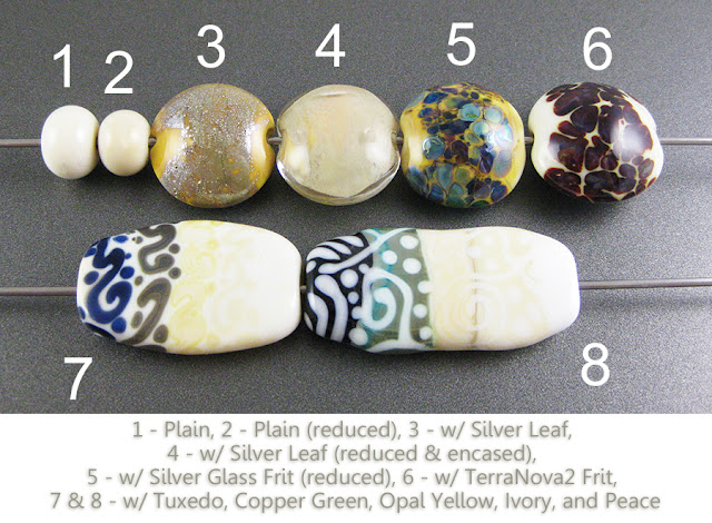
CiM Monarch (CiM216) is a really beautiful light orange. It does strike a little in the flame, but even after striking, it is still lighter and yellower than the other oranges I've tried. I found that it melted without any irritating boiling or shocking behaviour, and was interestingly reactive with silver and with Tuxedo.


Here, you can see how it strikes a little more orange in the flame. The smaller bead is the one that I waved around in a reduction flame and therefore struck a bit.


Here is Monarch with some of the other oranges I have in my stash right now. You can see that it is much more on the yellow side than CiM Phoenix, CiM Sunset, CiM Harvest, Effetre Dark Zucca, or Effetre Light Zucca. Older batches of Light Zucca can have streaks in it that are this light, yummy orange-yellow but the most recent batch of it (pictured) is much more on the orange side.


On top of Monarch, silver turns a bit golden. It fumes the Monarch underneath a brownish colour. When the silver is reduced and encased, it looks a bluish grey colour.


Monarch makes a splendid base colour for silver glass. I was really surprised at the nice colour I got from my TerraNova2 frit on top of this colour. Rather than a strong dark line, silver glass fritty bits get more of a gentle, fuzzy brown line around them on top of Monarch.


Here you can see Monarch with Tuxedo, Copper Green, Opal Yellow, Ivory, and Peace.  There isn't much to report here except that:

  • Monarch really likes being under Tuxedo and rises up around the Tuxedo in strong orange halos.
  • Copper Green and Monarch have a reciprocal dark line reaction, and Copper Green spreads rather a lot on top of Monarch.

Here are some other beads made with Monarch.


September 19, 2017

Test Results :: Spooky


CiM Spooky (CiM825) is a translucent white colour. I found my rods of Spooky to be a little bit shocky, and I also found that Spooky was a little sensitive to heat - it's not a chronic bubbler, but it is also not difficult to boil this colour by accident if you're not paying attention and park it in your flame for too long.


Nothing happens to Spooky when you reduce it.


Here you can see that Spooky is far more opaque than CiM Cirrus, but slightly more translucent than CiM Marshmallow.


The addition of silver fumes Spooky a gentle amber colour. When the silver is reduced and encased, most of the amber colour disappears in any non-silvered areas, but you can still see it under the silver. The silver turns a greyish colour after reducing and encasing it on top of Spooky.


Spooky is quite interesting with silver glass. It fumed yellow when I reduced this silver glass frit on top of it, and then in the rightmost bead I got a good starting strike from my TerraNova2 frit.


Copper Green separates on top of Spooky, but gets and stays so dark in colour that the only way to enjoy that reaction would be to etch the bead so that it is more visible.  Opal Yellow, Ivory, and Peace all separate on top of Spooky as well.   Ivory gets a light brown reaction line with Spooky. It's similar in colour to the line that forms around Opal Yellow when you use that colour on top of Ivory.

When Spooky is used on top of all of these colours, the only noteworthy thing that happens is that Ivory gets a darkish tan blush to it at the edges of the Spooky dots and stringer lines.

Here are some beads made with Spooky. The darker blues are Vetrofond Light Cobalt and Effetre Dark Periwinkle, and the white dots and stringer work are Effetre White.


September 14, 2017

Test Results :: Rapunzel


CiM Rapunzel (CiM627) is a light lavender pink colour. It's gorgeous with silver and silver glass, and I had buckets of fun combining it with orange and purple. It's a fairly tight colour, by which I mean that it condenses in on itself when you use it on top of other things, and other colours spread on top of it.

I usually make the plain spacers first when I make a set of test beads, but for some reason I started differently with these ones and then forgot to go back and make the plain spacers. I put maybe too much value on consistency, and so I'm probably way more upset about the fact that they're missing from this set of test beads than you are, but I apologize anyway.


Here is Rapunzel with CiM Gellys Sty, CiM Heffalump, Effetre Lilac Dark Dark, Effetre Lavender, and Reichenbach Soft Violet. Rapunzel sits directly between Gellys Sty and Heffalump, hue-wise, and is a very pretty colour.


Where Rapunzel really shines is when you pair it with silver. Silver leaf on top of it fumes the Rapunzel immediately surrounding the silver to a rich brown colour. When the silver is reduced and encased it gets a dark pink and bluish haze to it.


You can see in the leftmost bead here that reducing silver glass frit on top of Rapunzel fumes it a yellowish colour. I guess this is Rapunzel letting down her golden hair?  The reducing silver glass frit develops colour well on top of Rapunzel.

I also got a beautiful starting strike in my TerraNova2 frit on top of this colour and as an added bonus, Rapunzel separated underneath this silver glass colour and popped up around the fritty bits in little rapunzelly halos.


In general, Rapunzel separates with everything, and everything spreads on top of it.  Copper Green separates on top of Rapunzel.

The most noteworthy things that happened here involve Tuxedo and Opal Yellow:
  • Because the colour of Rapunzel is not very dense, it thins out considerably when you use it in thinner layers. It is almost translucent on top of Tuxedo, and you can see that when it separates on top of that colour it gets considerably lighter at the edges forming stringer lines and dots that are almost ghostly in appearance.
  • Rapunzel, when it separates on top of Opal Yellow also takes on some of the Opal Yellow colour. So, instead of looking like a cool pink, it instead looks like a warm, dusty rose colour in the middle of the dots and stringer lines.

Here are some other beads that include Rapunzel.


September 11, 2017

Test Results :: Buttermilk


CiM Buttermilk (CiM315) is a very pale, opaque yellow. It strikes in the flame, blushing a little more yellow as you work it, but doesn't darken significantly. The consistency of it is beautiful, and my rods of Buttermilk were not shocky. Like Bone, this colour fills a gap in my palette that has been open since Vetrofond stopped making us nice pale neutrals.


Here you can see that where I gave Buttermilk an extra shot of heat in a reduction flame, it got a little more yellow. I don't think this is due to the reducing nature of the flame I reheated it in - it warms in colour in a neutral flame as well.


The addition of silver yellows Buttermilk substantially. When the silver is reduced and encased, it does not develop any unusual colours or effects.


Silver glass is pretty on top of Buttermilk. Because Buttermilk is not particularly reactive with silver, it makes a good base for reducing silver glass frit on. I also got a nice starting strike here on my TerraNova2 frit, which tells me that this colour has some promise as a base for striking silver glass as well.


Copper Green separates on top of Buttermilk, ,becoming darker in the middle of stringer dots and lines. Buttermilk separates on top of both Tuxedo and Copper Green. On the whole, this colour is not very reactive and I found it to be quite stable.

Here are some other beads that include Buttermilk.


September 7, 2017

Test Results :: Bone


CiM Bone (CiM826) is a lovely, pale neutral colour. It's reactive, but much less volatile than other Ivories that we currently have available. Bone is paler and cooler than Effetre Ivory, and I think you'll like its reaction profile.

Do you miss Vetrofond Ivory and Yellow Ice? Bone isn't the same, but it is Ivory in colour, is not reactive in a muddy, negative way, and is beautiful with silver, which are the three things I miss most about those colours.


Reducing Bone seems to warm its colour to a light tan.


Here is CiM Bone with Vetrofond Biscotti, Vetrofond Cream, Reichenbach Porcelain, Effetre Wood, and Effetre Ivory. As you can see, it's very similar in colour to Vetrofond Cream. I haven't done a lot with Cream yet, so I am not certain how similar it and Bone are in other respects.


Silver Leaf on Bone behaves pretty much the way you'd expect if you know what it does with Effetre Ivory. The base colour fumes a deep brown and the silver gets a goldish cast to it. When the silver is reduced and encased, it turns blue in patches.


Since Effetre ivories are fun with silver, I thought I'd try silvered stringer with Bone.  Here's what silvered Bone is like - not as veiny as Effetre Ivory but a very interesting, mottled organic effect.


Reducing silver glass on Bone fumes the surface a richer Ivory colour and brownish around the edges of the frit. Striking silver glass on top of Bone was a slow starter. I looked back at my tests for Vetrofond Ivory and Effetre Light Ivory and it seems like this colour's less dramatic reactions mean that it will be less exciting with silver glass, but I would love it if someone would prove me wrong.


Like other Ivories, Bone develops a reciprocal dark line reaction with Opal Yellow. Unlike other Ivories, Bone does not react negatively with Copper Green, forming no dark line reaction at all. I have no idea why, but I can be grateful for this without understanding it.

Bone separates on top of Copper Green and Tuxedo.When Tuxedo is used on top of it, the Bone rises up in halos around the Tuxedo stringer lines and dots. When Copper Green is used on top of it, the Copper Green separates but the colour of it remains so dark and gunmetalish that it's not all that easy to see the reaction.

Has anyone else noticed that Tuxedo has gotten bluer and more transparent in recent years? I don't know what the current batch is like, but this stuff from last year seems much less opaque than I am used to.

Here are some other beads that include Bone.


September 4, 2017

Test Results :: Juniper


CiM Juniper (CiM459) reminds me a lot of another Limited Run called Army Men, except that Juniper is more on the blue side and maybe a bit lighter than that colour. This colour is very similar in hue to ASK Aloe Vera / Kugler Isar Blue, although it is a touch lighter and less reactive. Juniper is quite a pretty colour, which helped me to forgive it for being a bit shocky. It is very streaky.


Juniper doesn't change when you reduce it.


Here is Juniper with Effetre Green Cave, CiM Commando, CiM Eucalyptus, CiM Split Pea, and Effetre Moss Green.

It is darker and bluer than Split Pea, and is both brighter and bluer than Commando.


Unlike CiM Army Men, Juniper does not yellow with the addition of silver. Reducing and encasing silver on top of Juniper makes the silver into a smooth silvery blanket that turns blue at its edges.


Striking silver glass is pretty on top of Juniper. I got a beautiful starting strike our of my TerraNova2 frit.


Juniper separates on top of everything I used it with here except for CiM Peace.  Copper Green, Opal Yellow, and Ivory all separate on top of Juniper. Additionally, when these other colours are used on top of Juniper, it takes on a quite billowing, curdled appearance underneath the other colours.  I love that this colour does not develop a dark line reaction with Ivory.

Here are some other beads that include some Juniper.