Search This Blog

February 23, 2011

Test Results :: Latte Macchiato

1 - Plain, 2 - Plain (reduced), 3 - w/ Silver Leaf, 4 - w/ Silver Leaf (reduced & encased), 5 - w/ TerraNova2 Frit, 6 - w/ Silver Glass Frit (reduced), 7 - w/ Silver Glass Frit Stringer (encased), 8 - w/ Tuxedo, 9 - w/ Copper Green, 10 - w/ Opal Yellow, 11 - w/ Ivory, 12 - w/ White

Lauscha Latte Macchiato is sort of unlike the other Milky Way colours I have tested in terms of how it reacts with other colours.  It ranges in colour from a soft peach to a yellow, depending on how much it is struck and the colour it is used with.  Annealed, it is more like Thüringen Herb than it is like the Milky Way pinks.

Rods of Latte Macchiato are sort of shocky and splintery, so you need to be careful to heat it slowly.  It also looks completely different going into the kiln than it does coming out, which is a little disorienting. Before annealing, this colour looks very translucent and peachy, but post-annealing, it is far more opaque, and displays colours in the range I mentioned above.

I achieved some interesting effects with Latte Macchiato, and while it is not among my favourite Lauscha colours, it is definitely appealing and worthy of further study.


Here, I've put silver leaf over the bead on the left.  The silver has dispersed, and has fumed the surface of the bead with a brown haze.  In the bead on the right, the reduced and encased silver has turned a peachy colour.  This is similar to the reactions I got with Thüringen Herb.


On top of Latte Macchiato, I had a hard time getting decent colour out of my TerraNova2 frit, but I really like what happened with the reducing silver glass frit in the bead on the right.  The frit has bloomed and separated and fumed the bead a little to a yellowish tan colour.


Here, I made frit stringer with my reducing silver glass frit blend and Latte Macchiato.  I like this streaky effect a lot, particularly where the unfritted Latte Macchiato has struck to tan.


There is no noticeable reaction between Tuxedo and Latte Macchiato.  No bleeding and no weirdness.  The Latte Macchiato looks paler against Tuxedo than it does with the other colours I tested it with.


I expected Copper Green to separate on top of Latte Macchiato, and for the Latte Macchiato to help the Copper Green not sheen up the way the other Milky Way pinks did, but instead I got a reaction that is much more reminiscent of how Copper Green behaved with Thüringen Herb.  The Copper Green has developed an army green patina, and has bled into the Latte Macchiato stringer design on the left-hand side of the bead lending it some mottled turquoise streakiness.  The Latte Macchiato on the right-hand side of the bead looks more opaque and a little dirtier than it does in the other test beads.


On top of Latte Macchiato, Opal Yellow separates and develops a thin tranlucent line down the centre of the stringer lines I drew.  On top of Opal Yelow, Latte Macchiato looks sort of diffuse and mustardy.  The Latte Macchiato on the right-hand side of this bead looks deeper and peachier than it does on the other test beads.


There isn't really anything all that interesting about Latte Macchiato with Ivory or Latte Macchiato with White. The Latte Machiato sort of disappears on top of those colours, and the Ivory/White lines and dots are crisp and smooth.

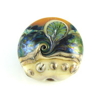
Here are some other beads made with Latte Macchiato.  I may add to these because I still have a little bit of this colour left.


February 21, 2011

Test Results :: Desert Pink Unique #2

1 - Plain, 2 - Plain (reduced), 3 - w/ Silver Leaf, 4 - w/ Silver Leaf (reduced & encased), 5 - w/ TerraNova2 Frit, 6 - w/ Silver Glass Frit (reduced), 7 - As a Floral (over Olive), 8 - w/ Tuxedo, 9 - w/ Copper Green, 10 - w/ Opal Yellow, 11 - w/ Ivory, 12 - w/ White, 13 - On Lauscha Olive


I was expecting to be really fond of CiM Desert Pink #2, because I really liked regular Desert Pink. I haven't tried Desert Pink Unique #1. On the whole, I do really like Desert Pink Unique #2 because of its reactions with silver and the way it looks with Copper Green. I should probably get some more of this colour before it sells out the way all of the uniques eventually do and there is no more of it to be had.

The colour of Desert Pink Unique #2 is a little warmer and a little darker than regular Desert Pink.  It is more reactive with silver than the original Desert Pink as well. In a thin layer, Desert Pink #2 is very translucent.  I haven't included an enlarged picture of Bead #7 (above) but you can see that the flower petals are so translucent that they almost vanish in that bead.


In the bead on the left, the Desert Pink Unique #2 has fumed a dark, rich brown from the application of silver leaf. When this effect is reduced and encased, the silver really shines up under the Clear and develops a bright, ethereal blue halo.  I like this effect a lot.

In both of these cases, the reaction is a lot like what happened with regular Desert Pink, but more intense.


Desert Pink Unique #2 does not score huge points in the silver glass department, but the reduced silver glass does look very interesting on top of it in the bead on the right, and there are some hints of colour on the bead on the left that indicates that if I'd been a little gentler with the striking of that bead I may have gotten better results.


When placed on top of Tuxedo, the Desert Pink Unique #2 develops a fine, shiny outline.  I've mentioned this a couple of times now, but a lot of colours seem to have this reaction with Tuxedo.  Regular Desert Pink, however, was not one of them.  The Tuxedo on top of Desert Pink Unique #2 doesn't have any noticeable reaction, but you can see in the middle of the bead where the two colours meet that there is a fair amount of Tuxedo bleed there.


Desert Pink Unique #2, when placed on top of Copper Green, helps the Copper Green to not develop that shiny patina. However, Copper Green on top of Desert Pink Unique #2 does sheen up.  Why?  Who knows... this glass chemistry thing is easy to observe, but more difficult to predict and diagnose.


I want to say something smart about these two beads, but I sort of shot myself in the foot by doing something stupid when I made them.  Unfortunately, I got my Opal Yellow and Ivory stringers mixed up and managed to completely bungle this, putting Ivory stringer on my Pink & Opal Yellow bead and putting Opal Yellow stringer on my Pink & Ivory bead.  Grrr.

Since there are no reactions I want to comment on, let's just move on to the next bead.


There is no real reaction between Desert Pink Unique #2 and White, but you can see how translucent the Desert Pink #2 is where I used it on White, because it's sort of hard to make it out.


Putting Olive on top of Desert Pink Unique #2 makes a curdled halo of Desert Pink Unique #2 pop up around the Olive stringer lines and dots.  Also, the Olive thins out a bit on top of the Desert Pink #2 and seems lighter and more translucent.  On top of Olive, mostly Desert Pink #2 just seems to disappear, but the Olive is uncharacteristically streaky underneath it.

And here is a fun bead with Desert Pink #2.  This bead is a base of Desert Pink #2, with silver leaf, TerraNova2 frit, A twistie made with Copper Green, Raku and Steel Blue and a bit of Opal Yellow and Mermaid dottage add some additional colour.

February 19, 2011

Test Results :: Appletini

1 - Plain, 2 - Plain (reduced), 3 - Over Silver Foil, 4 - w/ Silver Leaf, 5  w/ Silver Leaf (reduced & encased), 6 - w/ TerraNova2 Frit, 7 - w/ Silver Glass Frit (reduced), 8 - w/ Silver Glass Frit (pulled into stringer, encased), 9 & 10 - w/ Tuxedo, Peace, Copper Green, Opal Yellow, Ivory

CiM Appletini is a LOT like the handpulled Effetre Pale Emerald, except it is perhaps a little more saturated (seriously, not much though) than that colour and it is a little stiffer.  Like Pale Emerald, Appletini does not change the colour of silver when used to encase it, and is a fairly stable, minimally reactive colour.

The consistency of Appletini is a lot nicer than a lot of the other CiM transparents that I've tried. It is a bit less prone to bubbling than Mojito, making it similar to Maple in terms of how nice it is to use. You still have to be a little careful with Appletini, but you sort of have to be trying to boil it, unlike what happens with, say, Larkspur.


As I mentioned, this colour will not turn silver yellow-brown when it is used over silver foil.  On top of Appletini, silver leaf sort of dissipates, and then gets a little brown in the areas where it is more concentrated. When this combination is reduced and encased, the colour of the Appletini yellows slightly and the silver leaf looks sort of ethereal and wispy.


I got fairly nice results with my silver glass using it with Appletini. My TerraNova2 purpled and blued up nicely, and the silver glass reduction frit looks very shiny, if a little too static.  My frit stringer bead didn't do the fun things I was hoping for, but it does have an appealing wispiness to it. This just isn't a very reactive colour, but sometimes that's a good thing.


Here we have Appletini with Tuxedo, Peace, Copper Green, Opal Yellow and Ivory.  There is not much to see here in terms of reactions, but there are a few things worth noting.

Peace: On top of Appletini, Peace separates so that it has a translucent line in the middle of stringer lines and translucent dots in the middle of dots. This reaction is not as strong between these two colours as I've seen it with other combinations, and it's an interesting effect.

Copper Green: On top of Copper Green, Appletini serves mainly to lighten and make the Copper Green look a little greener. Copper Green on top of Appletini separates so that a dark line/dot forms in the middle of the stringerwork.

Opal Yellow: Inexplicably, when used on top of Opal Yellow, Appletini looks sort of greyish/purplish.  It also makes the opal yellow raise up in a halo around it.

And finally, I discovered (completely irrelevantly) that I shouildn't use Peace beside Tuxedo if I'm going to continue to make these amalgamated test beads because the Tuxedo bleeding into the Peace distracts me from being able to see if there's anything interesting going on right next to it.

I can cheat a little with the opaques and semi-opaques and encase a clear core to conserve colour, but with transparents, I sort of have to make solid beads to test with in order to preserve the saturation of the test colour. Also, when I test transparents, I make more beads than I do when I test opaques. As a result, these beads took a fair bit more Appletini than my Atlantis beads took Atlantis and I don't have anything to show you in terms of fun beads with this colour. 

February 17, 2011

Test Results :: Orchid

1 - Plain, 2 - Plain (reduced), 3 - w/ Silver Leaf, 4 - w/ Silver Leaf (reduced & encased), 5 - w/ TerraNova2 Frit, 6 - w/ Silver Glass Frit (reduced), 7 - w/ Tuxedo, 8 - w/ Copper Green, 9 - w/ Opal Yellow, 10 - w/ Ivory, 11 - w/ White

Do these test beads remind you of anything?  If not, they should, because at first glance, they are very, very similar to the test results I got with Faded Rose that were posted a short while back.  However, there are some key differences, which I will point out as we go here.


With unencased silver leaf added to the surface of an Orchid bead, the result is an interesting mottled colour that ranges from orange to green in the surface colour.  The silver itself wisps up on top of the Orchid.  When this reaction is reduced and then encased, the Orchid re-pinks and the silver presents as a snowy, cloudy layer with lavender clouds on its edges.


I had moderate success with my TerraNova2 frit with this colour, and the reducing silver glass frit blend that I used looks pretty darned interesting on top of Orchid.  With TerraNova2, the base of my Orchid bead stayed pink, but with the reducing silver glass, my Orchid turned orangey-yellow.  These results are similar to what I experienced with Faded Rose.


There is no reaction to speak of between Orchid and Tuxedo (note there is no silvery line when using Orchid on Tuxedo) but on top of Orchid, Tuxedo thins out a little and looks more translucent than I'm used to seeing it.  Again, these results are similar to what I experienced with Faded Rose, except for the translucency of the Tuxedo, which has only happened on top of Orchid.


The relationship between Orchid and Copper Green seems kind've complicated.  Where I used Copper Green over Orchid, it seems to have empinkened the Orchid quite a lot, and has created a very, very faint transparent film which emanates from the Copper Green. In the centre of the bead where the two colours meet, there is an odd ivory patch that looks like all of the colour has been sucked out of the Copper Green.  And then where the Orchid is over the Copper Green, the Copper Green seems really conflicted, ranging from a patina-coated army green to a raging turquoise.  This is worth experimenting with, since it'd be nice to know the reason for so much variation.  Here is where the Faded Rose and Orchid test results start to differ, since this is not the same reaction I got with Faded Rose and Copper Green at all.


Opal Yellow, like Copper Green, makes Orchid look pinker.  On top of Opal Yellow, Orchid looks like a pretty dusty rose colour, but under Opal Yellow, it looks more bubblegummy.  On top of Orchid, Opal Yellow lines look like they have a subtle, faintly darker line around them.  Faded Rose did not behave this way with Opal Yellow at all -- in fact, the results here are so different, I will need to invent completely separate mental categories for these two Milky Way colours.


Ivory on top of Orchid goes sort of wonky, spreading a bit and developing a transparent, crack-like line in the middle of dots and stringer lines.  On the Ivory side of the bead here, the Ivory has curdled and formed what almost looks like a translucent crack around the bead.  The Orchid is not very visible on top of Ivory.  Faded Rose did not do this with Ivory, so if you are looking for this reaction, it's Orchid you'll want.


The reaction between White and Orchid is quite similar to the reaction between Ivory and Orchid, only it's more subtle.  The transparent, crack-like lines/dots in the stringer work are less pronounced, and there is no evidence of curdling on the left-hand side of the bead.

Here is a fun bead made with Orchid.  I used a lot of Orchid in twisties as well, and as the base colour for a couple of bicones.  Sadly, I can no longer remember exactly which twisties or bicones, so all we are left with is this bead.

February 15, 2011

Test Results :: Atlantis

1 - Plain, 2 - Plain (reduced), 3 - w/ Silver Leaf, 4  w/ Silver Leaf (reduced & encased), 5 - w/ TerraNova2 Frit, 6 - w/ Silver Glass Frit (reduced), 7 & 8 - w/ Tuxedo, Copper Green, Peace, Opal Yellow, Ivory

The new CiM Atlantis is a medium turquoise semi-opaque, similar to Effetre Medium Turquoise Alabastro, but a little more vibrant, a little more reactive, maybe a little darker and much less irritating to work with. Atlantis seems to darken in colour with repeated striking.


Atlantis and silver have an interesting relationship. On top of Atlantis, silver leaf webs and bubbles and turns a golden colour. When this combination is reduced and encased, the yellowing is more pronounced, and the webbing effect is magnified. The area between the Atlantis and the silver, under the clear, looks green.


I'm not really sure about Atlantis and silver glass because I didn't make many beads with it, but I sort of like the way my reduction frit bloomed and grew on top of Atlantis. I didn't get much colour out of my TerraNova2 frit in the bead on the left, but in one of the fun beads at the end of this post you can see I had a little more success.


And I know, this looks like cheating. From left to right on both beads we have Tuxedo, Copper Green, Peace, Opal Yellow and Ivory.

Tuxedo: On top of Tuxedo, Atlantis separates and forms a dark line in the centre of stringer lines and a dark dot in the centre of dots. On top of Atlantis, Tuxedo doesn't do much.

Copper Green: On top of Copper Green, Atlantis sort of dissipates and causes odd turquoise halos in the Copper Green underneath. What you can see of the remaining copper green looks dark and blotchy. On top of Atlantis, Copper Green separates so that it has a dark line/dot in the middle of the stringerwork, and underneath that stringerwork, a fine dark webbing has appeared in the Atlantis.

Peace: There is no noticeable reaction between Peace and Atlantis when Atlantis is used on top of Peace except for a subtle curdling effect in the Peace that is not unlike how the Opal Yellow behaves with Atlantis but is much less pronounced. Atlantis spreads a little on top of Peace, too. Peace on top of Atlantis separates so that the dots/lines have a dark centre.

Opal Yellow: Atlantis and Opal Yellow are crazy together in the same way I remember Ming and Opal Yellow being crazy together.  Under the Opal Yellow, the Atlantis has crazed with tiny fine, dark lines.  As a result, the Opal Yellow stringer lines and dots also have this odd crazing, and the Opal Yellow separates so that the dots/lines have a dark centre. Under Atlantis, Opal Yellow develops a pronounced curdling effect, with transparent 'cracks' springing up in the Opal Yellow all around the Atlantis dots and stringer lines.  Atlantis also sort of spreads and disintegrates on top of Opal Yellow.

Ivory: Ack! This is an interesting reaction for sure. When Atlantis is used on top of Ivory, a fine crazing of brown, bubbly-looking webbing springs out from it and the Atlantis looks darker and tealer than with the other colours. When Ivory is used on top of Atlantis, it looks brown with black webbing, and the Atlantis is crazed underneath.

Here are some fun beads with Atlantis.
 

February 13, 2011

Test Results :: Sepia Unique #2

1 - Plain, 2 - Plain (reduced), 3 - Over Silver Foil, 4 - w/ Silver Leaf, 5 - w/ Silver Leaf (reduced & encased), 6 - w/ TerraNova2 Frit, 7 - w/ Silver Glass Frit (reduced), 8 - w/ Silver Glass Frit Stringer (encased), 9 - w/ Copper Green, 10 - w/ Opal Yellow, 11 - w/ Ivory, 12 - w/ White

I think that CiM Sepia Unique #2 might be the first CiM colour that I've tried that I really don't like.  At all.

This colour is so prone to bubbling that no matter where I worked it in the flame or how patient I tried to be, it was filled with tiny bubbles. I was a little disappointed, because I was sort of excited about the Sepia family of colours after experimenting with Sepia Unique #1, but this version of Sepia doesn't have nearly as much in common with that one as I'd hoped.  It's also sort of a bland, blueish/pinkish grey colour that just leaves me cold.

I do like the gentle, golden tan colour that it takes on with silver though.


The only real bright point in my testing of Sepia Unique #2 was this pretty, beer-hued brown tone that it acquires when used with silver.  In the bead on the left, you can see that the Sepia Unique #2 has turned the silver that pretty amber colour.  In the centre bead, the silver has turned the bead more of a Guinness brown, and has balled up on top of it and in places turned slightly blueish.  In the bead on the right, I reduced and encased the silver leaf, giving me both the pretty tan colour and an ethereal blue-purple around the silver.


Sepia Unique #2 is nicer as a base for reduction colours than it is as a base for striking silver glass colours.  It doesn't, however, do anything nice at all when used with reduction frit and pulled out into stringer.  I did get good colours out of my TerraNova2, but they aren't that evident in the picture.  Under silver glass seems to be the best way to use this colour, since afterwards it will be well-covered.


Sepia Unique #2 isn't a very reactive colour, and even the softer opaques (e.g. White, Opal Yellow) don't seem to spread on top of it much.

As with some of the other colours I haven't been super-fond of, once I'd made these test beads, I didn't have much desire to explore Sepia Unique #2 any further. If you discover that it's actually a great colour and that I am missing out, please let me know and maybe I'll give it another shot.

February 10, 2011

Test Results :: Faded Rose

1 - Plain, 2 - Plain (reduced), 3 - w/ Silver Leaf, 4 - w/ Silver Leaf (reduced & encased), 5 - w/ TerraNova2 Frit, 6 - w/ Silver Glass Frit (reduced), 7 - w/ Tuxedo, 8 - w/ Copper Green, 9 - w/ Opal Yellow, 10 - w/ Ivory, 11 - w/ White

Faded Rose is the first of a few Lauscha Milky Way colours that I tried last fall and quite liked. I have no idea how to keep these Milky Way colours opalescent, but that doesn't matter very much since I'm getting interesting results with them the opaque way.

Like Thüringen Herb, Faded Rose has an interesting relationship with silver and silver glass, and is beautifully reactive. The colour of it seems to range from a light, pinky peach to a darker, more purplish pink, depending on how much it is struck and the colour(s) it is used with. It also can acquire some yellow tones, as I'll discuss below.


The reaction between Faded Rose and silver leaf is not anything like what I got when I did my testing of Thüringen Herb. On top of Faded Rose, silver leaf webs and beads up in interesting, lace-like patterns. Reduced and under clear, this lace-like pattern with its dots and whorls is still very much in evidence, although softer.  The colour of the Faded Rose under silver leaf is a murkier, dark tan-rose. When the reaction is encased, it looks more like a soft pink.


With TerraNova2 frit, the colour of the Faded Rose is not much changed, although it is clear that one side of the bead has struck more here than the other. The right side of the bead is a little pinker, and I think it got a little more heat. In the bead on the right, you can see that reducing silver glass frit is very interesting on top of Faded Rose, and that the combination of the silver and the reduction has blushed the Faded Rose to an odd yellowish-orange colour.


There is no reaction to speak of between Tuxedo and Faded Rose, but the Faded Rose looks more purple when it is used with Tuxedo.


Like with Tuxedo, Faded Rose has a more purply-pink hue when it is used with Copper Green. There is also a very fun reaction between the Faded Rose and the Copper Green, which is a light turquoise outline that occurs between the two colours. Copper Green does not seem to sheen up when used with Faded Rose, either, which is happy.


On top of Faded Rose, Opal Yellow dots go sort of soft in the middle, and look like the centres of them have collapsed. The stringer lines get a faint, clear line down their centres as well. When Faded Rose is used over Opal Yellow, it curdles the surface, with an Opal Yellow halo rising up to surround the Faded Rose dots and stringer lines.


There is not a lot of reaction to speak of between Ivory and Faded Rose, which is nice, because a lot of pinks do not get along with Ivory at all. On top of Faded Rose, the Ivory lines and dots are nice and crisp. On top of Ivory, Faded Rose kind've gets lost and the Ivory goes a little funny and translucent in patches.


On top of Faded Rose, White separates and develops a clear line down its centre. Faded Rose is not very strong on top of White.

Faded Rose (and all of the other Milky Way colours I've tried, too) make a really gorgeous base colour for organics. This bicone has a base of Faded Rose. I made a nicer one, too, but broke it getting it off the mandrel.