Search This Blog

September 30, 2019

Test Results :: Medium Blue


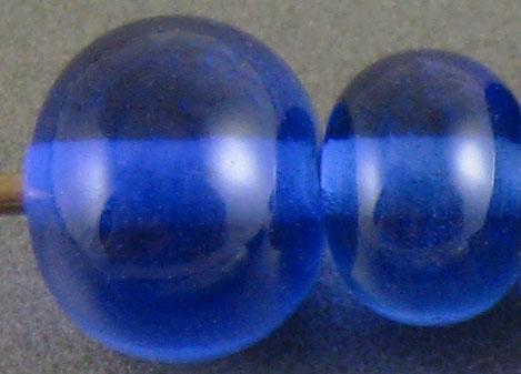
Effetre Medium Blue is a medium blue colour when used in concentration, but is very pale when used in fine layers. It's a good base colour for silver glass, and it has interesting reactions with silver but is not terribly reactive with other colours.


Medium blue does not change when you reduce it.


Silver goes yellowish on top of Medium Blue, but when you reduce it it goes all blue and cloudy.


My reducing silver glass looks a bit dull on top of Medium Blue, but it also has good delineation. I got a great starting strike from my TerraNova2 frit on top of this colour, so I'll flag this as one of the colours that's nice under striking silver glass.


Medium Blue is not a very reactive colour. I was pleasantly surprised that it didn't react with Ivory.

If you look closely at the bead where I've used Ivory and Opal Yellow on top of Medium Blue, you can see an interesting thinning of the colour around the edges of the stringerwork. I think it might be fun to use this effect in little dot beads, so I know what I'll be doing with the rest of my Medium Blue.

Here are some other beads made with Medium Blue:


September 13, 2019

Test Results :: Oracle742.pst


Oracle742.pst is a very pale pink opaque glass. In certain combination with other colours, and given some extra heat, that pink can darken into a medium mauve colour. This colour is well-behaved for the most part, but can get fizzy and boily when you use it in fine stringers.


This colour does not change when it is reduced.


I got some interesting orange/yellow tones from silver on top of this colour, but that blush of colour faded when I reduced and encased the silver.


The silver glass frit fumed Oracle742.pst a yellowish colour, and I got a reasonably good starting strike from my TerraNova2 frit on top of this colour.


On top of this colour, Tuxedo loses its integrity a little bit and bleeds a bluish halo into the Oracle742.pst.  Opal Yellow, Ivory, and Peace all spread excessively on top of this colour and it is very interesting to note that where you can see flashes of it between Opal Yellow and Ivory dots and lines, the colour of it is a more vivid pink than it is on its own.

On top of Ivory and Opal Yellow, this colour separates fairly dramatically into a lighter and darker version of itself. There is also separation in Oracle742.pst on top of both Tuxedo and Copper Green. On Tuxedo, this effect lends it a faint translucency, but the weirdest thing is the bright turquoise that appears around it on top of Copper Green.

Here are some more interesting beads containing Oracle742.pst.


The pale pink lines and dots in this bead are Oracle742.pst, but the little wavy pale pink bands with dark pink centres are also Oracle742.pst. I'm not sure how the colour gets darker, but I suspect it has something to do with reacting with the other things around it.

Interesting side note... I am not able to try this because I don't have any more of this colour but when I added a little Grass Green Opaque to Vetrofond Light Pink, I got a dark purple colour. I wonder what this colour would do with some green added to it?

September 6, 2019

Test Results :: Budgerigar


CiM Budgerigar (CiM477) is the misty opal twin of Ectoplasm, and both colours are a lovely light green.


Budgerigar does not change colour when you reduce it.


You can see blue in the silver leaf where I've melted it into the surface of Budgerigar even before reducing and encasing it. Reducing and encasing silver on top of Budgerigar yeilds a snowy, blue-streaked blanket under the clear layer.


My reducing silver glass frit came out quite pretty on top of Budgerigar, but colour in my TerraNova2 didn't develop quite the way I thought it would after using Ectoplasm. Possibly it just needed a hair more heat to bloom - more experimentation required.


Budgerigar is not very reactive with other colours, although it does separate Copper Green, Ivory, Opal Yellow, and Peace.

Here are some other beads made with Budgerigar: