Search This Blog

Showing posts with label Shiny line w/Tuxedo. Show all posts

March 25, 2015

Test Results :: Spanish Leather

1 - Plain, 2 - Plain (reduced), 3 - w/ Silver Leaf, 4 - w/ Silver Leaf (reduced & encased), 5 - w/ TerraNova2 Frit, 6 - w/ Silver Glass Frit (reduced), 7 & 8 - w/ Tuxedo, Copper Green, Opal Yellow, Ivory, and Peace

Effetre Spanish Leather is a streaky, stable dark reddish orange colour. It reminds me a lot more of ripe tomatoes or hot chili peppers than leather -- if the name had led you to believe that this colour was in any way brown, it has tricked you.

Spanish Leather behaves fairly predictably as compared to other reds and corals, although the consistency is a little stiffer than Coral and the texture less 'grainy' if that makes sense to you. It is a bit of a striker, and when it is allowed to heat and cool repeatedly, it can turn quite dark. You can see this on the ends of some of the beads as you look through the rest of this post.

Spanish Leather does not develop any noticeable effect from being introduced to a reduction flame.


Silver has a very interesting appearance on top of Spanish Leather, turning blueish in some places and yellowish in others, and hazing a little on the surface. When the silver is reduced and encased, the interesting effects are lost and you are left with just a silvery net effect on top of the dirty brown Silver/Spanish Leather reaction.


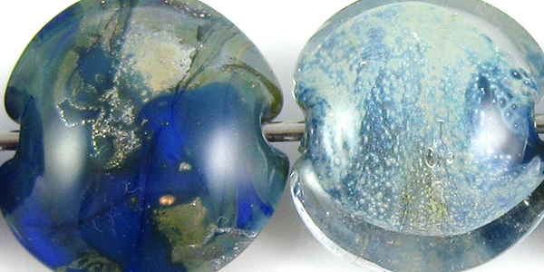
Silver Glass likes being on top of Spanish Leather. In both beads, a strong brown/black line has developed around the fritty bits. You can see in the bead on the left that I got nice pinks and purples from the TerraNova2 frit. It's too bad it sort of clashes with the Spanish Leather itself and that the colours don't gel better.

In the bead on the right, the reducing silver glass also developed colour nicely and because the blues of the silver glass has good contrast with the base, looks quite nice on top of Spanish Leather.


When Spanish Leather is used on top of Tuxedo, a shiny, greyish line appears around the dots and stringer lines.  This line is lighter and shinier than the line that pops up around it on top of Copper Green.

Spanish Leather and Copper Green have a reciprocal dark line reaction between them.

Ivory spreads out a little on top of Spanish Leather, but apart from that not much of interest occurs between Spanish Leather and Opal Yellow, Ivory, or Peace.

This sculptural goddess bead was made with Spanish Leather, and illustrates the richness and streakiness of the colour.


And here are some fun beads made with Spanish Leather:


May 27, 2011

Test Results :: Olive (Creation is Messy)

CiM Olive is the second glass by the name 'Olive' that I have tested now, and the third that I am aware of.  We can hope that it's the last one and that other manufacturers, seeing that there are already three (or more) glasses by this name, will choose some other thing when and if they move ahead with plans for another olive green-coloured glass.  Don't get me wrong... I welcome any and all colours to the 104 COE palette.  Even when they are named the same thing, they are all deliciously different and interesting to play with.  It's just confusing to talk about them when one name could reference multiple different actual colours.

Olive is darker and 'greener' than what I would normally think of when picturing olives, and reminds me more of the colour of the frogs we used to catch when I was a kid when my parents would take us camping.  For that reason, I would have named this particular glass 'Kermit' or 'Tadpole' or something else frog-related had it been left up to me.
1 - Plain, 2 - Plain (reduced), 3 - w/ Silver Leaf, 4 - w/ Silver Leaf (reduced & encased), 5 - w/ TerraNova2 Frit, 6 - w/ Silver Glass Frit (reduced), 7 - w/ Tuxedo, 8 - w/ Copper Green, 9 - w/ Opal Yellow, 10 - w/ Ivory, 11 - w/ Peace

So... all whining about the name aside, CiM Olive is a gorgeous green.  It's got a unique texture to it, being very smooth and streaky at the same time. It is also, for lack of a better word, somewhat more gelatinous than the other opaque CiM colours and way less 'grainy' than some of the Effetre greens (e.g. Pea Green, Nile Green, Grass Green).  Used in a thin layer over Peace, it lightens in colour significantly.  Because it is a little less saturated than some of the other greens, it gives an interesting effect when used as the core of vine twisties and canes, lending a bit of an inner glow. Cane made by using a thin layer of Olive over a thick base of Clear gives an interestingly semi-opaque result.


Silver leaf melted into the surface of Olive leaves a greyish/brownish residue behind. The silver discolours slightly, ranging from grey to a blueish tinted grey to a yellowish/brown. In the bead on the right, you can see that when the silver is subsequently reduced and encased that it seems to form an ethereal film over the Olive, and retains some of the blueishness (new word!) but otherwise does not much change the Olive underneath.


My TerraNova2 frit didn't strike very well in the bead on the left, but I think that was my fault.  The thin green halos that have sprung up around it are a bit of a clue that Olive is capable of greater things with silver glass frit than I was able to coax from it in this particular bead.  In the bead on the right, the reducing silver glass also has an interesting curdling effect on the Olive where it touches the base colour and has thinned out in weird and wonderful ways.


When used on top of CiM Tuxedo, Olive develops a thin silvery line around itself in dots and stringer work.  When Tuxedo is used on top of Olive, a greyish green halo pops up around it.  This is a very interesting set of reactions for a couple of reasons.

First, Tuxedo bleeds with a lot of the other greens I've tried it with, so it is very refreshing for Olive to be a green that it does not bleed into. Second, a lot of the colours I have tested with Tuxedo recently have had this silver halo effect, but this is the first time I've gotten this reaction between Tuxedo and a green.


Olive makes Copper Green not want to be green at all.  The darkness of the Copper Green here is very out of character, and the interesting brownish mottling in the centre of the bead is an effect I've not seen before.  Where I've used Copper Green over Olive, it seems to have caused a little curdling chaos in the Olive underneath.


Opal Yellow and Olive do not have any noticeable reaction apart from (possibly) a minor amount of bleeding of the Olive into the Opal Yellow when Olive us used on top of it.  You can make out a faint greenish halo around the Olive dots and stringer lines in the left side of this bead if you click on the picture to see an enlarged version of it.


With Ivory, Olive develops an interesting, irregular brownish dark line reaction.  It does this both when Ivory is used on top of it and when it is used on top of Ivory.  The reaction when Ivory is used on top of Olive is the more dramatic of the two.


Peace and Olive do not have much of a reaction with one another, but it is very interesting to me how much lighter the Olive looks on top of Peace than it does on top of any other colour. The Peace on the left-hand side of the bead seems to have acquired some of the colour from the Olive without leaving any noticeable evidence of 'bleeding'.

I let one of my friends walk off with what was left of my Olive before I'd made many beads with it, and all I've used it in so far is vine cane.  That vine cane is attached to beads I'm not ready to show anyone yet, so I"ll end this here.

March 23, 2011

Test Results :: Cornflower

1 - Plain, 2 - Plain (reduced), 3 - w/ Silver Leaf, 4 - w/ Silver Leaf (reduce d& encased), 5 - w/ TerraNova2 Frit, 6 - w/ Silver Glass Frit (reduced), 7 - w/ Tuxedo, 8 - w/ Copper Green, 9 - w/ Opal Yellow, 10 - w/ Ivory, 11 - w/ Peace

CiM Cornflower is a rich, vibrant medium blue colour, and quite a bright  colour so of course I went into the testing thinking that we weren't going to get along at all.  As it turns out, I have a lot of respect for this colour, and as long as I use it in an organic way, the massive brightness of it can't touch me.

On Ming and Cornflower
People have reported that Ming and Cornflower are very similar, and you will see that feedback when you go to the CiM page for Cornflower. However, my experience is that these colours are not the same at all. The only thing they really have in common is that they are both a bright, medium blue.

If you look at my test results for CiM Ming, you will see that in terms of how the two glasses react with other colours, they are very different in every single test that I performed.

Personally, I like them both.  I'd be sad if CiM decided to stop making one of them because other people thought they were too similar.

Onwards

On top of Cornflower, Silver Leaf sinks in and makes the Cornflower greener, resulting in a mottled surface that in places looks more akin to Lauscha Steel Blue, in other places has a greenish gold silver haze over top of it, and then, where not much silver stuck to the bead, Cornflower being itself.  This reaction is awesome! And then, when you reduce and encase the silver, you get this odd cloudy spray of silver whiteness between the Cornflower and the Clear.  The Cornflower here looks more like a navy blue underneath all of the action.


I didn't get much in the way of colour out of my TerraNova2 frit, but as we all know, that's sometimes my own stupid fault. What's interesting about this bead is the light blue halo that's sprung up around the fritty bits. In the bead on the right, I got awesome colour and shine out of my reduced silver glass frit, and love the way reducing the silver glass frit fumed the Cornflower at the ends of the beads to a more navy/greenish hue.


When Cornflower is used over Tuxedo, it develops a shiny outline around dots and stringer lines.  When Tuxedo is used over Cornflower, the Cornflower curdles a little and sends a light blue halo up to surround the Tuxedo stringerwork.


There isn't much in the way of a reaction between Cornflower and Copper Green, but the Copper Green on top of Cornflower looks decidedly redder than the Copper Green on the left-hand side of the bead.  Also, Copper Green develops its muddy patina when you use it with Cornflower.


There is not much reaction between Cornflower and Opal Yellow.  Maybe just the smallest amount of bleeding into the Opal Yellow from the Cornflower and a slight thinning around the edges of the Opal Yellow stringer work on top of the Cornflower.


On top of Ivory, Cornflower looks a little floaty, like it is sitting on top of an invisible, ultra-thin layer of clear glass and separating slightly so that it has a somewhat lighter blue outline to all of the stringer lines and dots. On top of Cornflower, Ivory dots and lines thin out a bit at the edges and take on some of the blue hue from the Cornflower.

Cornflower bleeds into Peace in a gentle way, turning the Peace a light-blue colour in subtle patches. On top of Cornflower, Peace looks somewhat translucent, letting the blue of the Cornflower seep through.

Here is a fun bead with Cornflower.
 

March 1, 2011

Test Results :: Butter Pecan Unique #5

1 - Plain, 2 - Plain (reduced), 3 - w/ Silver Leaf, 4 - w/ Silver Leaf (reduced & encased), 5 - w/ TerraNova2 Frit, 6 - w/ Silver Glass Frit (reduced), 7 - w/ Raku, 8 - w/ Tuxedo, 9 - w/ Copper Green, 10 - 2/ Opal Yellow, 11 - w/ Ivory, 12 - w/ White, 13 - w/ Olive

CiM Butter Pecan Unique #5 is officially one of my favourite colours, so I hope there's still some left when I allow myself to order glass for the first time this year.  This colour is versatile and interesting, and makes a brilliant base colour for organics.  I like it better than Butter Pecan Unique #4, which I posted about last October.

When you reduce Butter Pecan Unique #5, the colour of it warms up a bit and the surface goes faintly shiny. This is evident in the little crystal that I reduced as well as in the lentil I made with reducing silver glass frit. This colour, like Butter Pecan Unique #4, is very, very soft and drippy when you get it really hot.  For me, this means that if I'm going to make a pressed lentil with it, I want a core of Clear underneath the Butter Pecan Unique #5 or I squoosh the glass too much and end up with knobby bits at the end of my bead.  Yuck.  This is totally a heat control thing, and I know it, but coring the bead with Clear helps me avoid this problem.


Silver leaf is gorgeous on top of Butter Pecan Unique #5, crystallizing and forming a golden crust while fuming the surface of the bead to a rich brown.  Reduced and encased, this reaction is a vivid royal blue interspersed with silver.  Butter Pecan Unique #4 did not turn my silver blue this way, and silver leaf sits on top of Butter Pecan Unique #4 with more of a flat, shiny finish.


Butter Pecan Unique #5 is not a star with silver glass either, which is the wording I used to describe how I felt about Butter Pecan Unique #4 and silver glass.  However, I did find that I sort of like how Butter Pecan Unique #5 looks with 104 Raku.

One thing sort of interesting and worth a bit of a note is how the Butter Pecan Unique #5 went sort of satiny in the bead with the reducing silver glass frit after it had been reduced.  You can see in the picture, above, the way the light plays off of the Butter Pecan Unique #5 that has been fumed by the silver glass.  The other interesting thing is how the Raku has made the Butter Pecan Unique #5 sort of rise up and separate from itself around the Raku stringer in the bead on the far right (above).


Tuxedo bleeds into Butter Pecan Unique #5 in the middle of this test bead, and creates a strange blueish purple streakiness. The Butter Pecan #5 has sort of risen around the Tuxedo stringer work in places, and the colour of the Butter Pecan #5 side of this bead seems almost tea-stained. On top of Tuxedo, Butter Pecan Unique #5 develops a shiny outline to its dots and stringer lines.


On top of Butter Pecan Unique #5, Copper Green develops a dark outline and a shiny, dark patina.  When Butter Pecan Unique #5 is used on top of Copper Green, there is no reaction to speak of.  I really find this odd, because my expectation is that if the colours are reactive, they will behave oddly under both circumstances (as the base AND as decoration) but that was totally not the case here.


In a very similar way to what I noticed with Butter Pecan Unique #4, Butter Pecan Unique #5 and Opal Yellow have an odd relationship.  On top of Opal Yellow, Butter Pecan Unique #5 develops a dark line around the dots and stringer lines.  On top of Butter Pecan Unique #5, Opal Yellow looks sort of chalky, floaty and dirty.


There's nothing too exciting to report on the Ivory and White fronts, although the Ivory dots in the picture on the left seem sort of floaty on top of the Butter Pecan Unique #5.


Like Butter Pecan Unique #4, some serious separation and curdling happens when it is used on top of Lauscha Olive.  This reaction is milder than the one with the #4 unique though, because the green of the Olive hasn't permeated the Butter Pecan Unique #5 and migrated into the centre of the dots.

And here are some fun beads with Butter Pecan Unique #5.  I have some serious love for this colour.


February 21, 2011

Test Results :: Desert Pink Unique #2

1 - Plain, 2 - Plain (reduced), 3 - w/ Silver Leaf, 4 - w/ Silver Leaf (reduced & encased), 5 - w/ TerraNova2 Frit, 6 - w/ Silver Glass Frit (reduced), 7 - As a Floral (over Olive), 8 - w/ Tuxedo, 9 - w/ Copper Green, 10 - w/ Opal Yellow, 11 - w/ Ivory, 12 - w/ White, 13 - On Lauscha Olive


I was expecting to be really fond of CiM Desert Pink #2, because I really liked regular Desert Pink. I haven't tried Desert Pink Unique #1. On the whole, I do really like Desert Pink Unique #2 because of its reactions with silver and the way it looks with Copper Green. I should probably get some more of this colour before it sells out the way all of the uniques eventually do and there is no more of it to be had.

The colour of Desert Pink Unique #2 is a little warmer and a little darker than regular Desert Pink.  It is more reactive with silver than the original Desert Pink as well. In a thin layer, Desert Pink #2 is very translucent.  I haven't included an enlarged picture of Bead #7 (above) but you can see that the flower petals are so translucent that they almost vanish in that bead.


In the bead on the left, the Desert Pink Unique #2 has fumed a dark, rich brown from the application of silver leaf. When this effect is reduced and encased, the silver really shines up under the Clear and develops a bright, ethereal blue halo.  I like this effect a lot.

In both of these cases, the reaction is a lot like what happened with regular Desert Pink, but more intense.


Desert Pink Unique #2 does not score huge points in the silver glass department, but the reduced silver glass does look very interesting on top of it in the bead on the right, and there are some hints of colour on the bead on the left that indicates that if I'd been a little gentler with the striking of that bead I may have gotten better results.


When placed on top of Tuxedo, the Desert Pink Unique #2 develops a fine, shiny outline.  I've mentioned this a couple of times now, but a lot of colours seem to have this reaction with Tuxedo.  Regular Desert Pink, however, was not one of them.  The Tuxedo on top of Desert Pink Unique #2 doesn't have any noticeable reaction, but you can see in the middle of the bead where the two colours meet that there is a fair amount of Tuxedo bleed there.


Desert Pink Unique #2, when placed on top of Copper Green, helps the Copper Green to not develop that shiny patina. However, Copper Green on top of Desert Pink Unique #2 does sheen up.  Why?  Who knows... this glass chemistry thing is easy to observe, but more difficult to predict and diagnose.


I want to say something smart about these two beads, but I sort of shot myself in the foot by doing something stupid when I made them.  Unfortunately, I got my Opal Yellow and Ivory stringers mixed up and managed to completely bungle this, putting Ivory stringer on my Pink & Opal Yellow bead and putting Opal Yellow stringer on my Pink & Ivory bead.  Grrr.

Since there are no reactions I want to comment on, let's just move on to the next bead.


There is no real reaction between Desert Pink Unique #2 and White, but you can see how translucent the Desert Pink #2 is where I used it on White, because it's sort of hard to make it out.


Putting Olive on top of Desert Pink Unique #2 makes a curdled halo of Desert Pink Unique #2 pop up around the Olive stringer lines and dots.  Also, the Olive thins out a bit on top of the Desert Pink #2 and seems lighter and more translucent.  On top of Olive, mostly Desert Pink #2 just seems to disappear, but the Olive is uncharacteristically streaky underneath it.

And here is a fun bead with Desert Pink #2.  This bead is a base of Desert Pink #2, with silver leaf, TerraNova2 frit, A twistie made with Copper Green, Raku and Steel Blue and a bit of Opal Yellow and Mermaid dottage add some additional colour.

February 6, 2011

Test Results :: Mermaid Unique #1

This is trippy, this blogging thing, because you can look back at what you did a year ago (or more, I suppose, if you've blogged for more than a year) and see what your beads were like, what you were focusing on, and in the case of this blog post, the results from some other testing you did that you now want to reference.  Fun!
1 - Plain, 2 - Plain (reduced), 3 - w/ Silver Leaf, 4 - w/ Silver Leaf (reduced & encased), 5 - w/ TerraNova2 Frit, 6 - w/ Silver Glass Frit (reduced), 7 - w/ Tuxedo, 8 - w/ Copper Green, 9 - w/ Opal Yellow, 10 - w/ Ivory, 11 - w/ White

In this case, I was looking back to my test results with CiM Mermaid to see the differences between Mermaid and this newer colour, CiM Mermaid Unique #1.  I posted my Mermaid results in December 2009, so the format of the post is much different from this one, and my beads have improved quite a bit since then, so that is also evident when you look at the two sets of results.  I should go back at some point and re-do my Mermaid testing, but I have a lot of other colours to get through first.

Mermaid Unique #1 is both darker and bluer than original Mermaid.  It is also less streaky, and does not go red when you reduce it the way original Mermaid does.  Silver glass is GORGEOUS on Mermaid Unique #1.  This is another one of the CiM unique lots that sold out so quickly that it made my head spin, so there isn't any more left.  I only ever had a few rods of it -- just enough to tease me and get me all wound up about it.


Silver on Mermaid Unique #1 turns sort of greenish.  In the bead on the left, the silver seems to have migrated towards the centre of the bead and webbed out a little.  In the bead on the right, the colour of the reduced and encased silver leaf seems mottled with a greenish colour, pink and a yellowish orange competing for space.  When I used silver with Mermaid, the silver seemed to discolour the Mermaid and yellow it a bit, but I didn't see this effect with Mermaid Unique #1.


I got gorgeous colour out of my TerraNova2 frit on top of Mermaid Unique #1, and the reduced silver glass got interesting colour too, although I like the TN2 bead much better.


Tuxedo on top of Mermaid Unique #1 bleeds a little, and looks all smeary.  On top of Tuxedo, Mermaid Unique #1 developed a shiny, silvery outline.  A lot of colours seem to do this on top of Tuxedo, I'm noticing. This reaction did not happen between Effetre Black and Mermaid.


Something in the Mermaid Unique #1 makes Copper Green sheen up with a pinkish grey patina.  This isn't unattractive, but the colour doesn't really work well with the Mermaid Unique #1.  This didn't seem to happen between Mermaid and Copper Green, although my Copper Green batch might be slightly different now than it was then.


On top of Opal Yellow, Mermaid Unique #1 gets a faintly darker line and dot in the middle of the stringer lines and dots.  Mermaid Unique #1 bleeds into Opal Yellow, so you can see a petroleum green-coloured stain seeping into the Opal Yellow from the Mermaid Unique #1 side of the bead.


I think I'm using a different batch of Effetre Ivory now than when I tested Mermaid, and that might account for the CRAZY marbling that was caused in the middle of this bead.  It also might be that Mermaid Unique #1 is more reactive with Ivory than regular Mermaid is.  Either way, this reaction is way cool, and I like the dark line reaction between the Ivory and Mermaid Unique #1 too.  The dark line reaction is more pronounced in this bead than in the test bead I made with Ivory and Mermaid.


Like with Opal Yellow, Mermaid Unique #1 bleeds into White and gets a concentration line/dot in the centre of the stringer lines and dots placed over top of it.

Here are some fun beads with Mermaid Unique #1.  So sad there won't be any more.