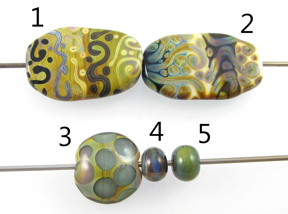
1 & 2 - w/ Tuxedo, Copper Green, Opal Yellow, Ivory, and Peace, 3 - w/ Clear dots, 4 - Plain (reduced), 5 - Plain
No one calls this colour "Iris Orange", to the best of my knowledge, in spite of that being the actual colour name that Reichenbach gave RL6208 when it was born. Instead, we all call it Raku, which is shorter and more meaningful since there's nothing particularly orange about this colour and the colours we get from it remind us of raku pottery. I think that you have to be either pretty loved or despised (or both at the same time!) as a colour to get a nickname like 'Raku' or 'Evil Devitrifying Purple', and I know that there are probably as many people who loathe this colour as there are those who love it.
That's for good reason. I find Raku sort of hard to work with when I am struggling with it to get those brilliant colours. I am consistently unsuccessful at striking it and never get the beautiful pinks, purples, and blues to stick in it that I see some of the people who are really handy with it getting. However, even if you can't yet get the brilliant colours out of Raku, I still think it's pretty lovable for its reactions and for the more subtle colour changes you can achieve without a lot of effort.

In the bead on the right, you can see what I usually get from Raku when I try to strike it in small beads. Some blues, maybe some greens. If I reduce the Raku (the leftmost bead), I can get some brighter blues and some shiny pinkish brown. Neither of these are what I really want when I start the bead, but they are both sort of awesome in their own right.
Something else that is sort of awesome about Raku is that you can trap its colours under an encasement layer, and even if you mismanage it the way I did here, you can still get some nice pastels in dots or flower petals under Clear.

Tuxedo does not do much on top of Raku, but if you look on the bead on the right you can see that Raku struck more readily on top of some colours than others. On top of Tuxedo, I got gentler blues and greens and the brownness of the Raku migrated into the centre of my stringerwork dots and lines.
On top of Raku, Copper Green separated and dark turquoise coalesced in the centre of my dots and stringer lines, and a crusty pinkish effect took over its edges. When I used Raku on top of Copper Green, it spread out quite a bit, and got a mottled, 3-dimensional look. It also made the Copper Green quite dark and rich-looking in between the spready Raku bits.
On top of Opal Yellow, I got a gentle strike from the Raku, but a strange, lingering brownish effect that almost looks like a shadow underlaying that colour change. You can also see that the Opal Yellow has risen up around the Raku in halos, for an extra border around the Raku stringerwork. Opal Yellow on top of Raku separates and intensifies in colour quite dramatically.
Both when used over and under Raku, Ivory turns brown, almost black. It also curdles and separates in a dark and murky way. The interesting thing for me here is that after Ivory has finished being all moody because the Raku is spreading around on top of it, it seems to facilitate a really nice colour change in the Raku. On top of Ivory, I got a wider range of colour than I got over any other of the base colours I tried.
The reaction between Raku and Peace is very similar in appearance to what happens with Opal Yellow. Behaviour specific to Peace is that it appears to change from white to look greenish yellow on top of Raku and yellowish when used underneath it, probably from the silver in the Raku fuming it.
My favourite way to use Raku is as a border for my mushroom beads. I love how dark I can get the brown to stay in its pre-striking stage, and then how some traces of rainbow show up in it no matter what I do. Here are some examples of that.


And here are some Raku goddesses. These are 100% Raku, and I have overstruck it, but I like the organic streakiness and the earthy pastels I got from it a lot.


