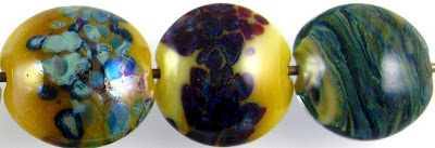
This interesting colour is CiM Ghee. It is a striking colour that deepens and darkens in colour the more you strike it, changing from a yellow just slightly brighter than Effetre Yellow Opalino (but just as translucent) to a rich, amber/caramel opal colour after repeated heating and cooling cycles.

1 - Plain, 2 - Plain (reduced), 3 - w/ Silver Leaf, 4 - w/ Silver Leaf (reduced & encased), 5 - w/ Silver Glass Frit (reduced), 6 - w/ TerraNova2 Frit, 7 - w/ Silver Glass Frit Stringer (encased), 8 & 9 - w/ Tuxedo, Copper Green, Opal Yellow, Ivory, Peace

The main differences between Yellow Opalino and Ghee are:
- Ghee strikes to a more opaque/opal dark caramel colour, where Yellow Opalino strikes to become more opaque, but doesn't really change colour.
- The
two glasses have different reactions with other colours, even though
their reactions with silver and with Ivory are mostly the same.

The reactions that Ghee has with silver are also fairly similar to the reactions with silver that I experienced with Yellow Opalino. Silver turns a strange pinkish brown colour when used on top of Ghee, and when the silver is reduced and encased, it forms a pink and silver blanket that is iridescent under the clear.

So, with silver glass, I didn't have anything really exciting happen with Ghee. In the leftmost bead, you can see that the Ghee has gone darker and more caramelly and it's not really clear to me whether this happened because I reduced the bead and it struck as a result of temperature change or if it was because of the silver in the silver glass frit.
I didn't get great results from my striking silver glass frit on top of Ghee, either, but please keep in mind that I am terrible at striking silver glass and that really the point of that test is to find the base colours where the glass does all the work and I just have to watch the magic. Ghee is not one of those base colours.
In the rightmost bead, I used frit stringer which I created by dipping Ghee into my silver glass reduction frit and pulling it out into thick stringer. Then, I wrapped that frit stringer around a core of Ghee and encased the whole mess with Clear. I got pretty colours, but overall I am not very pleased with the effect because with Ghee it is sort of ragged. I also didn't get all of the Ghee covered, and the yellow of the Ghee doesn't really go all that well with the blue and green of the frit. Since it's sort of hard to get 100% encasement coverage with stringer, I prefer to use this technique with colours that coordinate more nicely so that mistakes don't look as awful.

With Tuxedo, Ghee doesn't really do anything interesting. There is no reaction when Tuxedo is used on top of it and it largely disappears on top of Tuxedo.
With Copper Green, a light turquoise line appears wherever Copper Green and Ghee touch. You can see that the copper green has separated into bands of light and dark turquoise and that in some places, a dark line also formed. I don't know what caused that and it didn't happen consistently, so more experimentation would be required to be able to provide more information about that.
Ghee makes Opal Yellow separate. When Ghee is used on top of Opal Yellow, a faint halo of Opal Yellow pops up around it. When Opal Yellow is used on top of Ghee, a translucent line appears in the middle of Opal Yellow stringer lines and translucent, darker dots form in the middle of Opal Yellow dots.
Ivory and Ghee have a dark line reaction that is more pronounced when Ivory is used on top of Ghee, but still evident the other way around. Because Ghee is translucent, on top of Ivory it looks grey because of this reaction. A very strange colour of grey, too.
The reaction that occurs between Peace and Ghee is very similar to what happens with Opal Yellow only much less dramatic. Also, because Ghee is translucent, when layered on top of Peace it becomes a super-bright yellow.
Here is a goddess made with Ghee. It's my first sculptural piece with Ghee, and I can see that making anything nice with it using it this way would require some practice in order to get it to strike uniformly, or in order to spot-strike it intentionally. You can see here, though, the dramatic colour change that can be achieved through repeated heating and cooling.


