Search This Blog

Showing posts with label Separates w/Copper Green. Show all posts

March 6, 2020

Test Results :: Skyberry


Effetre Skyberry (EFF768) is a light blue opaque colour that blushes turquoise. It's like what you'd expect to get if Light Sky Blue and Copper Green got together and had a love child.

Like Copper Green, Skyberry develops a greyish sheen on its surface while it's being worked, although Skyberry's sheen tends more to the pinkish side, which is I guess where the whole 'berry' thing comes from. This sheen goes away when it is distracted by other surface reactions, like what you see in my colour tests with Tuxedo and Ivory.

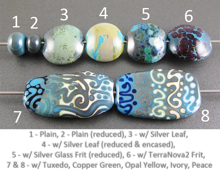
I went to check my findings for Light Sky Blue to see how this colour and that one are similar, only to realize in a surprised and slightly horrified way that I haven't tested that colour yet.


In the bead on the left, you can see what Skyberry will do in a typical, same-coloured spacer. It's darker at the edges, and lighter in the middle, covered across the shoulders with a pale pinkish greyish sheen.

When I reduced Skyberry in the bead on the right, it turned a dark brick red.


Silver makes an interesting greyish-greenish patina on the surface of this colour, which mostly disappears when it is reduced and encased.


Like most blues, this colour is a pretty boring base colour for silver glass.  The reactions in both beads are interesting - you can see the Skyberry doing odd things around the edges of the frit in both cases - but it fails to make the colours pop, and I didn't find it a good base to strike my striking silver glass frit on.


Tuxedo separates Skyberry both when it is used on top of and underneath it, and Skyberry develops a dark line with Ivory in exactly the way you'd expect it to, as a close cousin of Copper Green.  Skyberry also separates on top of Copper Green which I thought was interesting.

In the bead on the left, if you look closely, you may notice that I accidentally used Opal Yellow twice instead of testing with Peace the way I meant to.  Oops.

Anyway, here are some fun beads with Skyberry. I still have about a half pound of this left, and plan to use it all before I move on to another palette. I am glad that Frantz still has more of this, as I'll want to put some aside for the next time I feel like working with a light blue.


June 28, 2019

Test Results :: Porpoise


Porpoise (CiM828) is a medium grey opaque. When it is molten, it is disconcertingly green in colour. I thought for sure that the finished beads would be greenish, but they aren't in the least.


Reducing Porpoise turns it brown.


Porpoise seems to fall somewhere between Effetre Light Gray and Effetre Dark Gray in hue. It's much darker than Pearl Grey, and less blue/green than Bayou, another new CiM colour.


On top of Porpoise, reduced silver turns yellow under encasement.


Porpoise gets an interesting light border around TerraNova2 frit, and the colours really popped in my reduction frit bead. It seems like it might be an interesting base colour for silver glass.


Porpoise separates on top of Tuxedo, Copper Green, and Peace. It spreads out on top of Opal Yellow, and develops a brownish dark line reaction with Ivory.

On top of Porpose, Copper Green separates and Ivory develops a dark shadow line around its edges that looks like it has texture.

These beads contain some Porpoise.


May 28, 2019

Test Results :: Smurfy


Smurfy (CiM569) is a medium to dark turquoise opaque colour. I found it really creamy and nice to work with, and vastly prefer it to the other dark turquoise opaques (Dark Turquoise, Dark Sky Blue) from Effetre because it doesn't easily develop that greyish dirty patina that other turquoises get, although you can make that happen if you really try.


You can see in the bead on the left that when I reduced Smurfy it got a greyish haze on its surface. I reduced this bead a few times trying to get it to change colour. I was hoping for that solid red brick coating you can sometimes get on turquoises, but that doesn't seem to happen with this one.


Smurfy is darker than both Light Turquoise and Fremen, more of a shade with Dark Sky Blue. Unlike Dark Sky Blue, it doesn't easily develop that grey sheen, although you can make it happen if you hold it in a reducing flame.


On top of Smurfy, silver leaf looks a greyish green colour. When you reduce and encase it, it turns yellow.


Smurfy seems like it is probably a decent base for silver glass.


Like other turquoises, Smurfy gets a dark line with Ivory. Smurfy separates on top of Tuxedo and Copper Green. Apart from that, there weren't very many reactions in these beads.

Here are some other beads made with Smurfy.


September 3, 2018

Test Results :: Dark Sky Blue


Effetre Dark Sky Blue (EFF228) is a medium, turquoise opaque colour. Its reaction profile is similar to that of Light Turquoise or Dark Turquoise. In fact, this colour is so similar to Dark Turquoise that I have trouble telling the two apart in rod form. I did, however, find that this colour pits less than Dark Turquoise.


Here, you can see the greyish metallic sheen that Dark Sky Blue develops. This is the same sort of greyness that we see with Light and Dark Turquoise and Copper Green. Reducing the bead on the right made the grey sheen deeper and darker.

It is the unpleasant dirtiness that Effetre Dark Sky Blue and Dark Turquoise acquire in the flame that makes me prefer CiM Fremen and CiM Smurfy when I'm looking for a turquoise that is in this hue range. The CiM colours don't do this icky thing.


On top of Dark Sky Blue, silver leaf takes on a greyish-green appearance. When the silver is reduced and encased, though, it looks more of a yellowish-pink colour.


Silver glass on top of Dark Sky Blue surprised me a little because I never think of turquoise when I'm choosing a base for silver glass. It seems like maybe this means that I am resistant to my own testing information, because I looked back and found that I got neat results from silver glass on top of both Light Turquoise and Fremen but apparently failed to remember it. I guess that's why I keep posting these - I need this blog as a reference :)

On top of Dark Sky Blue, my silver glass reduction frit developed pretty colours, and an interesting light outline around the fritty bits. In the rightmost bead, the TerraNova2 frit got a nice starting strike to it.


Dark Sky Blue separates on top of both Tuxedo and Copper Green, and it develops a dark line when used with Ivory. Opal Yellow separates on top of Dark Sky Blue.

These beads all contain a little Dark Sky Blue.


August 11, 2018

Test Results :: Lilac


CiM Lilac (CiM912) is a pretty, soft pink with lavender overtones.  It reminds me a lot of Heffalump, although Heffalump is much more on the purple side.


Lilac does not change colour when you reduce it. Here, the smaller bead on the right was reduced but the larger bead was not.


Silver turns Lilac a golden yellow colour. When the silver is reduced and encased, this colour change is much less pronounced.


Reducing silver glass is very pretty on top of Lilac, with the fritty bits developing interesting halos and fuming the Lilac an  uneven yellowish colour. As a base for striking silver glass, Lilac is unremarkable.


Lilac separates on top of Ivory, Tuxedo, and Copper Green, and in thin layers is quite translucent.

Lilac rises up in  halos around Tuxedo stringer lines and dots. Opal Yellow, Ivory, and Peace all spread on top of Lilac.

Here are some other beads that include Lilac:


March 26, 2018

Test Results :: Dark Periwinkle


Effetre Dark Periwinkle (EFF222) is a medium indigo opaque colour that is very soft.


Reducing Dark Periwinkle doesn't alter its colour.


Like it's lighter cousin Periwinkle, Dark Periwinkle can change to a greenish version of itself when silver is added to its surface. Reducing and encasing silver leaf on top of Dark Periwinkle was unexpectedly nice. Because the visible Dark periwinkle between the lacy silver bits fumes a deeper green-blue colour but doesn't do it evenly, there's a lot of pretty variation in the colour.


This colour is an average base for silver glass. My reducing silver glass looks pretty on top of its blueness, with the purplishness of the Dark Periwinkle countering the greenishness of the silver glass very nicely. In the rightmost bead, I got a decent starting strike to my TerraNova2 frit, and I like the contrast of its deep burgundy with the Dark Periwinkle. With a little more work, the colours here probably could have been beautiful :)


Dark Periwinkle is not a very reactive colour. Here, you can see it separating on tp of Copper Green. In the rightmost bead, it rises up in gentle halos around Tuxedo and Copper Green stringer dots and lines. Ivory and Peace separate slightly on top of it.

Here are some beads made with Dark Periwinkle:


September 11, 2017

Test Results :: Buttermilk


CiM Buttermilk (CiM315) is a very pale, opaque yellow. It strikes in the flame, blushing a little more yellow as you work it, but doesn't darken significantly. The consistency of it is beautiful, and my rods of Buttermilk were not shocky. Like Bone, this colour fills a gap in my palette that has been open since Vetrofond stopped making us nice pale neutrals.


Here you can see that where I gave Buttermilk an extra shot of heat in a reduction flame, it got a little more yellow. I don't think this is due to the reducing nature of the flame I reheated it in - it warms in colour in a neutral flame as well.


The addition of silver yellows Buttermilk substantially. When the silver is reduced and encased, it does not develop any unusual colours or effects.


Silver glass is pretty on top of Buttermilk. Because Buttermilk is not particularly reactive with silver, it makes a good base for reducing silver glass frit on. I also got a nice starting strike here on my TerraNova2 frit, which tells me that this colour has some promise as a base for striking silver glass as well.


Copper Green separates on top of Buttermilk, ,becoming darker in the middle of stringer dots and lines. Buttermilk separates on top of both Tuxedo and Copper Green. On the whole, this colour is not very reactive and I found it to be quite stable.

Here are some other beads that include Buttermilk.