February 26, 2018
Test Results :: Kryolith White
Lauscha Kryolith White (LAU380) is a stiff, white, opaque glass. I wanted to like this colour, because due to some online marketing of the glass on LE, I had in my head that it would have awesome opacity and would be pretty with silver. It turns out that both of these things are true, which is nice, but there is an absolute vacuum online about this colour's incompatibility. That seems like an important omission.
It doesn't matter that this colour is nice with silver or that it is great with silver glass and beautifully inert when used with other colours. It doesn't matter because anything you make with this White and any other glass colour will probably break within a week of you making it. And this problem doesn't just occur when you encase it. I made some tricolour dot beads with flowers and stripes and various other designs with this colour, Effetre Periwinkle, and CiM Lapis. With my magnifier, I can see tiny little incompatibility cracks wherever this colour meets something else. Interestingly enough, I can't see the cracks when I photograph the beads and view the full-resolution image at 100% zoom, so there's no point in posting them here.
Beads where I used this colour in tiny amounts on the surface of another colour and didn't layer anything on top of it have survived for a couple of months, but I don't know how to feel optimistic about their long-term chances given the magnitude of the problems I observed.
Like with Reichenbach White, this made me sad and disinclined to put a lot of effort into a write-up. But, I made these test beads, so you might as well see them.
Kryolith White does not change colour when you reduce it.
Kryolith White doesn't so much fume yellow with silver as it does turn the silver yellowish on top of it. There's a little yellowing of the base glass, but to a much lesser degree than with Peace, White, or Reichenbach White.
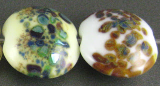
Here, you can see that Kryolith White makes a pretty base for silver glass, but I won't try this again because of the compatibility problem.
Copper Green, Opal Yellow, and Ivory all separate on top of Kryolith White. In spite of it being a stiff colour, on top of Opal Yellow and Ivory, Kryolith White spreads out quite a lot.
There's not much else to say about this. Kryolith White is a tease. It has behaviour and properties that we want and need in a white glass, but then also has the behaviour we can't tolerate in any glass colour that we're going to use in designs that contain more than one colour. I will probably stick to using the least expensive, most reliable opaque white glasses in my work: Effetre White and CiM Peace.
Posted by
Melanie Graham
0
comments
Labels:
Achromatics,
Cracks under encasement,
Kryolith White,
Lauscha,
Separates Copper Green,
Separates Ivory,
Separates Opal Yellow

February 12, 2018
Test Results :: Lime Green
Reichenbach Lime Green (RL4017) is a medium green transparent glass that is quite pale in thin layers, but darkens up significantly when used in solid, self-coloured beads. It darkens a little when worked, so you can expect any beads you make with this colour to end up somewhat darker than the rod colour might lead you to believe.
In this picture, Lime Green is in the middle. On its left is Effetre Olive Transparent, and on it's right is Effetre Light Grass Green. It's the darkest of the three, and builds saturation quickly as you build up a bead.
Here, you can see that the rightmost bead, which I reduced, looks no different from the left hand bead, which I did not.
Silver crusts up on top of Lime Green and develops some bluish haze. When the silver is reduced and encased, some of that blue haze can be captured under the clear layer. In the rightmost bead, I tried encasing some silver foil with Lime Green. I do this to see if the silver will turn yellow. It didn't :)
Lime Green is an interesting base for Silver Glass. Because it is a little stiffer than the Double Helix and TAG colours in my reducing frit blend, my frit spread out on it which was nice. I got a nice starting strike from my TerraNova2 frit on top of this colour, but nothing extraordinary.
I saw some very slight separation in Ivory, Copper Green, and Peace on top of this colour, but not enough that I am even tagging those reactions to Lime Green for future reference. I didn't get many unusual reactions when I used Lime Green on top of other glasses, either, although when I used it on top of Copper Green, I did notice that the edges of the dots and stringer lines looked much brighter turquoise than can be seen elsewhere on the bead.
Here's a goddess bead made with Lime Green and some green frit. I'm not very pleased with how this came out, but am not too proud to show it anyway. If nothing else, it demonstrates how this colour is actually quite saturated and looks very dark when melted into a solid mass.
These beads also contain some Lime Green.
Subscribe to:
Posts (Atom)


