Search This Blog

May 22, 2013

Test Results :: Golden

1 - Plain, 2 - Plain (reduced), 3 - w/ Silver Leaf, 4 - w/ Silver Leaf (reduced), 5 - w/ Silver Glass Frit (reduced), 6 - w/ TerraNova2 Frit, 7 - Over Silver Foil, 8 - As Silver Glass Frit Stringer (encased), 9 & 10 - w/ Tuxedo, Copper Green, Opal Yellow, Ivory and Peace

I have a soft spot for the Kugler Beadmaking 104 colours, and Kugler Golden is one of those colours that is so pretty to look at in the rod that you don't even really want to melt it. Golden is the only 104 COE Pink that I have found so far that does not turn Ivory black. I think that this means that it doesn't have any silver or copper in it, but what exactly -is- in it is anyone's guess.

Golden is a pretty soft colour, and is butter-smooth to melt.


Golden strikes darker, the longer you work it. The bead on the right here was reduced after cooling.  I don't think it's the extra propane that causes the colour change, but rather the repeated heating. My goddess bead (below, after the colour tests) holds up this theory.


Here, the silver leaf has made the Golden itself go really dark, and then in the bead on the left, it's turned a brown, coppery colour but in some places has also turned blue or slightly iridescent. In the bead on the right, you can see that if the silver is encased you get a smooth, silvery blanket  under the Clear that is fumed blue at its edges. Unfortunately, as I mentioned, it's not a good idea to encase Golden, and that bead cracked in multiple places.


I got beautiful colour from both reducing silver glass frit and striking silver glass frit on top of Golden.


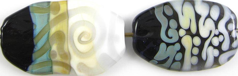
I also got great results with my Golden silver glass frit stringer here in the bead on the left. I love the colours I got and the weird grunginess of the effect. However, this bead also cracked in numerous places. I used Golden in the core, then frit stringer made with Golden and Double Helix frit, and then encased the bead with either Effetre 006 or the new Vetreria Soiva Clear. I'm not sure which Clear, but it doesn't really matter, because Golden has cracked every time I have ever encased it with any Clear, even just in dots.

In the bead on the right, you can see that Golden over Silver Foil results in a beautiful, shiny, pinkish coppery colour. I used Golden as the core of this bead, burnished on a couple of layers of Silver Foil, and then encased it with Golden.


So, in spite of how cool and reactive Golden is with silver, it is dull, dull, dull in terms of reactions with other colours. I don't think there's a single thing about these beads that I could pin on a reaction between Golden and one of the other colours.

This goddess bead is made with Golden.

I also did some messing around with colour mixing, because I wanted to prove to myself whether Golden just has an encasement problem or if it's a deeper, more concerning compatibility issue.  I haven't done any fancy polariscope testing, but after my colour mixing experiments below, I tend to believe that the problem with Golden is a problem with encasing it, because, weeks later, none of these beads have any cracking issues.

KUG Golden : EFF Dark Aqua (1:1)
This came out stranger than it looks. First, the Golden and Dark Aqua have only sort of blended together, so you can see clouds of pinkishness lurking in the depths of the bead when you look at it in person. Then, there's all the bubbles, which must have been my fault... but, why don't all of the other colours have bubbles, too, if that's the case? I don't think I did anything differently here. 

KUG Golden : EFF Ivory (1:2)
All of the other pinks I have used with Ivory have turned Ivory black. I wonder why Golden doesn't? I really expected this mixture to be terrible, but instead, it is very pretty and streaky, sort of like cotton candy.

KUG Golden : EFF Opal Yellow (1:1)
Of course. Light yellow plus pink makes a reddish black. I knew that.

KUG Golden : EFF Copper Green (1:1)
Strangely both not green and not golden. If anyone knows why the combination of these two colours creates a gross streaky black/grey colour, I'm interested.

KUG Golden : KUG Light Beige (aka ASK Moroccan Swirl) (2:1)
The rod I used was labelled 'Moroccan Swirl' with an ASK color number. Moroccan Swirl is apparently not all that opaque, but certainly lightens the colour of the Golden when combined with it this way. I also like the weird streakiness.

I need to work on my colour mixing technique, because I must have captured a lot of air mixing some of these colours.

Mixing colours is fun! If you haven't yet attempted it, though, here's a warning. Mixing colours takes a while. I wasted hours screwing around with these at the torch, and it's oddly addictive, so I'm sure that I'll be toileting more time on this type of activity again soon.

May 15, 2013

Test Results :: Eventide

1 - Plain, 2 - Plain (reduced), 3 - w/ Silver Leaf, 4 - w/ Silver Leaf (reduced & encased), 5 - w/ Silver Glass Frit (reduced), 6 - w/ TerraNova2 Frit, 7 - w/ Silver Glass Frit Stringer (encased), 8 - Over Silver Foil, 9 & 10 - w/ Tuxedo, Copper Green, Opal Yellow, Ivory and Peace

Eventide is a new Creation is Messy Limited Run, and it is very interesting with silver. I generally describe a colour's hue up here in the first paragraph, but as you will see below, I'm a little confused about what colour Eventide is.


If you read my post about Blue Steel last week, you already know that I may have been having some flame chemistry challenges when I made these beads. Like with Blue Steel, the bead on the left was made on a MiniCC, which was someone else's set-up. The bead on the right was made on my Minor, on a concentrator, with an oxygen hose that was, as it turns out, far longer than I needed it to be. I fixed it the other day and it made a huge difference in my flame, but I don't have any more Eventide to test, so I'm not sure if that was my problem or not.

I didn't anneal the brighter blue spacer, either, and I read on Kandice Seeber's blog (Color Addiction, here) that she believes it might be annealing that sucks the colour out of Eventide. Whatever the reason is, whether it was my oxygen levels or my kiln, the brighter blue is the colour I was hoping to retain after my bead had finished in the kiln.

Did you know that your oxygen hose only needs to be as long as the linear distance between your torch and your concentrator? I totally never even thought about it, which is a little embarrassing to admit.


I love how this colour reacts with silver. In the bead on the left, my unencased silver leaf dispersed into a lacy pattern. In the bead on the right, where I reduced and encased the silver leaf, it has turned a mottled blue colour with a dark blue halo. Often when a colour does this the silver looks smooth and shiny under the layer of Clear, but with Eventide the silver looks more jagged and dangerous.


Reducing silver glass develops vivid colour on top of Eventide, but it also fumes the Eventide a yellowish colour. The bead on the right, where I used TerraNova2 frit on top of Eventide, didn't strike as well as I might have liked. But your mileage may vary, particularly if you have more skill with the striking colours than I do.


Here, I used Eventide to make frit stringer with my reducing silver glass frit blend, and then wrapped it around the bead and encased it with Clear without reducing it. I got really pretty blue, turquoise and black striations under the encasement layer. Also, in the bead on the right, Eventide has turned the silver an interesting golden beer-bottle colour.


Eventide is not reactive with any of the colours that I typically test with. I think Peace, Ivory, Opal Yellow and Copper Green separated on top of Eventide ever so slightly, but I'm unable to come up with anything weird to report here.

This goddess bead was made with Eventide. I thought I washed her off, but she seems to still have a bit of bead release dust clinging to her. Please ignore it.

May 9, 2013

Test Results :: Blue Steel

 
1 - Plain, 2 - Plain (reduced), 3 - w/ Silver Leaf, 4 - w/ Silver Leaf (reduced), 5 - w/ Silver Glass Frit (reduced), 6 - w/ TerraNova2 Frit, 7 & 8 - w/ Tuxedo, Copper Green, Opal Yellow, Ivory and Peace

CiM Blue Steel is a new Limited Run colour from Creation is Messy. The colour of Blue Steel is similar to, but a bit darker than, the Vetrofond Blue Slate that I have buried in my Vetrofond stash. The colour of blue steel is hard to pin down with a single word, but is somewhere between blue and indigo and grey.

One of my rods of Blue Steel was quite shocky, but the other two were just fine, so if you get a shocky rod or two, just ride it out because they're not all like that.


These beads are both plain Blue Steel, but the bead on the right has been reduced. I'm not sure if it was the reduction or if Blue Steel is a bit of a striker, but the bead I reduced is more purple than the bead I did not reduce.

The other things that might be at play here are that I did not anneal the bead on the left, and I made the larger, bluer bead on a MiniCC and I made the smaller, purpler one on my Minor. I've learned since I made these beads that I've been working on my torch for the last five years with the oxygen hose too long, which may be responsible for this (as well as my ongoing battle with striking some silver glass colours). I've shortened my oxygen hose, so I'm ready to see if it makes any difference next time I have some Blue Steel handy.

In the meantime, all I can do is assure you that your beads will either be the colour on the left OR the colour on the right OR some colour in between OR some other colour entirely, because Blue Steel seems to be sort of sensitive to either flame chemistry, or annealing, or both.


Totally wasn't expecting this. In the bead on the left, I covered the Blue Steel with silver, burnished it in and then burned it off before pressing the bead. The first weird thing is that the silver has turned golden, pink and blue in various patches. The second (but more obvious) weird thing is that the silver has fumed the surface of the Blue Steel to a mustardy olive colour.

In the bead on the right, where I reduced and encased the silver, the Blue Steel is still that weird colour of green around the silver. The silver is oozing an ethereal blue halo under the layer of Clear, and has turned a blueish silver with a subtle MoP effect.


Reducing silver colours don't really play well with the colour of Blue Steel, however I found that Blue Steel is a pretty great base colour for striking silver glass. I got good colour out of my TerraNova2 frit, and I really like the light halos that sprang up all around the fritty bits in the bead on the right.


Blue Steel separates into lighter and darker versions of itself on top of Tuxedo. In the bead on the right, Tuxedo, Copper Green and Opal Yellow all seemed to spread a little on top of Blue Steel.

Blue Steel is not one of the colours that keeps Copper Green from developing a greyish film, although with Blue Steel the film that develops is also a bit on the brown side.

A faint, uneven dark line has showed up around the Blue Steel in the bead where I used it on top of Ivory.

When I used Ivory on top of Blue Steel, the Ivory separated a little and went all streaky, and the Blue Steel has darkened all the way around it in a thick band, but there is no crisp line there. If you click on the picture to the left of these words and look at it enlarged, it seems like the Blue Steel is curdling as well as turning a much darker colour where it surrounds the Ivory.

There seems to be not much in the way of reaction between Blue Steel and Opal Yellow or Blue Steel and Peace, apart from the spreading I already mentioned re: Opal Yellow.

I've used Blue Steel here as the base colour in this organic focal.

April 10, 2013

Test Results :: Mosaic Green

1 - Plain, 2 - Plain (reduced), 3 - w/ Silver Leaf, 4 - w/ Silver Leaf (reduced & encased), 5 - w/ Silver Glass Frit (reduced), 6 - w/ TerraNova2 Frit, 7 & 8 - w/ Tuxedo, Copper Green, Opal Yellow, Ivory & Peace

Effetre Mosaic Green is another crazy colour. I seem to be writing up test results for quite a few of those lately.

Mosaic Green is a pure dark green. You can't really get greener than this colour. I'm a little confused about whether it's an opaque or a transparent, because it has a transparent colour number and is sold at Frantz as a transparent, but I have also seen it sold as an opaque colour (on Delphi's website, for one) and it seems not transparent at all to me when I use it. When pulled out into stringer, it's very transparent (but DARK), although as you can see, it is not transparent in any of these test beads.


You can see in the self-coloured spacer on the left that Mosaic Green is a crazily streaky, mottling colour. When Mosaic Green is reduced, all of the bits between the dark streaks develop a rich red copper patina.


When Silver Leaf is melted into the surface of Mosaic Green, it just kinda disappears, except for some silvery bits that seem to get stuck in the 'cracks' formed by the mottled webbing of the surface. When the silver is reduced and encased, it goes a weird blueish grey colour, in a lacy, low-surface-coverage kind of way.


Silver Glass is not particularly effective on top of Mosaic Green, although the results are sort of interesting. My reducing silver glass frit has been somewhat swallowed by the Mosaic Green so there's not much left on the surface, but for the frit that IS left on the surface, an interesting separation has occured so that the edges of the frit are far lighter than the middles of each little bit. My TerraNova2 frit struck to blue on top of Mosaic Green, but the Mosaic Green so aggressively swallowed so much of it that it's not all that evident.


On top of Tuxedo, Mosaic Green separates so that it is lighter and more opaque around the edges, and is dark and seems completely transparent in the middle of the stringer lines. This might just be an illusion because it's on black and Mosaic Green is so dark, but it's odd. Tuxedo doesn't do much on top of Mosaic Green, although the Mosaic Green underneath it in the bead on the right looks more crazily mottled than it does under either Copper Green or Opal Yellow.

Copper Green separates on top of Mosaic Green, and the separation is a lot like what it does on top of EDP, Sedona, Steel Blue, Olive, Cocoa, Flamingo, Opal Raspberry (and I'm sure I'm missing some), but there is a slight difference. The dark line in the centre of the Copper Green lines and the dots in the middle of the Copper Green dots are more of an intense blue colour than they are turquoise, and they are also super thin/small. The edges of the Copper Green stringer work look almost frayed, because of the Mosaic Green bleeding into them.

When Mosaic Green is used on top of Copper Green, a light turquoise halo pops up around the Mosaic Green stringer lines, and a darker turquoise veining remains underneath, looking kind've like grout. The Mosaic Green separates so that a dark line runs down its centre, less dramatically than with Tuxedo but still pretty intensely.

Opal Yellow on top of Mosaic Green is a pretty similar story to what I just explained about the Copper Green reaction, except that the Opal Yellow takes on a lot of the Mosaic Green colour. You can see around the edges of the Opal Yellow stringer work that there has been a crazy amount of bleeding and almost all of the yellow has some level of green contamination. Also, the line down the middle of the Opal Yellow stringer work looks black rather than blue. When Mosaic Green is used on top of Opal Yellow, the Opal Yellow rises up around it in self-coloured halos, and the Mosaic Green bleeds into it.

When Ivory stringer work is done on top of Mosaic Green, it doesn't develop a dark line reaction. It just turns a dark brownish black completely. When Mosaic Green is used on top of Ivory, all of the Mosaic Green stringer lines and dots are surrounded by a dark brown miasma, that sort of reminds me of what happens in SimCity when your industrial buildings cause ground pollution.

In order to not repeat myself too much, I'm going to cheat and say that Peace reacts with Mosaic Green in almost the exact same way as Opal Yellow when it is used on top of Mosaic Green. However, when Mosaic Green is used on top of Peace, it doesn't really get those cool raised 'halos' that the Opal Yellow gets, and the Mosaic Green bleeds into it a lot. So much that the edges of the dots and stringer lines are sort of hard to look at because of their neon green-ness.

Mosaic Green is unexpectedly beautiful in sculptural work. It looks like Malachite in my goddess bead.

April 5, 2013

Test Results :: Phoenix


CiM Phoenix is a vibrant striking colour. The colour of fully-struck Phoenix is quite close to Vetrofond Poppy, although it is a little more on the orange side and the glass itself is utterly different in terms of its viscosity and its tendency to strike.

Unstruck Phoenix (not pictured, because I'm a doofus) is a pale peachy colour, although in my experience it's a little challenging to keep it that way. Other people have had better success keeping the peach colour though, and I gather (Thanks, Dwyn Tomlinson!) that the secret to keeping it is to just not reheat the bead again after you have it initially shaped.

Well, my Phoenix is pretty much fully struck. And it's done quite a few interesting things that I want to share with you.


Here, you can see in the bead on the left that melting silver leaf into the surface of Phonix has resulted in the silver having a weird greenish gold lacy effect to it, and turned the glass underneath a rich rose colour. When the silver is reduced and encased, for some reason, it turns blue. I'm learning that silver seems to do this blue thing when reduced and encased over a lot of the 'hot' colours.


These funny little lozenge beads with chill marks (anyone else notice that it's harder to melt chill marks out of the lozenge shape?) are my silver glass tests. As you can see, both reducing silver glass and striking silver glass do really amazingly well on top of Phoenix.

My reducing silver glass frit has developed a completely unexpected spectrum of pinkish and yellowish colours. In addition, it got dark lines around the fritty bits but apart from a little brownish bleeding left the Phoenix underneath more or less intact.

And my TerraNova2 frit. Just wow! I got fantastic colour out of it, and it has the same dark outlines and brown bleed as the reducing frit did.

Yum.


There isn't much going on when Tuxedo is used over Phoenix, but when Phoenix is used over Tuxedo, the lines and stringer dots get a greyer, translucent line around them and the bright colour of phoenix migrates to the centre of those dots or lines. When I saw this reaction with Sprout, I thought it was unusual. I think now that I just haven't been testing enough of the colours that have this reaction. After all, I've only tested ~150 colours out of what seems like a possible gazillion.

Phoenix helps Copper Green not to get that greyish sheen on it when the two colours are used together, and the two glasses develop a mutual dark line reaction. On top of Phoenix, Copper Green has a subtle line that looks almost like a shadow, but when Phoenix is on top of Copper Green, the line is very dark and distinct.

Opal Yellow is sort of subtle and weird on top of Phoenix. It's gone faintly blotchy in my dots and stringer lines, and there is an ever-so-faint line running around the edges. It also has spread out and almost curdled in places. It sort of makes me wonder what might happen if these two glasses were super-heated in combination with each other. When Phoenix is used on top of Opal Yellow, it develops a faint, darker orange border around it which is also pretty cool.

When Ivory is used on top of Phoenix, it sort of loses its cohesion. You can see in the bead on the left that the Ivory has curdled and gone translucent all over the place. No such weird thing happens when Phoenix is used on top of Ivory however. If you're looking for a crisp orange on Ivory colour combination to use with stringer work, this one seems like it might have potential.

On top of Phoenix, Peace lets some of the orange colour through, seeming slightly semi-opaque. When Phoenix is used on top of Peace, the Phoenix bleeds into the Peace, flooding it with a pinkish orange colour.

Now, it's not very scientific to speculate, unless you call it a hypothesis, so I am going to hypothesize that if I were to mix three parts Peace to, say, one part Phoenix, that I might just achieve a peachy pink colour. I haven't tried this, but I think I just might after I get my studio cleaned out and ready for the season next weekend.

Whew! My long-winded ramblings about Phoenix are finished, and here are some beads that I made with it sometime in the last few months.

The set is Phoenix, Kugler Pea Green, Effetre Opal Yellow and Effetre Periwinkle. The goddess is pure Phoenix, although I seem not to have fully struck her belly. And yes, I know that her boobs are oddly lopsided... but if the scientist in me wasn't stronger than the perfectionist, then I'd never post any beads at all. :)


March 30, 2013

Test Results :: Sprout

1 - Plain, 2 - Plain (reduced), 3 - w/ Silver Leaf, 4 - w/ Silver Leaf (reduced & encased), 5 - w/ Silver Glass Frit (reduced), 6 - w/ TerraNova2 Frit, 7 & 8 - w/ Tuxedo, Copper Green, Opal Yellow, Ivory and Peace

Both CiM Sprout and CiM Cardamom are light green opaque colours, however what I'm seeing is that Sprout is a bit lighter, and much less yellow. It's a brighter, more cheerful colour than CiM's other production pale green, Dirty Martini (which I have yet to test.... hopefully soon!), which I love very much. All of these colours are wonderful, but I think Sprout might just be my favourite of the three.

Sprout's reaction profile is much different than Cardamom's, and I won't be able to compare it to how Dirty Martini behaves until I've tested that colour. However at first blush I think I'll guess that these reactions and the reactions Dirty Martini shows us will have more in common than the reactions I got with Cardamom.

Sprout doesn't seem to change colour or have any other odd surface reaction when it is reduced.


On top of Sprout, silver turns a pinkish orange colour when it is simply burnished on and then melted into the surface of the glass. When the silver is reduced and encased, it forms a pinkish peach 'blanket' under the clear.

The other thing that's very interesting about the bead I reduced and encased is that the colour of the Sprout has turned very yellow, looking much more like CiM Cardamom. What I don't know (because I didn't test it *sigh*) is whether the silver is necessary for this discolouration or if Sprout will always look yellower under encasement.  It's hard to think of everything... especially since everything just looks orange when it's hot.

Another plus: Sprout didn't crack when I encased it.


Now, I'm not thrilled with the colours that Sprout pulled out of my silver glass, but I think there's some interesting potential here. In the bead on the left, with my reducing silver glass frit, you can see some brownish/yellowish fuming around some of the fritty bits. I got nice blues and nice shine out of my frit blend on that bead.

Regarding the bead on the right, I got a few good colour spots from my TerraNova2 frit which seem to indicate that the striking might just be slower on top of this colour. The most exciting thing about this bead is the weird haloed veining that occurred in the Sprout underneath the TerraNova2. You can see the light green that has risen up around the frit, and then the much darker green, grouty 'veins' between them. Neat.


When Tuxedo is used on top of Sprout, some subtle bleeding occurs. You can see that the Sprout, around the Tuxedo, has turned darker and sort of blueish. When Sprout is used on top of Tuxedo, the Sprout separates. And it separates in the exact opposite way from how colours usually separate, with the thinned out, translucent side of the separation on the outside of the dots and stringer lines and the more opaque centre of the separation being on the inside of the dots and stringer lines. Weird.

Sprout seems to be another one of those colours that helps Copper Green not to go all grey when they are used together. On top of Sprout, Copper Green seems to develop a faint dark line reaction. When Sprout is used on top of Copper Green, the line is turquoise.

Opal Yellow on top of Sprout is pure weirdness. The Opal Yellow has spread, and my dots and lines seem almost to form a mosaic, with darker veins like grout between them. The effect is especially cool because there is also a pale green halo around the Opal Yellow, resulting in two distinct reaction lines instead of the usual one. Opal Yellow seems to want to strike very butter-yellow both on top of and underneath this colour, although in a sort of patchy way.

Ivory on top of Sprout has to be the coolest thing in these tests. Like Opal Yellow, Ivory spreads out on top of Sprout and develops faint green halos around it and that interesting green grout reaction. Ivory has the additional feature of having separated in a wierd, shaded way. It almost looks like someone drew the Ivory lines on with oil pastels and did some blending, because the effect is very stylized. When Sprout is used on top of Ivory, it sort of gets swallowed.

Nothing very interesting happens between Sprout and Peace, but it's hard to feel sad about that when there's so much else going on. If anything, Peace seems to steal colour from the Sprout because my white lines and dots don't look all that white on top of Sprout.

So, now I need to tell you that there isn't much of this available. Frantz Art Glass has it in their funhouse currently, and you can buy 1/4# at a time. If you really have a burning need for this colour, the best place I've found to purchase it  is at Artistry in Glass in Ontario, because they haven't imposed a quantity limit.

March 24, 2013

Test Results :: Opal Raspberry


Reichenbach Opal Raspberry (RL6219) is a bright, dark pink colour. It might be the only consistent dark pink opaque colour in our palette that doesn't devitrify like my dog's life depends on it. It's also a really odd colour, both in terms of behaviour on its own and reactions with other colours. The reactions are a lot like the reactions I've observed from Sedona, EDP, Rubino Oro and Reichenbach Flamingo, so there's a whole category of pink and purple colours that are this strange.


In the bead on the left, you can see how Opal Raspberry mottles and streaks and develops separation lines with itself that look almost like cracks in the surface of the bead, although that's just an illusion. In the bead on the right, I reduced the Opal Raspberry resulting in a dark burgandy, shiny reduction film. The mottled surface of the bead shows through the reduction film - you can see it in the middle of the bead.


When silver leaf is melted into the surface of Opal Raspberry, it turns the pink to a vivid shade of yellowish orange. The silver settles into veins on the surface of the bead. When the bead is reduced and encased, the silver forms an interesting, lacy pattern over the discoloured Opal Raspberry. You can see its yellowish orangeness peeking through the 'holes' in the silvery lace coating under the clear.


Opal Raspberry is a beautiful base for silver glass colours, both striking and reducing. In the bead on the left, I got beautiful shine and variation from my reducing silver glass frit, and then in the bead on the right my TerraNova2 frit has struck to blues and greens very nicely.


Reaction-wise, quite a lot is going on in these beads.

When Opal Raspberry is used on top of Tuxedo, it looks not quite opaque and develops separation lines in the centre of dots and lines that are sort of messy in appearance.

On top of Opal Raspberry, Copper Green separates into a lighter and a darker, brighter version of itself. This is the same as the reaction Copper Green has to Lauscha Cocoa, Lauscha Steel Blue, Lauscha Cocoa, Effetre EDP, Effetre Sedona, and Reichenbach Flamingo, to name a few. When Opal Raspberry is used on top of Copper Green it separates the Copper Green underneath it so that a lighter line appears directly around the pink but then the darker, vivid turquoise remains between the dots and stringer lines. This reaction is not quite as attractive as the reaction with, say, EDP because the Opal Raspberry does not thin out enough around the Copper Green and lose enough of its opacity to really make the reaction work.

On top of Opal Raspberry, Opal Yellow takes on a decidedly orange appearance, especially around its edges. The separation lines that Opal Raspberry gets here are around the edge of the Opal Yellow instead of just down the middle, resulting in a sort of three-dimensional illusion of a crack wandering around the edges of some of the stringer work and a divot appearing in the centre of my dots. When Opal Raspberry is used on top of Opal Yellow, it causes the Opal Yellow to separate from itself and instead of the crack-like appearance, it looks rather like the base bead of Opal Yellow had a dot of clear and then another dot of Opal Yellow on top of it underneath my Opal Raspberry dots.

Ivory develops a serious dark black-brown line around it on top of Opal Raspberry. When Opal Raspberry is used on top of Ivory, because the Opal Raspberry is not completely opaque the entire line takes on a brownish purple appearance with smears of pink wandering around on top of it.

With Peace, the reactions are much less evident. When Peace is used on top of Opal Raspberry, it develops faint separation lines in the stringer work. When Opal Raspberry is used on top of Peace, it thins out to a semi-opaque appearance in an uneven, mottled way.

Here are some fun beads with Opal Raspberry. I had a bit of a fingerpainting session when I tested this glass, wanting to see if anything good would come of using Opal Raspberry in place of the EDP in the classic OY/EDP/CG reaction. Those beads also have some Periwinkle in them.

The goddess is self-coloured Opal Raspberry. Opal Raspberry is weird glass, but pretty!