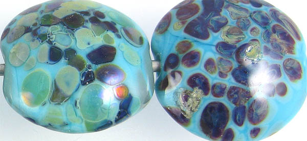
1 - Plain, 2 - Plain (reduced), 3 - w/ Silver Leaf, 4 - w/ Silver Leaf (reduced & encased), 5 - w/ Silver Glass Frit (reduced), 6 - w/ TerraNova2 Frit, 7 - w/ Raku, 8 & 9 - w/ Tuxedo, Copper Green, Opal Yellow, Ivory & Peace
CiM Coconut Milk is billed as a 'Non-Reactive' White. When I first looked at the rods next to Peace, I couldn't really see any difference between the two colours. However, after making my test beads and seeing the other beads posted on the CiM site, it's clear that there are some differences. Coconut Milk is ever-so-slightly off-white, and the reactions that it has with other colours are much different from those I got with Peace.
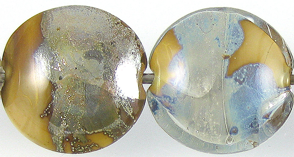
When Silver Leaf is used on top of Coconut Milk, the Coconut Milk fumes a tawny brown colour. The Silver Leaf takes on a patchy, bluish hue. When the Silver Leaf is subsequently reduced and encased, it looks very blue and shiny under the layer of Clear and the Coconut Milk remains a warm tan colour.
In the bead on the right, I got some crazy cracking... cracks every which way through the bead that appeared a day or so after the bead had been annealed. However, I'm not sure that we can blame this on the Coconut Milk, because I have had the same problem with other encased beads I have made with the batch of Effetre Clear I'm currently working with. I am going to try this again with Reichenbach Clear as the encasement layer to see if that makes a difference and I'll let you know what I find out. Maybe Coconut Milk is a colour that would rather not be encased.

Reducing silver glass looks beautiful on top of Coconut Milk - my frit has turned beautiful shades of turquoise and has an attractive, caramel-coloured dark line surrounding the frit pieces on the bead. I didn't get such pretty results from the TerraNova2 frit here, so my tentative conclusion is that Coconut Milk is nicer under reducing silver glass than it is under the striking colours.

Coconut Milk thins out slightly and loses some of its opacity over Tuxedo, however it does not take on the bluish hue that Peace did in the same test. Similarly, in the bead on the right you can see that Tuxedo has bled into the Coconut milk slightly but that the resulting halo of pale colour is grey rather than blue.
Coconut Milk seems to not have Peace's tendency to separate, because it has not done that with any of these colours, however when Opal Yellow is used on top of Coconut Milk it seems to be floating just above the surface of the bead due to a faint halo effect underneath in the Coconut Milk.