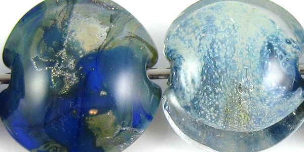
1 - Plain, 2 - Plain (reduced), 3 - w/ Silver Leaf, 4 - w/ Silver Leaf (reduced & encased), 5 - w/ TerraNova2 Frit, 6 - w/ Silver Glass Frit (reduced), 7 & 8 - w/ Tuxedo, Copper Green, Opal Yellow, Ivory, Peace
This second batch of CiM Adobe Limited Run is similar to the first batch, but has enough differences that for me it is not really the same glass, although the colour is very similar.
Compared to the first batch of Adobe, the colour of this second batch is a little lighter and a little cooler. The first batch of Adobe pinkened, darkened and sheened up when reduced, but this one does not. Regardless, I am thrilled that there will be more Adobe in some form or another. When a colour is this appealing, I'd far rather have it be slightly different from batch to batch than not have any of it at all.

This 2nd Batch of Adobe is not as reactive with silver as the first batch was, but silver leaf still fumes Adobe a darker colour of brown. When the silver leaf is reduced and encased, it forms a sort of ethereal blanket over the Adobe.

This batch of Adobe seems a little more silver glass-friendly than the first batch. My TerraNova2 frit doesn't have thick, dirty halos around it the way it did in my test results for the first batch, and it seems to have developed more colour as well.


Tuxedo: When Tuxedo is used on top of this batch of Adobe, the Adobe pops up around it with little 'halos'. The colour of these halos is the same as the colour of the rest of the adobe, but it is interesting nonetheless because of the faint tranlucent rings and lines that result from the reaction. Tuxedo does not seem to bleed into this batch of Adobe the way it did the other one, although I did not super-heat this bead so I may just not have gotten it hot enough.
On top of Tuxedo, the Adobe separates a little and becomes slightly translucent. This is much different than the effect I got with the first batch, because that batch got a silvery line surrounding the dots and lines I made with it on top of Tuxedo but this one definitely does not do that.
Copper Green: Copper Green stays a much lighter colour with this batch of Adobe than it did with the first one, and a faint brown line develops between the two colours that is paler than the brown line that developed between Copper Green and the first batch of Adobe.
Opal Yellow: On top of Opal Yellow, this batch of Adobe seems to float just above the surface of the bead, much like what I got with the first batch. However, Opal Yellow doesn't have nearly the same tendency to spread out on top of this batch as it did the first one.
Ivory: My Ivory got much spreadier (is that a word?) on top of this batch of Adobe than it did on top of the other one, and where my Adobe stringerwork seemed to have a little spiky bleeding to it on top of Ivory with the last batch, that reaction is not evident at all with this one.
Peace: When I tested the first batch of Adobe, I was using Effetre White, but now I am using Peace. So... no useful comparison to make here, and not much reactivity either.