Search This Blog

September 30, 2010

Test Results :: Ming

1 - Plain, 2 - Plain (reduced), 3 - w/ Silver Leaf, 4 - w/ Silver Leaf (reduced & encased), 5 - w/ TerraNova2 Frit, 6 - w/ Silver Glass Frit Blend (reduced), 7 - w/ Tuxedo, 8 - w/ Copper Green, 9 - w/ Opal Yellow, 10 - w/ Ivory, 11 - w/ White

General Impressions
CiM Ming is a medium, translucent blue. By itself, it's quite a bit brighter than I'd normally like, and it's a very 'webby' colour. It's also pretty shocky. Not as shocky as Anise White or some of the Vetrofond odds, but definitely shockier than I would prefer.

Some of the redeeming features of Ming are how interestingly it reacts with other colours, and how it can be applied in a thin layer and lose some of its crazy brightness in ways that just aren't possible with other blues of similar hue. The reactions that are possible with Ming are pretty interesting, and I haven't ever seen some of them before which was kind've thrilling.

Reactions

With silver leaf on its own, Ming just lets it vein through without much in the way of a reaction. You can see the veins of silver in the bead on the left.  However, if you reduce and encase that silver, you get the wild, webby, crazy, shiny reaction we see in the bead on the right. I really like this reaction.


In the bead on the left, the TerraNova2 frit has struck nicely, but more in the blue and purple ranges that make it not stand out so well against the Ming. In the bead on the right, some of the bits of frit have developed an interesting halo around them. I need to do a little more testing with Ming and Silver Glass. The other interesting thing about these two beads is that the Ming has lost some of its harshness and some of its translucency and become a more milky blue.


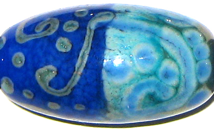
With Tuxedo, the cloudy marbling in the ming is mild, but there is some curdling of the surface of the colour. The Tuxedo dots and lines look fairly crisp on the Ming though, unlike what happens in the beads below.


Over Copper Green, Ming thins out to almost nothing, looks completely transparent and really befuddles the surface of the Copper Green. It develops light turquoise halos around it and odd, grainy veins of Ming concentrate in the surface of the dots and lines of the stringerwork that remind me of cracks in cement walls.

On top of Ming, Copper Green gets frazzled around the edges and separates into two parts -- a shiny outer shell with a darker green in the middle of the dots and stringer lines. Under the Copper Green, the Ming is quite cloudy and curdled.


This reaction is the weirdest of the lot.

On top of Opal Yellow, Ming looks transparent, and it lifts fuzzy yellow halos out of the Opal Yellow and seems to float on top of the surface with them.  The appearance of the dots and lines goes all fuzzy, and like in the Copper Green test bead above, the Ming seems to gather in thin, frizzy bits in the centre of the scrollwork and the dots.

On top of Ming, Opal Yellow is ragged, and it develops a thin, translucent line in the centre of lines and dots that is a deeper and more orange hue of yellow than the outside edges. In the centre of the bead, you can see some odd greyish webbing between the two colours.


On top of Ivory, Ming spreads in a crazy, blotchy, I-think-I'm-a-transparent sort of way. The Ivory underneath it clots like cream.  On top of Ming, the Ivory lines and dots have good cohesion, but you can see some marbling in them and the blue of the Ming breaching their boundaries.


The reaction between Ming and White is very similar to what happens with Ivory, but because White is a more translucent colour than Ivory, the lines and dots of it over Ming are not as crisp, and the odd curdling of the White on the right side of the bead has even less real definition to it.

I haven't made many fun beads with Ming yet, and one of the ones I have made I've posted a lot since it's got lots of colours in it.  I have two rods of Ming left, so there will be a couple more Ming beads before I'm moving on.


September 26, 2010

Test Results :: Olive (Lauscha)

1 - Plain, 2 - Plain (reduced), 3 - w/ Silver Leaf, 4 - w/ Silver Leaf (reduced & encased), 5 - w/ TerraNova2 Frit, 6 - w/ Silver Glass Frit Blend (reduced), 7 - w/ Tuxedo, 8 - w/ Copper Green, 9 - w/ Opal Yellow, 10 - w/ Ivory, 11 - w/ White

General Impressions
Lauscha Olive looks almost black when it's hot. It is also a very stiff, very dense colour. It is a pleasure to use in stringer form because of its stiffness.

This colour is also very reactive, and does crazy things with other colours. I have not done my tests yet for CiM Olive (This is a thankless, endless job I've set myself! Someday I'll get to it) but I don't think the two colours, apart from both being a similar olive-y shade of green, have much in common. I don't expect CiM Olive to do the same kinds of weird, spready reactive things that this Lauscha Olive does, but I'm sure that it has compelling secrets of its own for me to discover.

My Lauscha Olive rods are pretty thick - possibly around 9mm in diameter. The glass is surprisingly not-shocky for its girth, which was also my experience with Lauscha Cocoa. After you've melted some of the rod and you reintroduce it to the flame you're likely to lose the tip of it, but apart from that it's smooth sailing with this colour.

Reactions

One of the things I'm discovering is that a lot of the colours that are full of endless organic fun do this blue thing with silver that you see in the bead on the right. On top of Olive, silver leaf melted in sort of disappears and forms some blue-ish blotches. Once the silver is reduced and encased, it forms a shiny armour-like patina over the Olive with a fumed blue haze around it.  Awesome.

The reactions with silver are NOT one of the ways Lasucha Olive and Lauscha Cocoa are similar. Olive is WAY nicer with silver and striking silver glass than Cocoa is.


I got better colour out of my TerraNova2 frit on top of Olive than I have with almost any other colour. Lauscha Olive is much nicer with the striking silver glass frit here than with the reduction frit blend.


Lauscha Olive is odd with Tuxedo only in that almost every other green that I have tried with Tuxedo has stirred Tuxedo into a crazy, webbing frenzy. With Olive, Tuxedo is simply a nice, crisp Black. The only strange thing I see in this bead is that where the Tuxedo and Olive portions of the bead met in the middle, the Olive is a bit lighter.

Whoah. I thought that Lauscha Cocoa was cool with Copper Green, but as cool as that reaction was, this one blows it away. On top of Olive, Copper Green develops a light outline, and then a silvery inner outline with a concentration of a darker teal colour in the centre.  Three rings for the price of one :)

On top of Copper Green, Lauscha Olive seems to spread a little and take on a faint translucency, and a light turquoise watercolour outline surrounds the Olive dots and lines.


On top of Opal Yellow, Lauscha Olive loses its vibrancy, and it does weird things to the Opal Yellow underneath it. The Opal Yellow on the right side of this bead almost seems to have a crack in it, but that's just a transparent crease formed by this reaction.

On the left side of this bead, the Opal Yellow dots and lines have developed a light yellow outline and the inside of them has blushed a pinkish orange colour. Another really cool reaction here.


On top of Lauscha Olive, Ivory develops a fine, translucent line in the middle of its dots and lines. On top of Ivory, Lauscha Olive loses its cohesion a little and bleeds. This reaction is pretty similar to what happened with Lauscha Cocoa and Ivory, although Cocoa is a little better at it than Olive is.


And finally, White separates a little on top of Lauscha Olive (but not as much as Ivory does) and Olive spreads on top of White (but not as much as on top of Ivory).

Fun beads with Olive:


September 16, 2010

Test Results :: Mojito

1 - Plain, 2 - Plain (reduced), 3 - Over Clear, 4 - w/ Silver Leaf, 5 - w/ Silver Leaf (reduced & encased), 6 - Over Silver Foil, Over Itself, 7 - Over Ivory as a Floral, 8 - w/ Silver Glass Reduction Frit, 9 - w/ Silver Glass Reduction Frit, 10 - w/ TerraNova2 frit, 11 - w/ Tuxedo, 12 - w/ Copper Green, 13 - w/ Opal Yellow, 14 - w/ Ivory, 15 - w/ White


General Impressions
Until recently, it had been a while since I fell in love with a colour and I didn't really expect to love CiM Mojito, but I totally do.

Mojito looks yellowish-orange when you're working it which is a little freaky. It also seems sort of opaque when you put it on top of another transparent colour when both colours are hot. But, as promised by the rod colour, Mojito is a transparent light yellow-green that is deliciously reactive.

In spite of how light it is, Mojito is still very much present in thin layers. In this floral, I've used it on top of Ivory.
Mojito is just a little too stiff to be paired with Ivory for flower petals, but I like the colour of the Mojito over Ivory very much. Perhaps I'll give it a shot with Vetrofond Ivory once I've managed to get my hands on some more of it, since it's a little stiffer than its Effetre cousin.

Mojito has a beautiful consistency, similar to Maple. It is nice and viscous, making it easy to work with. It is a little more prone to bubbling and boiling than Maple, but still well within happy working ranges for me. That said, it was hard to avoid having at least some bubbles in my Mojito beads. Stringers of Mojito boil a little more easily, so you need to be careful to heat them at the outer edge of the flame, a little higher up than you might with other colours.

Many people compare Mojito to Effetre Pale Green Apple, but even though both colours are a pale, yellowish green, Mojito is a little less slime-green and a bit more muted than Pale Green Apple. I think this is great, because I prefer the more sedate hue of the Mojito.

Reactions


On the left, I've included a photo snippet of a bead I made with Pale Green Apple and silver glass reduction frit. On the right is a similar swath of a bead made with Mojito and a slightly different frit blend. I make these kinds of designs by pulling frit stringer with silver glass reduction frit and then using that stringer to encase a core bead. Another colour I have found to react this way so far with the reduction frit is Light Brown Transparent.

Because the frit I used in both cases was not identical, I'm not sure how much of the difference here is because my 'everything' frit blend has changed over time and how much is native to the glasses. Regardless, both effects are really cool.


Mojito is sort of weird with silver. Weird in a good way.

In the first bead, I put silver leaf onto the bead in an unconventional way because I didn't have enough glass on the mandrel after putting on the leaf and had to swipe on more glass and then add more silver. This has resulted in a very strange-looking creation indeed because the middle of the bead has fumed almost brown and there are silver splatter patterns all the way through the bead that range in colour from greenish-brown to greenish-aqua. The silver that remained on the surface inexplicably turned a shiny pinkish colour. Freaky.

In the bead in the middle, silver leaf reduced over Mojito and then encased with Moretti clear resulted in a shiny silver coating with hints of blue.

In the bead on the far right, silver foil turns brownish gold when encased with Mojito.


The reduced silver glass reduction frit over Mojito combination in the bead on the left doesn't really do a lot for me. With colours like Mojito, I prefer to use my silver glass reduction frit in frit stringers as described above.

In the bead on the right, I used TerraNova2 frit over the Mojito and am pleased with the range of blues and purples I got from it.


With Tuxedo, Ivory and White, Mojito doesn't really have much of a reaction.

On top of Mojito, Copper Green develops a strange, shiny ring around it. Where I put Mojito over Copper Green, it seems to have intensified the turquoise nature of the Copper Green and left a washy light turquoise line behind. This reaction might be worth further study.

On top of Opal Yellow, Mojito looks much more yellow than green and it develops a floaty Opal Yellow halo. On top of Mojito, Opal Yellow blushes a rosy, egg-yolk hue.


Here are some fun beads with Mojito.


September 12, 2010

New Uniques from Creation is Messy

Today, I thought I'd post some beads made with the newest colours from Creation is Messy.
This bead is made with the new Mermaid Unique #1. This version of Mermaid is darker and bluer than Mermaid-proper, and the colour of it is just gorgeous. In this bead, I added silver glass frit and a twistie with silver glass in it over the Mermaid and then encased the whole thing.

It would have been good if I'd stopped there. I'm not sure what possessed me to put quite so much goldstone on it or the odd pink (Cranberry) dots that are on the side that I didn't photograph, but I'll restrain myself next time I make this style of bead.

The Mermaid Unique is a gorgeous, dense, dark teal that is several shades darker than regular Mermaid. It made my TerraNova2 frit do beautiful things, and it bled into my Opal Yellow dots.
This bead also featured Mermaid Unique #1. What a gorgeous colour!

This next bead is made with the new Butter Pecan Unique #5. This version of Butter Pecan fumes in a really interesting way with Silver Glass and is a little bit reactive, developing a fuzzy, greyish-brown outline with silver and copper-laden colours. I haven't done  my proper testing with regular Butter Pecan yet, so I'm not sure if this is a reaction I should have expected or not. Regardless, I am a little in love with this colour and will definitely be buying more of it once my wallet recovers from the double financial whammy of the Frantz Bash and Glass Stock.

This bead features Butter Pecan Unique #4 in some of the stripey swirls, and it's interesting to me that the lighter Butter Pecan Unique here is much less reactive than the darker #5 version. The #4 Unique isn't as appealing to me as the #5 one, but that is probably just a personal taste thing. It's lighter and a little more yellow than the #5 Unique and probably has all kinds of good things going for it that aren't apparent to me yet.


The new Celadon Unique #2 is just slightly greener than regular Celadon, and is just a little bit streakier and maybe a touch more reactive with Ivory. I prefer it to the original version of Celadon because the slightly greener hue takes it a bit further away from the turquoises in our 104 palette.


Next, here's a freeform bead made with a Limited Run colour called Adobe. This colour is reminiscent of the dark, gorgeous Butter Pecan Unique #3, only it is a little lighter than that colour. Again, gorgeous. I want more.
This little lentil also features Adobe, but as the base of the bead under all kinds of silver and silver glass. The Adobe fumes a much darker shade with the addition of those elements.


And finally, there is a light unique of Adamantium coming out. It's just like Adamantium-proper only a few shades lighter. I love Adamantium, and I love this new lighter version, too. This bead was made on a base of Dirty Martini with a silver glass twistie and then dots of Triton. It was encased with Reichenbach Crystal.

Not shown, but coming your way soon as well are Desert Pink Unique #2 and  Sepia Unique #2. Unfortunately for me, I had so many bead release incidents when I was torching that I don't have anything to show you about these colours. 

Sepia Unique #2 is not brown in the rod like Sepia-proper, and looks more like a dusky pale lavender-blue. I'm going to get some more of this when it's released so that I can properly examine it.

And that's your new Messy Colour update!