Search This Blog

January 27, 2017

Test Results :: Purple Rose


Reichenbach Purple Rose (RL2202) is an almost shockingly vibrant purple. It's a very, very soft colour and it boils and pits really easily if you repeatedly heat and cool it while working it.  It seems best, when using this colour, to apply it, quickly shape whatever you're working on, and then get it in the kiln as quickly as possible with minimal reheating.

This colour is very, very reactive.  Because of this colour's super softness and because of its dramatic, black reaction with Ivory, I want to guess that this colour contains lead.  It is pretty common for pinks and purples to contain lead, and you can only be sure that there is no lead if it does not do this to Ivory.  Some other colours that react similarly include Effetre EDP, Effetre Sedona, Effetre Rubino Oro, CiM Cranberry, Reichenbach Opal Raspberry, and Reichenbach Flamingo.


In the self-coloured spacers above, you can see that Purple Rose can have a lot of colour variation. The spacer on the left contains a lighter bright purple as well as a dark purple blushing.  Reducing Purple Rose brings the metals to the surface and makes it a shiny, duller greyish purple.


Purple Rose is tremendously reactive with Silver. In the bead on the left, my silver turned a bizarre blend of mustardy colours. When this reaction is reduced and encased, it is paler yellow and has really interesting texture under the clear.


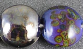
It's sort of difficult to see what's going on in the bead on the left because the silver glass has been reduced and the Purple Rose reduced right along with it. It has a greyish purple mirror finish that is mottled with yellowish reaction clouds from the silver glass.  In the bead on the right, my TerraNova2 frit went sort of crazy on top of this colour. It has pinkish borders around all the little pieces, and then the fritty bits went all green and yellow.  I don't know what other colours would have appeared if I continued to strike it, but I'm pretty interested in doing this again.


Purple Rose makes Copper Green separate pretty dramatically into dark and light turquoise. When the Purple Rose is used on top of Copper Green, it makes the Copper Green float into broad halos around it, giving it a sort of cellular look. Copper Green does not develop its customary metallic sheen when used with Purple Rose.

Purple Rose also reacts really dramatically with Opal Yellow.  In the leftmost bead here, you can see that the Opal Yellow has blushed a deep yellow around the edges of the separated dots and stringer lines. This is remarkable because Opal Yellow almost never looks truly yellow. It's usually the colour of butter, and can sometimes turn pink, but I think this is the only time I've ever seen it go bright yellow. On top of Opal Yellow, Purple Rose looks more pink than purple.

Purple Rose turns Ivory into a black mess.  In the bead on the right, the Purple Rose looks almost crumpled with dark blotchiness.

Peace separates on top of Purple Rose. On top of Peace, Purple Rose spreads slightly and looks a little translucent in places.

Here are some beads that I made with Purple Rose.  I didn't have a lot of this colour, so I didn't get to have as much fun with it as I might have liked.


This goddess bead was etched because of the serious amount of devitrification, boiling, and pitting this colour did on me.  You can see the really fun variations in purple that you can get with a single rod of Purple Rose.


January 23, 2017

Test Results :: Pale Blue Transparent


Effetre Pale Blue transparent is a soft blue. The colour of it is beautiful, and I think I would love it if the clarity of it was better.  I found my rods of this colour a little bit scummy, even when I cleaned them much more fastidiously than usual.


Reducing this colour does not appear to have any affect on it. If you click on this picture and make it larger, you can see all of the scummy bubbles and other floaty yuckiness that is throughout these pale blue spacers.  When it's hot, the scumminess is even more apparent. 


On top of Pale Blue Transparent, silver leaf spreads out and looks lacy and a bit yellowish and just sits on the surface. When the silver is reduced and encased, the yellow blush fades and the effect is more whitish and translucent. Pretty :)


Here, I've used Pale Blue Transparent as the base colour for silver glass. In the rightmost bead I used my random blend of reducing silver glass colours, and it looks pretty and cloudy on top of the Pale Blue base.  In the bead on the right, I didn't get much colour starting in  my TerraNova2 frit, and so if I were looking for a colour to put striking silver glass on top of, I would probably choose something else.


There are not many reactions to speak of here, but there are a couple of things that I want to mention.

When you use Pale Blue on top of Copper Green, it creates turquoise 'islands' in the Copper Green that are ringed with slightly darker turquoise. You can see this in both my dots and my stringer lines, and I think it's a pretty neat effect.

Pale Blue transparent does not affect the colour of Ivory, and it looks pretty and soft wehn used over top of Ivory. I'm sure there's a neat use for this.

Peace separates slightly on top of Pale Blue Transparent.

Here are some beads I made using Pale Blue Transparent:


January 9, 2017

Test Results :: Bordello


This colour is very saturated and dark in colour, but lightens up beautifully over White/Ivory. I didn't expect to like it as much as I do, but I find this colour oddly appealing.  Because it is so dark, it's not a great colour for applications like flower petals in encased florals, but it does layer really nicely over colours like coral, adding depth to the colour and making a deep, warm red.


Here you can see that in self-coloured spacers, Bordello is so saturated that it almost looks black. Reducing it has no effect on the colour.


Silver fumes a bluish colour on top of Bordello, and that blue is still evident when the silver is reduced and encased. There's also some greyish murkiness in these beads, like the silver is reaction with Bordello the way it does with Ivory.


In these beads, you can see that Bordello wars a bit with silver glass, too. There's really interesting reactivity around the fritty bits in both of these beads -- in the reducing silver glass frit bead the weirdness is inside the frit itself, with the frit forming borders around itself of different colours. In the rightmost bead, the frit appears to have caused a greyish halo to rise up in the surrounding Bordello. and I got some initial purples and blues from the TerraNova2 frit indicating that it would probably have struck fairly well on top of this colour if I'd given it a chance.


I was surprised here, because since Bordello was so reactive with silver and silver glass, I was expecting it and Copper Green to not get along. However, there is no dark line reaction between Bordello and Copper Green, and the Copper Green separated slightly on top of Bordello.

Where I used Opal Yellow on top of Bordello, the Bordello has bled into it in places.  Opal Yellow, Ivory, and Peace all seem to spread on top of Bordello. Additionally, Opal Yellow and Peace separate on top of it.

Bordello is very saturated. It keeps a dark, deep red colour even in thin layers over very light colours. It was sort of interesting to see that in a couple of places, I had trouble with Bordello unstriking on top of Ivory and Peace. I'm not sure what caused this, and it's also sort of noteworthy that where it unstruck over Ivory it looks yellow, whereas where it unstruck over peace it just looks lighter.

Some beads in these sets were made with Bordello.


January 2, 2017

Test Results :: Light Violet Transparent


Effetre Light Violet is a medium to dark transparent violet. When I got these pictures taken and started writing this post, I looked back at my test results to see how different this colour is from Dark Violet, its close cousin.  As far as I can tell, apart from being a touch brighter in thin layers and quite a bit less reactive with silver and colours like Opal Yellow, it is very, very similar. 


Light Violet, like Dark Violet, is a bit of a saturation puzzle... it is very, very dark when used alone in self-coloured beads, making you think that it must be a very dense colour. The contrast between the 'lightness' of this colour with other Effetre 'light' transparents like Light Aqua, Light Teal, Light Emerald, Light Topaz, etc. is marked. If you were to put these spacers beside spacers of any of those other colours, it would be hard to convince someone that this colour was supposed to be 'Light' since you can't see through it at all and those others all let a lot of light through.

Reducing Light Violet has no effect on the colour of it.


Interestingly, I think that the lower reactivity of this colour makes it a better base of silver glass colours. As I've been doing these tests, I've been making note of the colours that seem to make easier bases for striking silver glass, because I'm trying to find a pattern. I don't think I'm there yet, and maybe seeing this test every time isn't useful for other people. If not, I'm sorry about that. Let's move on :)


Silver lies pretty inert on the surface of Light Violet, spreading out a bit and balling up. When it's reduced and encased, a faint blue blush can be seen where there are 'holes' in the silvery blanket under the clear.


Light Violet is not a reactive colour, and I have nothing interesting to say about any of these tests.  It seems like this colour would be good in layering combinations since it stays pretty much as you put it and doesn't cause a lot of weirdness in other colours.

While Light Violet is actually pretty dark in self-coloured beads, and the hue of it is 'dark', it is not a very saturated colour. It thins out significantly when it's used over other colours in thin layers.