Search This Blog

December 26, 2016

Test Results :: Crocus


CiM Crocus is a light, bright, semi-opaque lavender. I'm not sure why it's taken me this long to try it, but I've really enjoyed my adventures with semi-opaques this year -- I love the translucency and the reactivity of almost every single semi-opaque colour I have tried, and this one has been no exception.

Crocus is not very reactive, making it a both beautiful and stable colour to use in my designs. Someone told me when I started using this colour to watch out because they had incompatibility problems with Crocus, but I did not experience any problems that way at all, whether I encased the Crocus or not. I did find some of the rods a bit shocky, but not in any serious 'want to throw it across the room and forget it's name' kind of way.


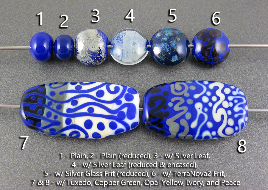
Here we have Crocus, au-naturel. Reduced, unreduced, it's all the same. I also didn't find that I got much colour change or opacification from Crocus when I repeatedly heated it, which was nice since it happens a lot with other semi-opaques.


Crocus does not seem to be very reactive with Silver. The silver spreads out and basically just looks like a fine silver crust on top of Crocus, and when you reduce and encase the silver on top of Crocus you get a silvery, snowy blanket look.  Silver does not affect the colour of Crocus much in my test beads, above.


However, when I used my reducing silver glass frit on top of Crocus and reduced it, the Crocus turned an odd colour of grey. I'm not sure if this was because of reactions with the frit, the reduction, or if the colour change is a mix of reactivity with the frit and reduction, but it's a dramatic difference.  In the rightmost bead, my TerraNova2 went reddish purple which is the first striking step. This means to me that I could probably get decent colours with striking silver glass on top of Crocus if I worked at it a little.


In terms of reactions, I didn't observe that much with Crocus.

Copper green didn't go grungy when used underneath Crocus, which to me means that something in the Crocus helped to keep it clean. On top of Crocus, Copper Green separates and the edges of my dots and stringer lines turned an odd greyish pink colour.

There were also some very minor separation reactions in Opal Yellow, Ivory, and Peace when used on top of Crocus, but the separation was so minor that I'm not counting those in my overall reaction index.

Here are some beads that include CiM Crocus:


December 19, 2016

Test Results :: Periwinkle


I'm finally testing Effetre Periwinkle. I've spent eight years avoiding this colour pretty religiously, so it's surprising (to me) that I'm using it so much right now. It's a pretty but kind of alien colour that falls somewhere between blue and purple on the colour wheel.


Reducing Periwinkle doesn't have any effect on its colour.


Silver seems to discolour periwinkle slightly, which seems like it could be fun. The silver, reduced and encased, lies like a lacy whiteish blanket under a layer of clear in the leftmost bead.


In the bead on the left, you can see again how reducing the silver glass has discoloured the periwinkle, robbing it of its bright blueness. The silver glass frit is a touch coppery on top of the periwinkle, which I don't usually see in this test. in the bead on the right, I got big pale halos around all of the TerraNova2 fritty bits.  I didn't get much colour from the TerraNova2 in this quick test beads, telling me that it isn't one of the magic silver glass base colours I'm hunting for.


Periwinkle is not a very reactive colour. However, there are a few notes for me to make here.

On top of Tuxedo, Periwinkle seems to separate very slightly, developing some translucency around its edges. Tuxedo bleeds into Periwinkle when it is used on top.

With Periwinkle, I got a lot of the grunginess on my Copper Green that I only seem to avoid naturally when I combine the Copper Green with certain other colours.  I don't know if Periwinkle brings out the sludginess or if it just doesn't help to inhibit it, but I definitely get this more when combining Copper Green with some colours than others.

When I used Periwinkle on top of Opal Yellow, a faint crevice showed around all of the dots and stringer lines causing them to almost look lifted off the surface of the bead.

I don't have anything significant to add about either Ivory or Peace.

Here are some other beads that include Effetre Periwinkle:


December 12, 2016

Test Results :: Light Cobalt (Vetrofond)


So just to start things off on the right foot, this is Vetrofond Light Cobalt, not Effetre. I don't know how similar Effetre Light Cobalt is, because I have not tried it.  I'm trying to test more production colours than out-of-production to make this resource more generally useful, but I had two pounds of this and I needed to know how the reactions work and what the colour looks like and since Frantz seems to still have tons of this, maybe someone else will too.

Light Cobalt is a not-very-light royal blue. It's a gorgeous colour, if you like bright, dark blue. It reminds me of the colour of some ice wine bottles, although those are generally transparent.

It was weird for me that this colour was transparent when I pulled it into stringer because it's so very saturated. So, it's dark and it's saturated, but not as dense and opaque as it seems like it will be in rod form. The stringer, when used on top of other colours, looks perfectly opaque, like that whole transparency thing was all in my head. (it wasn't)


What a vibrant colour this is. Reducing it seemed to darken the colour slightly.


Silver looks pretty silvery on top of Light Cobalt. In the bead on the left, the silver seems to have just stayed where I put it, and then when the silver is reduced and encased, it looks like a soft silvery blanket under the clear glass.


This colour is fun with reducing silver glass. It has struck darker here in the bead on the left just like it did in the spacer I reduced, and my silver glass frit looks beautiful on top of it, in lacy shades of blue and green. In the bead on the right, you can see gentle lighter blue halos popped up around my TerraNova2 frit.


Light Cobalt is not a very reactive colour, but there are a few things to talk about here.

Where I used Light Cobalt on top of Tuxedo, there is a thin crusty whiteish line around the dots and stringer lines in a not-very-uniform way. Nothing happens when it's the Tuxedo that's on top.

There's no real reaction between Copper Green and Light Cobalt except that Copper Green seems to develop that yucky greyish sheen more easily with this colour.

When Light Cobalt is used on top of Peace or Opal Yellow, you can see that there is some bleeding of the Light Cobalt into the glass around the stringer lines and dots giving a blueish glowy effect. When Peace or Opal Yellow is used on top of Light Cobalt, it develops a light blue outline, which is really neat-looking.

These beads all contain Light Cobalt.


December 5, 2016

Test Results :: Dirty Martini


CiM Dirty Martini is a very pale opaque teal that is one of my favourite colours. It's versatile, the consistency of it is beautiful, it is stable, not reacting really outrageously with anything apart from silver, and the reactions with silver just make me happy.

It makes a fabulous base colour for just about anything, and I was able to get some pretty neat effects from it combining it in spacer beads with other colours.


Reducing Dirty Martini has no effect on its colour, and Dirty Martini does not strike.


The bead on the left where I put silver leaf on top of Dirty Martini is really interesting. You can see how it has fumed brown and yellow and I even see a touch of purple underneath the silver, which has gone a yellowish grey colour.

Reducing and encasing the silver removes all of that visual interest and the silver turns snow white and all of the discolouration vanishes. Weird.


Dirty Martini seems to make a pretty good base for striking silver glass, as I got some really nice colour starts from my TerraNova2 frit in the rightmost bead. With reducing silver glass frit, it yellows significantly after the reducing step and I'm not sure that the result is very attractive.


Dirty Martini separates on top of Tuxedo, and when Tuxedo is used on top of Dirty Martini, it spreads. This was weird for me because I am accustomed to thinking that it will be the softer colour that will spread, but Dirty Martini is softer than Tuxedo. Again, weird.

Dirty Martini makes Copper Green separate. The separation is subtle, and more obvious when Copper Green is used on top of Dirty Martini than the opposite.

The most interesting thing here is that Opal Yellow makes Dirty Martini greener. I don't know how or why, but it happens both when Dirty Martini is on top and when it is underneath Opal Yellow. There's no real reaction, just greenness.

There are no obvious reactions between Dirty Martini and Peace or Dirty Martini and Ivory, although Ivory seems to really spread on top of it.

Here are some other beads made with Dirty Martini:


November 28, 2016

Test Results :: Carnelian Opalino


Effetre Carnelian Opalino is such a beautiful colour of pink. I find it an easy glass to use, without significant boiling or shocking issues the way people fear with the Opalino colours. Each batch of Carnelian seems to be a bit different, with the most recent batch being beautifully rich in colour.

It's also among a small number of deep pinks that are not antagonistic towards Ivory, because colours like Opal Raspberry, Rubino Oro, Cranberry, and Sedona turn Ivory into a black mess. It's nice that there are a few pinks out there that can be used with Ivory without creating that problem.


Reducing has no specific, unique effect on the colour of Carnelian Opalino, but here when I reduced the bead, reintroducing it to the heat resulted in the colour striking.  Carnelian is a striking pink, and the more times you heat and cool it, the pinker it gets.


In these beads you can see that using silver with Carnelian turns it a bit orange, which is consistent with how I am accustomed to pinks behaving when silver is added. Reducing and encasing the silver made most of the orange go away.


Carnelian is a nice base for silver glass. My reducing silver glass pops on top of it colourwise, mostly because of the good contrast between the yellowed pink and the blue frit. In the rightmost bead, you can see that colour started to bloom early in my TerraNova2 frit, which is a good sign that this is a decent base colour for striking silver glass.


Copper Green separates on top of Carnelian, and when Carnelian is used on top of Copper Green, you can see light lines around the Carnelian as well as a fracturing of the Copper Green into little beads of dark turquoise. Neat.

Opal Yellow also separates on top of Carnelian, and on top of Opal Yellow, Carnelian looks a bit orange. I think this is because it is semi-opaque, and it's the result of the yellow peeking through the pinkness.

There are no real reactions to speak of with Carnelian and Tuxedo, Ivory, or Peace.

Here are some beads made with Carnelian.


November 21, 2016

Test Results :: Elphaba


CiM Elphaba is a beautiful spring green.  For the longest time I've shied away from brighter colours, but I've burst out of that self-imposed prison this year, and I'm hooked on this one. After some very minor encounters with the bright Effetre greens (Nile Green, Pea Green) I approached this colour thinking that it would be more aggressive with other colours, and streakier. I was pleasantly surprised!

Elphaba is a surprisingly soft colour. I'd rate its viscosity maybe a 1 or 2 on the scale where 0 is Effetre White and 10 is Effetre Black.


Here, you can see that reducing Elphaba in the bead on the right had no effect on the colour of it.


Silver causes a little bit of brown discolouration when it's used on top of Elphaba.

I don't really understand the things that happened when I reduced and encased the silver, because the brownness seems to have diminished, and really organized itself in a vertical line in the rightmost bead. Possibly that was a join line in my encasing, and so maybe it was all looking for somewhere to go and there was some space there before it melted in?  I just don't know, but it's one of those things that make me go "hmmm".


I'm not sure what to say here except that Elphaba doesn't really make a pretty or particularly effective base for silver glass.


Tuxedo makes Elphaba separate, and so you can see in both beads how wherever the two touch, the Elphaba develops a line. In the bead on the left, the result looks like a green outline to the tuxedo stringerwork that is faintly outlined in black. In the bead on the right, you can see a faint black line through the Elphaba stringer lines and faint black dots in the centre of the Elphaba dots.

Copper Green, Opal Yellow, and Ivory all spread quite a lot on top of Elphaba, and the Copper Green looks really Turquoise when it's used with Elphaba and even blushes a bit pink in places, but there's no trace of the dark patina that often develops on it.  Also, around the Copper Green stringer lines there's almost a fissure-like outline and you can see in the rightmost bead that the Elphaba has separated on top of the Copper Green.

Opal Yellow strikes odd pinkish grey in blotches when it's used on top of Elphaba, and around Elphaba dots and stringer lines. Peace goes a little weird in the same way on top of Elphaba, but so mildly that it's not very noticeable.

There are no real reactions of note with Ivory.

Here are some beads made with Elphaba. This colour has stolen my heart :)


November 14, 2016

Test Results :: Sky Blue Opalino


Effetre Sky Blue Opalino is a lovely pale blue semi-opaque colour. I used rods from two separate batches (bought eight years apart) and there was no variation to speak of between the two which was nice. It has a unique reaction profile, and I was able to do some pretty fun things with it. And since the Opalino colours are widely feared and reviled, it's not very expensive.  Win!

When I was using this colour on my 5L oxycon, I got a lot of sooting no matter how cool I tried to work and how neutral I tried to keep my flame. It was pretty frustrating. But, at the beginning of September I got a new 10L oxygen concentrator, and it has been a very happy experience discovering that not all of my problems are my own fault!

I don't find this colour particularly shocky, and I didn't have any trouble with boiling it, either.


Here, you can see that in the bead I reduced, some of the brightness has been stolen from the colour. There are two things at work here - the first is that repeatedly striking semi-opaque colours pretty much universally (with the exception of the pink opalinos, and ghee and possibly a few others that are striking colours) opacifies them and lightens the colour. But I do believe that reducing it has changed the colour slightly as well, making it tend a little purpler than in the unreduced beads.


Here's something that I did not expect. This is the first blue that I've tested that turns brown when it's used with silver. It did it both in the bead where the silver is on top of the colour, and the bead where the silver is reduced and encased on top of the colour, although reducing and encasing it resulted in a much lighter brown.

Silver also behaves a bit differently on top of Sky Blue Opalino than it does on   If we look back at one of my early tests of Vetrofond Pajama Blue, which is the colour closest to this one that I've tested (I think - there are really a lot of tests up here at this point), we see that the reactions are quite different. With Pajama Blue, the silver turned brown. In these beads, the colour change is in the Sky Blue Opalino.


In the bead on the left, you can see that the silver glass reduction frit has discoloured the base bead giving it a really interesting antiqued look.  Also, the reduction has deadened the colour of the Sky Blue Opalino, making it contrast better with the colours of the frit.  

In the rightmost bead, although I didn't get the colour very uniformly, I got some gorgeous colours from the TerraNova2 frit towards the bottom edge of the bead.  This tells me that this is a pretty friendly base colour for striking silver glass.


On top of Sky Blue Opalino, Tuxedo looks blue-ish.

Copper Green separates when it's used with Sky Blue Opalino, and when it's used on top, it gets a pinkish grey outline to its dots and stringer lines.

Using Sky Blue Opalino on top of Opal Yellow seems to have helped it to strike a pinkish colour. Opal Yellow and Peace both separate slightly on top of Sky Blue Opalino.

Sky Blue Opalino reacts with Ivory, and you can see that the Sky Blue stringerwork in the leftmost bead has turned a brownish colour, and the Ivory stringer lines and dots are ringed with a faint dark line in the bead on the right.

Here is a very small sample of the fun I am having with Sky Blue Opalino.