Search This Blog

May 31, 2010

May Palette Update

It's been another whole month, so it's time for a Palette Update.

For anyone new to the blog, this where I tell everyone about my obsessive-compulsive glass usage habits.  I still secretly hope that someone out there will want to play along and work through these colours with me, but I have decided to settle for just shouting my colour choices out to the universe.


These are the colours that I'll kick off with in June.  As I run out of them / get tired of them (whichever comes first), I'll substitute others in from my treasure hoard.
  • REI Flamingo
  • CiM Sepia
  • EFF Yellow Opalino
  • CiM Slytherin
  • CiM Split Pea
  • EFF Ink Blue
  • REI Mystic Grey Blue
  • CiM Poi
Silver Glass:
  • DHX Terra2
  • DHX CE352
  • TAG Aquis
  • PRC Abe's Ivy
Anyone care to join me? If so, the staple colours that you are allowed to use with this palette are Black, White, Clear, Ivory, Dark Ivory, Adamantium, Opal Yellow and Copper Green. Dichro and metals are also allowed.

Since last month:
Flamingo has replaced Desert Pink
Sepia has replaced Sepia Unique #1
Yellow Opalino has replaced Mud Slide
Slytherin has replaced Dark Grass Green
Split Pea has replaced Elphaba Unique #2
... and I've done some waffling on the silver glass I'm using, but still just four colours at a time!  Expect me to waffle again, because I have no willpower and have two new TAG colours coming that I am not going to be able to stop myself from using.

May 30, 2010

Test Results :: Slytherin

1 - Plain, 2 - Reduced, 3 - Over Clear, 4 - w/ Silver Leaf, 5 - w/ Silver Leaf (reduced & encased), 6 - w/ TerraNova2 Frit, 7 - w/ Silver Glass Frit Blend (reduced), 8 - Over Silver Foil, 9 - w/ Copper Green, 10 - w/ Opal Yellow, 11 - w/ Ivory, 12 - w/ White

General Impressions
CiM Slytherin is a really, really stiff colour. It is almost as stiff, if not as stiff, as Leaky Pen. It's also super-saturated like Leaky Pen, but that's really where the similarity ends. It doesn't pit, spark or boil the way Leaky Pen does at all. Remembering my Leaky Pen experience I really pushed this glass, and even after parking it in the hottest part of my flame until it was molten, I got only the tiniest amount of bubbling action in the tip of it. Nice. Because of the gorgeous colour, the workability and the super-saturation, Slytherin will definitely be a permanent addition to my palette.

Where Leaky Pen is a super-dark Greenish Blue, Slytherin is a super-dark Olive Green, at least until you add silver to it. Even putting Slytherin over Clear doesn't really seem to do all that much to lighten it. It's a reactive colour, and all of the reactions I've gotten with it so far are interesting, and I want to see more. I can't wait to play with my remaining stash of this colour to see what else I can get it to do.

Reactions

This is totally trippy. When you put silver on Slytherin, it turns blue. This reaction is really similar to what happened with Sepia, although because Slytherin is a more saturated colour you can see more of it through the reaction which changes it a little.  It's pretty nifty though, right?

I also sort of expected Slytherin to turn silver brown, but it totally doesn't.  You can see that in Bead #8. Unfortunately, Bead #8 cracked while I was waving it around stupidly trying to rearrange other beads in the kiln.  I absolve the Slytherin of any responsibility for this breakage.


I got some good colour with the TerraNova2 frit, although the bead ended up so dark it didn't photograph very well, but the star of this show is the neat spreading and fuming thing that the reducing silver glass blend did on top of the Slytherin. I really like it when this happens -- other colours where I have gotten a reaction this exciting with reducing silver glass include Great Bluedini, Pale Ink Blue and Cocoa.


On top of Slytherin, Copper Green separates a little so that the edges are lighter than the middle. On top of Copper Green, Slytherin settles right in and chases the colour out of the Copper Green where the two colours touch so that a lighter turquoise line forms around the Slytherin dots and lines.

Slytherin does not seem to prevent Copper Green from sheening up, but it does seem to make that sheen take on a reddish/pinkish tint.


On top of Slytherin, Opal Yellow goes a little tranlucent at the edges. Under Slytherin, the Opal Yellow seems to curdle a little and fold up on itself. There are vertical, wavy transparent lines running through the Opal Yellow on the right side of this bead, and you can see where deep yellow streaks have formed near the centre of the bead on the Opal Yellow side.


On top of Slytherin, Ivory lines look translucent in the centre but more opaque around the edges. The dots are even more interesting -- the Ivory has separated so that there is an opaque dot in the middle and an opaque ring around the edges, but then a semi-translucent 'donut' around that central opaque dot.

Slytherin seems to lose some of its cohesion on top of Ivory, and the way the Ivory has sort of developed a transparent rift in it under the Slytherin is very strange.


And finally, with White, Slytherin doesn't really to do much of note except just sit there and look all cool and green and stuff.

Here are my fun beads with Slytherin... more to come as I play with it a little more:

May 28, 2010

Test Results :: Ink Blue

1 - Plain, 2 - Reduced, 3 - Over Clear, 4 - Over Silver Foil (Over Tuxedo), 5 - w/ Silver Leaf, 6 - w/ Silver Leaf (reduced & encased), 7 - w/ TerraNova2 Frit, 8 - w/ Silver Glass Frit Blend (reduced), 9 - w/ Copper Green, 10 - w/ Opal Yellow, 11 - w/ Ivory, 12 - w/ White

General Impressions
Effetre Ink Blue is a gorgeous, saturated blue with an indigo bent to it. It is not particularly reactive, and I have really enjoyed my time with it. Only four rods left, and then I'm on to different things.

Regular Ink Blue is quite a lot more saturated than the Pale Ink Blue I tested back in February. I'm not really sure which I prefer -- I like the rich saturation of this 'regular' version of Ink Blue, but I also enjoyed the slightly more muted, paler version.  I am looking forward to giving the Violet Ink Blue a spin sometime in the next few months.

Fun Usage Tips
One of my favourite things to do with Ink Blue is use it to make encased goldstone stringer. It's perfect for that because it adds some visual interest to the goldstone, and doesn't react with either the goldstone or with the colours you subsequently use the stringer on.

Something else I like to do with Ink Blue is to use it to make encased cane, for more or less the same reason. It allows you to add an extra bit of depth to another colour, and also prevent that colour from reacting with the other ones you're using. I especially enjoyed this with Poi, because Poi is really soft and spready and a bit reactive, so encasing it with Ink Blue turned it into a much more manageable, but still beautiful, version of itself.  

There are pictures of both of these ways of using Ink Blue in the 'fun beads' section at the end of this post.

Reactions

In the first bead on the left, you can see that Ink Blue does not alter the colour of silver foil when you encase with it. The reactions that Ink Blue has with silver are identical to the reactions that Pale Ink Blue has with silver. The silver just sort of crusts up and stays on the surface. If you reduce and encase the silver, it changes the colour of the Ink Blue to a lighter and brighter, milky blue.


This is not the best picture, but I got some pretty decent colour out of the TerraNova2 frit on top of Ink  Blue.  The reduction frit blend didn't do as many fun things. I am using different silver glasses in the bottomless frit blend I keep chucking random stuff into, but I've gotten the reaction I got with Pale Ink Blue with my current blend when combined with other base colours (most recently on Slytherin, which I've yet to post) so it's not that the frit blend just wont do it... it just didn't seem to want to do it with Ink Blue. Maybe I did something wrong, but I've made so many of these test beads now that I'm pretty confident in my consistency.


This batch of Ink Blue (at least in this test) did not react with Copper Green in the same way that it's cousin Pale Ink Blue did.

I have not yet figured out the mystery behind why Copper Green sometimes develops a silver sheen on it and why it sometimes doesn't, but in all of the beads I've made with Ink Blue, that effect seems to absent itself. With Pale Ink Blue, on the other hand, the silvery sheen was readily apparent.


Isn't this interesting. Over White, Ink Blue looks like a medium, slightly indigo shade of blue. Over Ivory, it looks slightly more purple, and then over Opal Yellow, it looks kind've greyed out and very purple indeed. These beads were all made with the same Ink Blue stringer. I'm sure that it's just the base colour shining though, because there doesn't seem to be much of a reaction in any of the three cases, but it's neat nonetheless. There is a little feathering/fraying of the edges of Ink Blue when you put it over Ivory. This is consistent with my results for Pale Ink Blue as well.

Here are some of the fun beads I've made with Ink Blue.


May 22, 2010

Test Results :: Desert Pink

1 & 2 - Plain and Reduced (Darn it, I can't remember which one was which, although I suspect that the darker one is the one I reduced), 3 - w/ Silver Leaf, 4 - w/ Silver Leaf (reduced & encased), 5 - w/ TerraNova2 Frit, 6 - w/ Silver Glass Frit (reduced), 7 - w/ Copper Green, 8 - w/ Tuxedo, 9 - w/ Opal Yellow, 10 - w/ Ivory, 11 - w/ White

General Impressions
CiM Desert Pink turns a funky radioactive yellow-green colour when molten. This really has no bearing on the colour test, since that obviously goes away, but I think it's worth mentioning if only because Desert Pink is the first glass I've used that does that when it's really hot.

The consistency of Desert Pink is a little different from that of the majority of CiM Opaques, in that it is a little more 'gelatinous', for lack of a better word. The consistency of Desert Pink is fairly similar to the consistency of Khaki, although the reactions are completely different. Desert Pink is very reactive with silver, which I really like. Depending on what colour you use it with, and how much you strike it, it ranges from a soft, powder pink to a slightly darker version of itself with purple overtones.

Pinks keep surprising me.  I never expect to like them, because I am decidedly NOT a pink person... but the reactions with pinks are so interesting that I'm acquiring a taste. I'm finding it difficult, however, to leave them looking like the pink they start out as. That wouldn't be nearly as much fun.

Reduction
Honestly, I can't be sure whether or not reducing Desert Pink does anything. I made two spacers, and one of them is reduced, but I unfortunately don't remember which one I reduced. Sort of embarrassing, really.  But reducing Desert Pink MIGHT darken the colour of it a little. I tend to try to make the bead I'm reducing a little smaller than the one I'm not when I make the spacer tests.

Of course, it's also possible that it's just striking the Desert Pink that makes it darker. Either way, the only thing that I can be sure of is that it can be made darker by doing -something-. Maybe I'll figure it out and come back and update this.

Reactions

Desert Pink fumes a caramel colour when you put Silver Leaf on it, and the Silver stays on the surface and discolours slightly, not unlike the way it did with Effetre Mud Slide.

In the bead on the right, which I reduced and then encased with Effetre Clear, a lot of the fuming has dissipated, and the silver has turned a really interesting pink/blue shiny colour that is very cool indeed. You can also see how, under the silver, the Desert Pink has taken on a more mauve appearance.


I don't much like the way silver glass takes to Desert Pink, but I have a sneaking suspicion that if I encased it, I'd like it more. OK, it's more than a suspicion. I'm including a couple of beads at the end of this post that make it clear why I am certain that I like it more after encasing the silver/silver glass.


Desert Pink does very interesting things to Copper Green when it's put on top of it. I like the messy turquoise that results from this combination.

On the other side, you can see that Copper Green spreads a little on Desert Pink, and you can see in the centre of the bead that there's been a little bleeding where the Copper Green snuck into the Desert Pink side of the bead a little bit. These two things don't thrill me quite as much, but overall, I am intrigued about how these two colours react together and plan to do a bit more experimentation.


If Copper Green bleeds with Desert Pink a little, Tuxedo surely does it a lot. The Tuxedo has taken over fully half of the Desert Pink-designated area of this bead, and coated it so that it looks like a faintly inky purple. The Desert Pink looks almost translucent over the Tuxedo, but it's totally not even a translucent colour. The lentils I did with the silver and silver glass have Clear cores, and you can't see through them at all.


On the right side of the bead with Opal Yellow, Desert Pink looks like a mauver version (is mauver a word?  Oh well, I guess it is now...) of itself, and the Opal Yellow has separated on top of it so that it is lighter on the edges and darker in the middle. The left side of the bead isn't as interesting, so I'm ignoring it.


Ivory and White both spread on Desert Pink, but there's no real reaction here to note.

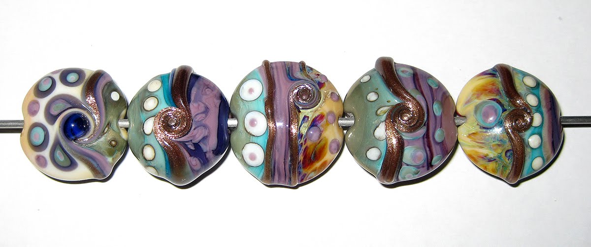
Here are some fun beads made with Desert Pink. As usual, I've so completely camouflaged the base colour (Desert Pink) that you can't really identify it. But it's there, and without it, these beads just wouldn't be the same.


May 21, 2010

Test Results :: Mud Slide

1 - Plain, 2 - Reduced, 3 - w/ Silver Leaf, 4 - w/ Silver Leaf (reduced & encased), 5- w/ TerraNova2 Frit, 6- w/ Silver Glass 'reduction' frit blend (Gaia, Kronos, Triton, Aion, Black Nebula, Elektra), 7 - w/ Copper Green, 8 - w/ Tuxedo, 9 - w/ Opal Yellow, 10 - w/ Ivory, 11 - w/ White

General Impressions
Effetre Mud Slide is a soft, milky, pinkish brown colour that varies in darkness depending on what it is used with and how much it is struck.  It darkens with silver, and it darkens with repeated striking, whether that strike is in a neutral flame or a reducing one. While this kind of colour shift is very similar to what I experienced with the CiM Tamarind Uniques (#1 and #2), the reactions this glass has with silver are totally different and the glass is of a completely different consistency.

The rods are oddly brittle, and can snap fairly easily when being manhandled. I snapped one in half bundling my rods together with an elastic, and I didn't think I was being all that rough with them. The rod that I snapped was a standard 5mm rod.

This colour is a little shocky when first introduced into the flame, but settles down and is not annoying to work with. The consistency is similar to Ivory or Dark Ivory, and it bubbles and almost foams in a hot flame, but that foaming doesn't seem to affect the finished bead.

Reactions

This silver reaction is really cool, and definitely worth a repeat. In the bead on the left, the silver leaf has sort of webbed out into the bead, and where it is concentrated, there is an interesting blue and gold colouration. Check out how much darker the Mud Slide looks here compared to every other bead I made with it. The silver has to be the factor here.

In the bead on the right, where I reduced and encased the silver, the leaf is really shiny and the bead has developed a fair amount of blue colour that ranges from baby blue to a deeper cobalt colour. Neat! I encased this bead with Effetre 006 Clear. I think encasing lightened the silver reaction up here, or at least prevented it get from getting the Mud Slide as dark as it did in the bead on the left.


Meh. I'm not thrilled with Mud Slide as a base for silver glass, but I did get a little colour out of my TerraNova2.  The bead on the right, with the reduction frit blend, llooks dark and muddy, but is not altogether unattractive.


Mud Slide develops a brown line reaction with Copper Green. This reaction seems to take place in the Copper Green areas of the bead as opposed to the Mud Slide ones.


On top of Tuxedo, the Mud Slide seems to separate a little into lighter and darker versions of itself. Tuxedo has webbed over to the Mud Slide half of the bead in the centre, and the Tuxedo looks a little floaty on top of the Mud Slide. This bead is full of weirdness, isn't it?


There is no obvious reaction between Mud Slide and Opal Yellow or Mud Slide and White.


Mud Slide and Ivory just don't seem to get along at all. The stringer dots and lines of both colours seem to go all frazzled and weird when placed on top of the other colour. The main difference here is that where the Mud Slide seems to want to collapse in on itself, focusing a dark line in the centre and feathering around the edges when placed on top of Ivory, Ivory on top of Mud Slide seems to do the reverse, getting almost a clear line through the centre and spreading out and going all chalky and wispy. I've been struggling trying to dream up a scenario where I would want this look on a bead.  Can you think of one?

Here are some fun beads with Mud Slide:


May 15, 2010

Test Results :: Elphaba Unique #2

1 - Plain, 2 - Plain (reduced), 3 - w/ Silver leaf, 4 - w/ Silver leaf (reduced & encased), 5 - w/ TerraNova2 frit, 6 - w/ Silver glass frit (reduced) [Gaia, Kronos, Elektra, Aion, Black Nebula, Triton], 7 - w/ Copper Green, 8 - w/ Tuxedo, 9 - w/ Opal Yellow, 10 - w/ Ivory, 11 - w/ White

General Impressions
CiM Elphaba Unique #2 is a gorgeous, green opaque with a blue tint. It's been pretty sought-after since Frantz ran out of it sometime last year, but I was lucky enough to come across some at Nortel Manufacturing in Ontario when I was there on non-glass-related business last July. If you ever have a chance to visit Nortel, DO IT! Although there's probably not much chance that any of this colour is still kicking around, it's awesome to go in and see the torches be born, and they've got lots of great glass and tools.

Elphaba Unique #2 is a relatively stiff opaque colour, and the consistency of it is really nice to work with. It's got the same consistency as Mermaid, Lipstick, Thai Orchid and many of the other CiM Colours - stiff and pasty and a dream to work with. Also like many of the other CiM opaques, Elphaba Unique #2 is streaky.  I wish that it was a regular colour... the regular Elphaba doesn't appeal to me nearly so much.


This picture doesn't have any Elphaba Unique #2 in it. The bead on the left is Mermaid and Copper Green, and the bead on the right is Petroleum Green and Mermaid. The reason I am showing it here is to illustrate how much richer of a green Elphaba Unique #2 is when compared to Petroleum Green, and how much greener than Mermaid the Elphaba Unique #2 is.

Reduction
Reducing Elphaba #2 on its own has no discernible effect on the colour. (Bead #2)

Reactions

Silver pretty much just sits on top of this colour and shines. In the bead on the left, it's broken up into many tiny dots. In the bead on the right, the silver has been reduced and then encased and has formed itself into a shiny, smooth blanket that is somewhat reflective.  The edges of the silver are blue-ish.

It's interesting to me how silver can SEEM to break up and scatter on the surface when you melt it in, but then once you reduce it and/or encase it, it's obvious that it was right there all along, and not really dispersed at all.


Elphaba Unique #2 isn't a fabulous base for silver glass, but it's not awful, either. I overstruck the bead on the left a little, but I got some decent blues and purples out of the TerraNova2 frit on top of it, and the way the silver glass frit blend yellowed the Elphaba Unique #2 is sort of interesting.


Elphaba Unique #2 dots and lines on top of Copper Green end up looking as though they are recessed into the bead.  Copper Green spreads on top of Elphaba Unique #2 since the Elphaba Unique is a denser colour.


When used with Tuxedo, Elphaba Unique #2 gets swallowed. This bead was half Tuxedo and half Elphaba Unique #2, but the Tuxedo bled right into the Elphaba Unique #2, and you can barely even see that the right half of the bead started out green. The Elphaba Unique #2, on top of the Tuxedo, has separated into two different greens with the inside of the dots and lines being darker than the edges.


Elphaba Unique #2 lines on top of Opal Yellow develop a thin, dark green line in the middle. The Opal Yellow really struck to a strong yellow when used with Elphaba Unique #2, and the lines and dots of Opal Yellow have an interesting mottled look to them.


Ivory goes a little feathery overtop of the Elphaba Unique #2, and Elphaba Unique #2 bleeds into Ivory a little. This probably isn't the best combination for fine stringerwork.


White spreads on top of Elphaba Unique #2, and you can see a faint green halo around the Elphaba Unique #2 dots and lines on top of White where it has bled pretty evenly and diffusely into the white as the super-soft White swallowed it a little.

Here are some fun beads with Elphaba Unique #2.