
CiM Cleopatra is a very dark and dense transparent purple. It's so saturated that in order to see any colour in it at all, you need to use it in very thin layers over much lighter colours. Like most transparent colours, its apparent colour is very sensitive to the colour that is placed underneath it. For instance, as you can see in the the photos, it makes a very big difference to the resulting colour whether I've put it over Opal Yellow, Ivory, or Peace.
While I tested CiM Cleopatra, I thought about Effetre Dark Violet and my test results with that colour, and the first very significant difference I noted was that Cleopatra is redder than Effetre Dark Violet and more of a true 'purple' shade, at least when it's used over White.

To illustrate this, here are my pictures of Dark Violet and Cleopatra side by side. To see my other Dark Violet test results, follow this link. It is sort of interesting to note that while the colour of Cleopatra differed very greatly depending on what I placed it over, the colour of Dark Violet was less influenced by the base colour under it. I have no idea why, but I love glass and its mysteries.


Silver on top of Cleopatra is a very different set of reactions from what I got with Effetre Dark Violet, so the glasses are of very different composition. On top of Effetre Dark Violet, silver dissipates and beads up. On top of Cleopatra, it crusts up more like it does on top of Ivory. The appearance of the reaction is also different when reduced and encased, in that with Cleopatra it takes on a more cloudy, lighter appearance.
I am using a slightly different reducing silver glass blend now than I was last year when I tested Dark Violet, but the blend is still pretty similar and contains many of the same silver glass colours. While I like what it did on top of Dark Violet, I really love the vibrant blues that came out on top of Cleopatra.

When used on top of Cleopatra, Opal Yellow, Peace, and Ivory all separate slightly and look three-dimensional.
The two tests here where the results are dramatically different from Dark Violet were with Copper Green and Opal Yellow. Specifically, Copper Green separates more dramatically on top of Cleopatra than on top of Dark Violet and Opal Yellow tolerates being topped with Cleopatra much better than it did with Dark Violet. The Opal Yellow stayed yellow and the Cleopatra stayed together.
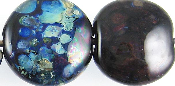
Here are some fun beads with Cleopatra:


