
1 - Plain, 2 - Plain (reduced), 3 - w/ Silver Leaf, 4 - w/ Silver Leaf (reduce d& encased), 5 - w/ TerraNova2 Frit, 6 - w/ Silver Glass Frit (reduced), 7 - w/ Tuxedo, 8 - w/ Copper Green, 9 - w/ Opal Yellow, 10 - w/ Ivory, 11 - w/ Peace
CiM Cornflower is a rich, vibrant medium blue colour, and quite a bright colour so of course I went into the testing thinking that we weren't going to get along at all. As it turns out, I have a lot of respect for this colour, and as long as I use it in an organic way, the massive brightness of it can't touch me.
On Ming and Cornflower
People have reported that Ming and Cornflower are very similar, and you will see that feedback when you go to the CiM page for Cornflower. However, my experience is that these colours are not the same at all. The only thing they really have in common is that they are both a bright, medium blue.
If you look at my test results for CiM Ming, you will see that in terms of how the two glasses react with other colours, they are very different in every single test that I performed.
Personally, I like them both. I'd be sad if CiM decided to stop making one of them because other people thought they were too similar.
Onwards
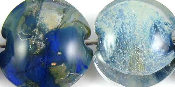
On top of Cornflower, Silver Leaf sinks in and makes the Cornflower greener, resulting in a mottled surface that in places looks more akin to Lauscha Steel Blue, in other places has a greenish gold silver haze over top of it, and then, where not much silver stuck to the bead, Cornflower being itself. This reaction is awesome! And then, when you reduce and encase the silver, you get this odd cloudy spray of silver whiteness between the Cornflower and the Clear. The Cornflower here looks more like a navy blue underneath all of the action.

I didn't get much in the way of colour out of my TerraNova2 frit, but as we all know, that's sometimes my own stupid fault. What's interesting about this bead is the light blue halo that's sprung up around the fritty bits. In the bead on the right, I got awesome colour and shine out of my reduced silver glass frit, and love the way reducing the silver glass frit fumed the Cornflower at the ends of the beads to a more navy/greenish hue.

When Cornflower is used over Tuxedo, it develops a shiny outline around dots and stringer lines. When Tuxedo is used over Cornflower, the Cornflower curdles a little and sends a light blue halo up to surround the Tuxedo stringerwork.

There isn't much in the way of a reaction between Cornflower and Copper Green, but the Copper Green on top of Cornflower looks decidedly redder than the Copper Green on the left-hand side of the bead. Also, Copper Green develops its muddy patina when you use it with Cornflower.

There is not much reaction between Cornflower and Opal Yellow. Maybe just the smallest amount of bleeding into the Opal Yellow from the Cornflower and a slight thinning around the edges of the Opal Yellow stringer work on top of the Cornflower.

On top of Ivory, Cornflower looks a little floaty, like it is sitting on top of an invisible, ultra-thin layer of clear glass and separating slightly so that it has a somewhat lighter blue outline to all of the stringer lines and dots. On top of Cornflower, Ivory dots and lines thin out a bit at the edges and take on some of the blue hue from the Cornflower.
Cornflower bleeds into Peace in a gentle way, turning the Peace a light-blue colour in subtle patches. On top of Cornflower, Peace looks somewhat translucent, letting the blue of the Cornflower seep through.
Here is a fun bead with Cornflower.

What a beautiful blue! I thinks I needs me some cornflower!
ReplyDeleteI know, right? It is always interesting when a colour I think I will not like jumps out and smacks me awake. I think I need some more too.
ReplyDelete