Search This Blog

August 28, 2015

Test Results :: Mosaic Blue

1 - Plain, 2 - Plain (reduced), 3 - w/ Silver Leaf, 4 - w/ Silver Leaf (reduced & encased), 5 - w/ Silver Glass Frit (reduced), 6 - w/ TerraNova2 Frit, 7 & 8 - w/ Tuxedo, Copper Green, Opal Yellow, Ivory, and Peace

Effetre Mosaic Blue is an extremely dense medium blue colour that looks darker and darker, the thicker it is layered. Unlike its friend Mosaic Green, this colour is not terribly reactive, and does not spread or web at all when used on top of other colours. I found this a bit disappointing on a mental level, since I wanted there to be something similar about two colours with such similar names.

This colour is very stiff, and very dense. It's not a great colour for overdotting flower petals (at least I don't think so) in encased florals because the result doesn't have a lot of depth because not much light gets through the Mosaic Blue.

Where this colour really shines is when it is used with silver. You can see here that both of my silver leaf beads are interesting-looking. The bead on the left has a greyish silver film over it that is made up of hundreds of little microdots of silver. The bead on the right was reduced and encased, and the silver has gone bluish where it touches the Mosaic Blue, and silvery and shiny where it does not. Pretty!


Mosaic Blue is also a good base colour for silver glasses. It doesn't compete with them, and the reduction colours and striking colours do well on top of it.


And weirdly, there is not a single thing to say about these beads. Usually there is a lot of action here, but I can't detect a single reaction between any of these colour combinations apart from (maybe) a little bleeding of Mosaic Blue into Peace, and a gentle separation of Peace over Mosaic Blue. These are pretty typical reactions for Peace, and not in any way unique to, or spectacular with, this colour.

Here are two sets using Mosaic Blue (I didn't bother making a goddess bead, since it would have just been an almost-black bead because this colour is so dense). One is with Antique Green, and the other is with Ivory.


August 22, 2015

Test Results :: Fremen

 
1 - Plain, 2 - Plain (reduced), 3 - w/ Silver Leaf, 4 - w/ Silver Leaf (reduced & encased), 5 - w/ Reducing Silver Glass Frit, 6 - w/ TerraNova2 Frit, 7 & 8 - w/ Peace, Ivory, Opal Yellow, Copper Green, and Tuxedo

CiM Fremen is a brilliant sky blue opaque colour that is brighter and happier than Effetre Dark Sky Blue, and bluer than Effetre turquoise. I find the colour of Fremen sort of overwhelmingly bright on its own (like the startlingly blue eyes of the Fremen people in the book "Dune" by Frank Herbert!), but love it when it is combined with other colours.


Here you can see that Fremen turns brick red when you reduce it. This is a common characteristic of colours that contain a lot of copper.


On top of Fremen, silver gets a greyish/beigeish look to it which is lacy and shows up fairly solidly against the base colour. If you reduce and encase this reaction, most of the interesting variation is lost and for some reason, the silver turns a strange ochre yellow colour.


Here you can see that Fremen is 'meh' with silver glass.


On top of Peace, Fremen looks almost fluorescent, it is so bright. I'm not sure why this is, but it is a very dramatic difference from how Fremen looks on top of other colours. It also seems to bleed into the Peace a bit, which you can see on both beads. The Peace lines on top of Fremen look almost light blue rather than white, and separate slightly.

As you might expect, Fremen and Ivory have a reciprocal dark line reaction. This reaction is sort of spready, and the more you heat these two colours together, the bigger, messier, and more pronounced it gets.

I didn't get much of a reaction when I used Fremen on top of Opal Yellow, but my Opal Yellow struck a pretty pink colour in a number of places where I used it on top of Fremen. It could just be that it was a particularly pinkish Opal Yellow, but I try not to use my nice pink Opal Yellow when I make test beads, so it could also be Fremen-related.

Copper Green and Fremen both separate when used together, with the reaction being visible in the colour that is used on top. I'm not sure how useful this knowledge is since in my opinion these colours don't look all that nice together, but you may feel differently.

Fremen separates on top of Tuxedo. Tuxedo looks more or less inert, whether Fremen is on top of it or underneath it.

This goddess bead was made with Fremen and one my 104 CoE frit blends, Ode to Blues.


All of these beads have Fremen in them. The first two sets are Spanish Leather + Ivory + Fremen.


These ones are Tuxedo with a design using wigwag cane that included Fremen.

And these also have Fremen in them, combined with a couple of other colours.

August 13, 2015

Test Results :: Iris Orange (Raku)

1 & 2 - w/ Tuxedo, Copper Green, Opal Yellow, Ivory, and Peace, 3 - w/ Clear dots, 4 - Plain (reduced), 5 - Plain

No one calls this colour "Iris Orange", to the best of my knowledge, in spite of that being the actual colour name that Reichenbach gave RL6208 when it was born. Instead, we all call it Raku, which is shorter and more meaningful since there's nothing particularly orange about this colour and the colours we get from it remind us of raku pottery. I think that you have to be either pretty loved or despised (or both at the same time!) as a colour to get a nickname like 'Raku' or 'Evil Devitrifying Purple', and I know that there are probably as many people who loathe this colour as there are those who love it.

That's for good reason. I find Raku sort of hard to work with when I am struggling with it to get those brilliant colours. I am consistently unsuccessful at striking it and never get the beautiful pinks, purples, and blues to stick in it that I see some of the people who are really handy with it getting. However, even if you can't yet get the brilliant colours out of Raku, I still think it's pretty lovable for its reactions and for the more subtle colour changes you can achieve without a lot of effort.


In the bead on the right, you can see what I usually get from Raku when I try to strike it in small beads. Some blues, maybe some greens.  If I reduce the Raku (the leftmost bead), I can get some brighter blues and some shiny pinkish brown. Neither of these are what I really want when I start the bead, but they are both sort of awesome in their own right.


Something else that is sort of awesome about Raku is that you can trap its colours under an encasement layer, and even if you mismanage it the way I did here, you can still get some nice pastels in dots or flower petals under Clear.


Tuxedo does not do much on top of Raku, but if you look on the bead on the right you can see that Raku struck more readily on top of some colours than others.  On top of Tuxedo, I got gentler blues and greens and the brownness of the Raku migrated into the centre of my stringerwork dots and lines.

On top of Raku, Copper Green separated and dark turquoise coalesced in the centre of my dots and stringer lines, and a  crusty pinkish effect took over its edges.  When I used Raku on top of Copper Green, it spread out quite a bit, and got a mottled, 3-dimensional look. It also made the Copper Green quite dark and rich-looking in between the spready Raku bits.

On top of Opal Yellow, I got a gentle strike from the Raku, but a strange, lingering brownish effect that almost looks like a shadow underlaying that colour change.  You can also see that the Opal Yellow has risen up around the Raku in halos, for an extra border around the Raku stringerwork. Opal Yellow on top of Raku separates and intensifies in colour quite dramatically.

Both when used over and under Raku, Ivory turns brown, almost black. It also curdles and separates in a dark and murky way. The interesting thing for me here is that after Ivory has finished being all moody because the Raku is spreading around on top of it, it seems to facilitate a really nice colour change in the Raku. On top of Ivory, I got a wider range of colour than I got over any other of the base colours I tried.

The reaction between Raku and Peace is very similar in appearance to what happens with Opal Yellow. Behaviour specific to Peace is that it appears to change from white to look greenish yellow on top of Raku and yellowish when used underneath it, probably from the silver in the Raku fuming it.

My favourite way to use Raku is as a border for my mushroom beads. I love how dark I can get the brown to stay in its pre-striking stage, and then how some traces of rainbow show up in it no matter what I do.  Here are some examples of that.


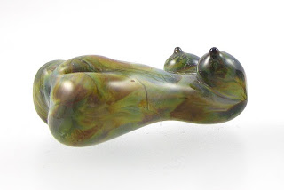
And here are some Raku goddesses. These are 100% Raku, and I have overstruck it, but I like the organic streakiness and the earthy pastels I got from it a lot.