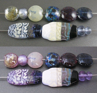
Effetre Dark Lavender (EFF081) is only slightly "darker" than its close cousin Pale Lavender. Because it is a colour-changer like many other lavender glass colours, it can look either blue-ish or pink-ish depending on the light. This means that depending on the kind of light bulbs you have at your torch and in your photography setup, your pictures can end up looking quite different from the finished beads, and the colour of this glass might look quite different while you're working it.
Here's what happens when I turn off my photo lights. Neat colour-shiftiness, right? Now go ahead and imagine the other pictures in both lights, because I am not doing this for all of them. The rest of the pictures are all either blow-ups from the main set photo or were taken under the same lights as the main set photo.
Here you can see that reducing Dark Lavender (right bead) doesn't change the colour. You can also see that I got a little bubbly scum in this colour while I was using it. This is just an unfortunate bead because on the whole I find this colour nice to work with and bubble-free.
Here is Dark Lavender with some of the other, similar colours that are available. It is noticeably (in this light) bluer than the new CiM Enchanted. I've pictured it here with CiM Pink Champagne, CiM Enchanted, Effetre Rosata Extralux, Effetre Pale Amethyst, and Effetre Pale Lavender Blue.
Silver Leaf on top of Dark Lavender turns golden in colour. I was hoping that I'd get pretty gold in my silver foil bead (centre) as well when I encased it with Dark Lavender, but I didn't so much get that. There is a faint yellowish hint here and there, but the silver foil mostly stayed silver under Dark Lavender. In the bead where I reduced and encased the silver leaf, the silver shows up as a whiteish layer under the clear that is fumed faintly blue at its edges.
Here you can see that Dark Lavender makes an average base colour for silver glass. My silver glass frit stringer test was a bit of a bust. There's some pretty wispiness in the bead, but it's pretty sparse.
On top of White and Ivory, you can really see how pale this Dark Lavender is.
The only one of these colours that it acted funny with is Copper Green. Copper Green on top of Dark Lavender separates and turns reddish at its edges. I am at a loss to explain what happened in the Dark Lavender though... I had to double-check to make sure I hadn't somehow polluted this picture by somehow conflating the different light-type photos in my editing software. I don't have the faintest clue why the Dark Lavender has gotten veiny and pinkish in patches both over and around the Copper Green, but I like it!
Here are some little earring pairs made with Dark Lavender.


I love the changing light feature you have on the photograph - it really illustrates the colour changing properties - I also prefer them more pink and if anyone had asked previously I would definitely have said blue. Thanks for all the hard work. Clear information as ever. x
ReplyDelete:D Thank you!
ReplyDelete