Search This Blog

July 11, 2012

Test Results :: Light Ivory (Effetre)

1 - Plain, 2 - Plain (reduced), 3 - w/ Silver Leaf, 4 - w/ Silver Leaf (reduced & encased), 5 - w/ Silver Glass Frit (reduced), 6 - w/ TerraNova2 Frit, 7 - w/ Raku, 8 & 9 - w/ Tuxedo, Copper Green, Opal Yellow, Ivory & Peace, 10 - w/ Gaia Stringer (reduced)

Effetre Light Ivory is a pale, neutral opaque colour that is very soft and somewhat 'grainy' in consistency. It has a tendency to curdle and spread, although some batches of it are less prone to do this than others.

When I first started lampworking, I had a batch of Light Ivory that was great for making flower petals. If you look back at my test results for Light Brown Transparent, you will see an example of a flower there that I made with Ivory and Light Brown. My most recent batch of Ivory wouldn't do this as well because it likes to feather and spread on top of transparent colours.


Ivory, as you can see, is very reactive with silver. Silver spreads out on top of Ivory, and the reaction takes over a great deal of the bead. The reaction is in places bluish, and in others yellowish and in still others just dark or light grey. It's neat though, and reducing and encasing it doesn't change it much.


Silver glass is nice on top of Ivory. I particularly like reducing silver glass on Ivory... I don't usually have a lot of luck with the striking silver glass colours on top of it, but I did get some colour in my TerraNova2 frit and I like how each bit of frit has developed its own discrete outline.


On top of Tuxedo, Ivory sort of 'flees to the middle' of itself, leaving the outside part of the dots and stringer lines looking oddly faded and three-dimensional. When I used Tuxedo on top of Ivory, there is a hint of bleed around the Tuxedo dots and stringer lines.

Ivory and Copper Green develop a mutual dark line reaction. Also, the outline is irregular, particularly where Copper Green is on top of Ivory, and has little spiky bits poking out of it.

On top of Opal Yellow, Ivory develops a greyish outline. When Opal Yellow is used on top of Ivory, the outline is more pronounced, looking like sharp crevices around the Opal Yellow dots and stringer lines. In both cases, the Opal Yellow wherever it surrounds the Ivory seems to take on a slightly greyish hue.

There's not much to report in terms of reactions between Ivory and Peace. There's some separation, I think, but it's hard to tell because it's hard to see, even with the bead right in front of me.

July 7, 2012

Test Results :: Cardamom

1 - Plain, 2 - Plain (reduced), 3 - w/ Silver Leaf, 4 - w/ Silver Leaf (reduced & encased), 5 - w/ Silver Glass Frit (reduced), 6 - w/ TerraNova2 Frit, 7 & 8 - w/ Tuxedo, Copper Green, Opal Yellow, Ivory & Peace

CiM Cardamom is a medium yellowish green colour. It has a fairly even consistency, with only a little bit of streakiness and is a great addition to our 104 palette. It's darker and greener than Effetre Uranium Yellow, and is much lighter and more gentle than CiM Elphaba. I haven't tested the Effetre/Vetrofond green opaques yet but I am pretty certain you won't find a duplicate there, either.


When silver leaf is melted into the surface of Cardamom, it just looks sort of grey and patchy. When the silver is reduced and encased, it forms a shiny silvery blanket over top of the Cardamom. However, I used Effetre clear in the bead on the right and just like what happened with my Coconut Milk test bead, there are crazy, curly cracks running all through this bead that appeared a day or two after it was annealed.

The strange thing about this is that I made a pretty large bead that had a core of Cardamom and then was encased three separate times, with three separate colours, and that bead has no evidence of malfunction whatsoever. This adds weight to my theory that it's my most recent batch of Effetre 006 clear that is the culprit here. I've shown the large, encased focal at the end of this post with a list of the other colours I encased the Cardamom with.


The reducing silver glass looks sort of pretty on top of Cardamom, but didn't get the super shine or do anything particularly noteworthy. The TerraNova2 frit fails to impress on top of this colour.

But that's ok, Cardamom is so appealing of a colour, being boring with silver doesn't really change how I feel about it.


Cardamom makes Tuxedo bleed. You can see in the bead on the left how the Tuxedo has greyed out the stringer lines of Cardamom that I made on top of it. In the bead on the right, the Tuxedo lines and dots are surrounded by a greyish haze.

Copper Green also bleeds into Cardamom a little when Cardamom dots and lines are made on top of it, however this reaction is not as evident when Copper Green is used on top of Cardamom.

The reaction with Opal Yellow is the weirdest one. In both of the beads aboce, Opal Yellow has developed a light line wherever Cardamom touches it. In the bead on the right, you can see a faint ivoryish line around the Cardamom dots and stringer lines, and in the bead on the right the Opal Yellow (which looks very yellow) is surrounded by a paler yellow border.

There are no real reactions to note between Cardamom and Ivory and Cardamom and Peace.

This bead has Cardamom in the vine cane, and I also used Cardamom in the core of this bead. I encased the Cardamom core with Vetrofond Light Aqua, followed by a layer of CiM Mint Lozenge and then finally, a thin layer of Uroboros 104 COE Clear.

July 3, 2012

Test Results :: Uranium Yellow

1 - Plain, 2 - Plain (reduced), 3 - w/ Silver Leaf, 4 - w/ Silver Leaf (reduced & encased), 5 - w/ Silver Glass Frit (reduced), 6 - w/ TerraNova2 Frit, 7 & 8 - w/ Tuxedo, Copper Green, Opal Yellow, Ivory & Peace

Effetre Uranium Yellow is a soft, yellowish green opaque. There's also, just to confuse things, another Uranium Yellow in the Effetre line, however that one is transparent and I haven't tested it yet.

This is a very soft colour that has a tendency to spread on top of other colours, and it is moderately reactive. Uranium Yellow has a very even consistency, and is not streaky.


When used with silver, Uranium Yellow loses its green-ness and looks very yellow. In the bead on the right, the silver leaf on top of Uranium Yellow is a cloudy pinkish brown colour. In the bead on the right, where I reduced and encased the silver, most of the brown colour has disappeared but the silver still looks faintly pink through the Clear. Neither of these reactions is all that attractive to me.


On top of Uranium Yellow, my reducing silver glass frit looks a little washed out and sad, and it has fumed the base bead to a lemony yellow colour. In the bead on the right, my TerraNova2 frit has developed some nice colour. My tentative position on Uranium Yellow is that it is a nicer base for striking silver glass than it is for the reducing colours.


On top of Tuxedo, Uranium Yellow separates and thins out at the edges, looking slightly translucent. In the bead on the right, you can see that the edges of the Tuxedo stringer dots and lines are faintly hazy and there has been a little bit of bleeding.

When Uranium Yellow is used on top of Copper Green, you can see some evidence of a bright turquoise bleeding into the stringer dots and lines, however this reaction is not evident at all when Copper Green is used on top of Uranium Yellow.

When Uranium Yellow is used on top of Opal Yellow, the Opal Yellow underneath blushes a pinkish orange colour, however this reaction is not evident when the colour positions are reversed, because in the bead on the right Opal Yellow looks just about as yellow as I've ever seen it.

There are no real reactions to note between Uranium Yellow and Ivory or Uranium Yellow and Peace.

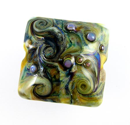
Here's a fun organic bead with a base of Uranium Yellow.