Search This Blog

December 18, 2012

Test Results :: Fostoria

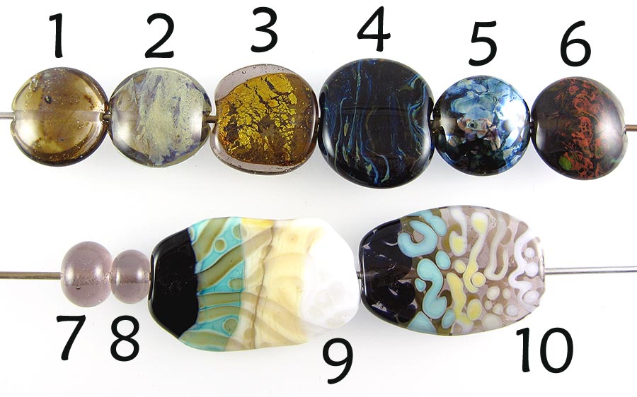
1 - w/ Silver Leaf, 2 - w/ Silver Leaf (reduced & encased), 3 - Over Silver Foil, 4 - w/ Silver Glass Frit Stringer (encased), 5 - w/ Silver Glass Frit (reduced), 6 - w/ TerraNova2 Frit, 7 - Plain, 8 - Plain (reduced), 9 & 10 - w/ Tuxedo, Copper Green, Opal Yellow, Ivory and Peace

CiM Fostoria is a pale pinkish, purplish neutral colour. Whenever there is a new colour in this range, I always hope that it will be like Sepia Unique #1, but this one wasn't. It's a pretty colour in its own right though, and nice to work with. This colour will boil, if you aren't careful, but I was working pretty hot and had to more or less park the rod in the hottest part of the flame to make it happen.


Silver turns Fostoria a yellowish brown. This is most visible in the bead on the left, where I used Silver Leaf over Fostoria. In the centre bead, I reduced and encased the silver which has resulted in an interesting, blue and purple-tinged silver coating under the clear. In the bead on the right, I encased a couple of layers of silver foil, and it turned golden.


I didn't get the results I wanted, but I did get some appealing streakiness in the bead on the left, where I used frit stringer made from Fostoria and my random Double Helix frit blend over Fostoria and then encased the bead in clear. If you look back at my results for Mojito, Pale Green Apple and Straw Yellow you'll see what I was wanting to happen. This bead ended up quite a bit too dark.

However, my reducing silver glass frit looks gorgeous over this colour, and I think my TerraNova2 frit would have too, if only I had not accidentally reduced the bead. It doesn't show up well in the picture, but the colour developed fairly well except for the mess I made.


When Fostoria is used on top of Opal Yellow and Copper Green, a lighter outline forms around the dots/stringer lines. I'm not sure how useful this information is, because, as you can see, Fostoria doesn't exactly look beautiful on top of these colours. I am probably just not using my imagination.

Opal Yellow has a sort of mottled appearance on top of Fostoria, alternating between pale, almost Ivory and brighter yellow.

Peace, Ivory, Opal Yellow and Copper Green all seem to separate slightly on top of Forstoria, resulting in a faint inner outline.

I already showed this bead with my Vanilla Latte test results, but I used Fostoria to encase the base bead prior to adding the decoration, so I'm showing it again. If you had enough of this one last week, don't look :P

December 11, 2012

Test Results :: Vanilla Latte

1 - Plain, 2 - Plain (reduced), 3 - w/ Silver Leaf, 4 - w/ Silver Leaf (reduced & encased), 5 - w/ Silver Glass Frit (reduced), 6 - w/ TerraNova2 Frit, 7 & 8 - w/ Tuxedo, Copper Green, Opal Yellow, Ivory and Peace

CiM Vanilla Latte is just a beautiful colour of tan, that falls somewhere hue-wise between the beautiful pale of Butter Pecan and the rich terracotta of Adobe. The glass is creamy and wonderful to use, and just loves silver. Vanilla Latte is the first CiM colour that I have used where I have observed any curdling effect. I have so many more things I want to try with this colour, but will have to wait until it is for sale in January like everyone else before I can get any more.

This is a colour that will be gorgeous as a base colour for organics. It is nice to use for sculptural work, but like a lot of other CiM colours, you can see streaky joining rings wherever new glass is added to old, so you'll need to keep that in mind.


For those of us who like making organic beads, the bead on the left shows how beautiful Vanilla Latte is with silver. The silver leaf I used has turned sort of golden on top of the Vanilla Latte, has spread out, looks a little wispy in places, and has fumed the Vanilla Latte to a golden brown sort of randomly. When the silver leaf is reduced and encased, it develops a shiny silver coating that is heavily tinged with both blue and pink under the clear.


The bead on the left, with my reducing silver glass frit, got so shiny that it was extremely difficult to photograph. And I got beautiful colour out of my TerraNova frit, considering that I didn't even strike it properly. I think I must have had a little less oxygen in my flame than I needed because there are some red reduction streaks visible in the fritty bits.


The most interesting reaction here is the one that occurred between Tuxedo and Vanilla Latte in the bead on the right. The Vanilla Latte has risen up in halos around the Tuxedo, and in places that halos are ringed with an extra outline of black that must have migrated from the Tuxedo.

Copper Green likes Vanilla Latte, and the two colours develop a very faint dark line reaction, but the big takeaway here is that using these two colours together keeps Copper Green looking pretty and turquoisey instead of greyish green.

Copper Green, Opal Yellow, Ivory and Peace all spread on top of Vanilla Latte, making the stringer dots and lines quite a bit wider than I thought they were when I put them on. When Vanilla Latte is used on top of those colours, it seems to sink very slightly into the surface, resulting in thinner lines and smaller dots than I actually applied to the bead.

Finally, in the bead on the right, not only did the Opal Yellow spread out, but it has also gone all strangely mottled, with darker yellow in the centre of the stringer dots and lines and paleness towards the outer edge. It hasn't really separated, but it looks pretty neat.

Here are some fun beads with Vanilla Latte. You can see evidence of the colour curdling if you click on the goddess picture to see a bigger version of it and check out her belly.

December 5, 2012

Test Results :: Bonnie Blue

1 - Plain, 2 - Plain (reduced), 3 - w/ Silver Leaf, 4 - w/ Silver Leaf (reduced & encased), 5 - w/ Silver Glass Frit (reduced), 6 - w/ TerraNova2 Frit, 7 & 8 - w/ Tuxedo, Copper Green, Opal Yellow, Ivory and Peace

I have deep love for this colour... the kind of love that drives people to hoard glass. Unfortunately, I talked myself out of participating in Frantz Art Glass' Black Friday sale, so I don't have a whole lot of it, and if you all agree with me that this is possibly the nicest blue glass ever, I will miss my chance to get more.  This colour really shines on its own, and is also really nice in a base bead, under clear where it won't react with anything. It is also weirdly compelling on top of Opal Yellow.

Effetre Bonnie Blue seems to be a light blue opaque layered with two different colours of blue transparent - one on the teal side, and the other more aqua. Whatever they did at the factory, the result is a magical, streaky and beautiful.


When you reduce Bonnie Blue, it develops a patchy reddish reduction coating. I won't ever do this on purpose again, but if you have a use for this effect it's nice to know how to make it happen.


When silver leaf is melted into the surface of Bonnie Blue, a couple of strange things happen. First, the silver turns sort of yellow in places. Second, where it is darker, almost a dark grey, the silver has beaded up on the surface slightly. When the silver is reduced and encased, no good comes of it - it's yellow and brown and really sort of gross-looking.


Bonnie Blue also isn't a big winner with silver glass. My reducing silver glass frit sort of turned brown in places, and while I got some decent shine out of it the blues of the silver glass frit don't really bring out the beauty of the base colour. My TerraNova2 frit didn't really develop nice colour on top of Bonnie Blue and looks sort of sad and brown in places.


In terms of colour reactions, there are some interesting things to report.

On top of Tuxedo, the edges of my Bonnie Blue seem to have curdled slightly, and the streakiness of the Bonnie Blue is really evident. Nothing so interesting happens when things are turned upside down and it is Tuxedo on top of Bonnie Blue.

Bonnie Blue causes Copper Green to separate when Copper Green is used on top of it, and when Bonnie Blue is used on top of Copper Green it helps Copper Green to looks pretty and turquoise and not develop that greyish sheen it seems to like having when used by itself or with other colours.

I am oddly attracted to what happens to Bonnie Blue on top of Opal Yellow - the streakiness of it is accentuated and the stringer lines and dots look almost weirdly rippled on top of Opal Yellow in the bead on the left. When Opal Yellow is used on top of Bonnie Blue, it just looks like Opal Yellow.

Bonnie Blue and Ivory have a reciprocal dark line reaction, which because of the streakiness and semi-transparency of the Bonnie Blue in places is echoed all through the stringer lines and dots in my test bead where I used it on top of Ivory. This reaction is fairly strong - even in the bead on the right you can see that the Ivory has a dark line around it but is also pretty thoroughly shaded and discoloured on the inside of the stringerwork.

Peace and Bonnie Blue co-exist without doing anything noteworthy.

Here are some fun beads made with this colour. I used Bonnie Blue in the base of the mushroom bead.


And here is a really bad picture of the goddess bead I made with Bonnie Blue. I'm posting it only because I'm too lazy to try to take another picture, and so that you can see how pretty the colour looks when used in a sculptural piece. Please excuse the lint.