Search This Blog

February 22, 2010

Winter Colour Diet - Session 15

This past weekend, I had a BREAKTHROUGH.  I'm so excited, my brain is racing a mile a minute, and I can hardly wait to get back to the torch on Saturday to do it again.

I made small beads, and I made sets -- and I made sets with small beads. Whoah. This may seem really silly to people who are already doing this without any problems at all, but I've been stuck in huge bead world for almost two years, and didn't have a clue how to fix it.

The best part is that I figured out that one of my favourite designs (my plasmablossoms) translates really well to a smaller bead. I also figured out that almost all of the nightmares of using a bead press disappear when you use a 1/16" mandrel. The mandrel fits in the press cavity without any rubbing, and the beads just look... well... nicer. I don't know how I'm going to function all week now that I know this! All I want to do is make more beads, but I have to work instead.

I haven't used my 1/16" mandrels very much because I had a BAD EXPERIENCE the first time I went to Andrighetti Glassworks to torch, before I'd taken my first real class. Joanne has the torches on natural gas and tanked oxy, so they're pretty hot, and my heat control was super-newb. I started making a bead and got the shit scared right out of me when part of my mandrel went down and I realized I'd melted the stupid thing apart. I went back to 3/32" mandrels right away and until now, didn't have a compelling reason to take another look at the suicidal scrawny ones.

More recently, I've learned that no matter how warm it seems like it is out there, the middle of February is still a pretty nasty, chilly time to torch outside in Canada. By the time I finished on Sunday, I was like a giant ice cube, had to take a hot shower just to stop shivering, and still didn't feel completely warm again until hours later when I was snuggled into bed.

Every time I look at these beads, I hear a line from Blackadder III, Episode V play in my head, because they are "tiny, and so wee, that I sometimes think the pixies gave them to me!"

I'm out of random, disconnected things to tell you so I'm going to just move on to the pictures. ("Thank God!", they sigh, "I thought she'd never shut up!")


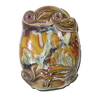
OK, so I didn't make this one on the 1/16" mandrel, but I switched sizes right after I finished it. It's Tamarind Unique #2 with a twistie made from Thüringen Herb, Red Copper Green, Triton and TerraNova2. I think I rolled it in silver foil first, and after it was all shaped and polished and stuff, I did the random SiS swirly thing around the ends.


I did a little dance when I pulled this out of the kiln because it confirmed that I can shrink this design significantly and still preserve all of the things I like about it. This one is Pale Ink Blue encased with Magic, the flowers are Ivory and the surface decoration is Ivory and SiS.


And holy carp, I made a set. It even has more than three beads in it.  I was so pleased with myself on Sunday that I thought I might cry. It's Tamarind Unique #2, with silver foil, silver wire, Copper Green and silver glass frit.

The most hilarious thing about this set is that even when I put all the beads together in a line, the whole thing isn't as long as one of the gargantuan beads I made last weekend all by itself.  lol.


And finally, here are some fun beads, with much less in the way of babble accompanying them.  I need to get some sleep or I won't be able to retain this great mood I'm in.

Tamarind Unique #2, Silver Foil, Silver Glass Frit

Tamarind Unique #2, SiS, Copper Green, Silver Glass Frit

Pale Ink Blue, Magic, Ivory, Clear

Cocoa, Ivory, Copper Green

Test Results :: Zombie

1 - Plain, 2 - Plain - reduced, 3 - w/ Silver foil, 4 - w/ Silver foil - reduced & encased, 5 - w/ Khaos frit, 6 - w/ Silver glass frit (Nyx, Gaia, Elektra) - reduced, 7 - w/ Ivory, 9 - w/ Copper Green, 9 - w/ Tuxedo

CiM Zombie (Formerly Tamarind Unique #2) rods are a sort of greyish tan colour and after looking at the rod colour, I don't think I expected great things from it, but it both surprised and delighted me as I put it through its paces this past weekend. I told you (and sent a general plea out into the universe) when I reviewed Tamarind Unique #1 that I wanted more fun browns to play with.

General Impressions
On its own without any special striking, reduction or the addition of silver, Zombie is not too terribly different from CiM Khaki, although it's a little darker and somewhat denser. But, once you start messing with it, it's colour, behaviour and reactions are much different than the ones Khaki exhibits.

This colour is fabulous with silver and silver glass, the surface colour of it can be manipulated, and even on its own it's a neutral colour that lends itself well to organic designs.  Plus, it's reactive, which is always fun.

Reduction
Reducing Zombie darkens the colour slightly. (Bead #2) 

Reducing it with silver or silver glass blushes the Zombie to a darker chocolate brown colour.  (Bead #6, and other 'fun beads' at the end of this post)

Reactions

For lack of a better way to express it, silver unkhakifies Zombie. It takes the grey out. (Bead #3) The effect is more pronounced right at the edge of the silver where the colour is a dark chocolate brown, but the whole surface of the bead warms up a little with the addition of some silver. 

When you reduce the bead with silver on it, that effect becomes more pronounced, and consumes more of the bead surface. (Bead #4)  Encasing it doesn't change that, either.  .


Now, I completely bungle Khaos frit every time I attempt it, so let's not look at the colours in Bead #5.  Instead, let's look at the way the base colour darkened all over the surface of the bead and then popped up in light halos around all of the little fritty bits.  I will get my TerraNova2 frit in the mail this week, and you can bet I'll be trying this again with a frit that loves me more.  My Khaos frit is pretty nearly gone, never to be replaced.  Grrr.

In Bead #6, my silver glass frit sang on the Zombie. And reducing my silver glass frit darkened the Zombie to a milk chocolate colour. 


The reaction with Copper Green is really subtle. (Bead #8) The Copper Green darkened slightly around the edges where it was placed on top of the Tamarind Unique #2, and the Zombie developed a thin shiny outline in places (but not consistently) where it was placed over Copper Green.


Zombie with Tuxedo is just weird. (Bead #9)  Where the Zombie is over Tuxedo, it develops a seriously shiny light outline.  Where the Tuxedo is over the Zombie, it bleeds, separates and creates purple-blue halos around the black dots, and it webs all over the place, sort of like what happens when you get paper wet that's been written on with black ink.

I'm positive that there are lots of other cool discoveries to make with Zombie.  I'm intrigued!

Here are some other 'fun beads' made with Zombie.


February 21, 2010

Test Results :: Cocoa

1 - Plain, 2 - Plain - reduced, 3 - w/ SiS, 4 - w/ Silver foil, 5 - w/ Silver foil - reduced & encased, 6 - w/ Khaos frit, 7 - w/ Silver glass frit blend (Nyx, Gaia, Elektra) - reduced, 8 - As a floral, 9 - w/ Tuxedo, 10 - w/ Copper Green, 11 - w/ Ivory

Lauscha Cocoa is a dark, chocolate brown as promised by its name.  It doesn't need any special striking or encouragement to do its thing, and it is wonderfully reactive.  

General Impressions
Even though the Cocoa rods I have are pretty thick (9 mm, I think... super thick) the glass melts like butter and even melted ends don't shock as badly as you might expect.  I was working outside (in FEBRUARY) and I had a little popping from melted ends, but that was the extent of the shockiness I experienced.

Cocoa is a relatively soft colour, and on that imaginary scale in my head where Opal Yellow is 1 and Black is 10, I'd put Cocoa at around a 2 or a 3.  Because this colour is so reactive, much more experimentation will be required before I will feel comfortable that I really 'know' it. Some colours go through these tests and either behave in predictable ways or in ways I feel I can explain, but Cocoa is a strange animal.

When I did my tests for CiM Adamantium, I sat down expecting that colour to behave similarly to Cocoa just because it was also dark brown, and I learned that browns are far less predictable than I'd been lead to expect by some of the other colour groups.

Reduction
Reducing Cocoa all by itself (Bead #2) doesn't have any effect on the colour or surface of the bead.

Reactions

In Bead #3, I put some silvered Ivory stringer on top of the Cocoa and melted it in.  There's a dark line in the middle of the stringer, presumably because all of the silver fled into the middle.  

In the bead with the silver foil just melted in, I got a different result from what I was expecting. (Bead #4) I know I shouldn't have expected it to crust up like with Adamantium (I learned that lesson, right?) but I wasn't expecting it to turn almost blue in places the way it did. Neat! 

And in the bead where I reduced the silver foil and encased it with Clear, I got some interesting pale blue colour as well.  (Bead #5)


In Bead #6, Khaos didn't do what I wanted it to do, but at least it looks sort of interesting.  I got a little colour, and it's gone all feathery. The silver glass colours in the silver glass frit blend (Bead #7) did sort of the same thing, webbing over the surface of the Cocoa. And I got great shine out of the frit, unlike the matte, yucky results I got with Pajama Blue and Aqua recently.

I need to do some more experimentation with Cocoa and silver glass, because I think that really cool things are possible here.


Cocoa makes Copper Green behave oddly. (Bead #10)  Both when the Copper Green is on top of the Cocoa and when the Cocoa is on top of the Copper Green, the Copper Green separates into two versions of itself - a light, chalky turquoise and a dark, vivid turquoise with the lighter colour next to the Cocoa.  Awesome.


I'm pretty interested in how it behaved with Ivory, too. (Bead #11) The Ivory on top of the Cocoa just sinks right in, making the line and dots slimmer than they were when I put them on the bead... and the line stayed nice and crisp, too. Cocoa must be even softer than Ivory, and that's pretty soft.  

On top of Ivory, the Cocoa sort of loses its cohesion.  It seems to feather out into the Ivory, and I can't wait to figure out a way to exploit this. Especially since where there are two bits of Cocoa both behaving this way, where the reactions meet, a fine line of pure Ivory pops up to separate it. Again, awesome.

Here are some other beads made with Cocoa:


February 18, 2010

Winter Colour Diet - Session 14

Session 14's first bead was super-long. Ridiculously long, in fact, at 10 cm. I am going to really buckle down this weekend and make a concerted effort to do some smaller work, on smaller mandrels. I'll let you know how that goes.


In spite of its ridiculous size, it's oddly compelling. Especially if you can touch it. The texture and all of the swirls and bumps are fun to play with.  It's a base of Effetre Avocado with silver foil, Triton, Silvered Ivory and Cocoa on the ends.


Next, we have my first experiment with Tamarind Unique #2. I haven't made test beads with this colour yet, but I'm really looking forward to it. The surface colours are Khaos and Copper Green and there is silvered ivory around the ends and in the centre, swirled. The Tamarind Unique #2 struck a little around the silver, and it doesn't look much like the rod colour at all.  


This Khaos experiment wasn't terribly successful in terms of colour, but I rather like the way all the semi-opaque browns it left behind look. This one is a base of Pajama Blue with silver foil, Khaos frit and silvered Ivory.


Aurae , when used over Pale Ink Blue and then reduced, shines with a purply blue iridescence -- the bead is way shinier in person than it is in the picture. There is a little Khaos on the surface, which has a brown, woody look to it. The silvered Ivory swirls are over-dotted with Aqua.


The plasmablossom above is Khaos over Light Brown Transparent, and by george, it struck. The dots are ivory and the goldstone was encased with Clear. 


I think this is my favourite bead out of all of the beads I made last weekend. The base is Lauscha Cocoa rolled in silver foil. I used my frit blend (Gaia, Nyx and Elektra) and a Twistie that I made with Thuringen Herb, Red Copper Green, TerraNova2 and Triton. The stringer decoration and swirls are silvered Ivory (surprise!), and the ends are Cocoa.


Last but not least, the base of this bead is Khaki rolled in Silver Foil and lightly decorated with Khaos and Leaky Pen. The dots are Leaky Pen and the swirled stringer decoration is silvered Ivory.

My colour diet palette will be pretty much the same going into Session 15, although I gave my last three rods of Mermaid away so I've switched Celadon in to replace it.
  • (1) Red Copper Green
  • (3) Cocoa
  • (3) Avocado
  • (5) Tamarind Unique #2
  • (5) Khaki
  • (2) Thüringen Herb
  • (8) Celadon
  • (1) Copper Green
  • (3) Pajama Blue
  • (2) Light Brown Transparent
  • (3) Pale Green Apple
  • (3) Aqua
  • (4) Leaky Pen
  • (1) Pale Ink Blue
This week, I'll probably kill off the last sad, lonely rods of Pale Ink Blue, Red Copper Green and Copper Green. I'm looking forward to that... the testing is sort of taking over and I can't wait to see what Simply Berry, Mystic Pink and Kryptonite can do!

February 17, 2010

Colour Defuglification

Defuglification is a new word I've invented (?) to describe the process of making something that is commonly regarded as ugly into something beautiful. Periodically on LE, a thread will get started where everyone chimes in about the glass colours that they really dislike. I regard this as sort of a challenge... and maintain that even though I don't personally like some of these colours, for the most part they are just really badly misunderstood.

As luck would have it, I have enough on hand of some of this glass to run colour tests with.  I was going to start my painful (but necessary) spring cleaning exercise once my winter colour diet was finished, but I guess I am getting sidetracked, because I've decided that I need to do some defuglification first.

If you're interested in helping us to defuglify these colours, here's a link to the bead exchange on LE where we are going to make that happen... Come join us, if you dare! The deadline for bead submission is May 15th.

For reference, here's a list of the colours that are part of the palette we are restricted to for this bead exchange.  If it isn't on the list, it can't be used.

Allowed Glass Colours
  • EFF Dark Violet
  • REI Iris Violet
  • EFF EDP
  • EFF Pink Opalino
  • EFF Dark Pink Alabastro 
  • EFF Medium Pink Alabastro 
  • EFF Light Pink Alabastro 
  • EFF Powder Pink
  • EFF Tongue Pink
  • VET Fish Pink
  • EFF Cherry Shake
  • VET Italian Marble
  • CiM Gellys Sty
  • EFF Sedona
  • CiM Bordello
  • EFF Striking Red
  • VET Jupiter
  • EFF American Beauty
  • VET Sweet Lime
  • VET Dark Brown Transparent
  • VET Petrified Wood
  • EFF Striking Orange
  • EFF Striking Yellow
  • EFF Acid Yellow
  • VET Pineapple Sparkle
  • VET Yellowjacket
  • VET Yellow Ochre
  • VET Jungle Twilight
  • VET Lichen
  • VET Frog Pond
  • VET Swamp Moss
  • VET Lemongrass
  • EFF Petroleum Green
  • EFF Dark Turquoise
  • EFF Dark Aqua
  • CiM Leaky Pen
  • EFF Blue Aventurine
  • EFF Dark Grey
  • EFF Light Grey
  • EFF Anise White
  • VET Black
  • EFF Fossil (any shade)
  • VET Smoke Rings
  • VET Honey Crunch
  • DHX Pandora
  • DHX TerraNova2 / TerraNova2.1
  • DHX Elektra
  • KUG Copper Ruby
EFF = Effetre, VET = Vetrofond, DHX = Double Helix, REI = Reichenbach, KUG = Kugler, CiM = Creation is Messy

Permitted Staples / Enhancers
  • Silver, Copper, Gold, Palladium (Leaf/Foil/Wire/Whatever)
  • Dichro
  • Aventurine Chunk / Frit / Stringer (Blue, Gold, Green)
  • Clear (any Clear)
I don't have all of these colours, but I'm going to use this as an excuse to work through some of the ones on this list that I do have.  I really wish I had some Fish Pink or some Sweet Lime to play with, but I have plenty of Yellow Ochre, Petrified Wood, Powder Pink, Honey Crunch, Smoke Rings, TerraNova2, Elektra, Lemongrass, Lichen, Frog Pond, Sedona and Dark Turquoise (and more, you can be sure) to keep me busy.  I sincerely hope I don't feel compelled to use them all in the same bead because that really does sound like a nightmare :)

I'll be starting into this gradually, because I need to finish up the commitment I made to myself regarding my winter colour diet, and will be adding the 'ugly colours' gradually as I run out of what I'm currently using.  But, I should be in full swing by mid-March, so look for fugly colour tests beginning sometime over the next few weeks as I start the transition.

If you want to take part, but don't have the right colours in your glass stash, contact me on LE and we'll work out a trade so that you no longer have that problem. 

February 16, 2010

Test Results :: Aqua

1 - Plain, 2 - Plain - reduced, 3 - Over Clear, 4 - w/ Silver foil, 5 - w/ Silver foil, reduced & encased, 6 - w/ Khaos frit, 7 - w/ Silver glass frit (Elektra, Gaia, Nyx) - reduced, 8 - As a floral over Ivory, 9 - w/ Ivory, 10 - w/ Copper Green

The rods are really more of a greenish colour and a little more muted than the beads turned out, but I guess what I got from Reichenbach Aqua (RL4015) is exactly what the OCR website promised me.  Still, a secret part of me pointlessly hoped that the rod colour would indicate the post-annealing colour of the glass.  I'm on a hunt for a pale transparent colour that is somewhere between Effetre Pale Aqua and Effetre Pale Emerald in hue, but no luck so far.

For reference, here's what the rods look like:


General Impressions
The consistency of Aqua is viscous and stiff, and from that perspective, it's a pleasure to use. It doesn't boil easily, although if you park it in a hot part of the flame you can manage it. When it's hot, it has a yellowish/greenish cast to it, but after annealing that goes away and you're left with just aqua. This is a utilitarian colour that has a lot of practical purposes, but it is very similar to Effetre Pale Aqua.  Reichenback Aqua, however, costs twice as much.

The most important thing I learned from testing this colour is that I really need to get a handle on Pale Aqua before I decide whether or not I need this colour.  If Pale Aqua has the same kinds of behaviour with silver as this glass has, I don't need Reichenbach Aqua for anything at all.  If it doesn't, I will need to keep a little on hand just so that I can keep doing what I did in Bead #5.

Colour Density
 

Aqua is just pale enough to be able to encase with it. It's similar to Effetre Pale Aqua in this respect, but it's maybe just a smidgen darker.

You can see just how pale the colour is here, over Ivory. Aqua is too stiff for this application, too - see how all of my ivory petals melted together before the Aqua settled down? I used the same method to make these as I did my flowers in the Light Brown Transparent tests, with depressingly different results.

Reduction
Reducing Aqua by itself had no discernable effect on the colour. (Bead #2)

Reactions
Aqua is interesting with silver, in ways that I didn't expect. I guess I wish now that I had done the tests I was supposed to do with Pale Aqua so that I could compare the results. This is an example of why you're supposed to stick with a plan after you've gone to the trouble to create one.


I did not expect Aqua to change colour when used with silver, but it really seems to.  In bead #4, the silver is just melted in on top but the bead underneath seems to have gotten darker and turned a little green. In Bead #5, where I reduced and then encased the silver, all traces of aqua are gone, the silver looks all cool and ethereal and where the Aqua was (under the silver) is brown. I love glass -- it does such interesting things!


With silver glass, Aqua isn't really a winner for me. The bead with Khaos frit (Bead #6) didn't just fail... it's a disgusting eyesore. And the reduced silver glass frit in Bead #7 doesn't really look nice either. Where is the shine? I guess it's hiding in the same place as the shine that didn't show up with Pajama Blue. Lesson learned.  


There are no noticeable reactions between Aqua and Copper Green or between Aqua and Ivory. Because the Aqua is so stiff, both colours spread on it a little, and the Aqua sinks into the opaques making the lines seem a little finer and the dots seem a little smaller than they were when I put them down.

Here are some beads made with Reichenbach Aqua:
 

February 13, 2010

Test Results :: Pajama Blue

1 - Plain, 2 - Plain - reduced, 3 - w/ Silver foil, 4 - w/ Silver foil - reduced & encased, 5 - w/ Khaos frit, 6 - w/ Silver glass frit (Gaia, Elektra2, Nyx) - reduced, 7 - as a floral, 8 - w/ Tuxedo, 9 - w/ Copper Green, 10 - w/ Ivory

Vetrofond Pajama Blue is a soft baby blue that is a little more muted in tone than Effetre Light Sky Blue.  I prefer more muted hues, so this made me pretty happy.  It isn't magical with silver glass, but I am finding that it makes a good base for organics because it is generally silver friendly and the way it subtly reduces to diffuse pink/red is really interesting.

I realized last week that it is better to put the pictures ahead of the text in each paragraph, so I've started doing it that way.  If I develop a compulsive need to make them all that way consistently, you might notice some changes in my previous test result entries.

General Impressions
Pajama Blue is a litle stiffer than Effetre Light Sky Blue, which I prefer -- the soupier a colour is, the less likely I am to have success shaping it.  It behaves almost identically with other colours to what you would expect Light Turquoise or Copper Green to do, and the soft, muted blue colour of it is really pretty.  The colour is faintly streaky, which I also enjoy.

Reduction

When you reduce Pajama Blue, it develops a soft, diffuse, red/pink reduction film.   (Bead #2)  I like that the reduction creates such a soft effect... it's much more subtle and attractive than what happens when you reduce turquoises.

Reactions

Silver doesn't do much to change the colour of Pajama Blue (or anything else at all really) while it's sitting on top of it. And if you look at Bead #3, you can see that the silver has stayed more in place and is forming a smooth layer over the Pajama Blue.  In Bead #4, I think my Clear caused some of the yellowing, but similarly to how I felt when I did this test with Red Copper Green, the results leave me certain I don't need to ever reduce silver and encase it over this colour again.

This is a little different than what I've seen in colours like Seashell Swirl, where the silver balled up and left brown remains everywhere or Tamarind Unique #1 which seemed to make it crust up on the surface of the glass. I need to explore the net differences between those two silver reactions at some point, but in the meantime I'm also contemplating this third sort of behaviour.  I think it means that Pajama Blue will make a good base for organics, and possibly not the best base for silver glass.


You can see in Bead #5 that I still haven't solved my Khaos problem, but frankly, I don't think the base colour was giving me a lot of help here. The reduced silver glass frit bead (Bead #6) didn't even really come out looking all that great, and those have been consistently attractive in my other colour tests. Even Dark Violet did more interesting things with my reduced silver glass frit than Pajama Blue did.


I don't know if it will do this with Effetre or Vetrofond Black, but Tuxedo bleeds into Pajama Blue and the bleed is a sort of electric blue-purple in colour. (Bead #8) It's really cool, although I still haven't managed to think of an instance where I'd want to make it happen on purpose.


And isn't this interesting... I didn't expect Pajama Blue and Copper Green to have a reaction, but they totally did. (Bead #9) Where I put the Copper Green over Pajama Blue, it separated and you can see how it is lighter around the outside and darker in the middle. Where the Pajama Blue is on top of the Copper Green, you can see the Copper Green has developed a darker turquoise outline around it.  I think it's also worth noticing that although I didn't do anything special to it, this Copper Green bead doesn't have dark silvery stuff all over it the way a lot of my other Copper Green test beads do.


And finally, with Ivory, Pajama Blue develops a dark line in the same way that all blues and turquoises seem to.  The difference with Pajama Blue is that the line is more grey than it is black, and spreads a little.  I rather like the softness of it.

I only had a chance to make one 'fun bead' with Pajama Blue, but I'll post more as they pop out of the kiln.